Richard
Creative Director / Brand-writer
ABOUT
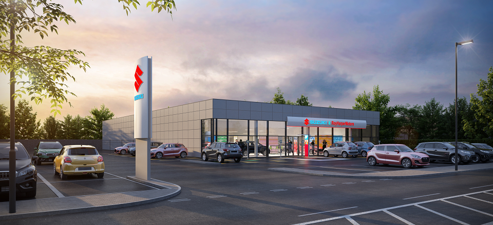
Some years back, we were working with Suzuki on helping them develop a set of ‘refreshment’ design ideas for the UK retail network; and at the time we were asked by an excellent (now retired) client to take a look at the signage.
Which was amazing as a. it’s super-rare to be asked to look at something as important as this just off the cuff and b. this area of ‘corporate identity’ for car brands is really well defended.
What they have is as a result of a heavy investment in time, money and reputation - the reputations of seriously senior leaders of a parent company usually.
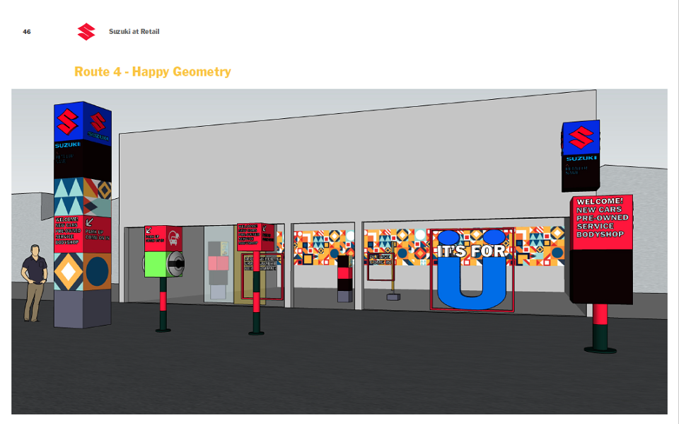
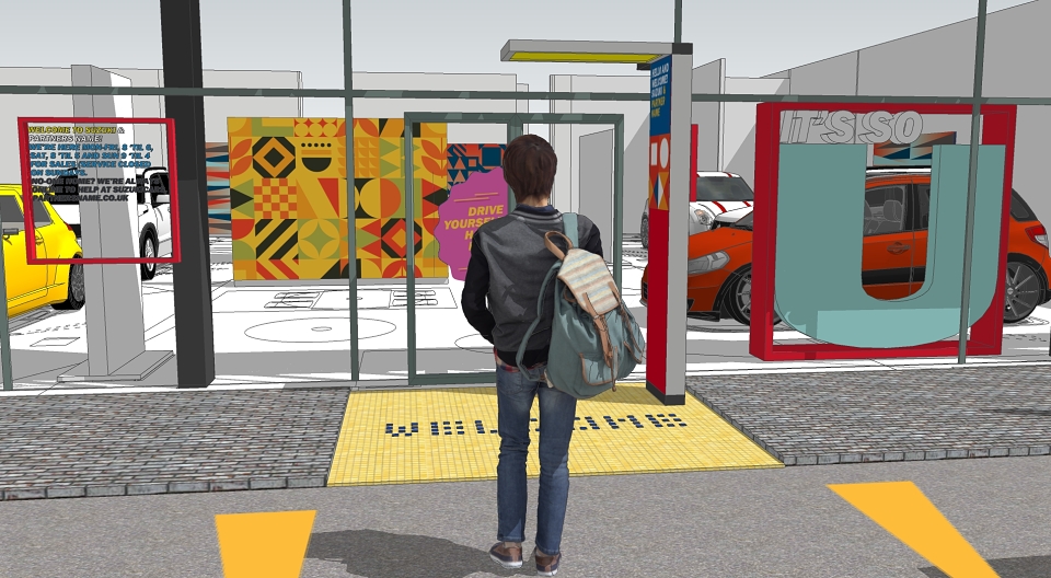
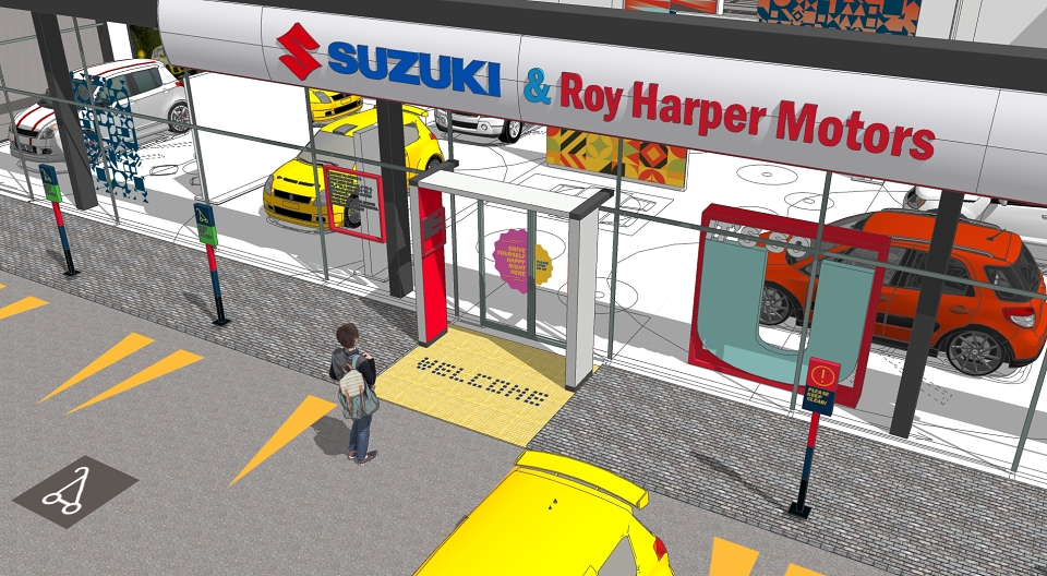
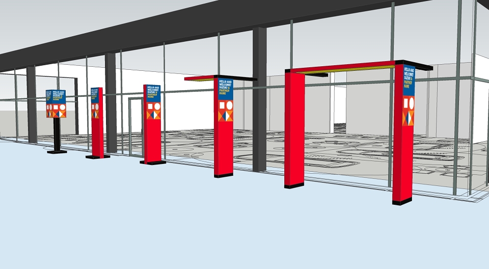
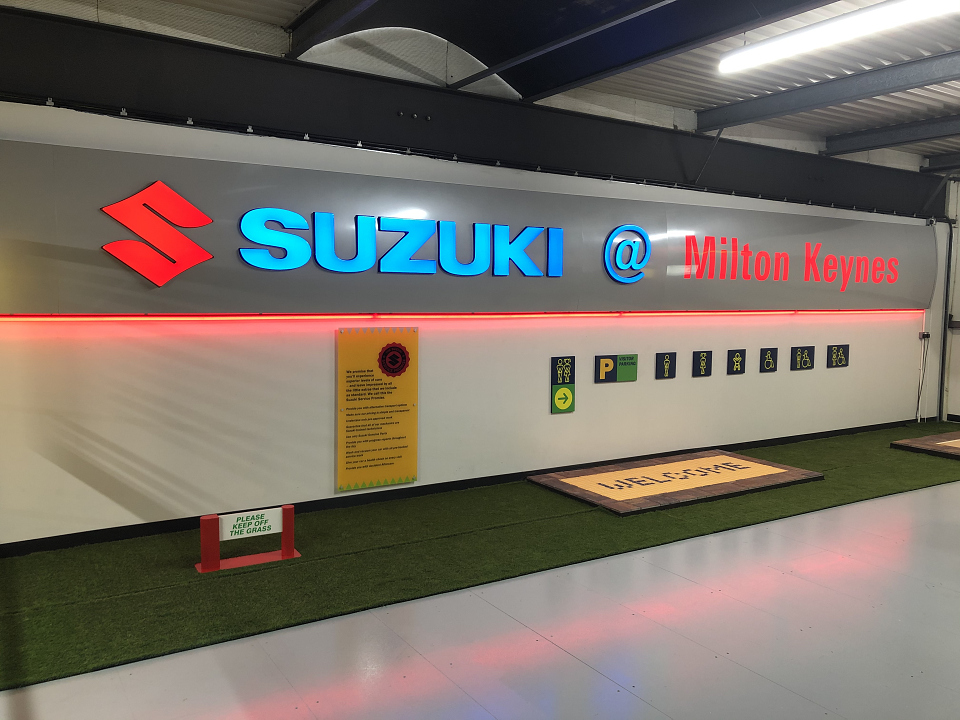
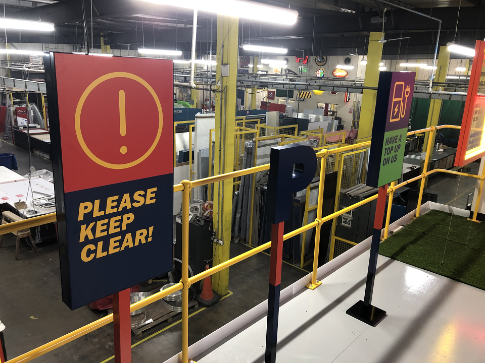
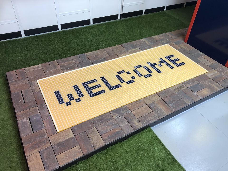
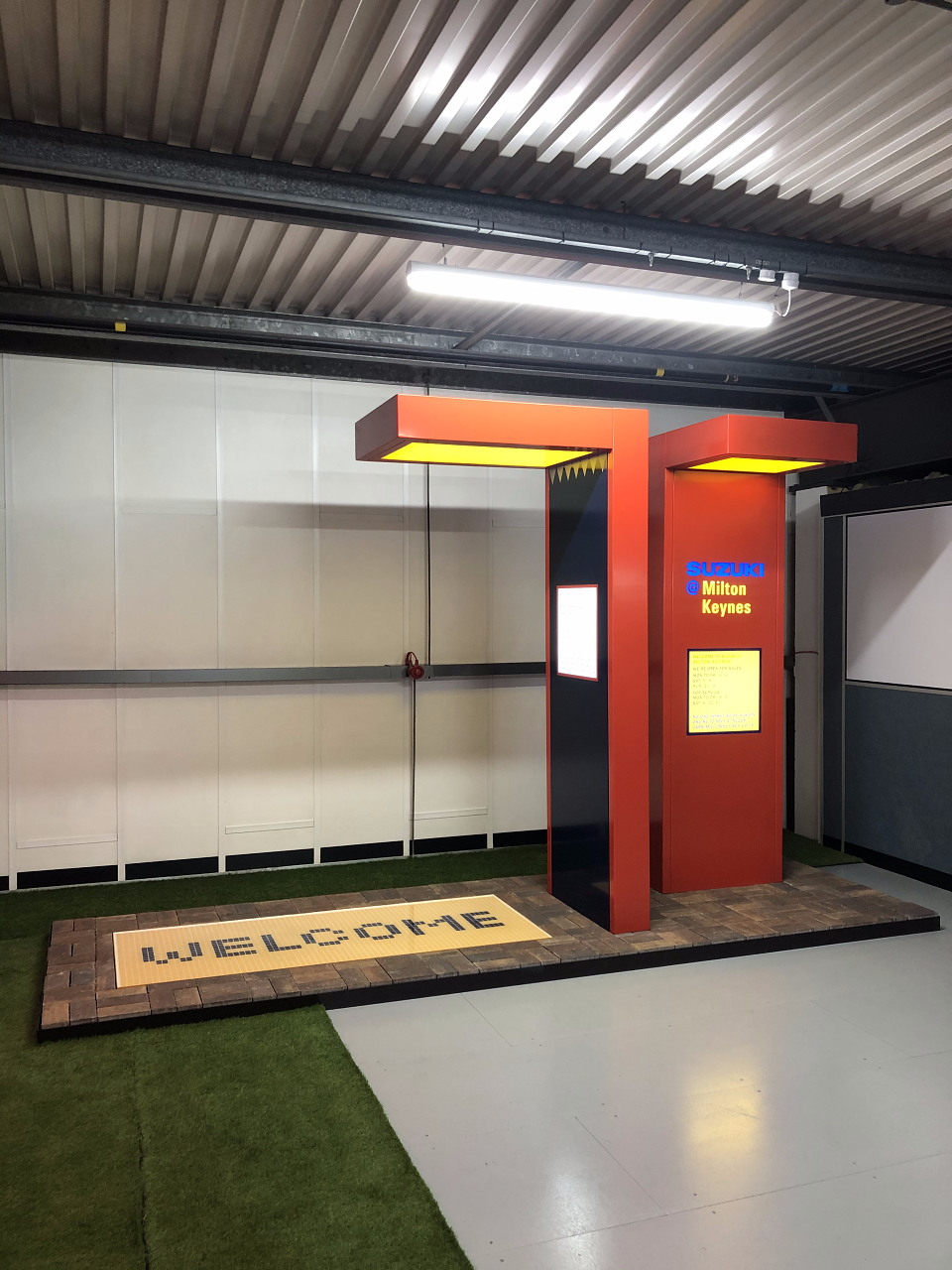
But I wasn’t going to be asked twice and came up with three concepts, the third of which (coined ‘Happy Geometry’ - after all, Suzuki is supposed to be about fun, so happiness has to be the destination) ended up being developed into a full suite of full-sized, fully working prototypes.
And while we were at it, let’s look at how much fun we can have with signage. Design signs to make you smile.
And then. Lockdown. Everything literally ground to a stop.
Our client retired a year later.
As far as I know the prototypes are still at the signage company’s factory.
Apart from the P For Parking sign.
I have that :)