

Maybe it’s just me, but there seems to be a lot of the 1970’s about at the moment?
Was taking a dip through the state of graphic design and from identity to packaging, my eye kept snagging on shades of 1973 which set me to wondering why it was - or, why am I ‘seeing’ that?
Then it dawned, as I’m primed to spot it (priming, btw, is using a stimulus like a word, image or action to change someone's behaviour) as a. I spend a quite a bit of time looking at the economic news and b. I’m of a certain age.
To the first point, there does seem to be a lot of talk about the UK economy returning to a state of economic woes it struggled with during the early and mid-70’s - when inflation and industrial strife ran rife. This state of things isn’t unique to us at the moment, but there does seem to be a clear folk (collective?) memory of the pre-Thatcher years. Personally I can’t really see the romance in shopping by candlelight, the TV not showing any programmes after 10pm and three day weeks…
…er, hang on. Perhaps I can.
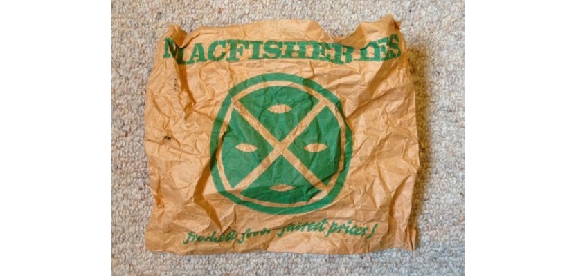
Anyway. With all the talk of destabilisation that inflation / stagflation / industrial unrest / political party implosions might be about to throw us under the recession-bus all this triggers point ‘b’ - I grew up knowing that a Tilley lamp isn’t just for miners and Macfisheries wasn’t the coverall term for all the ports north of Grimsby.
In fact, Macfisheries always stuck in my mind. I think it was the first supermarket we went to.
No Tesco round our way at the time (just imagine.) It also had a great logo, which wouldn’t look out of place on a craft beverage.
Strangely, I don’t recall much else about the effects of the economy (hardly surprising, but I do recall Polo’s going up from 2p to 3p, but that was likely about the limit of my exposure to the fiscal chaos.)
What did stick was the subliminal graphic design.
From R-Whites to Corona, Birds Eye to Vesta, JPS to Old Holborn which I can still imagine quite clearly. Whatever caused such a powerful imprint, it still trips on when I see certain folds in fonts, swashes in logotypes, the crisp cut of certain corduroy colours.
The great thing about the emergence and cycle of styles is that it creates amazing visual economies, with a terrific vividness. Graphic design is much more than the surface, it’s a memory-maker. Imagine being part of the economy that does that.
It’s (marginally) fascinating that in my fourth decade of dancing with graphic design, that it still exerts a huge emotional pull. Anyone lucky enough to be part of creating it, more power to you. You’re busy writing memories to the future.