
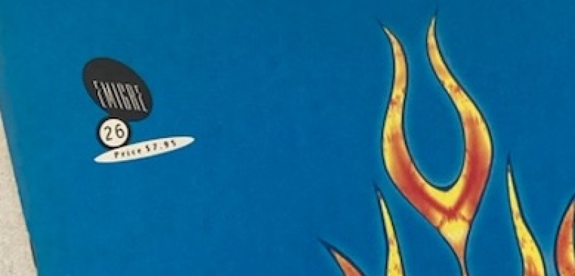

Was having a bit of a tidy up, and because I’m loathed to throw stuff away, was rather pleased to find a copy of Emigre No.26 (published in Spring 1993, lol) and wondered what was on the mind of the graphic disruptor’s minds three decades back.
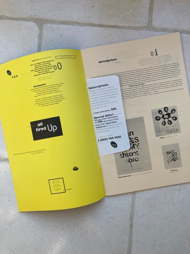
The opener for the issue was that No.26 marked ten years of publications, and a big ‘thank you’ to its subscribers (thanks right back, Rudy Vanderlans ;) for keeping an entirely independent endeavour going. Followed by letters from (mostly) fans and some feedback on the last issue(s) - Helvetica, guest editorships, the appropriation of imagery in the ‘public domain’ and begs for type specimen books from the foundry - segue seamlessly (typographically) into a debate about font piracy and copyright. Delightfully set out in a series of ‘letters’ (or likely even ‘faxes’) between the protagonists and the editors.
There’s an interview with Rick Valicenti on making a living through THIRST (his design agency), riffing on David Carson, the struggle with designer-as-celebrity, nurturing new talent, on being a ‘trouble-maker’:
“I don’t mind starting a fire. I just hope it doesn’t burn or hurt anyone.”
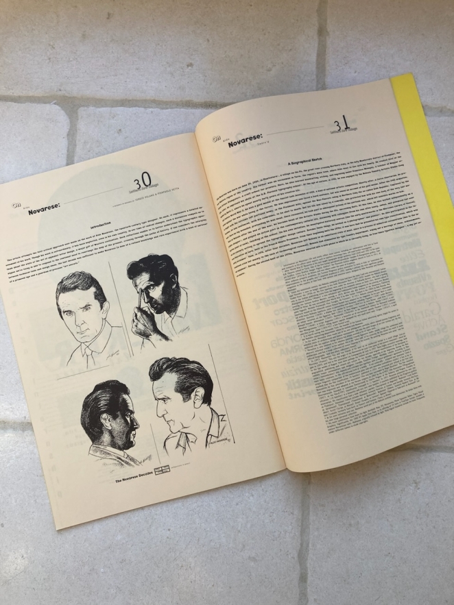
Past half-way-in, a short review of The Designers (sic) Republic exhibition, a typeface submission, a feature on ‘white space’ in design and a wrap-up critique on Aldo Novarese’s body of work (which I couldn’t really draw into a conclusion, other than someone who had a forty-year-career behind them could still draw admiration from the new wave.)
So, what’s to be drawn from the retro-respect? My take is that the design is still fire (in fact, even improved with age. Which is a strange sensation), and that the design energy that drove the Emigre engine really didn’t need much beyond itself, when the fun was all in the fuel.
I don’t mean to disparage the editorial, but what’s striking was (is) that here was a craft concerned with tearing up decorative tropes. Of graphic design as an artistic, devil-may-care endeavour, full of the energy of beautiful experimentation. That only needed the vehicle of, and for itself, to find a shape and burst into being. A sort-of ‘happening’ in print with no better reason nor none needed.
Let’s keep chasing the glitches that still have designer’s setting themselves against the visual orthodoxies of the day. It’s a methodology that never goes out of style despite the fads.
Here's to the manifesto-as-graphic-design-object.