


Languages, whether visual or verbal, are amazingly plastic. Words used to define those languages are likewise. Ones that sound rather similar at first listening, but on inspection couldn’t be more distinct in meaning.
Brands also can be a lot like this.
While they might offer something actually different - whether better, stronger, faster, beneficial in some way, shape or form - many spend a lot of time crafting guidelines (which are the means of disposal or distribution in the main) that look, and sound, a lot like those three word examples: on surface all sounding rather similar, while utterly different in meaning.
It might appear a somewhat specious argument, trying to find (well force) a connection between words that sort-of sound the same, and brands using the same strictures and structures to define themselves - and so appearing to follow a pattern of sameness - but I have thing about this.
Spending a good deal of my professional time tending to design guidelines, it’s really quite astonishing how constricted are the constraints applied to framing brands can be.
Sure, I get it that the reason for a guideline is to guide - so a certain level of familiarity can be really useful for their audience - and most brands employ the same (or demand the same) modes of operation, application and execution for that reason.
But it’s also rather surprising how much important stuff gets left out to focus on the ’stuff everyone else puts in’; to the shortcomings of things that you actual users might find actually useful.
The result is a fixation on what a guideline ‘ought’ to include; to the detriment of what it really should. The difference being the outcome of careful differentiation, and so resulting in (supposed) all-important distinction.
I’m likely old-fashioned in my view, but beyond The Agency (and I talking about users who will never be commissioning long-copy ads or writing style-guides for employees) I’d take useful multi-application references for those brand colour breakdowns that help me pick a paint colour every time. HEX, you’re good. But RAL’s trump.
Am going to guess (well, offer) that if we swapped out ‘guide-line’ for ‘application-line’ - and so shift linguistically from the ‘general rule, principle, or piece of advice’ to the ‘specific’ - maybe the thinking and approach to application (and from promotion of the brand to implementation of it) might shift as well. And welcome, toward the more useful.
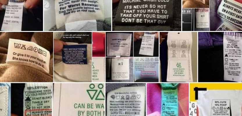
I’d prefer the ‘Instructions For Using This Brand’ to be more like the labels I check before bunging everything in the washing machine. Clear. Concise. And if I ignore the 30deg rule, that those favourite jeans likely won’t fit afterward.
* A blood thinning drug, since you were likely wondering :)