Richard Boyle
Head of Design
ABOUT
Helping patients living in pain by helping the practitioners who manage it.
We put our all into every piece of work we do. But when a groundbreaking start-up asked us to build them a brand that helps those living in pain, we felt an even greater responsibility to get it right.
Lumina are a collaborative of medical practitioners and patients who are joining together to help further the advancement of pain management. By treating patients in ways specifically geared towards them, Lumina and their accredited practitioners will help those living in pain, live beyond it.
-
You can’t give a brand an identity without knowing the people - and purpose - behind it.
We spent days talking to the team behind Lumina, understanding who they were, what they wanted to achieve, the complex medical world in which they operated, and the benefits they would bring to both patients and practitioners.
The key elements that came out of this was a need to build a sense of professionalism, empowerment, and community with both patients and practitioners.
Understanding this allowed us to craft their mission, vision, values, and brand essence - the foundations of any brand. And from which would come our creative.
-
“We're very happy with the brand - the Woven team has delivered exceptional work. ”
David Loubser - Partner, Luxuriant Capital (Lumina investor)
-
Lighting the way
Throughout our discussions with the team, one symbolic motif kept coming back to us: the idea of light.
Lumina would be a beacon of hope for those struggling to manage their pain. And it would be an illuminatory experience for practitioners who would find new, proven ways to better help their patients.
That’s where we got the name Lumina - a reference to that beacon of hope, and also a play on the scientific Age of Enlightenment, which in French is called le Siècle des Lumières.
For us, this is what Lumina represents - a new age of medical enlightenment to help practitioners better manage pain, and patients live better lives.
-
A brand of two halves.
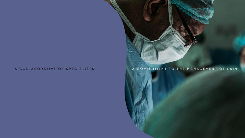
Lumina having two distinct audiences - practitioner and patient - meant we had to approach our creative in two slightly different ways.
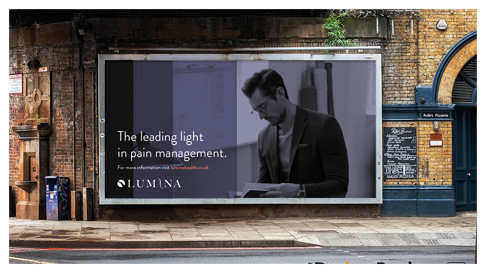
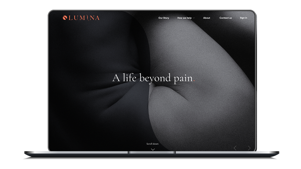
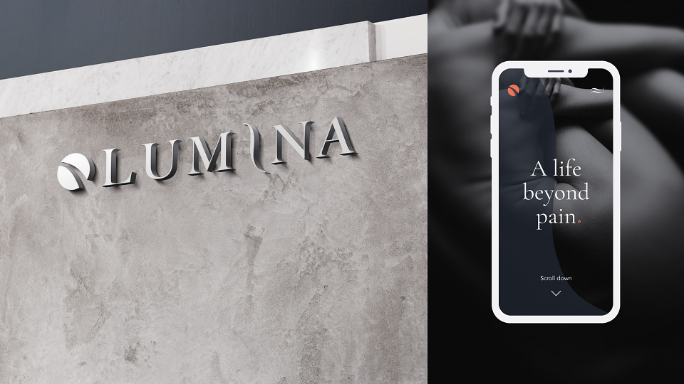
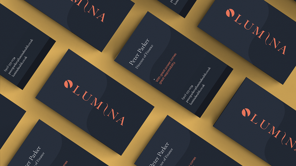
Our overall aesthetic - logo, design, fonts, etc. - would be consistent across the brand. But Lumina’s use of imagery and copy would flex depending on which audience they were talking to.
With patients, Lumina’s tone would be authoritative, hopeful, and reassuring. Whereas with practitioners, the tone would be more technical, concise, and community-driven.
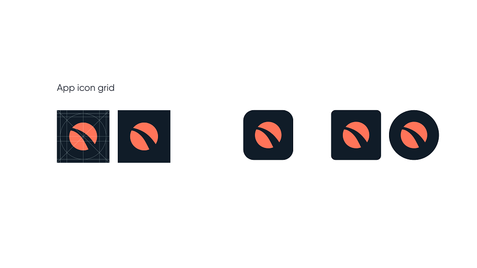
But whether appealing to practitioner or patient, our creative team have delivered a brand that looks authoritative and elegant yet welcoming and accessible.
-
A brand built from the ground up in just 4 months.