Rhombus Studio
Bristol
ABOUT
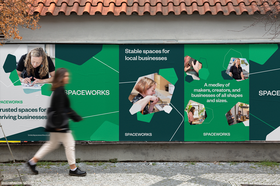
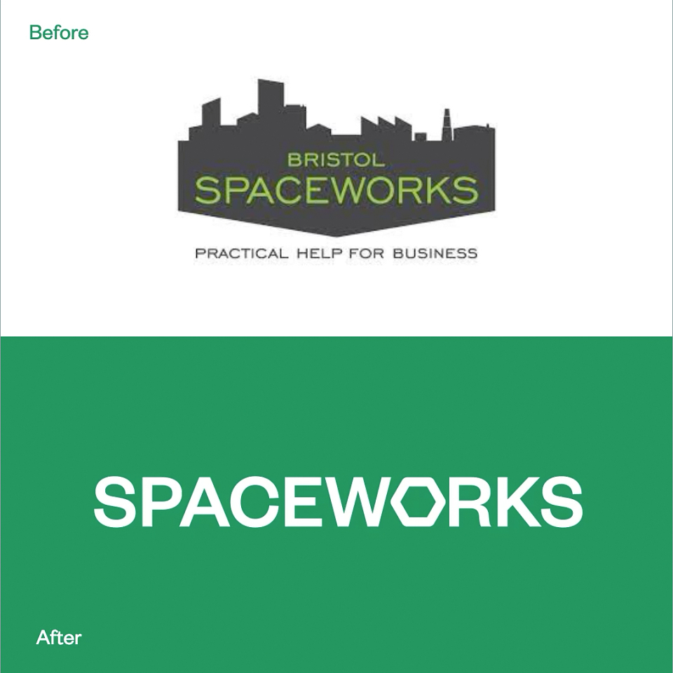
Spaceworks is a platform for makers, creators and businesses of all shapes and sizes. They have been on a mission to bring community driven work spaces to Bristol since 1985 and needed a rebrand and website to match.
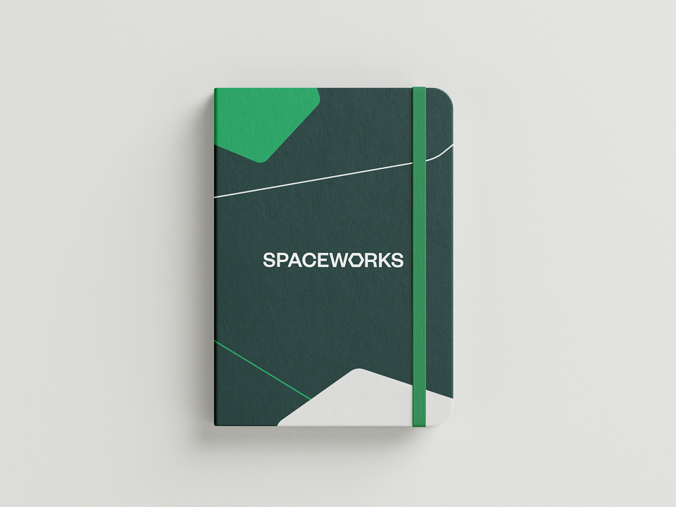
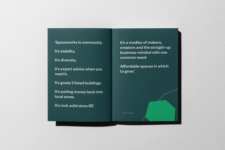
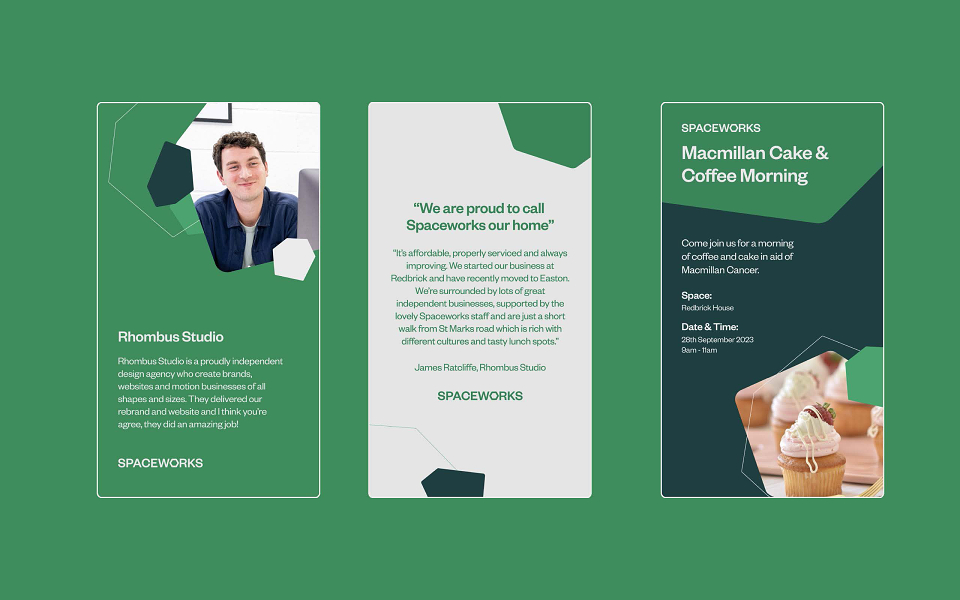
The new identity by Rhombus nods to the past while looking forward, inspired by the diverse community of businesses who call Spaceworks their home. The brand balances play with trust and accessibility, uniting makers, creators and businesses across Bristol.
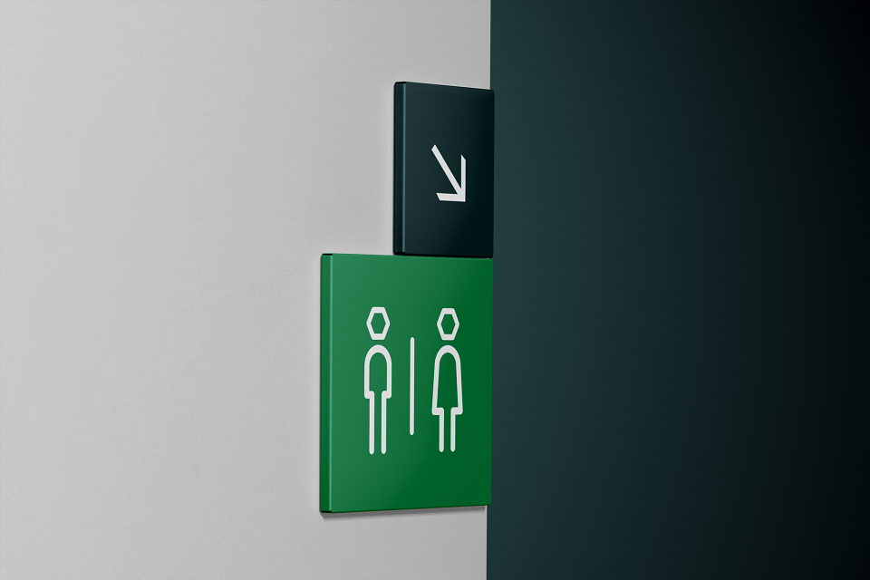
The visual identity was built around the new logo, evolved from their geographical footprint in Bristol. The wider identity system uses more abstract evolutions of the logo to portray the businesses of all shapes and sizes that make up Spaceworks.
The colourway is an evolution of the green they launched with in 1985, as a nod to their rock-solid history. The typeface (aptly titled Founders Grotesk from Klim Type Foundry) is a sans serif with plenty of character, inspired by some of the buildings they have transformed over the years – grade 2, big hangars, small nooks and stained-glass windows.
Spaceworks are the same today as they were when they started – committed to providing affordable, supportive spaces for diverse businesses in local communities: Easton, Barton Hill, St Phillips, Stokes Croft, St Jude’s and Bishopston.
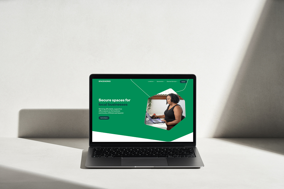
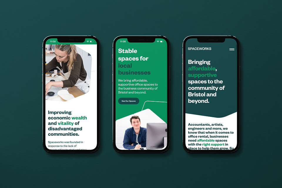
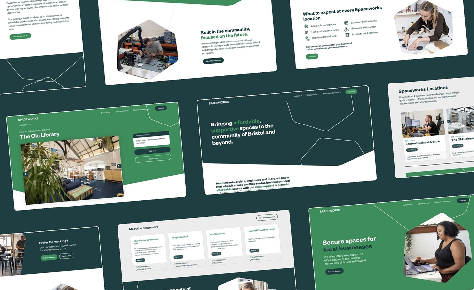
Their new custom website is testament to this commitment, delivered in partnership with Papaya Studio – making it easier than ever to access workspaces and business support.
“Rhombus Studio created our new branding and website and we are delighted with the results. It was a thorough and carefully planned process and aside from creating some amazing visual assets, they took the time to understand our business and aspirations and created something that represents us very well.”
Matthew Johnstone
Chief Executive, Spaceworks