Rhaby K
Graphic Designer
ABOUT
Project title:
Surely Nut: bold rebrand & product line expansion
Role:
Lead brand strategist, identity designer, & illustrator
Scope:
Full-cycle concept and execution, including market analysis, brand narrative development, logo design and animation, creation of a flexible packaging design system for multiple flavours, custom illustration suite, copywriting/tone of voice, and the development of the supporting sports and fitness campaign.
Design challenge:
Surely Nut, a growing peanut butter brand known for its bold and unique flavours, needed a new brand identity that could evolve with its expansion. The challenge was to develop packaging that stood out in a saturated market, communicated flavour variety and fun, and maintained consistency across multiple product lines while appealing to a diverse, health-conscious, and taste-driven audience.
Insight:
Research revealed that many competitors leaned into natural or minimalist aesthetics, often overlooking visual excitement or personality. Consumers, particularly younger demographics and active lifestyle segments, were drawn to vibrant, joyful packaging that reflected flavour as much as function. Additionally, buyers valued transparency, storytelling, and visual cues about health benefits.
Solution:
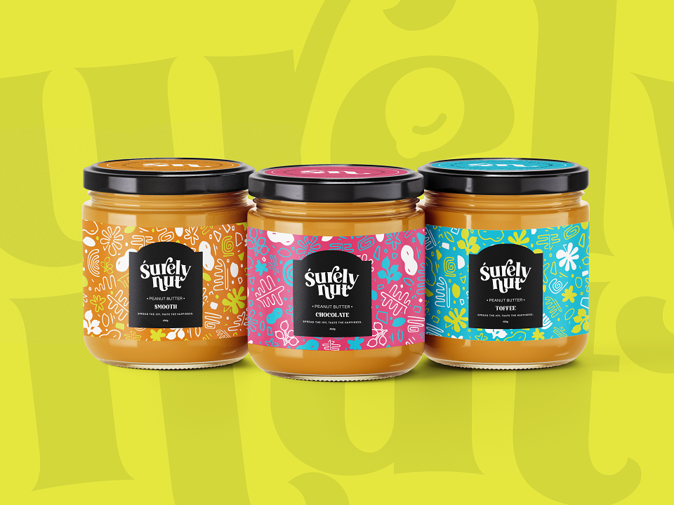
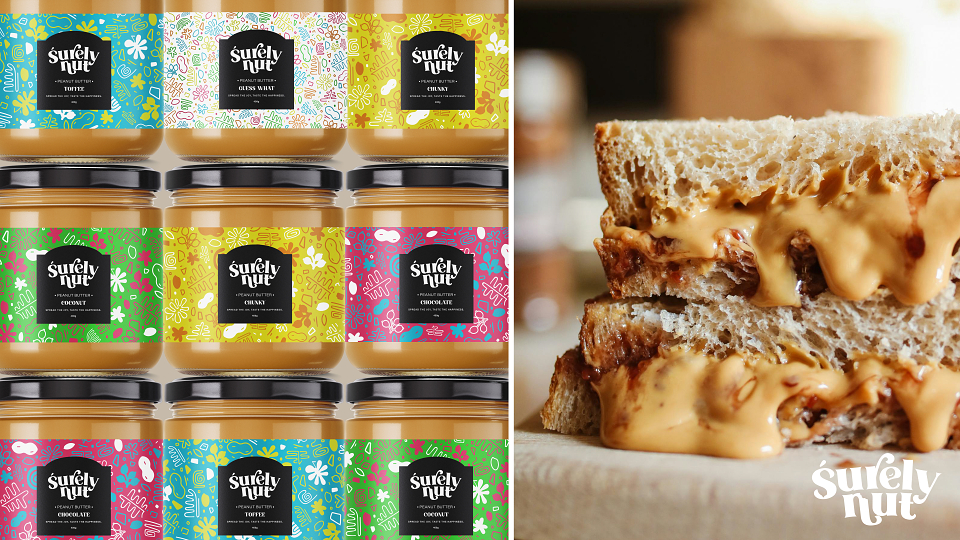
The final design system for Surely Nut balances bold personality with brand cohesion. A retro-inspired, playful logo captures the handcrafted, joyful spirit of the product, while colourful, flavour-specific illustrations bring the peanut plant’s elements to life in an abstract, engaging way. Each label uses vibrant, energetic colour palettes and fun graphics to communicate flavour and mood at a glance. The packaging not only makes Surely Nut instantly recognizable on shelves but also remains flexible for future product extensions without losing its core identity. Paired with a sports-focused campaign that reinforces its health benefits, the brand now confidently speaks to both indulgent eaters and fitness-focused consumers alike.
Brand identity development:
Surely Nut is a peanut butter brand with bold, distinct flavours that offer a unique tasting experience. As they expanded their product line, Surely Nut sought a fresh, vibrant brand identity that would reflect their growth and personality, connecting more strongly with their audience while embodying the fun and joyful spirit of their products. The design objective was to craft a dynamic and engaging brand that is not only visually appealing but also memorable and aligned with their playful yet quality-driven image.
Design concept and process:
The design process was initiated with the understanding that Surely Nut’s core value is in its distinctive and fun flavours. The goal was to create packaging that feels modern, energetic, and reflective of the variety and vibrancy of their peanut butter options.
Logo and typography:
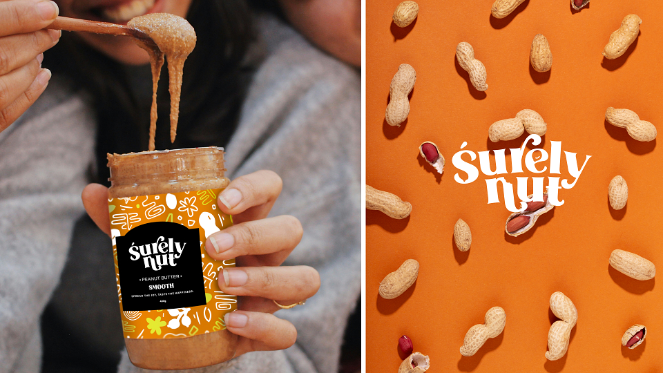
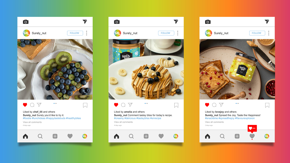
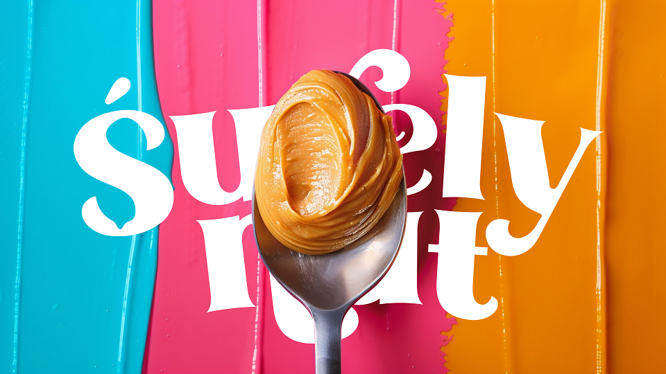
The bold, retro-inspired typography for "Surely Nut" exudes personality, mirroring the fun and playful nature of the brand. A quirky yet legible typeface was selected to add charm, with the slightly irregular lettering symbolizing the handcrafted, wholesome nature of the product. The tagline “Spread the Joy, Taste the Happiness” emphasizes the emotional connection customers have with food, tying the brand’s identity to a sense of joy and indulgence.
Packaging and colour palette:
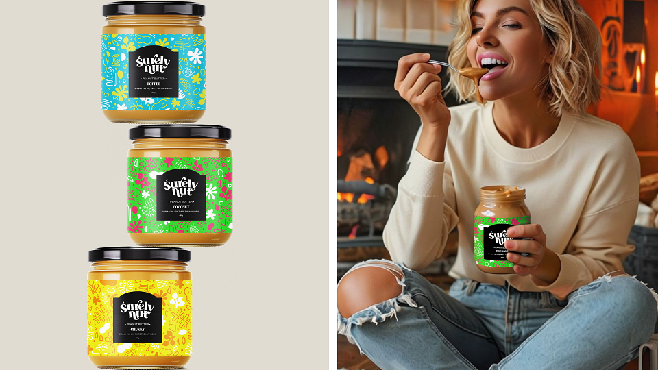
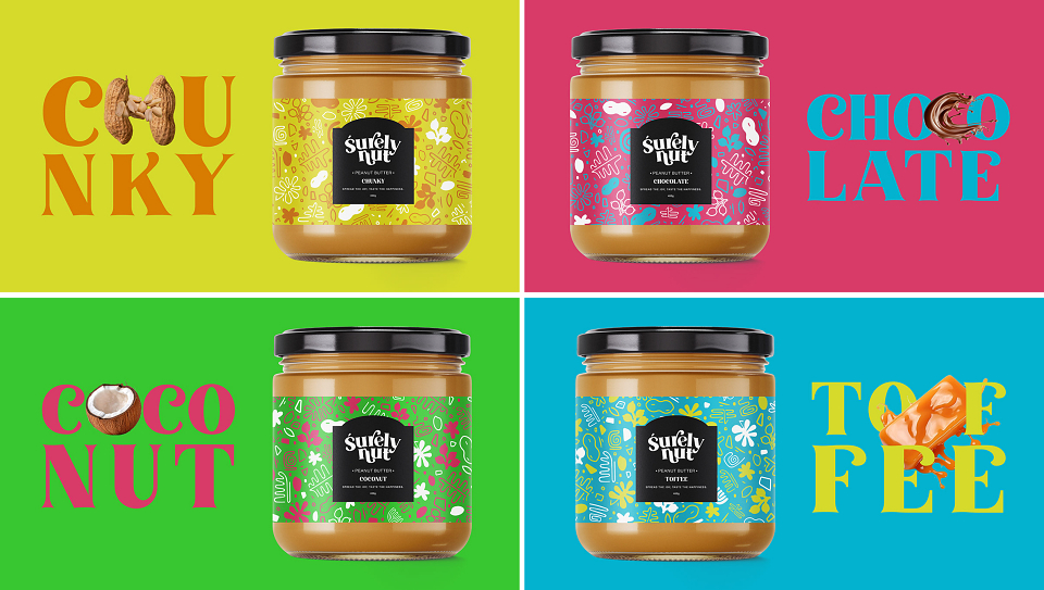
The design for Surely Nut’s packaging needed to stand out on shelves and reflect the excitement of the product inside. The vibrant colour palettes were chosen carefully for each flavour.
Illustrations and graphics:
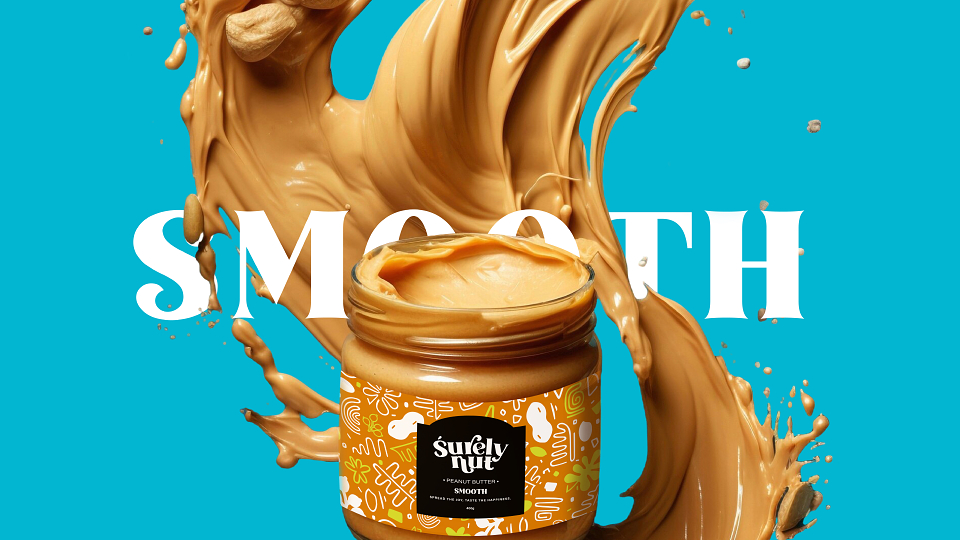
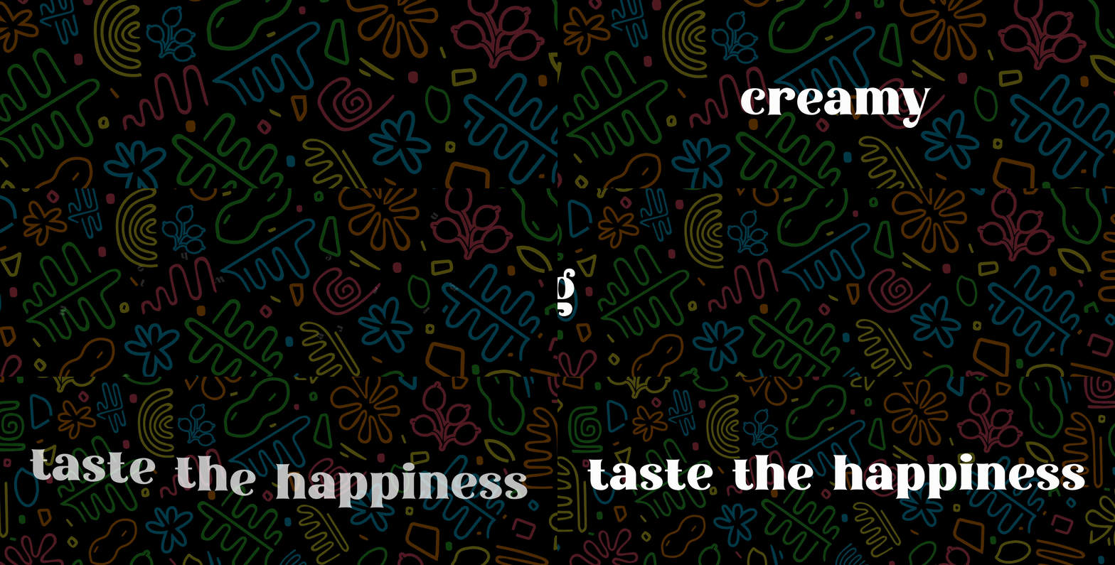
Each jar is adorned with simple yet playful illustrations that combine peanut shapes with seemingly abstract forms, reflecting the playful and imaginative approach Surely Nut brings to their product offerings. We say "seemingly abstract forms" because the forms are not necessarily abstract; they represent the peanut plant. The leaves, the flower before and after it blooms, and the peanut inside and outside its shell. The abstract shapes are taken from the texture and patterns formed on the peanut shell. These graphics bring the designs to life while ensuring brand consistency across different flavour variants.
Consistency across branding:
The design also allows for future flexibility. Each new flavour can be easily differentiated through varied colour schemes and slight adjustments to the illustrative elements while maintaining the core branding identity. The balance between fun, bold design and clear, easily recognizable branding was key in making Surely Nut’s identity flexible for future product launches while still being rooted in their original story.
Sports and fitness campaign:
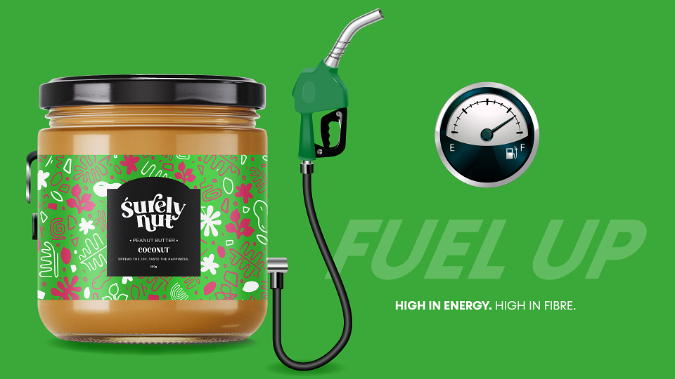
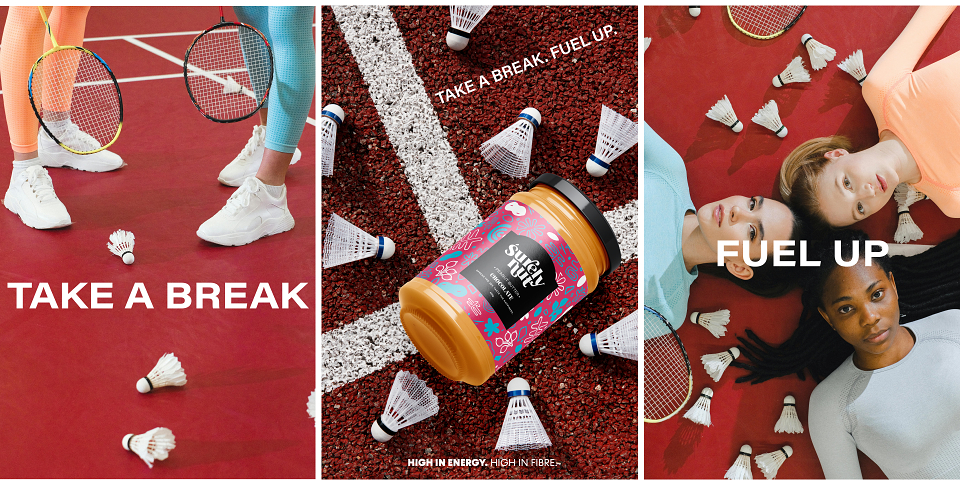
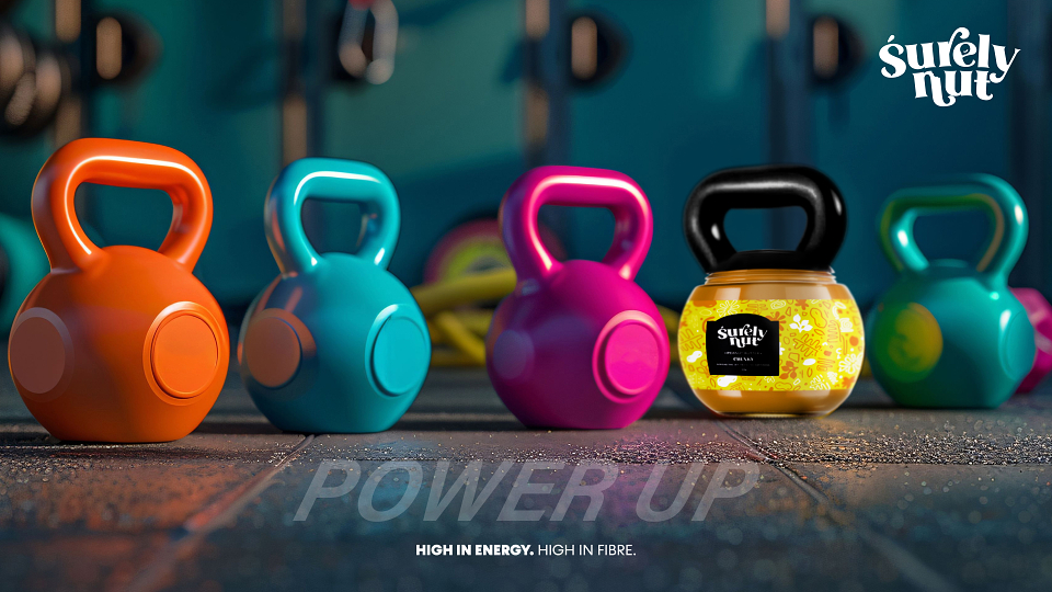
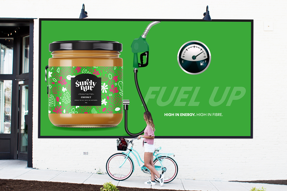
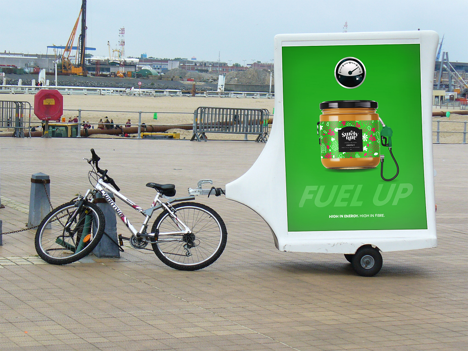
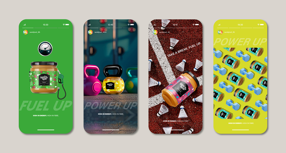
Fuel up. Power up.
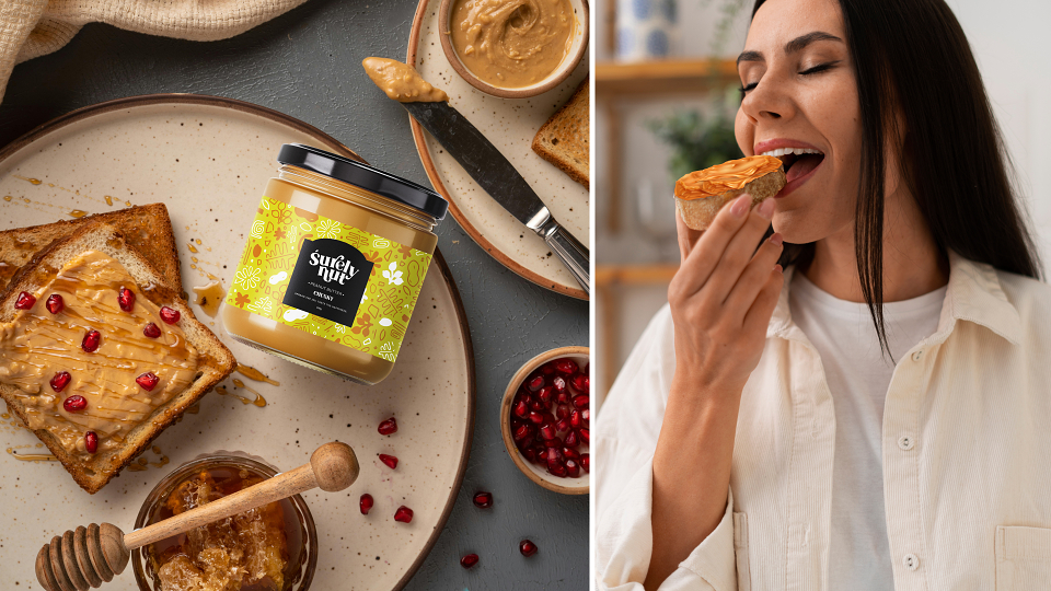
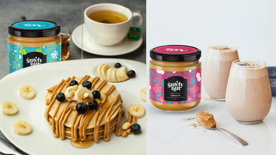
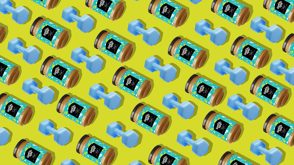
Surely Nut provides a good amount of protein, which is essential for muscle repair and growth. It contains monounsaturated and polyunsaturated fats, which are important for overall health and can provide sustained energy. Its calorie-dense nature makes it a great option for sportsmen who need to meet high energy demands. The combination of protein and healthy fats can help keep sports lovers and gym fanatics feeling full, making it easier to manage hunger during intense training. It is versatile and can be easily added to smoothies or oatmeal or consumed with fruits, making it a convenient snack.
The campaign aims to show that Surely Nut is a great snack of choice whether you're doing light or heavy lifting or doing active sports. It's all the fuel you need to get you going. It's strength in a jar.
Surely Nut:
Bold Flavour. Bold Personality.
Surely Nut isn’t your average peanut butter brand. With unique flavours, a cheeky attitude, and a focus on joy, nutrition, and creativity, this rebrand delivers a vibrant identity packed with energy. From the playful logo to the flavourful, illustrative packaging, every element was crafted to spread happiness, one spoonful at a time.
MADEIT CREDITS
-

Rhaby KGraphic Designer