Rhaby K
Graphic Designer
ABOUT
Project title:
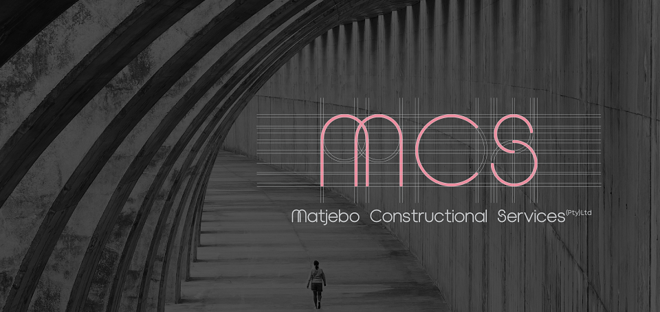
MCS: identity for female empowerment in industry
Role:
Lead brand strategist & corporate identity designer
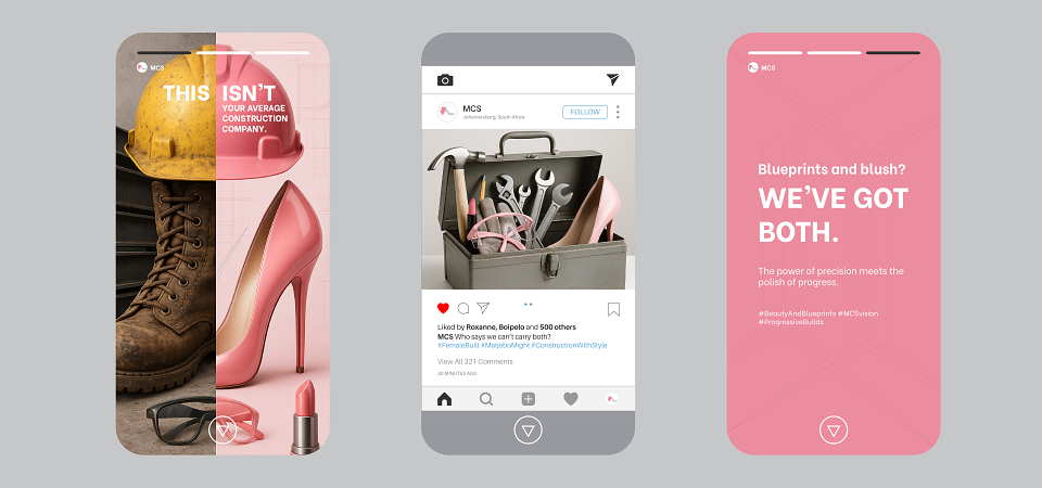
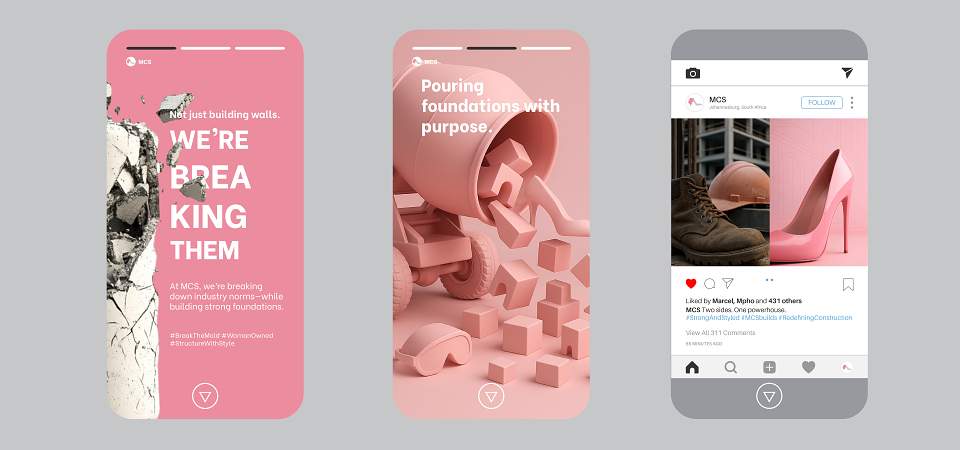
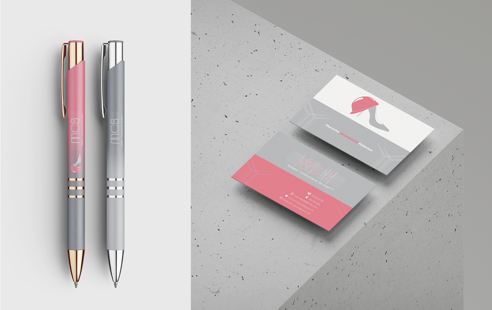
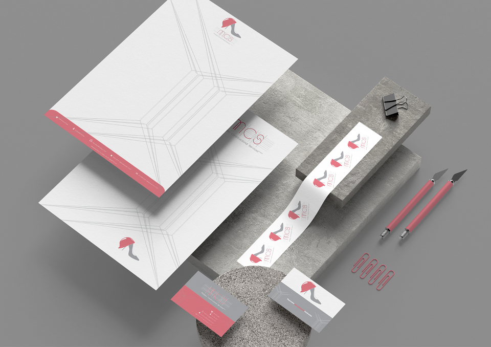
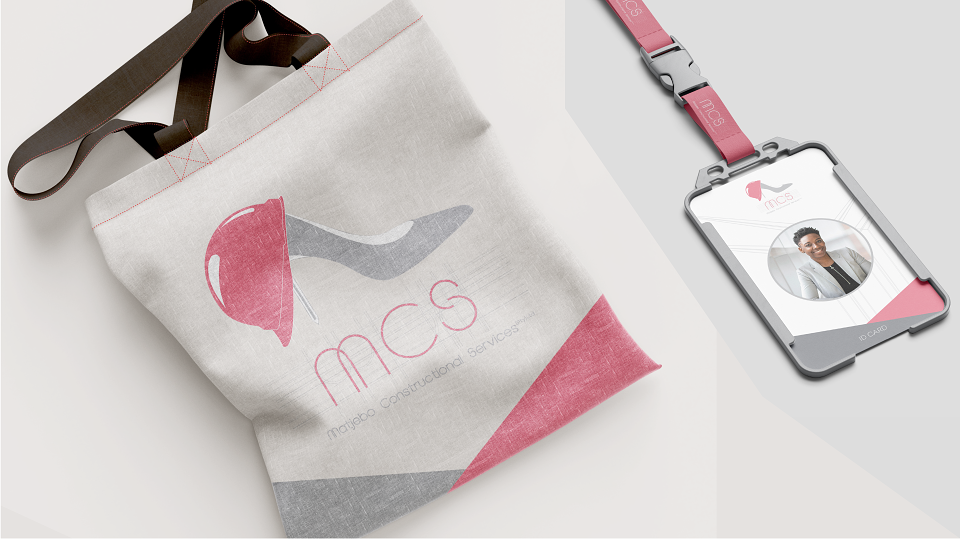
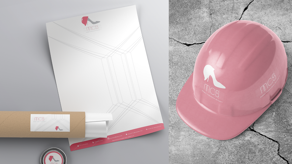
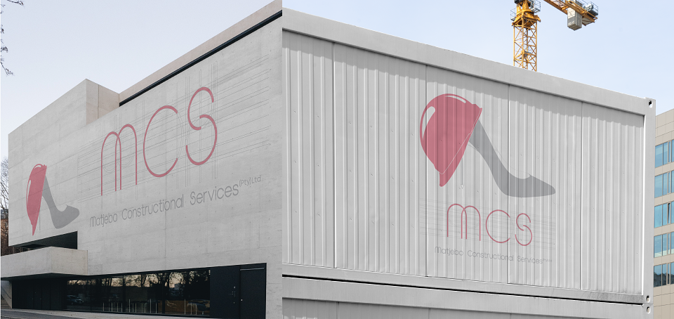
Scope: Full-cycle corporate identity development for a female-led construction firm. Scope included strategic brand positioning, defining the tone of voice and brand personality, creation of the concept logo, and design of all corresponding corporate collateral, social media templates, and promotional items.
Design challenge:
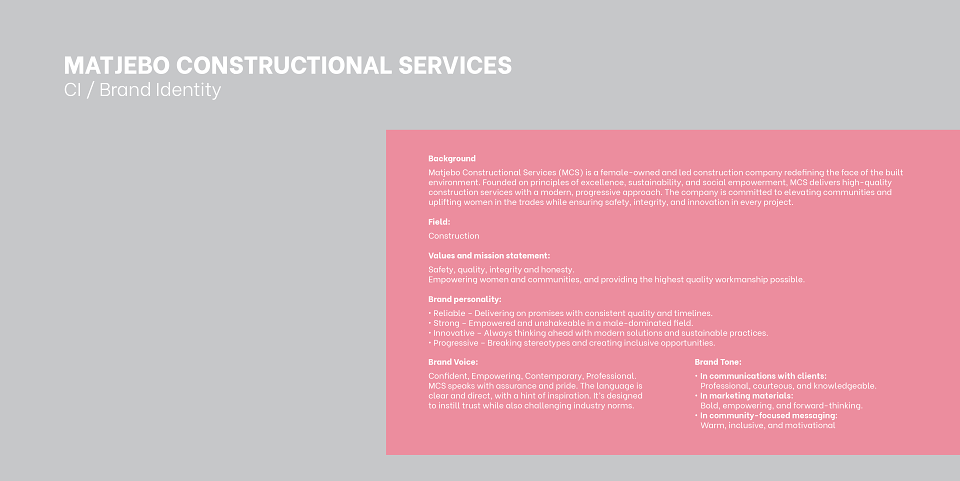
Matjebo Constructional Services (MCS) needed a visual identity that would not only allow them to stand out in the typically male-dominated construction industry but would also embody their core values: female empowerment, progressive thinking, and unwavering commitment to quality and safety. The challenge was finding a middle ground between strength and elegance, fusing construction’s grit with the sophistication of a female-led brand.
Insight:
Research on the construction industry showed a shared visual language, dominated by masculine aesthetics: bold, rigid lines and heavy industrial imagery. However, competitor analysis revealed a growing niche of female-owned construction companies which were underserved by generic branding. There was an opportunity in the market for a construction brand that conveyed both strength and femininity, breaking stereotypes while still being taken seriously.
Solution:
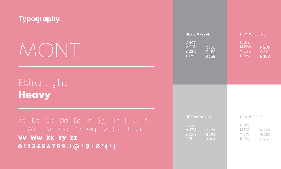
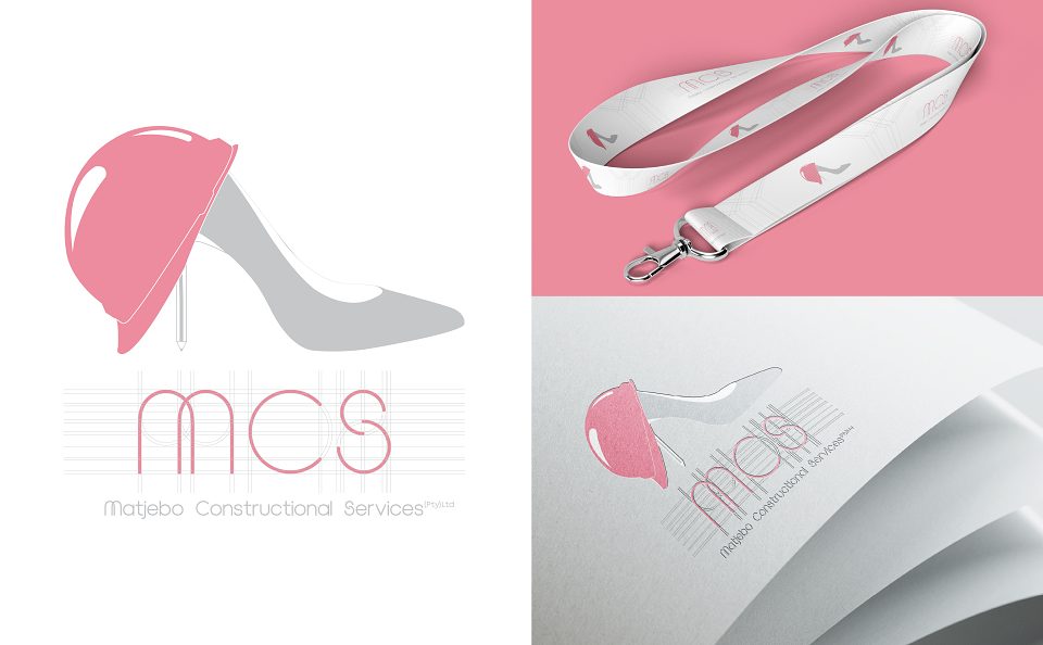
The final CI concept combines a stiletto heel and a hard hat, juxtaposing the traditionally feminine with the industrial. The pink and grey colour palette reinforces this fusion, where pink symbolises empowerment and approachability, while grey grounds the brand with professionalism and reliability. The custom logotype and minimal linework add a refined, modern feel while maintaining a structured look that aligns with architectural precision. The brand identity confidently communicates: "Strong doesn’t have to look masculine."
MADEIT CREDITS
-

Rhaby KGraphic Designer