Rhaby K
Graphic Designer
ABOUT
Project title:
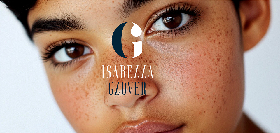
Isabella Glover: self-love skincare brand & packaging
Role:
Chief brand strategist, brand, verbal identity, & packaging designer
Scope:
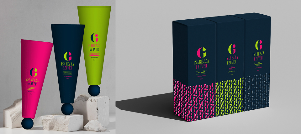
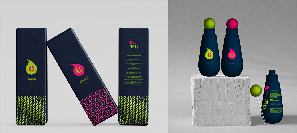
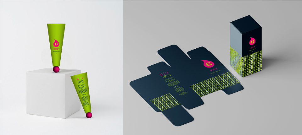
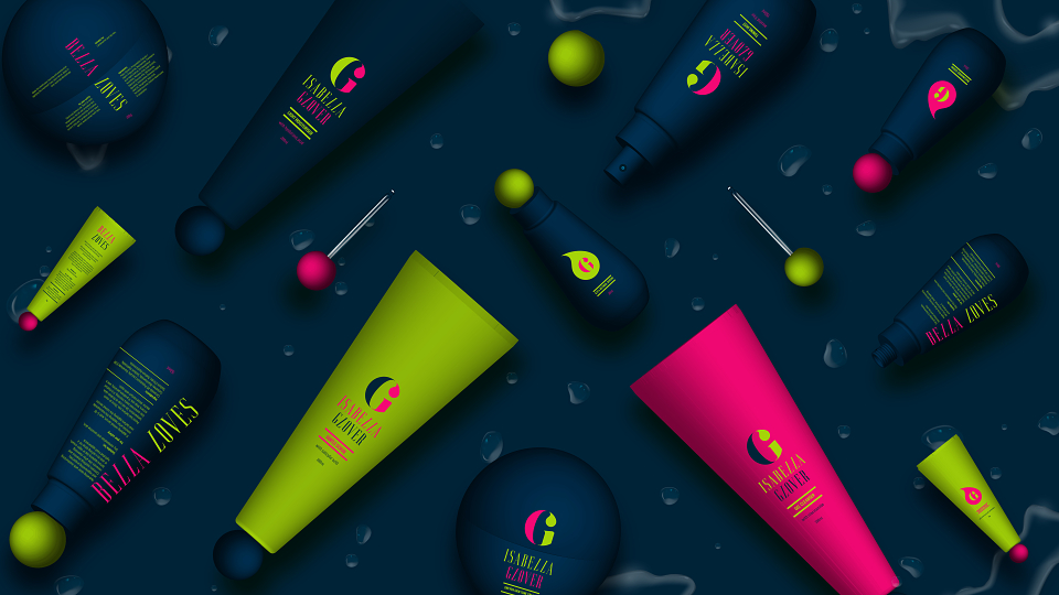
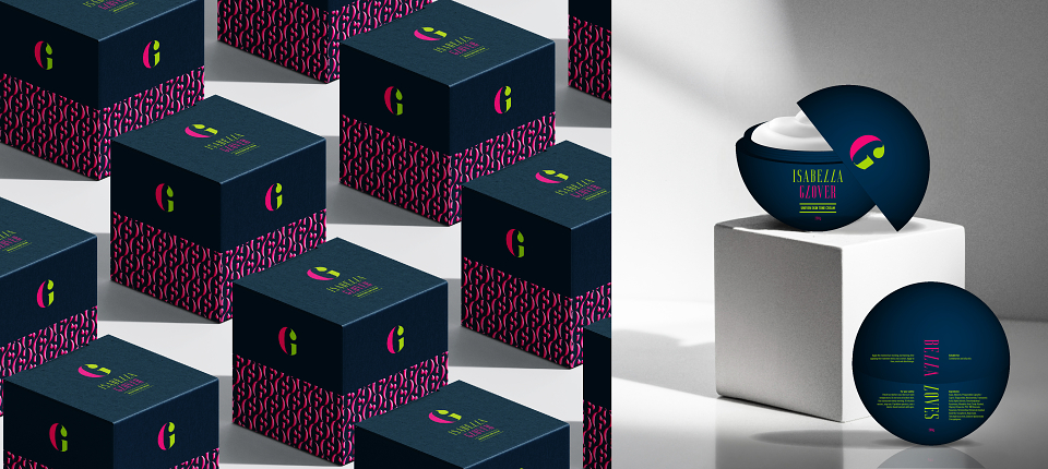
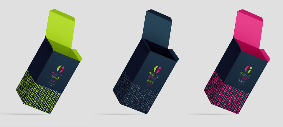
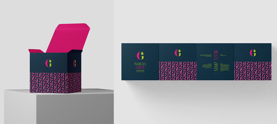
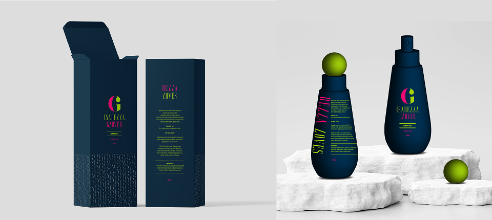
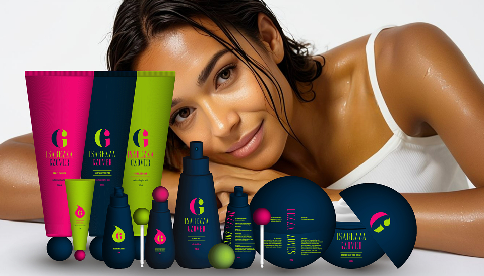
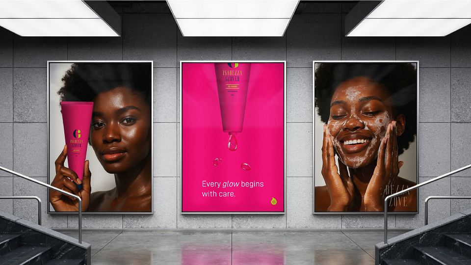
Full-cycle brand strategy and identity development for a premium skincare launch. Scope included brand naming, defining the verbal identity, creating a disruptive visual identity, designing a complete packaging system across the full product range, and conceptualizing supporting advertising collateral.
Design challenge:
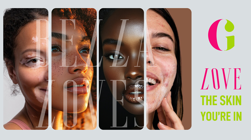
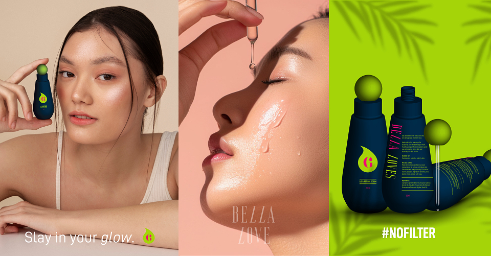
To launch a premium skincare brand, Isabella Glover, that disrupts the pervasive market narrative centred on perfection, correction, and flaw-fixing. The challenge was to create a visual and verbal identity that successfully repositions the daily skincare routine away from external validation and toward an internal ritual of self-love and radical acceptance. The design needed to embody both nurturing kindness and bold self-expression to resonate with a consumer fatigued by idealised beauty standards.
Insight:
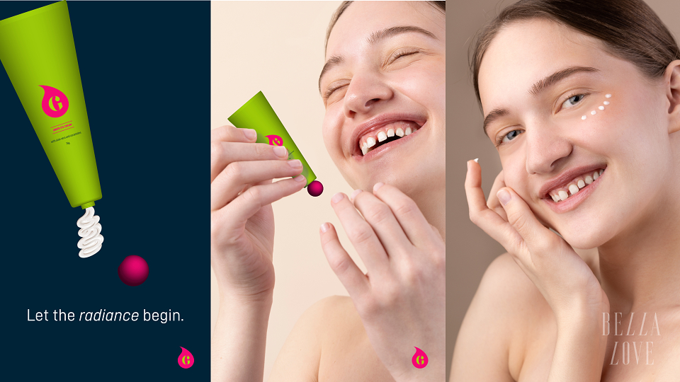
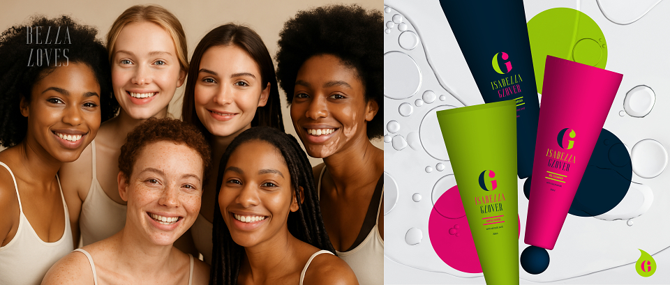
Modern consumers, particularly those engaging with beauty and wellness content, are experiencing a deep disconnect between the highly filtered digital ideal and their real-life skin. The key insight is that the consumer's primary emotional goal is not flawless skin but a "glowing sense of self."
They are actively seeking brands that:
Grant permission to be imperfect.
Elevate their routine from a chore of correction to a mindful ritual of kindness.
This reveals a market need for a brand that is fiercely authentic, where the product serves as a catalyst for self-compassion rather than an instrument of self-criticism.
Solution:
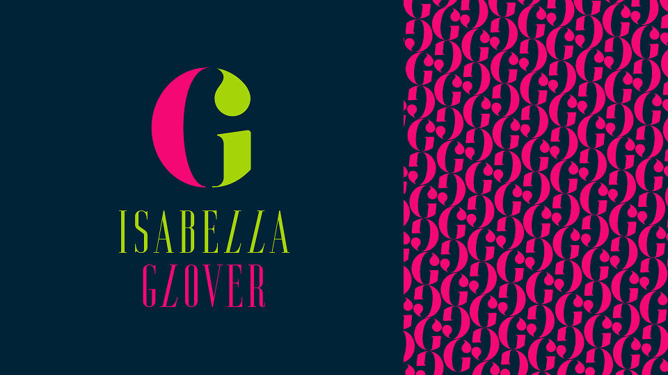
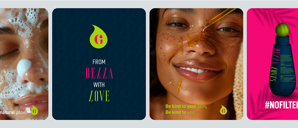
I developed a full-spectrum brand identity for Isabella Glover that aligns the emotional core of self-love with a visually disruptive and confident aesthetic.
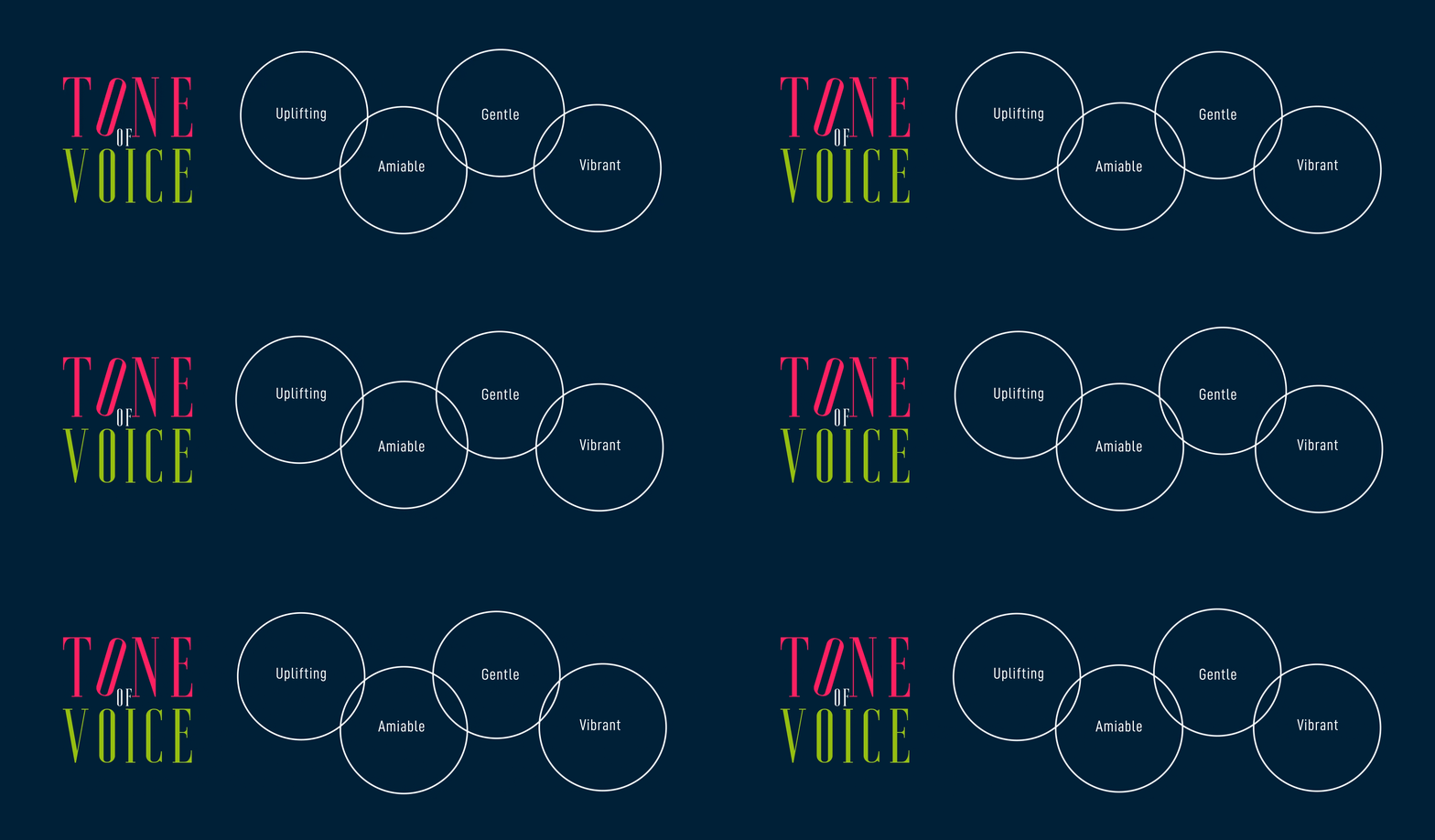
Verbal identity and tone:
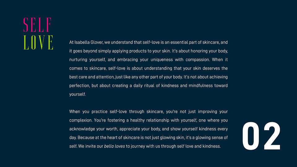
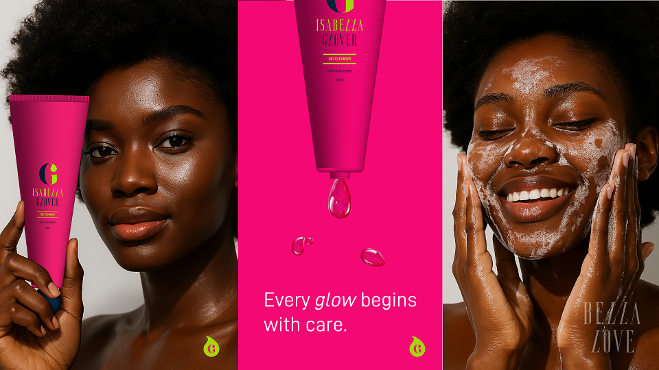
The copy was crafted to be a supportive voice, framing the routine as an act of personal reverence: "It’s about honouring your body, nurturing yourself, and embracing your uniqueness with compassion." I established self-loving, kindness overflowing as the guiding principle, shifting the focus from product benefits to emotional benefits.
Visual identity and colour strategy:
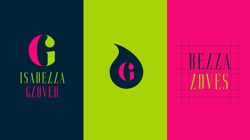
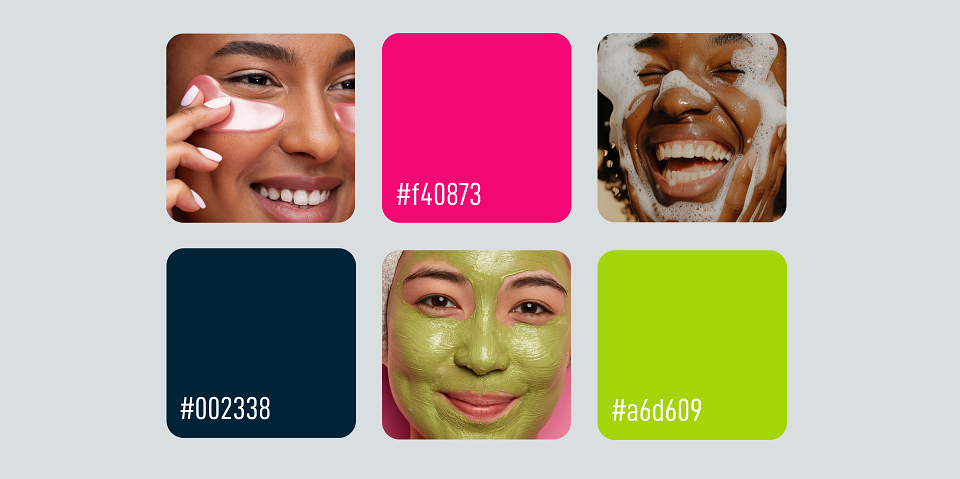
The colour scheme was strategically chosen to embody the brand's position of breaking barriers in skincare:
Dark blue: serves as the sophisticated anchor, conveying trust, depth, and luxury, grounding the brand in quality and efficacy.
Vibrant magenta: represents the boldness and daring of self-expression and acceptance. This electric hue prevents the brand from feeling overly soft or passive.
Acid green: provides an energetic, natural element, symbolising purity and the "unveil your natural glow" concept.
This unique, high-contrast palette is designed to stand out against competitors who rely on muted pastels, visually communicating that Isabella Glover is a brand that is both kind and unapologetically bold. The final design solution delivers a unified experience where skincare is synonymous with a powerful, mindful ritual.
MADEIT CREDITS
-

Rhaby KGraphic Designer