


A Q&A with Sarah Holland on her illustration journey and introducing Red Setter’s Walking Map
Remember those heady days when we were 100% office based and had to be nudged to leave our desks? It seems ages ago, but we had the bright idea of taking inspiration from Steve Jobs (who was a big fan) and encouraging more walking meetings. To embrace this new way of thinking we commissioned Red Setter’s Account Manager and resident artist Sarah Holland to create an illustrated walking map of highlights around our HQ in Brighton to prompt the possibilities of more walking meetings and time away from desks.
As we start spending more time in the office, now is the perfect moment to launch Sarah’s beautifully illustrated walking map to the team, to inspire purpose and excitement when they see everything our office has to offer (including what’s around it).
We’re big fans of Sarah’s illustration technique and wanted to find out how she got to her unique style that you see in our walking map. Here’s Sarah’s story as an illustrator…
Q: We’d love to find out your journey to develop your illustration style, tell us more…
Sarah: I loved Art at school (I neglected other subjects in favour of it). Then I studied English Literature at University, and didn’t draw for years.
I developed a fear of the blank page and let perfectionism and imposter syndrome get the better of me. What if I drew something and it was total rubbish? What will that mean? (News flash: often it is, and it’s fine).
In my mid-twenties, I bought a sketchbook and began experimenting again with pen and watercolour. Over the last five years, my work has eventually developed into a style I am happy with.
Sometimes, it’s hard to see how much you’ve evolved. You can’t see the wood for the trees until you find a piece of old work hidden away (and cringe silently).
It’s trial and error, and a gradual evolution. An illustrative style isn’t something you can plan. It just takes time. Nowadays, I enjoy how my linework is precise, but it does have a quirky and stylised feel to it. I like to embrace the quirkiness.
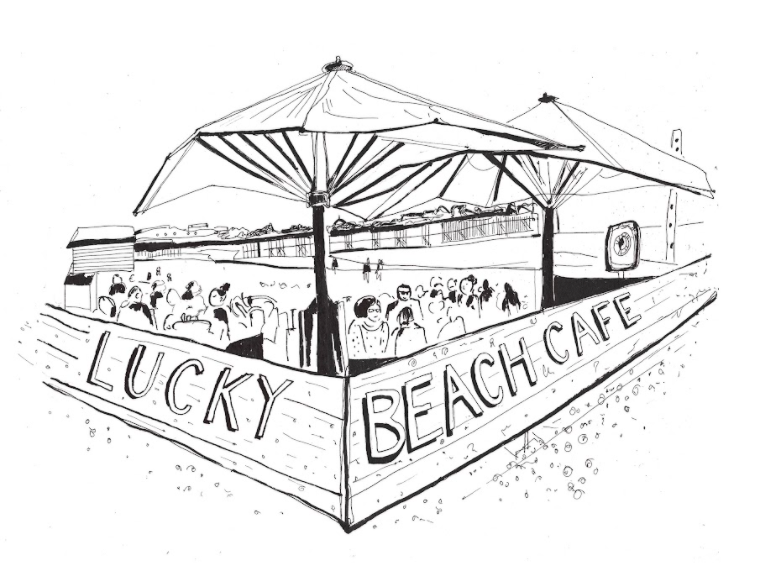
Lucky Beach Cafe by Sarah Holland
Q: What do you like about pen and ink?
Sarah: I love pen and ink. Many artists create amazing work using block acrylic paint, or pencils. But for me, if pen isn’t involved, I just don’t feel right.
There’s a spontaneity to ink and watercolour. I love a messy ink sketch. Drawing with ink seems to tap into my subconscious, it encourages a real state of ‘flow’. Lines appear which I didn’t plan. If I’m too precise about it all, I find my drawing dull and flat.
Watercolour does its own thing, too. It feels lively. It has personality and movement, but an element of risk too. It can be a Marmite medium in that regard.
I’m a bit impatient. I want to sit down and create something that will materialise relatively quickly, although I truly admire painters who take a slow approach.
Q: Are there any illustrators you’ve come across in the design and branding world that you admire?
Sarah: My ultimate art inspiration is Sir Quentin Blake (Together Design did some great work adapting his classic illustrations for the digital world, I wrote a blog on this in 2019). He may be an obvious choice, but he’s the King of scruffy ink drawings.
I once went to an exhibition of his at the Hastings Contemporary Gallery. On each canvas in light pencil, he’d written down the time he spent on the painting; ’20 minutes’, ’30 minutes’.
There were photographs of him dotted around the exhibition, smiling up a step ladder, drawing away well into in his eighties. He just rocked up and created the whole exhibit in no time at all. I thought that was inspiring. It’s really stuck in my mind.
In the design world, many may critique large amounts of money spent on a logo design that is rendered quickly, but it’s taken the designer years of experience to get to that point. Art doesn’t have to take weeks in order to be impressive.
Charlie Smith Design uses and respects the work of illustrators, in all kinds of campaigns, and across many sectors. The property sector wouldn’t typically be associated with art for example, but the agency connects the two in a beautiful way, with striking wayfinding, typography and signage.
One of my favourite projects of theirs was for Cass Art, featuring work by the prolific illustrator Nina Cosford. It was a booklet that illustrated the store’s journey, and the team also made a brand film of the process.
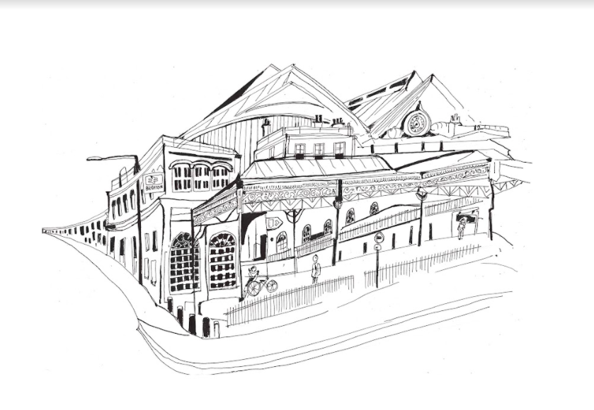
Brighton Station by Sarah Holland
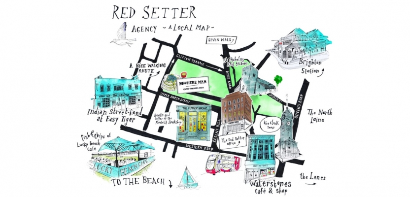
Q: How did you respond to the Red Setter brief of creating a walking map?
Sarah: I was excited to get stuck in, if a little daunted by the digital assembly, as there were so many elements involved. It’s totally possible to create an illustrated map solely by hand, but I wanted this to be flexible and high-resolution, so it made sense to combine traditional handiwork with digital editing.
Firstly, I took photographs of all our key businesses in the area (Feminist Bookshop, Nowhere Man, Waterstones etc) and drew them on A4 paper in black and white ink. I also explored the area to find a short and sweet walking route for lunch breaks and walking meetings.
Next, I thought what other little Brighton-esque details we could include (a seagull, a bus, a sailboat) and drew them too. I’ve still got a gin and tonic knocking around somewhere that didn’t make the cut.
Then I set about creating my own font for the road names and the directions. I initially measured out the letters in an official fashion, designer style, then I just started over and drew the letters by eye in my own way. I’m not very good at doing things in a ‘proper’ way. It never works.
Next were the watercolour splashes. Even though everything was digitally coloured, I created the watercolour washes by hand, as I wanted the locations to have a hand-painted vibe . These were A4 sized splashes of greens and blues, scanned into Photoshop, and layered over the top of my sketches.
Then finally there was the fiddly process of getting it all together, arranging the layout, and playing around. This process was probably longer than necessary as I’m a right fusspot.
But I love the end result! I think it shows Red Setter’s wonderful location and the ace cafes and businesses in the area. (ed: we love it too Sarah!)
Q: What would you like to illustrate next?
Sarah: So many things, and too little time! I have piles of notebooks scattered around with ideas I haven’t got round to yet.
I love looking at Brutalist and Soviet architecture. I have lots of books on these periods knocking around, and pages ripped out of architecture journals, like RIBA.
I’m a Mancunian and I love the aesthetic of my Northern industrial heritage; those packed-in rooftops and the atmospheric, smog-filled Manchester landscapes that Lowry and his tutor, Pierre Adolphe Valette, would capture in their paintings.
I also want to lead a self-initiated project about UK libraries as they’re such valued, precious spaces that are rapidly disappearing.
I’m looking forward to a project with a charity that’s in the pipeline, and I have a fair few house and architectural portrait requests to work through. I’m forming a niche in architecture and buildings, which I’m feeling good about, and looking forward to seeing where this might lead.
Check out more of Sarah’s work on her website and Instagram
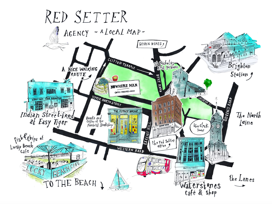
Red Setter's Walking Map by Sarah Holland