Red Bee Creative
London
ABOUT
The task was to strengthen STÖÐ 2's position in the market and broaden its channel reach by targeting a younger demographic drawn to modern, minimal Nordic aesthetics.
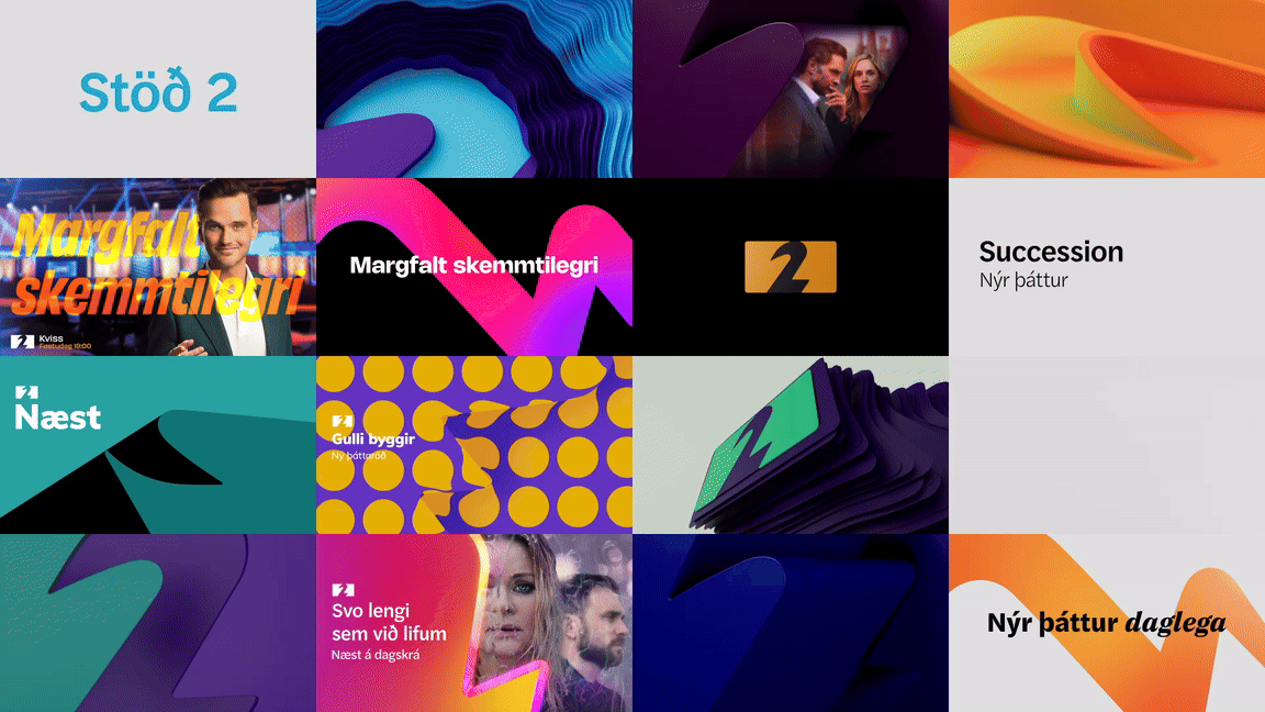
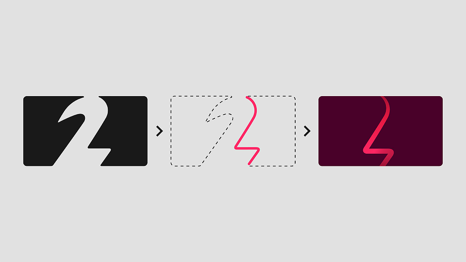
We created an energised logo and unique brand property that originates from its outline. In isolation it resembles a 2, but also an energy bolt. Reflective of Stöð 2’s 100% awareness in the market, it's a mark that can’t be ignored.
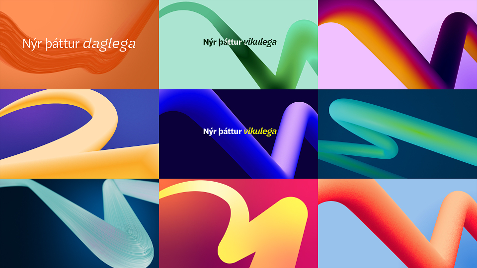
The motion theory follows the form of the graphic device, with a long sweeping curve followed by a sharp flick. Distinctive typography reflects the quality and edginess of the channel. It’s functional and effective but can be injected with a sense of fun through a secondary yellow font often used in animation.
We devised a flexible colour palette to span the breadth of Stöð 2's content - from dark dramas, to flagship entertainment and light family TV.
Quality, Fun, Luxurious and Edgy are key words that Stöð 2 use to describe themselves. Our brand identity is fun and edgy through its bravely minimal and modern approach, its bold use of colour and occasionally quirky typography, and exudes a sense of quality and luxury via a flexible but structured design system.