Rebecca Hayter
Creative Director
ABOUT
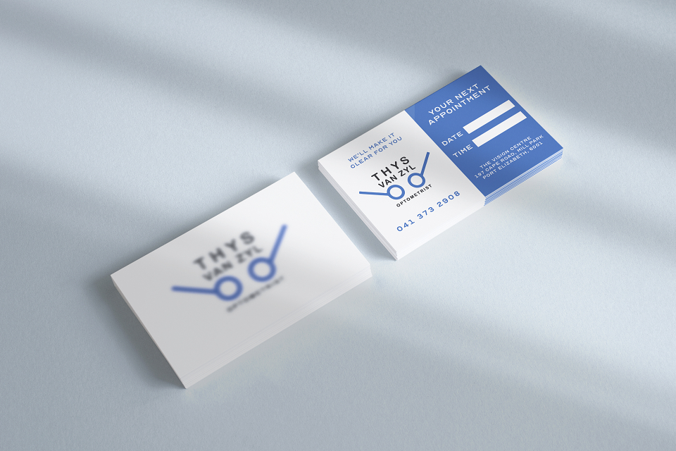
This was a business card I designed for an optometrist in Port Elizabeth. I wanted to design something that would catch the eye. A blurred logo confuses the viewer at first sight, at which they prompt to pick up the card and look further. They then turn it over in natural instinct and it all becomes clear. I also used the standard eye sight chart font for this.