Rebecca Hayter
Creative Director
ABOUT
Project Overview:
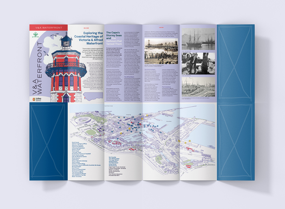
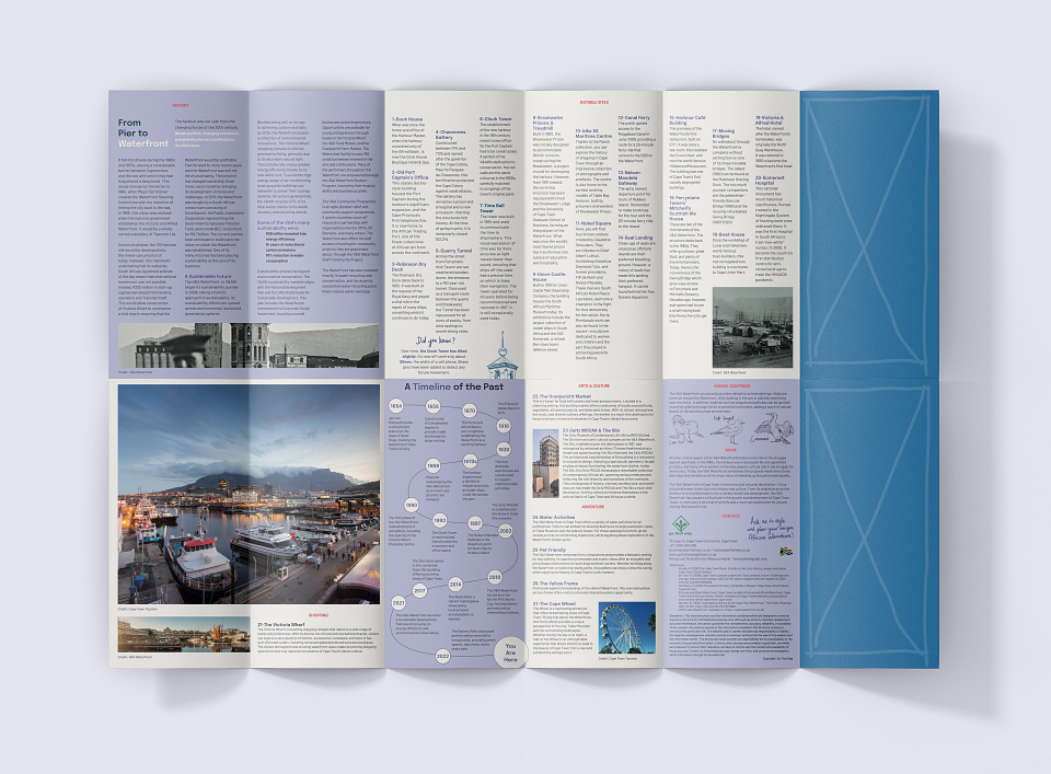
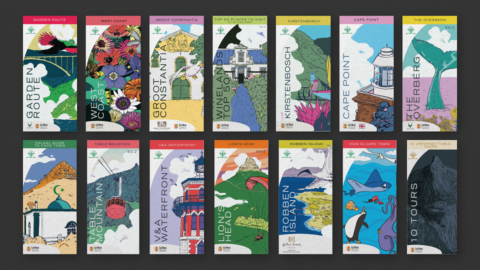
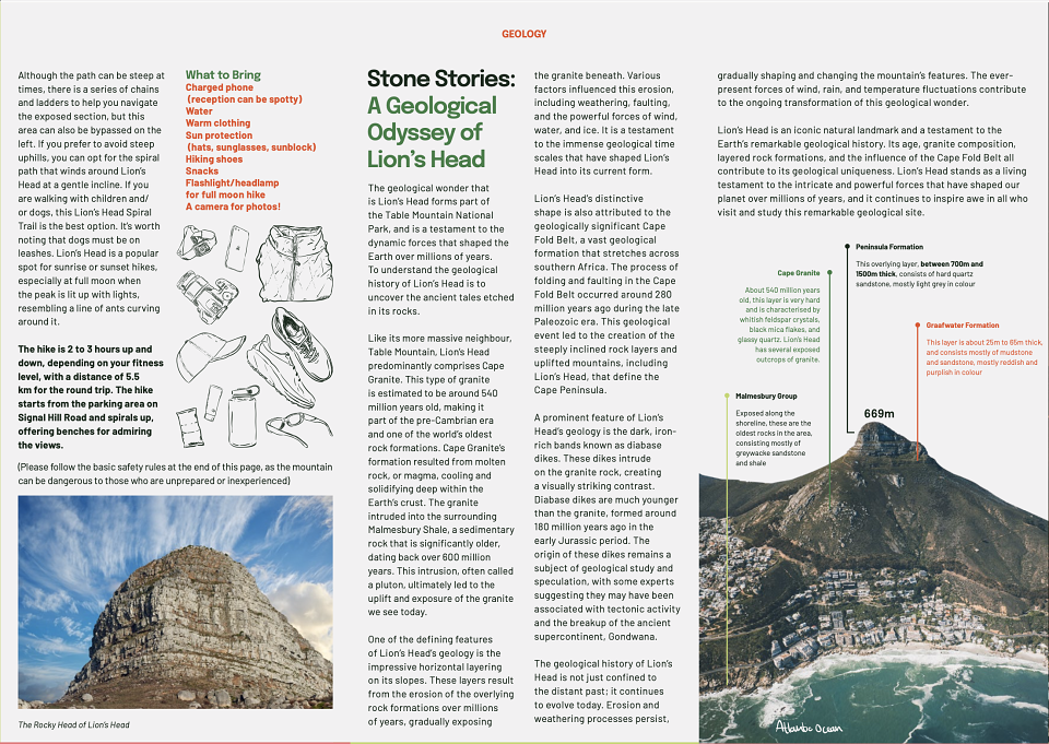
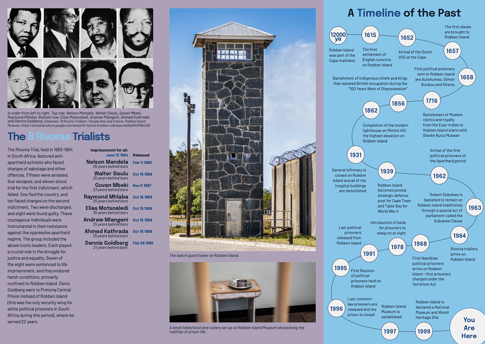
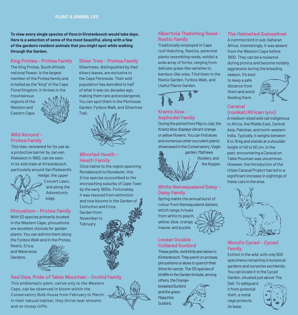
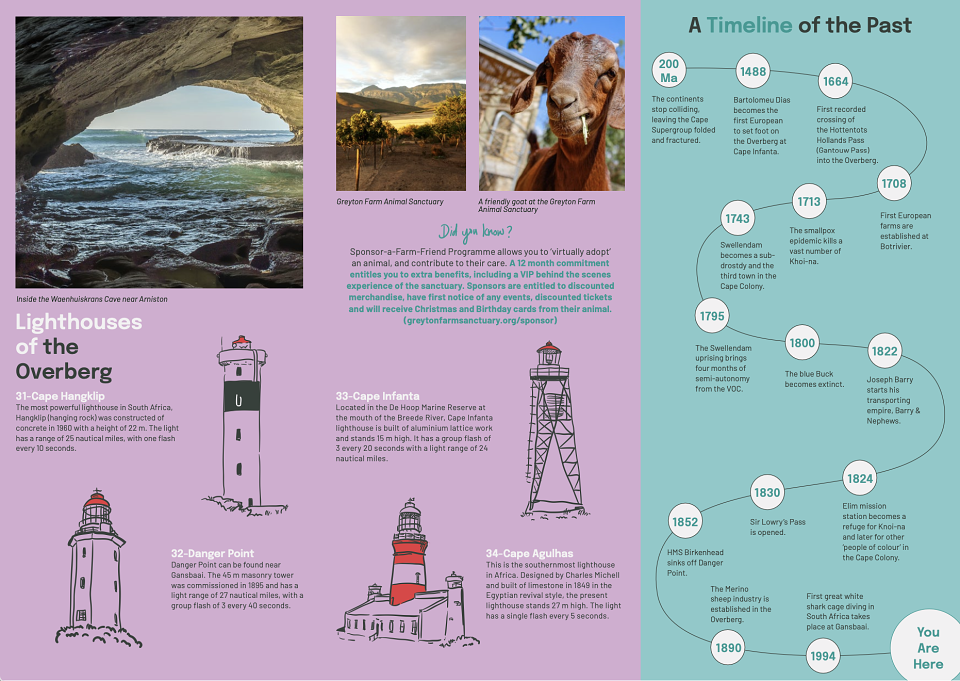
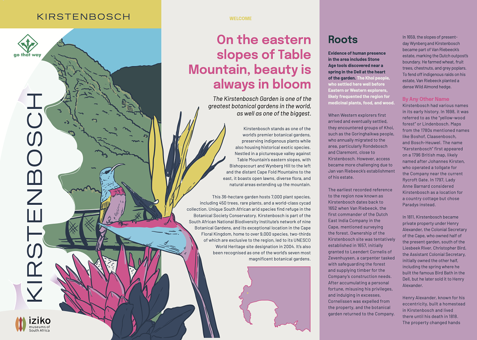
Go That Way, a tour company offering experiences in and around the Western Cape, needed a complete overhaul of their brochures. The existing brochures were outdated, text-heavy, unattractive, and lacked the excitement that would appeal to both tourists and locals. They asked me to redesign the brochures, and I took on the challenge of reimagining each one, bringing a fresh, modern look with a focus on interactivity and visual appeal.
Creative Approach:
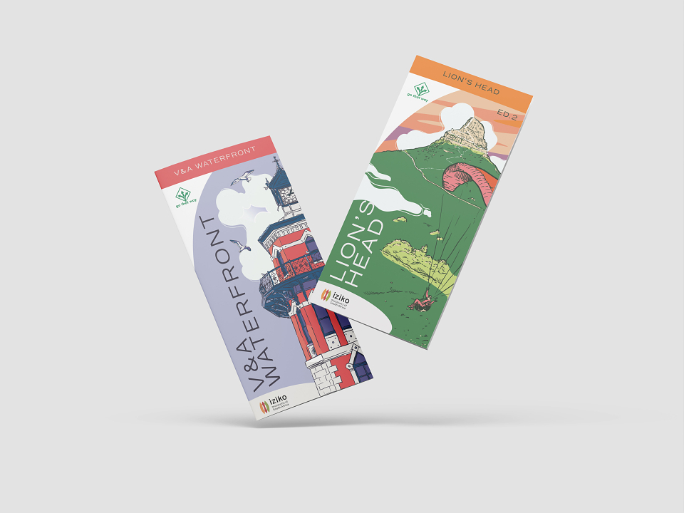
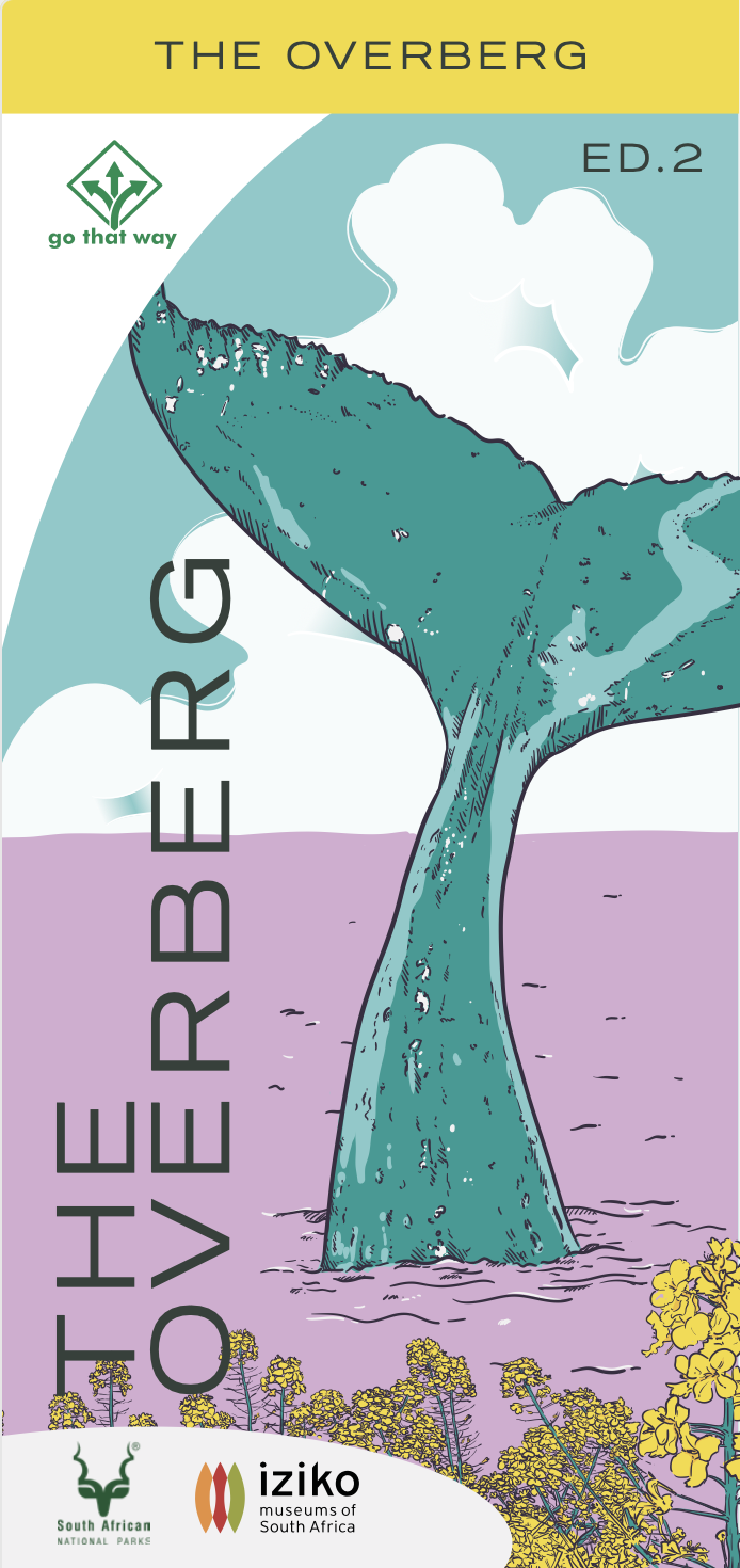
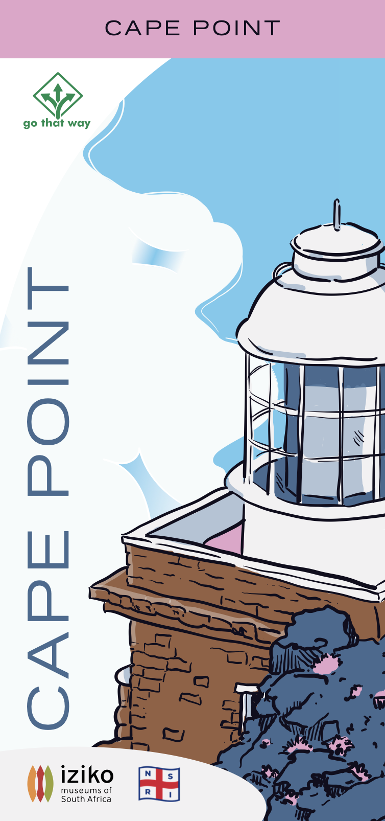
I wanted to modernise and breathe new life into the brochures, transforming them into something both aesthetically appealing and functional. Instead of relying on photography, I decided to illustrate each brochure cover. I knew that illustration, especially in my style with organic lines and slight imperfections, would offer a more human touch and feel more inviting and relatable than stock photos. By using vibrant, bespoke colour palettes for each brochure, I could also strategically attract attention and enhance the overall aesthetic.
Key Challenges:
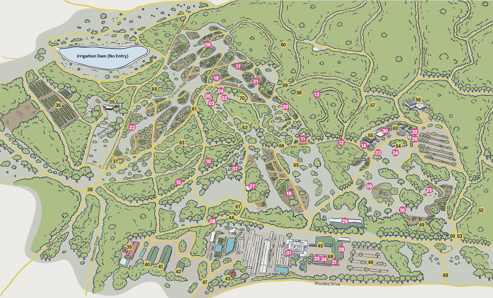
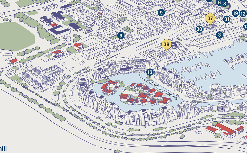
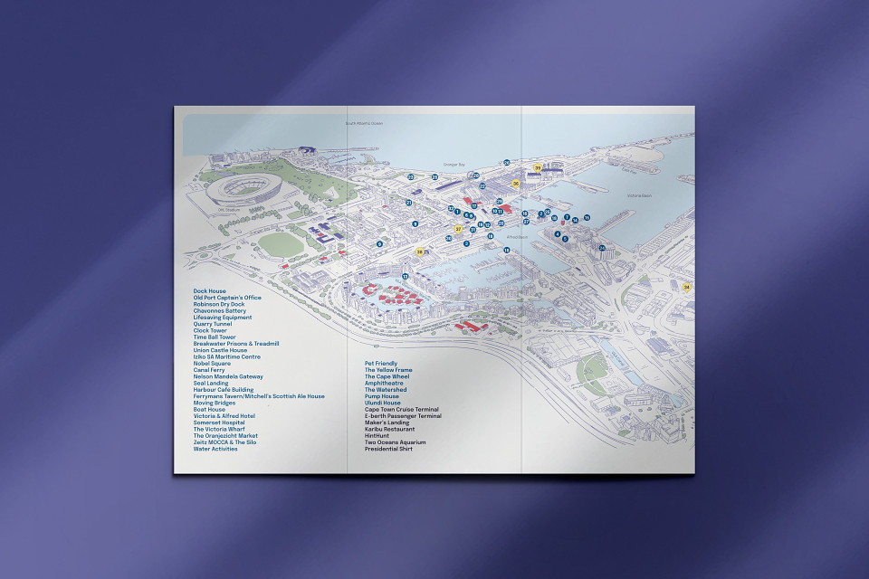
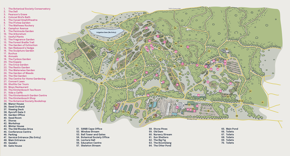
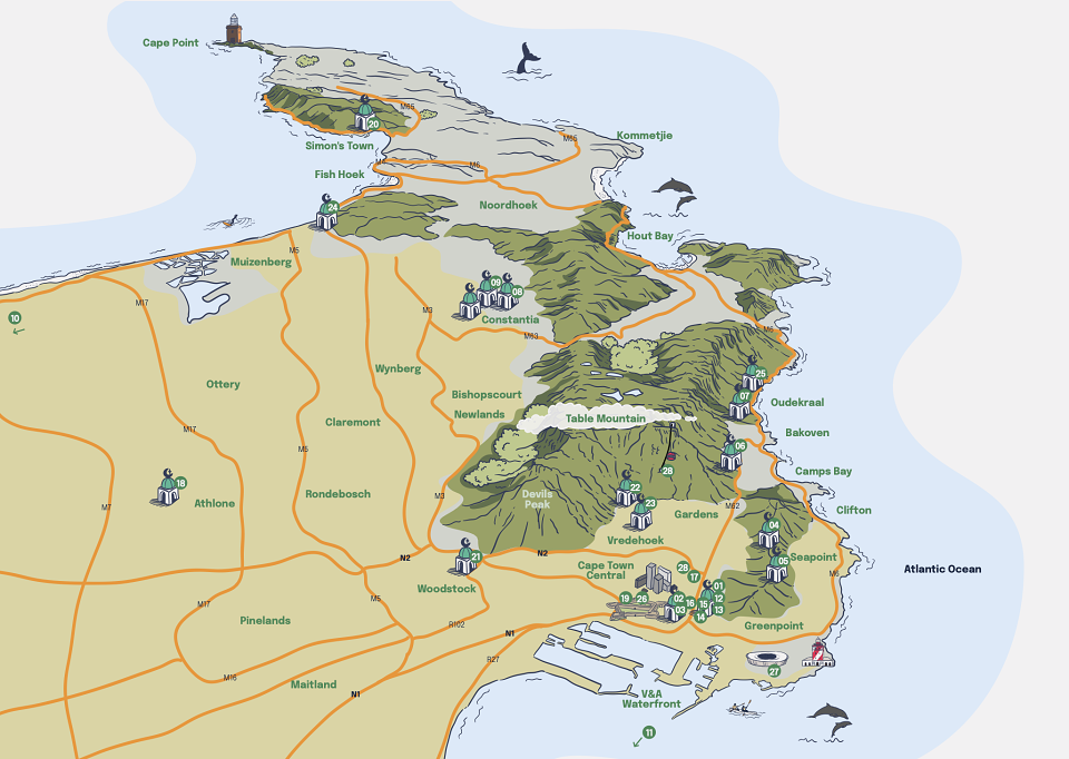
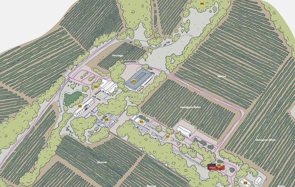
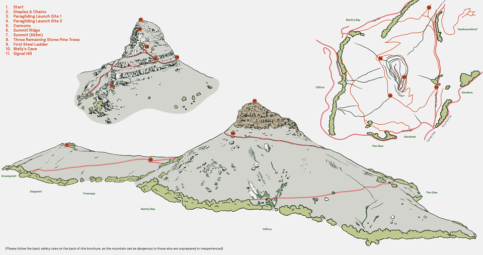
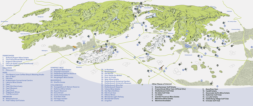
The most time-consuming and challenging part of the project was the map illustration for each brochure. I illustrated them from scratch, using Google Maps as a reference. These maps needed to be precise and detailed, while also blending seamlessly with the overall brochure design. This process required immense attention to detail, ensuring that every aspect was visually engaging while being easy to navigate for potential customers.
Results:
The final brochures are now featured on stands all over Cape Town and its surrounding areas, offering both locals and tourists an exciting and visually engaging way to explore the region. The new designs have not only modernised Go That Way’s marketing materials but have also created a more interactive, approachable, and colourful experience for their audience.