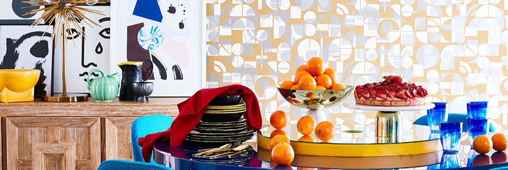

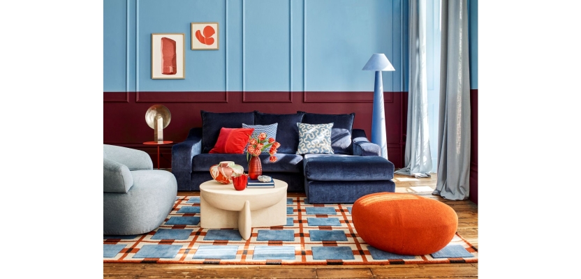

Interior Stylist and Set Designer Rebecca de Boehmler brings a fresh perspective to colour-led interiors with A Touch of Sky, a striking feature created for House Beautiful UK. Blending calming sky blue with rich oxblood red and a series of unexpected “disruptor” shades, the project explores how bold, unconventional pairings can transform everyday spaces into visually compelling environments. Across six distinct room sets, each carefully designed and styled, the feature showcases a layered approach to colour, texture, and composition.
Developed over an intensive two-month process and brought to life during a four-day on-location shoot, the project reflects a meticulous balance of creativity and production precision. From sourcing and coordinating loaned pieces to collaborating closely with the creative team on set, Rebecca’s approach demonstrates how aspirational interiors can remain accessible, encouraging readers to experiment with colour, embrace contrast, and rethink traditional decorating rules.
What was the brief?
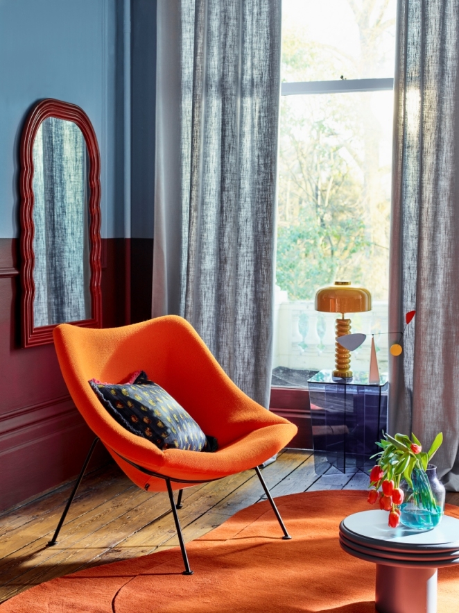 A Touch of Sky feature- decorating with sky blue, deep reds, and adding other unexpected colour pairings.
The brief was to create a 10-page interiors trend feature for House Beautiful UK. I propose a trend idea; find a suitable location we can paint and transform into our brief during the 4 days on location. I designed six individual room sets, also used for detailed shots, resulting in 12 final images. Each setup explored different decorating ideas, with all props, furniture, accessories, wallpapers, paints, and fabrics sourced and loaned specifically for the shoot.
How did the initial pitch/brainstorming phase go?
I send a selection of current interiors trend ideas to the Interiors Editor, Sarah Keady at House Beautiful. I research the ideas by looking at interior news, press releases from brands, new fabric and wallpaper collections, and visiting exhibitions. I also use Pinterest and Instagram as a visual reference; it is often a good place to spot emerging colour stories or interior trends. And a useful source of images to add to my initial mood board, tells the story. Once the idea is signed off, I will sketch up each shot in detail. Adding all the necessary elements to complete the shot. From wallpapers, paint colours, specific furniture, and accessories.
What was the production process like?
 Producing this type of shoot involves significant planning and production. The biggest challenge is making sure all the products we loan for shoot, arrive on time and go back to the correct brand. Every item in each image are loaned and carefully selected to suit the theme. I create an ideas mood board for each image, which includes all the products I need to create my finished images. Each shot is signed off by my client before we loan the items.
Sometimes we must make changes at the last minute, brands may have sold the items we are using. I have a fantastic team of assistants on the shoot, who are very experienced at sorting through many press loans and props. Enabling me to concentrate on styling the images.
What kit/tools/software were used to create the project?
No software.
How long did it take from inception to delivery?
The process typically takes around two months from initial concept to the shoot itself. During that time, I develop the ideas, gather inspiration, source the best products, and wait for various stages of sign-off. A key part of the process is securing the right location, which usually needs to be booked several months in advance, particularly as the shoot runs over four days. The feature is published around three to four months after the shoot.
Can you describe the creative spark or inspiration behind the initial concept? Was there a specific moment or insight that ignited the idea?
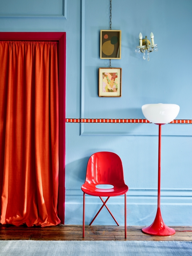
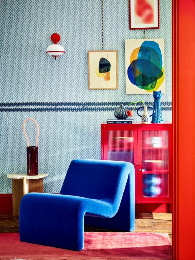 I loved the idea of using a calm colour such as sky blue with a deep oxblood red. Adding other clashing unexpected colours to the colour palette. I call these the disruptor colours, the unexpected tones that break up a palette and give an image that extra impact. Such as the bright orange curtains with bright red furniture. Knowing which colours will work together, and accepting that some clashing combinations, no matter how tempting, just do not fit well together.
How did you ensure that the concept aligned with the brand's values, goals, and target audience?
Having styled and produced many features for this brand, House Beautiful. I can adapt my ideas to the relevant target audience. It is important to create aspirational interior images using a broad range of products across different price points, creating a wow factor by making lower-priced items feel more premium. That is a skill that I have honed over many years in the industry.
Were there any alternative concepts or ideas considered during the ideation phase? If so, what led to the selection of the final concept?
Even if I have had an idea signed off, I need to make sure the idea, or theme of the photo shoot will translate well, and is accessible to the House Beautiful reader.
Can you discuss any collaborative or interdisciplinary aspects of the ideation process, such as working with other departments or external partners?
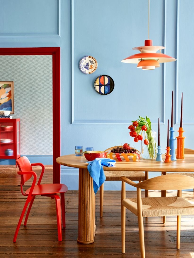 I discuss my ideas with the interiors commissioning editor and the magazine’s creative director during our meetings, the team have a clear understanding of what each shoot needs to deliver, and I stick to the narrative behind the shoot, so the written copy aligns.
On set, the photographer and I collaborate closely throughout the shoot, making it a true team effort once shooting begins. I also listen closely to any suggestions my set builder has, during planning and on set. There will be limitations on set, such as budget and time. This usually involves diluting the ideas and working out the best compromise.
What role did consumer research or market analysis play in shaping the concept and its execution?
None.
How did you ensure that the concept remained innovative and stood out in a crowded marketplace?
I try to incorporate new decorating techniques, so that the reader can easily reproduce themselves. Often these are simple affordable ideas, such as using trims along the wall, in an unexpected place, crossing over wall panelling so your eye is drawn to it. Or painting a wide stripe of oxblood red, further up a panelled wall than you would expect.
Adding that element of surprise.
Mixing traditional pieces with modern high street affordable pieces. And layering pattern on pattern, to create a sense of vibrancy.
What do you hope it achieves for the brand?
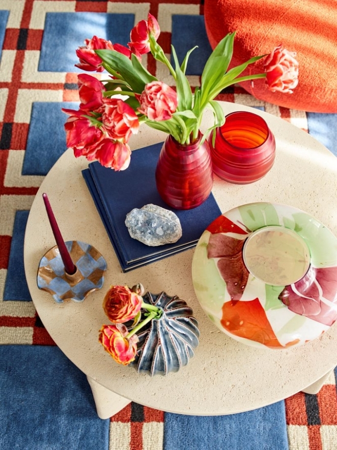 I hope it allows the reader to experiment with their colour pairings and not be scared of mixing patterns.
Credit list for the work?
Styling, concept, set design, production by Rebecca de Boehmler
Art Direction: Sarah Keady. Creative Direction Dina Koulla at House Beautiful.
Photography: Polly Wreford
Set Build Rob Howard
Assistants: Assistants Celia Campbel, Liz Lane & Holly Ryan
All the products we loaned for this shoot are credited in the July 2025 issue.