R Design Ltd
London
ABOUT
The brief: The old packaging lacked confidence, the branding was almost invisible and the product was in danger of being delisted.
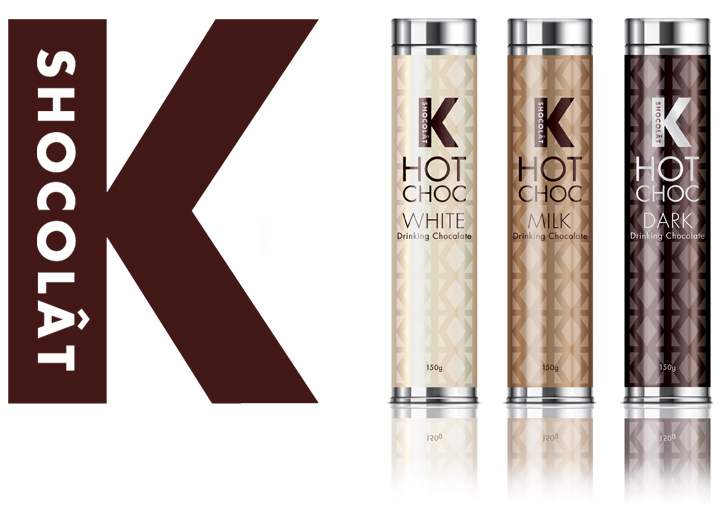
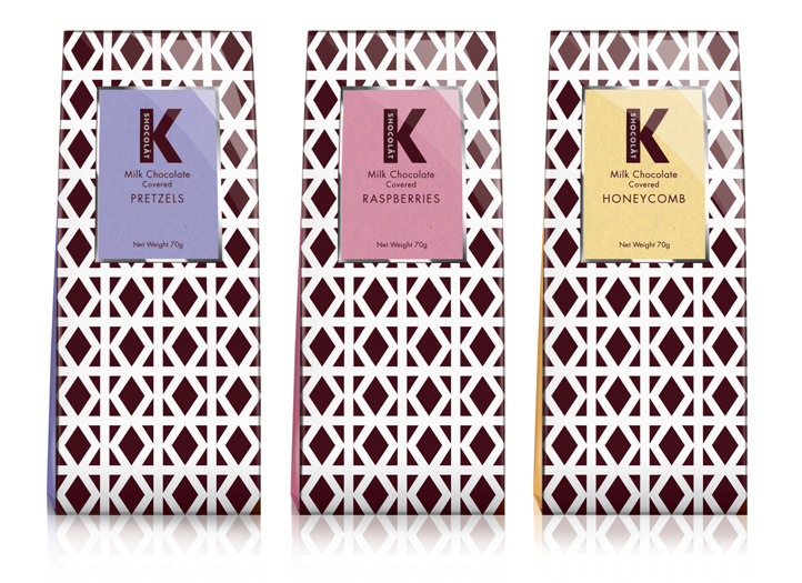
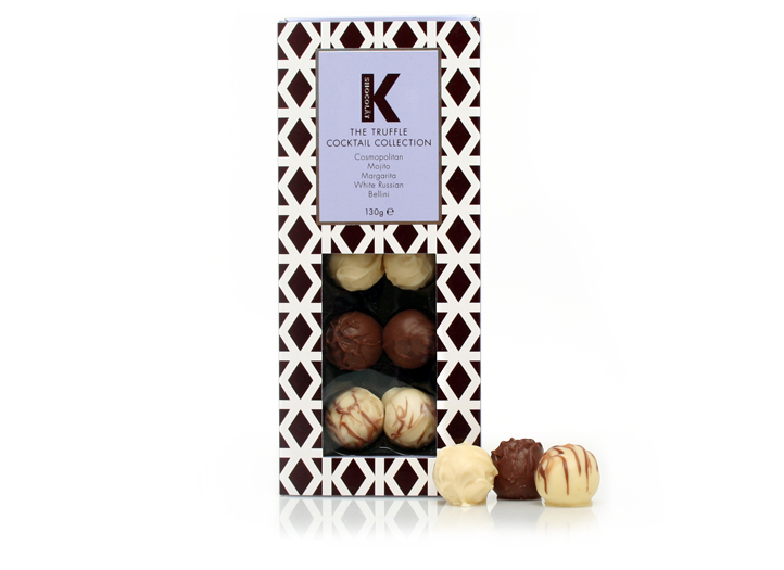
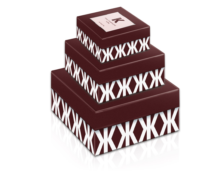
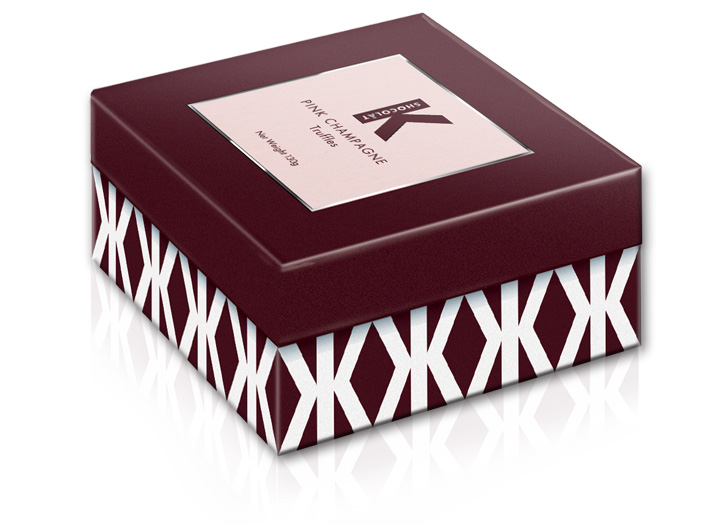
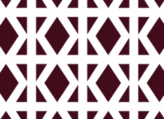
The solution: Focusing in on the unique brand name we designed an iconic new K logo that encourages the correct articulation of the brand name. We incorporated the K into the pattern helping to give a contemporary feel, whilst appealing more to the female consumer.
The result: The redesign brought the brand and its extended range back on the shelves of UK retailers John Lewis and Waitrose and extended distribution to House of Fraser, Debenhams, Galleries Lafayette, La Grande Epicerie de Paris and Monoprix in France, reclaiming K Shocolât’s historic positioning as an inspirational and indulgent brand.
We delivered: Logo, brand identity, packaging design.