Pum Lefebure
Co-Founder & Chief Creative Officer
ABOUT
Challenge
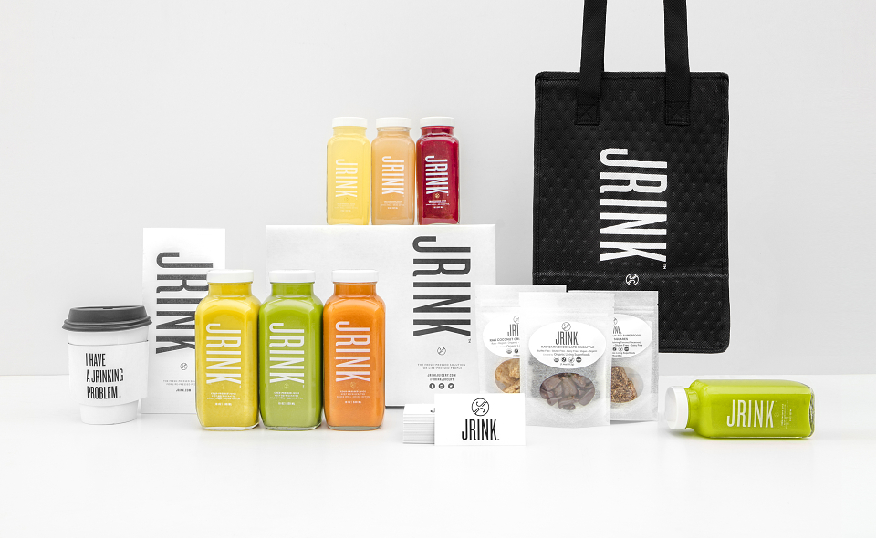
JRINK JUICERY wanted to rebrand and find ways to cut costs on packaging. With so many new flavors coming to market, how could they reduce the cost of packaging, keep up with logistics and create a simpler process while maintaining consistency for the brand?
Idea
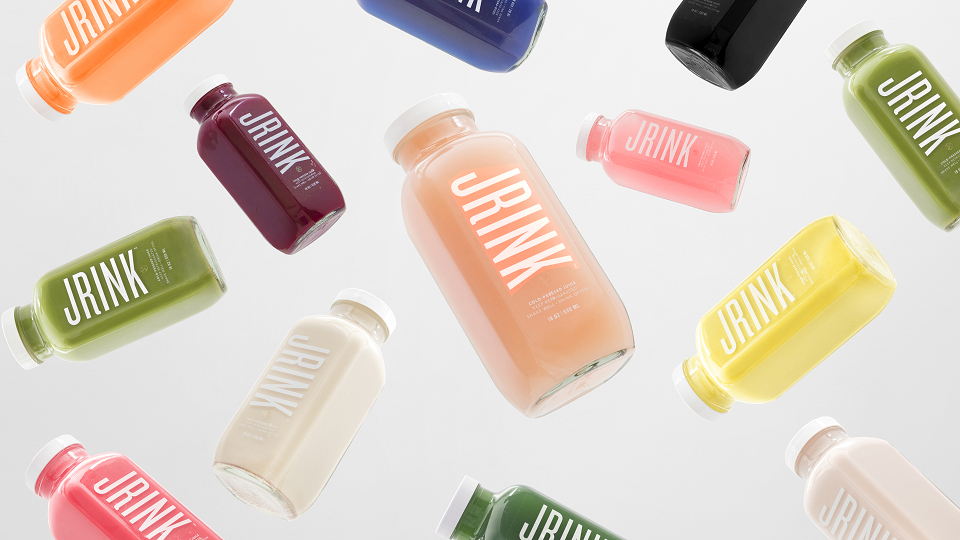
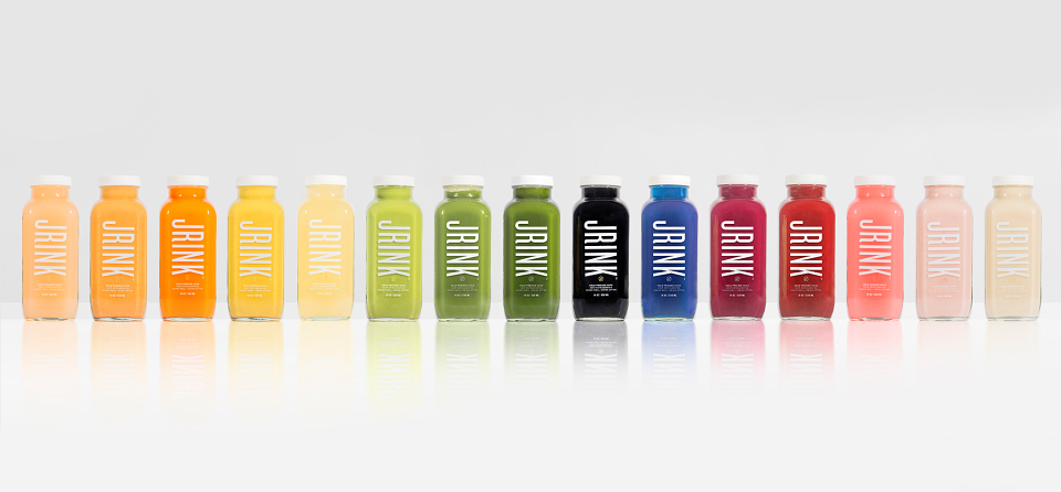
With a focus on high quality cold pressed juices, made with 100% fresh locally sourced produce, we believed their “reboot” needed to reflect their healthy offerings and socially conscious lifestyle. We chose white for their packaging, de cluttered their labels, and redesigned the logo to let the color of the juices speak to customers. With the addition of their new delivery service, we also revised their boxes and packing tape to reflect the fun and playful personality of the brand, including lines like, “I have a jrinking problem” and “pop, clink, jrink.” Finally, we recommended they stick with recyclable glass bottles, and moved the flavor information to the cap, reducing their need for 15 labels down to one and cutting productions costs!
Result
Each new detail reflects the brand’s socially conscious lifestyle, generating buzz on social by showcasing their vibrantly colored juices and smart copy - growing their brand awareness and creating a more mature, clean look & feel.
MADEIT CREDITS


Influencer:
Project featured: on 8th March 2017
Pro member:
Contributor:
Invite
x3
Pum Lefebure was recognised as an Industry Influencer on 31st January 2017
Pro accounts have added benefits for Creativepool members. To get your Pro account go here.
Pum Lefebure has been a Contributor since 31st January 2017.