Valeria Aristidou
Brand Strategist & Designer
ABOUT
EZORIA: Establishing a trusted travel partner Visual Identity
BUSINESS DESCRIPTION:
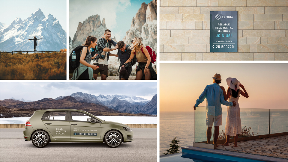
Ezoria is a vacation rental business with a mission to unlock the potential of every property they undertake and bring real and hospitable experiences that guests desire. Ezoria’s goal was to re-establish its presence as the trusted and go-to travel partner locally. Ezoria provides thrilling local adventures, authentic & immersive local experiences, and activities for their customers.
PROJECT GOAL:
EZORIA's goal was to establish a professional & trusted presence in the hospitality industry as the go-to specialist travel partner locally all around Cyprus. Ezoria wants to be known in the hospitality industry by associating the words “ADVENTURE, EXPLORATION, DISCOVERY & CONNECTION” in the mind of their audience.
VISUAL IDENTITY
ATTRIBUTES:
ADVENTURE, EXPLORATION, DISCOVERY, CONNECTION
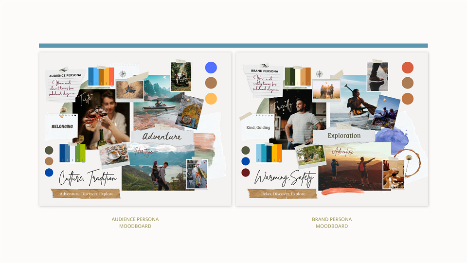
BRAND PERSONA: Explorer & Sage
AUDIENCE: Everyday man & Explorer
LOGO SYMBOL:
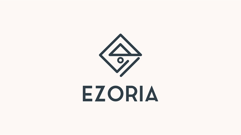
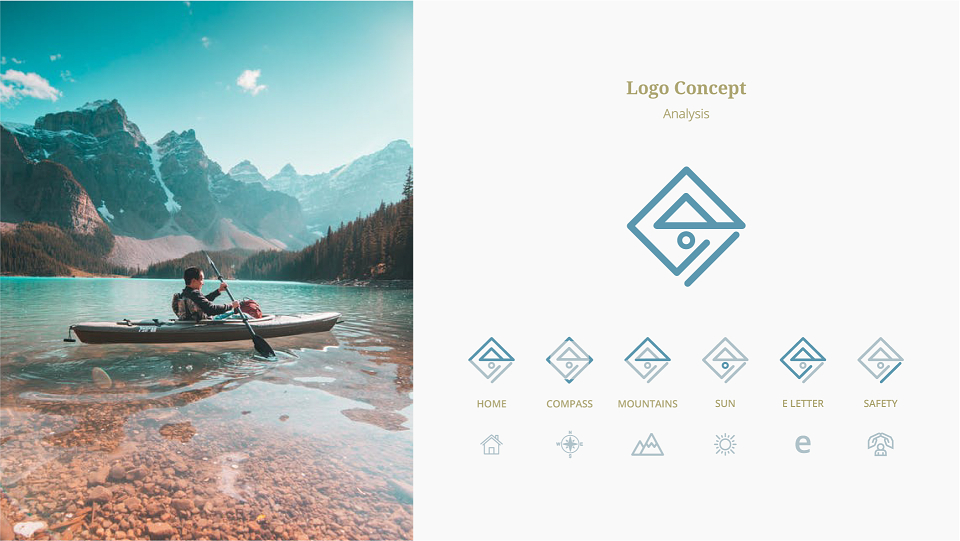
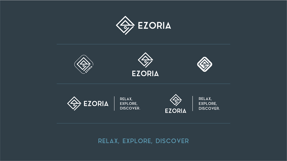
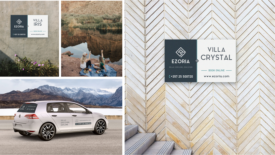
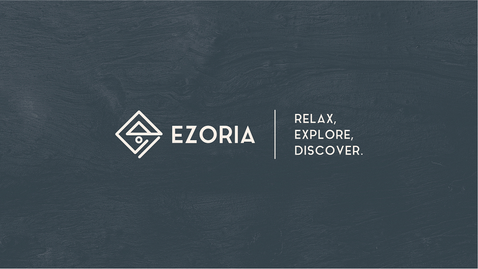
The logo illustrates a rhombus shape and an abstract formation of the letter E in geometric lines.
Embodied also in the symbol are various symbolism such as the home (belonging/connection), compass (exploration/discovery), mountains (adventure/nature), and sun (outdoors/nature).
Each corner represents a direction the East, West, North & South resembling a compass. The single line closing and creating the rhombus shape represents safety & trust.
BRAND COLORS:
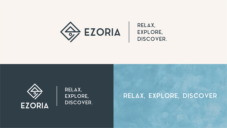
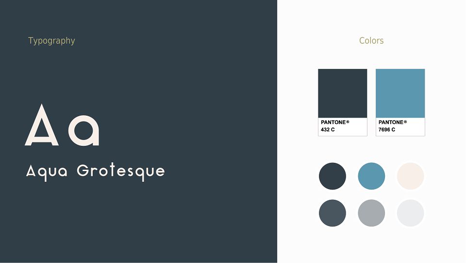
Primary Color: Dark Blue (Stability, Reliable, ELEGANCE, Sophistication)
Secondary Color: Teal (Self-expression, trust)
FONTS:
Sans: Clarity, Legibility & Simplicity