
With over five decades of expertise in climate mapping, Sierra has long been a pioneer in advancing the climate economy. Known for harnessing AI, satellite analytics, and machine learning to deliver precision-driven insights, the family-owned company sought a brand identity that could both honour its legacy and position it at the forefront of a rapidly evolving sector.
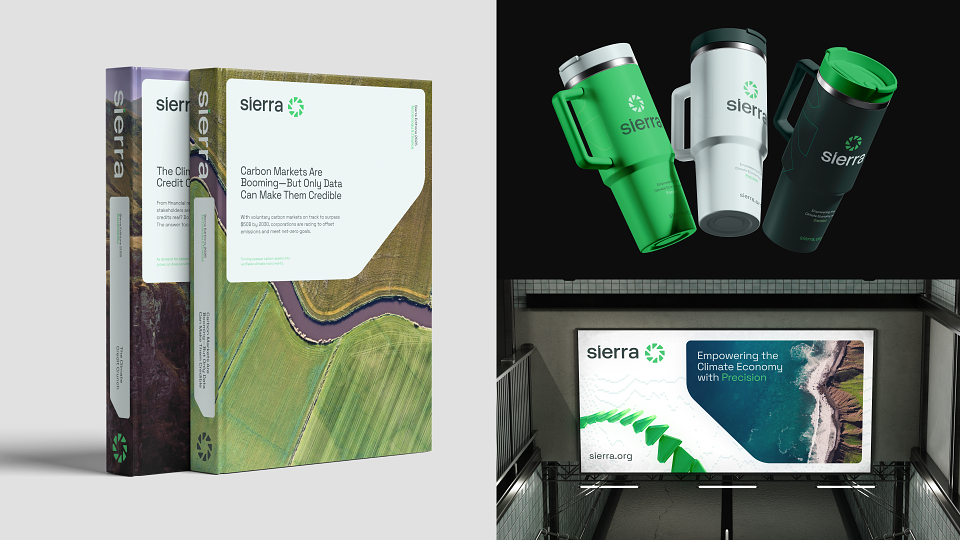
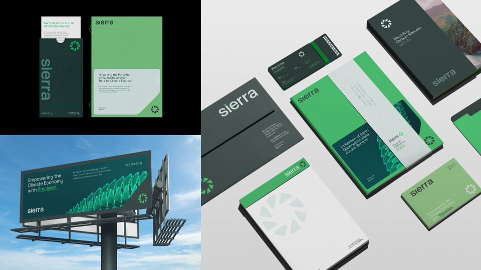
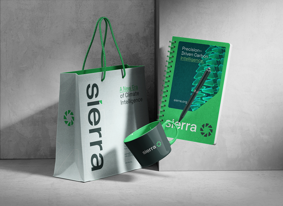
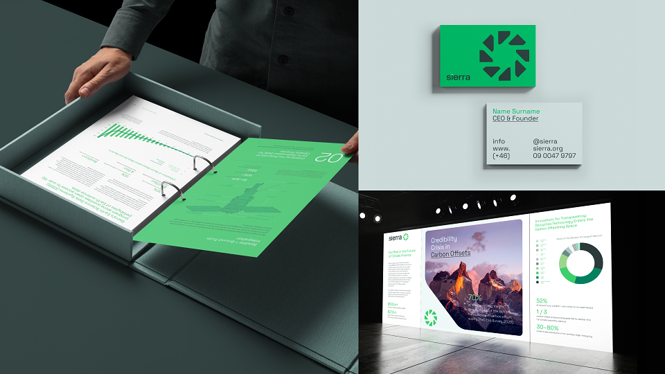
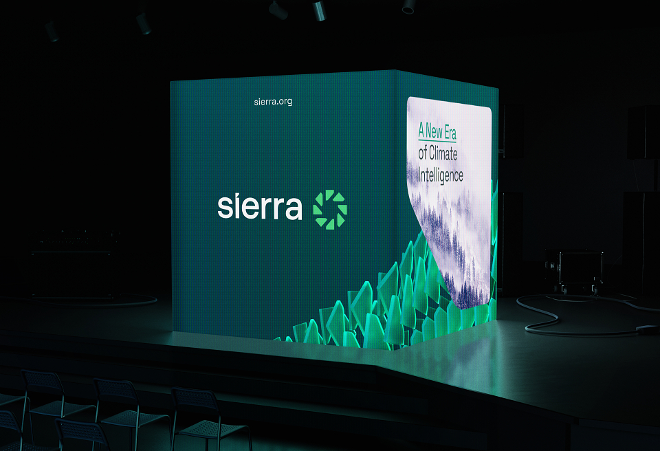
Our solution was to transform the dot of the lowercase “i” into a distinctive symbol of innovation and progress. This adapted mark became the foundation of Sierra’s unified group identity—versatile, recognisable, and rich with meaning. The resulting logo strikes a balance between geometric precision and organic flow, capturing the duality of science and nature that defines Sierra’s work.
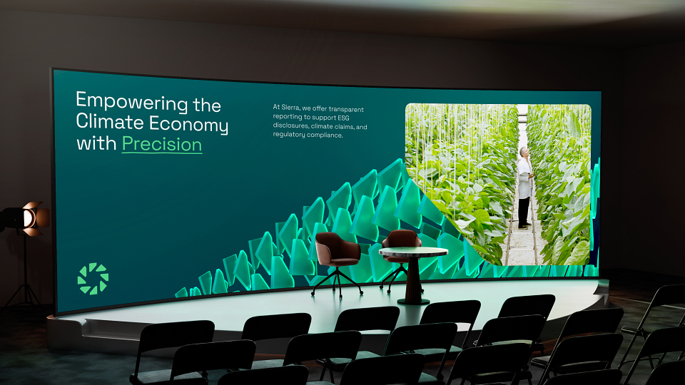
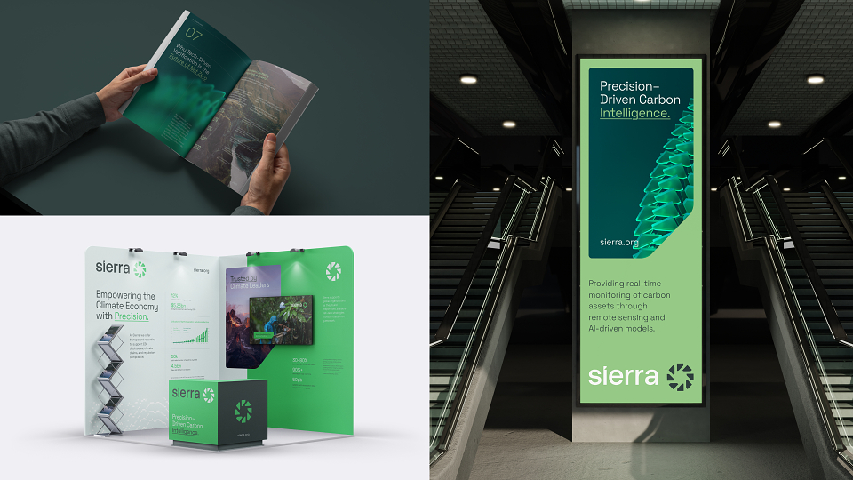
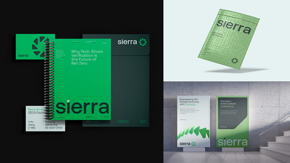
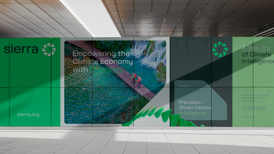
To extend this system, we drew inspiration from natural textures—ice, earth, and glass—introducing a series of shimmering 3D brand elements that bring depth and humanity to digital and physical touch points. These crafted visuals reflect Sierra’s grounding in scientific clarity while evoking the natural world.
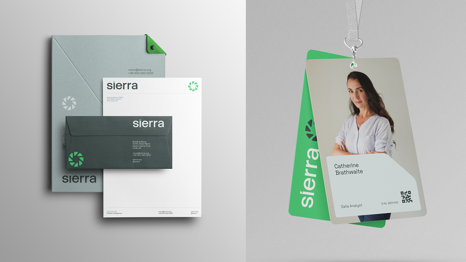
The identity is anchored by a bespoke wordmark derived from Aeonik, refined with subtle details like a custom “i” and shortened “a,” which informed the rounded, fluid visual language throughout. Paired with Space Grotesk, the typography system balances technical precision and modern confidence, ensuring clarity across every application.
The result is a future-ready brand identity that positions Sierra as a trusted leader in climate intelligence—honouring its legacy while embodying innovation, progress, and sustainability.
 |
SierraClient |
 |
Jordan PearmanArt Director |
 |
VNSH Creative HouseCreative Agency |
 |
David PreeceArt Director |