


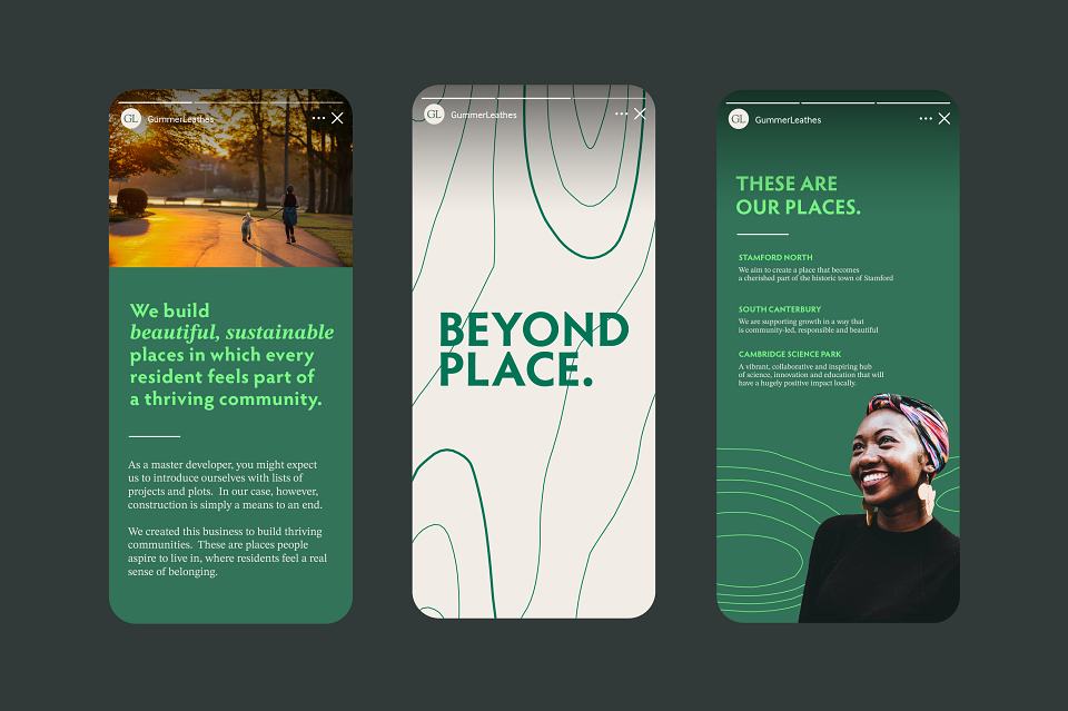

A brand built from the land itself
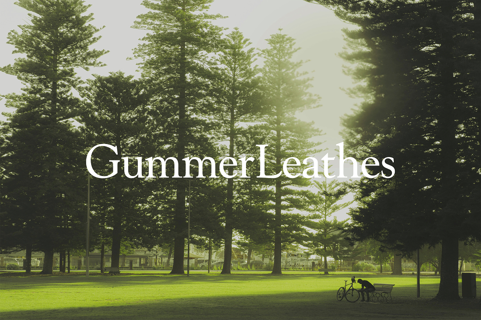
GummerLeathes doesn't build properties, they build communities. Places people aspire to live in, where residents feel a genuine sense of belonging. But they also needed a brand that could do two things at once: speak clearly as a company, and give every place they develop its own distinct identity.
The challenge was building a system with enough coherence to hold together and enough flexibility to feel personal to each project. A style guide wasn't going to cut it. This needed to be a brand with its own internal logic.
Fenlow Fold — a landscape born from memory
At the heart of the brand is a story. The founders of GummerLeathes have two places that mean everything to them. Neither is a GummerLeathes project. Both shaped who they are.
"What if those two landscapes became one?"
The contour lines of both places were merged — overlaid and blended until a new, fictitious landmass emerged. Fenlow Fold: a place that has never existed on any map, built entirely from places that are deeply real. Every line in the brand has a reason to be there.
The wall in Stamford
Fenlow Fold lives on the wall of the GummerLeathes office. It's the founders' pattern — When you visit their offices, it’s the first thing you see, even if you don’t know the story behind it, The founders alwasy will. This was at the heart of the work we did, and it is the soul of the work they do.
Same bedrock. Every surface different.
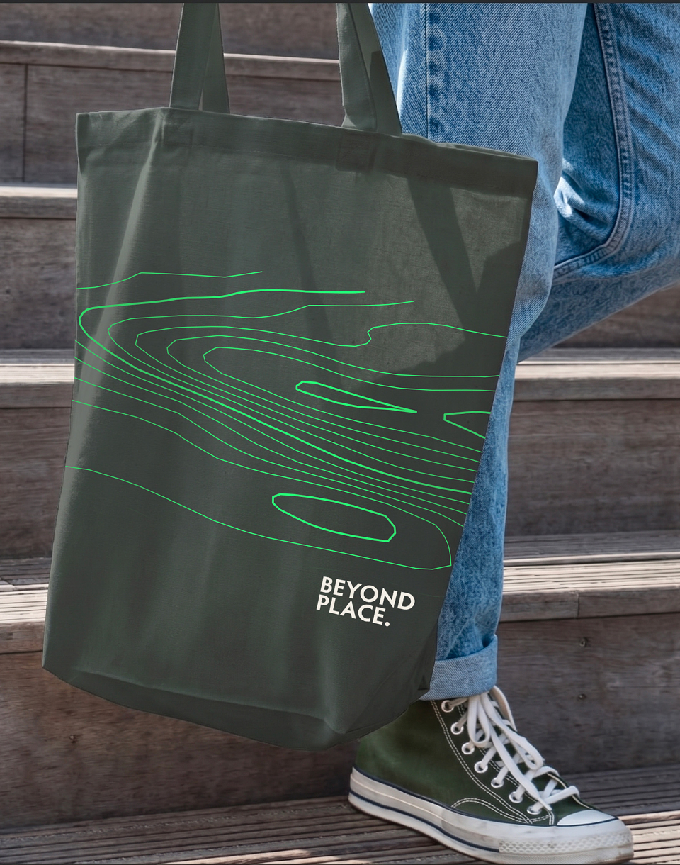
Contour lines were the right answer not just because of the founding story, but because they could carry the whole brand architecture. Every landscape has a geology: an underlying structure that determines the character of everything above it. GummerLeathes is that structure, the bedrock that sets the logic, the values, and the visual language that holds everything together.
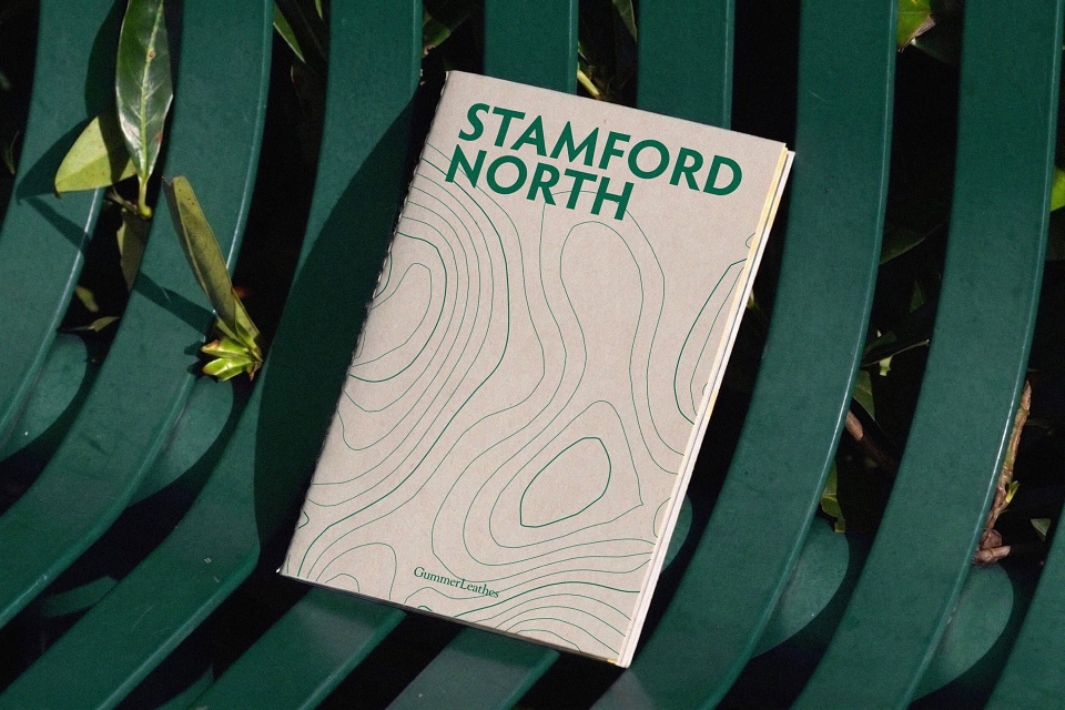
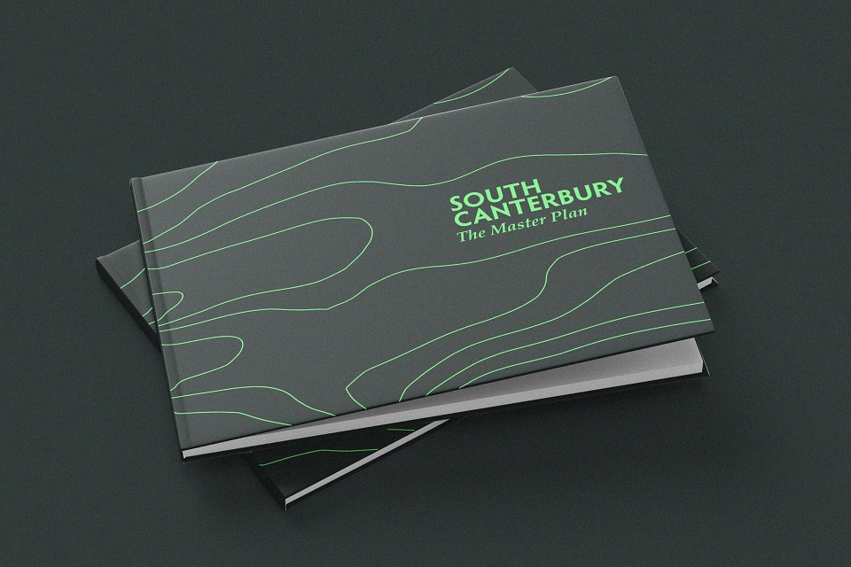
Each place they develop sits on that same foundation but emerges with its own character. South Canterbury has its own landscape, its own contours, unmistakably part of the same formation. Stamford North is completely different terrain, a different surface and identity, yet the same geology runs beneath it.
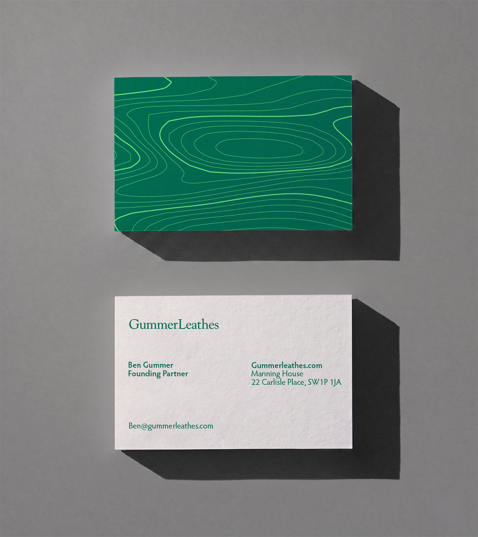
A procedural contour generator was built so that every project gets its own unique landscape, drawn from the same underlying rules but specific to each site. based on real Google Maps coordinats, the lines crowd where the ground rises steeply and open where it flattens. Each application is genuinely different. All of them feel like home.
Steadfast and true, a bold new look for a trusted face.
The existing brand of GummerLeathes used Goudy Old Style for everything, including the logo. The founders were attached to it and were cautious about changing something that existing clients and investors trusted.
Our question was simple: What if Goudy had been drawn today? And like the GummerLeathes business model itself, we created something new that seamlessly blends and honours the old without being restricted by it.
GL Serif is the answer: a custom typeface that keeps the humanist warmth and proportions the founders knew, while sharpening the serifs, refining the stroke contrast, and resolving the idiosyncrasies that made it feel dated.