



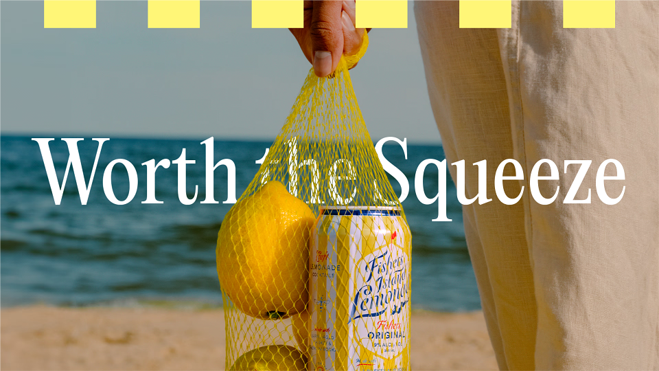

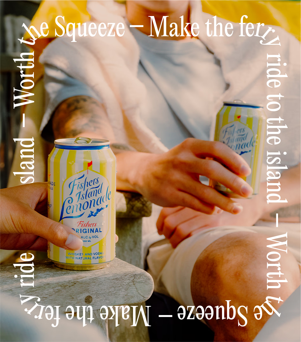
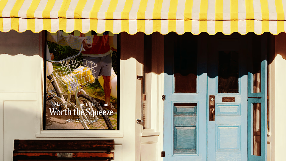
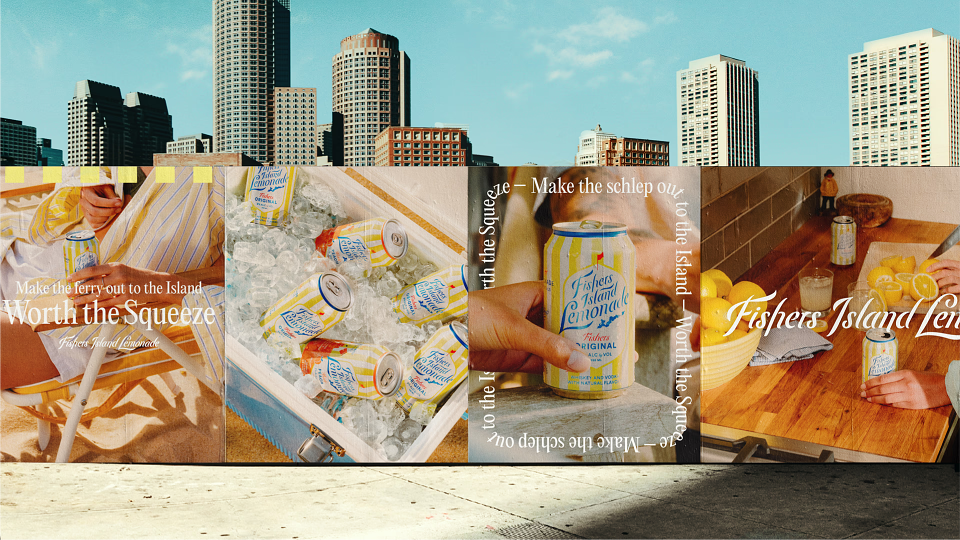


Though sold at a premium price and tied to an upscale New England destination, Fishers Island Lemonade lacked the visual and emotional cues of a luxury brand. To elevate its positioning, we shifted the brand’s communication from function-first to lifestyle-led—transforming it into a modern expression of aspirational escape.
Inspired by vintage J.Crew, Polo, and L.L. Bean catalogs, we crafted a photo-driven identity rooted in laid-back East Coast nostalgia. A lifestyle shoot brought the brand’s namesake island to life through cinematic, editorial vignettes—beach days, poolside hangs, ferry rides—designed to evoke a long weekend escape.
- We refined the brand system with:
- A cleaner, single-line logo for better legibility across formats
- A new fashion-mag-inspired type system
- Subtle striped accents referencing the original yellow-and-white identity
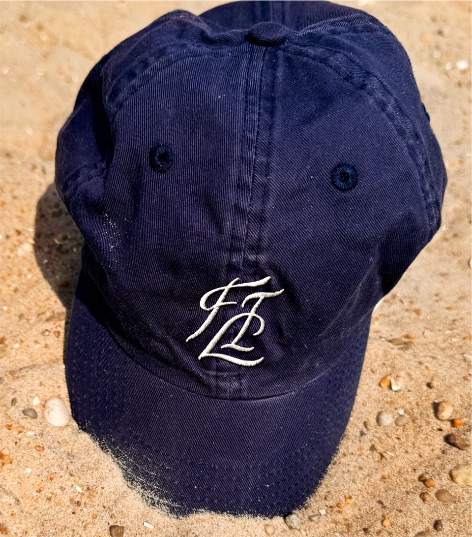
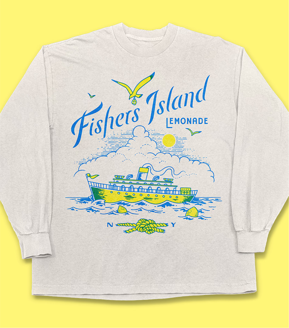
- A FIL monogram and souvenir-style illustrations to expand the visual toolkit
- Stylized, filmstrip-framed images for editorial flair
To give the system longevity, we introduced a new tagline and brand platform:
“Worth the Squeeze.” It connects the product to indulgent effort—whether reaching Fishers Island or simply cracking open a can—and flexes into local-targeted messaging like: “Make jitney-ing to the island worth the squeeze.”
By reimagining the brand through the lens of aspirational lifestyle, Fishers Island Lemonade now competes as a true premium player—visually distinctive, emotionally resonant, and ready for seasonal storytelling across channels.