Yanina Sinitsyna
Graphic Designer
ABOUT
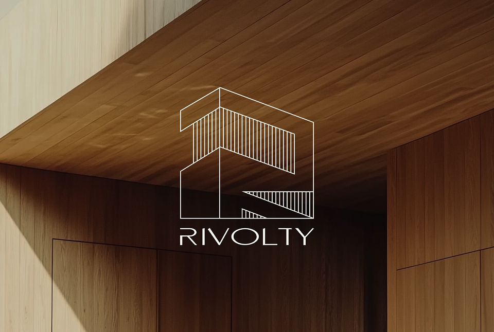
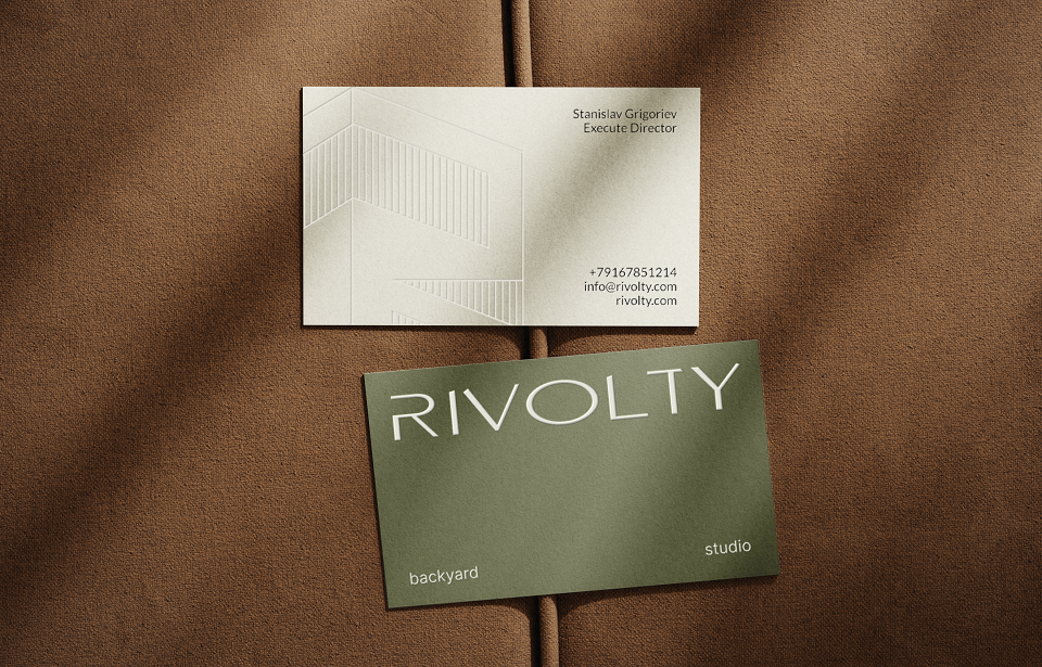
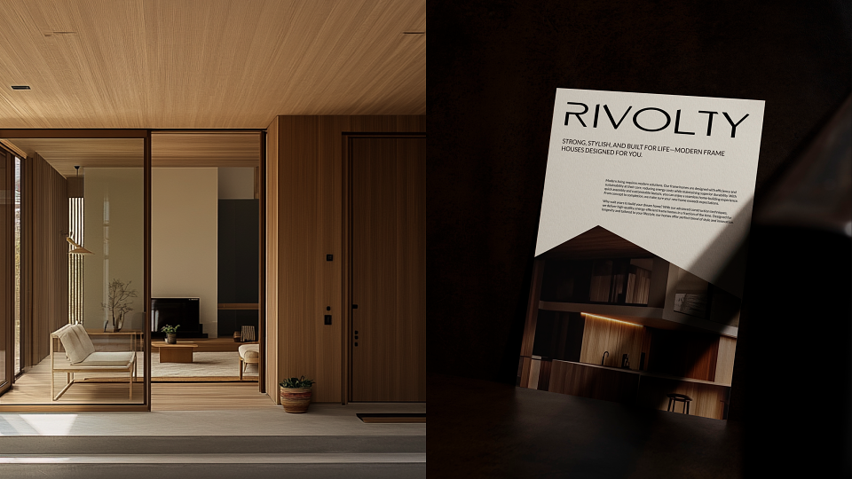
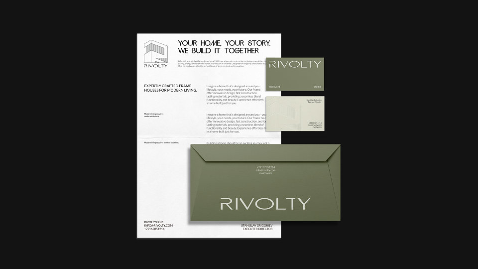
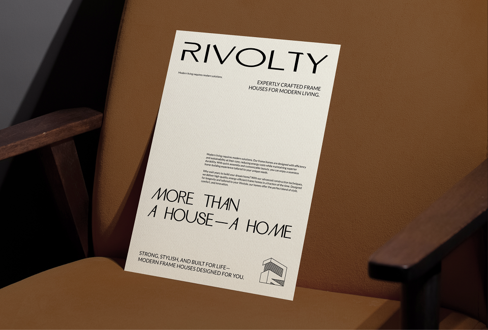
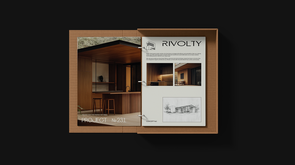
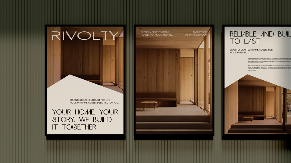
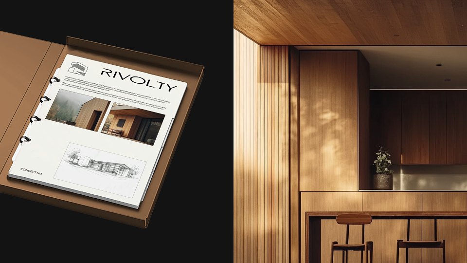
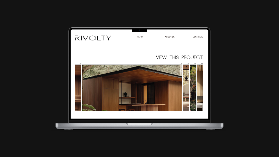
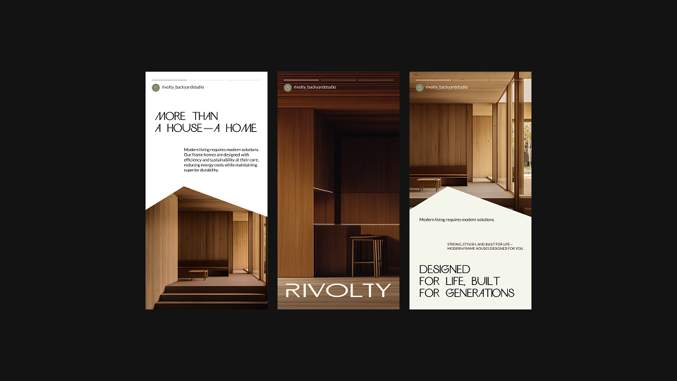
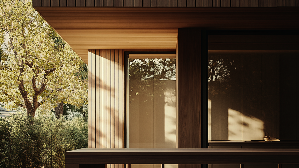
RIVOLTY is a studio specializing in the design, production, and implementation of frame houses and other architectural structures. The key advantage of such buildings is their rapid construction speed.
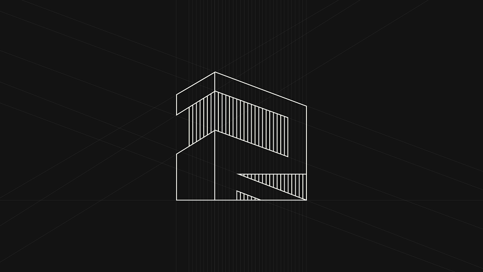
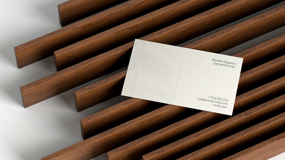
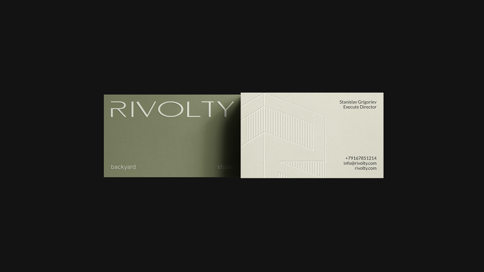
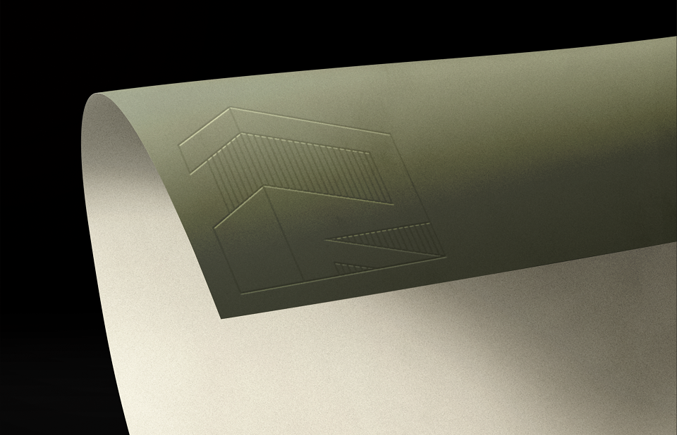
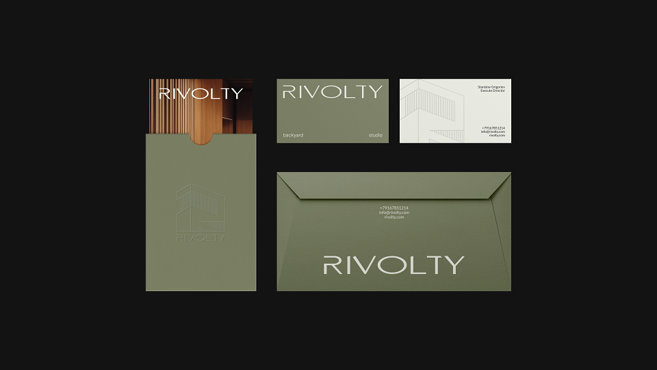
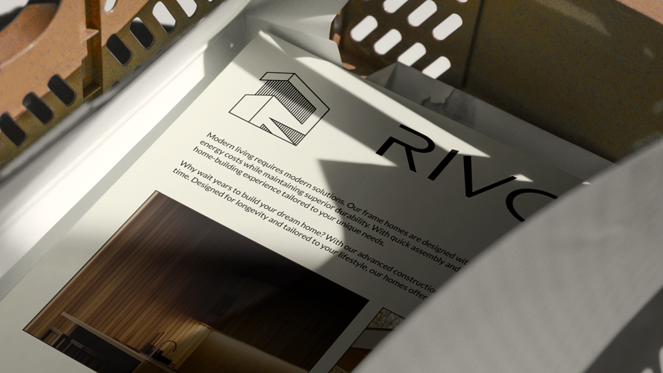
The graphic symbol represents the silhouette of a house, in which the shape of the letter “R” is clearly visible. The structure of the symbol is based on vertical beams—precisely the elements that form the foundation of frame construction. This visual metaphor emphasizes the brand’s core values: strength, reliability, and confidence. The letters in the logo have a solid base, symbolizing stability and dependability, while their upper parts are slanted, adding a sense of dynamism and modernity.
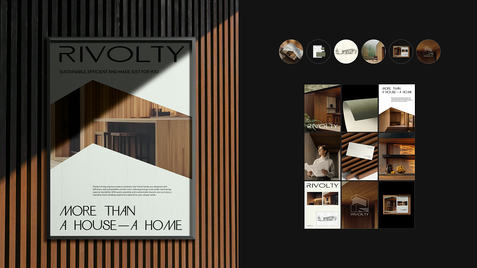
The brand’s color system is built on natural, earthy tones that reflect its commitment to sustainability and natural materials.Soft green evokes the essence of nature, harmony, and the organic environment. Deep brown conveys the warmth of wooden structures, resilience, and a strong foundation.
MADEIT CREDITS
-

Yanina SinitsynaGraphic Designer