Artsiom Dashkevich
Freelance Brand Designer
ABOUT
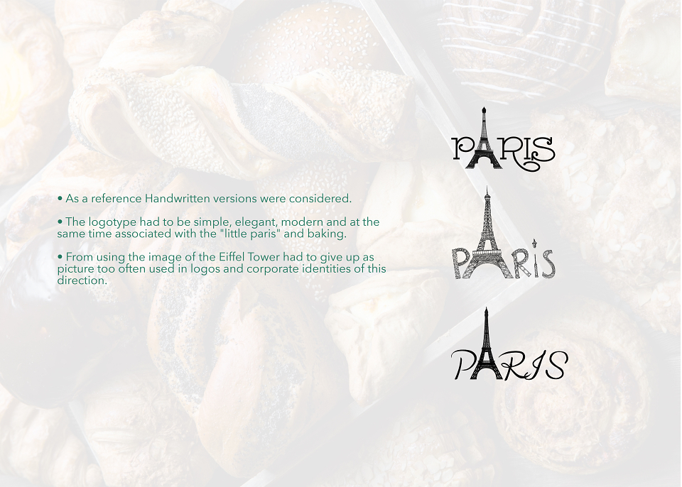
• As a reference Handwritten versions were considered.
The logotype had to be simple, elegant, modern and at the same time associated with the "little paris" and baking.
• From using the image of the Eiffel Tower had to give up as picture too often used in logos and corporate identities of this direction.
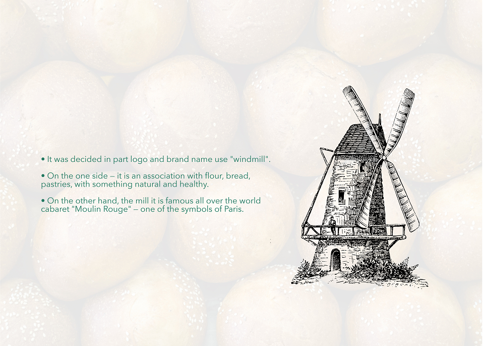
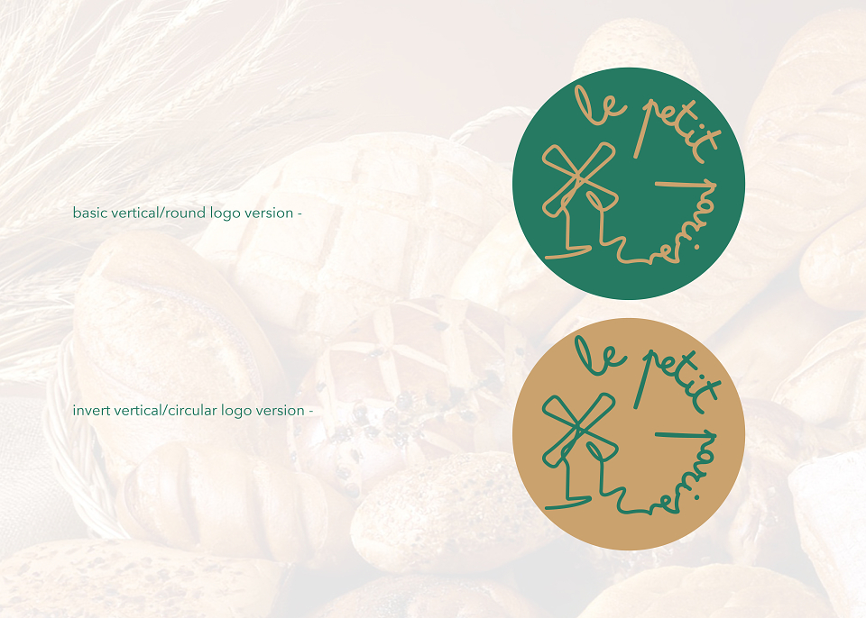
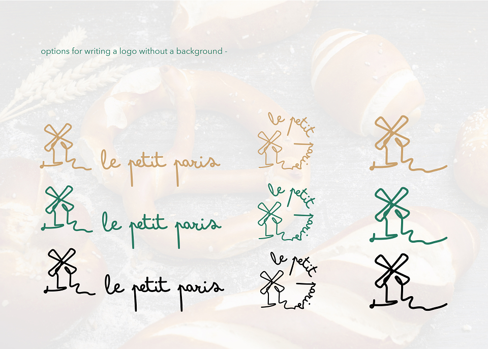
• It was decided in part logo and brand name use "windmill".
• On the one side - it is an association with flour, bread, pastries, with something natural and healthy.
• On the other hand, the mill it is famous all over the world cabaret "Moulin Rouge" - one of the symbols of Paris.
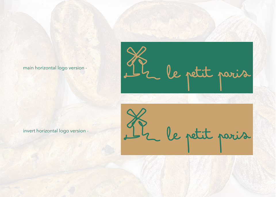
• The font is 'bimbo' by ZETAFONTS FOUNDRY.
Handwriting is associated with something natural, man-made, hand made. In the inscription, you can catch resemblance to a candy store fondant sprinkled on an eclair or a croissant.
• At the same time, the font has expression and movement - what symbolizes bakery format - take away.
• The "green" color symbolizes the traditions of old Europe: oxidized copper - this is exactly the shade that old monuments, sculptures and signs.
• "Brown / coffee" shade symbolizes the same copper or gold. Also associated with coffee cinnamon and pastries.
MADEIT CREDITS
-

Artsiom DashkevichFreelance Brand Designer