Gayane Gharagyozyan
Graphic Designer | Brand designer
ABOUT
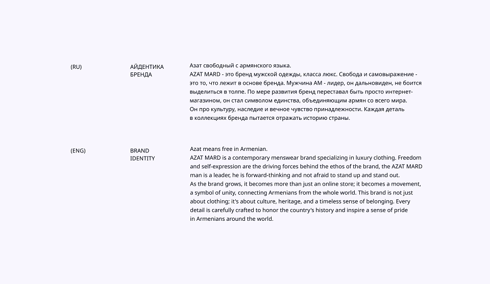
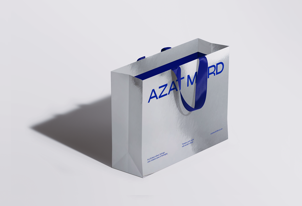
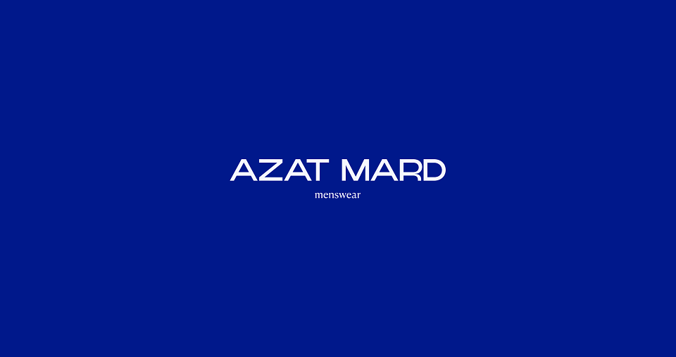
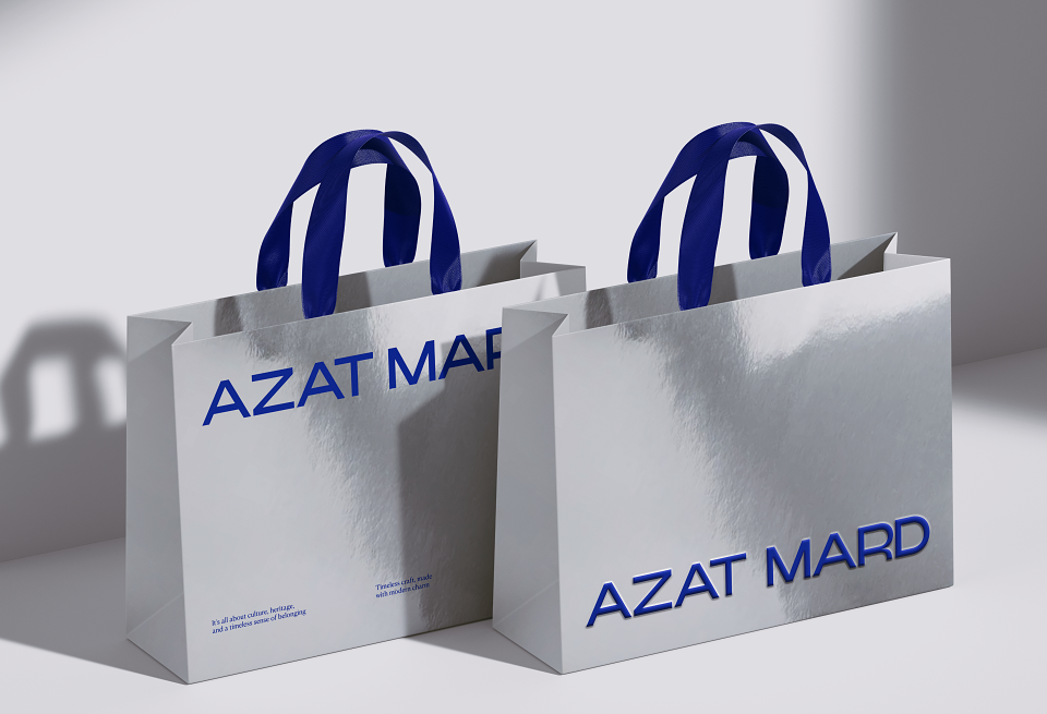
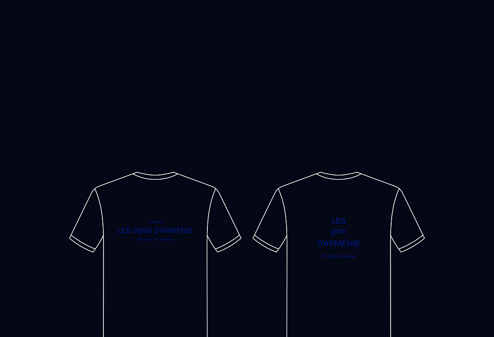
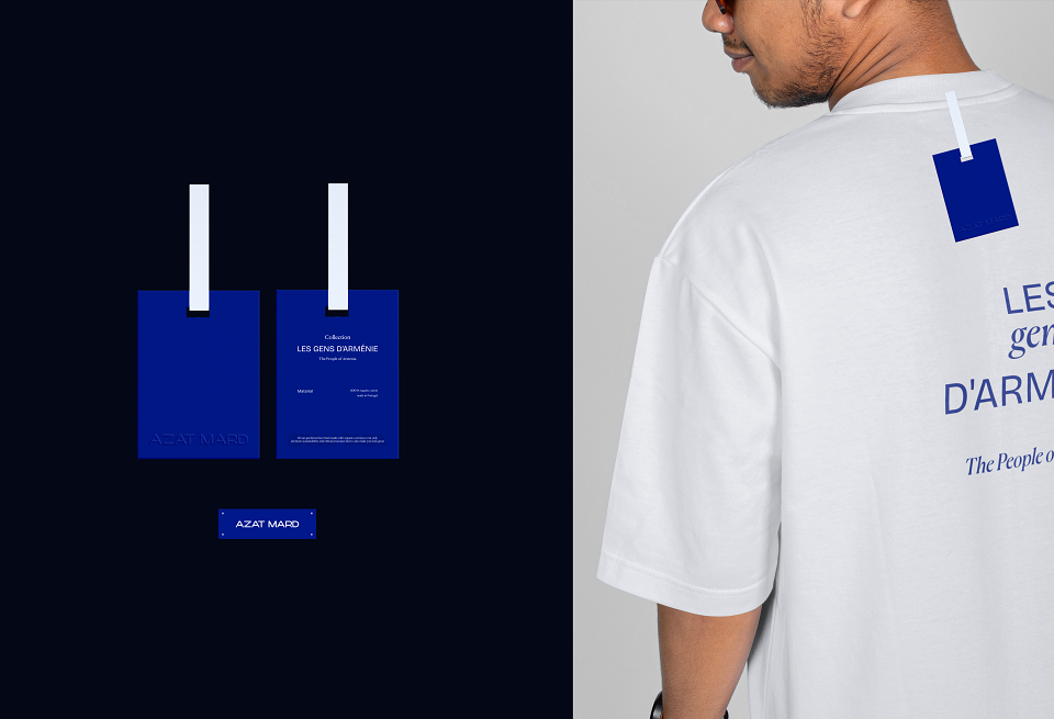
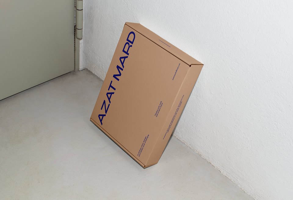
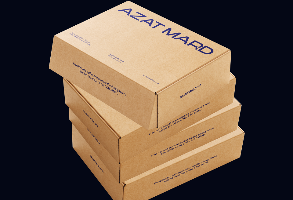
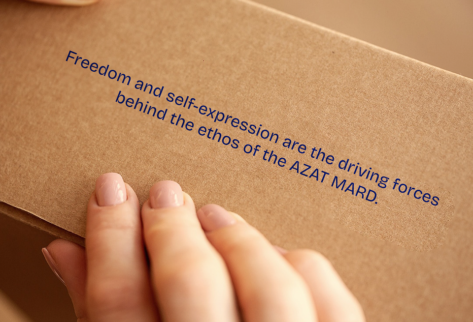
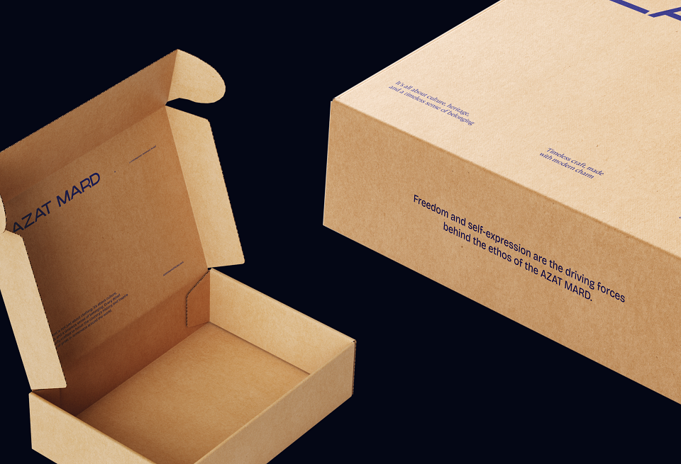
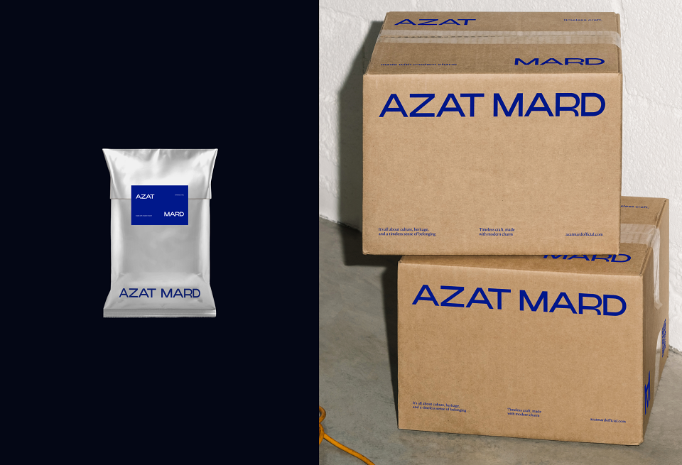
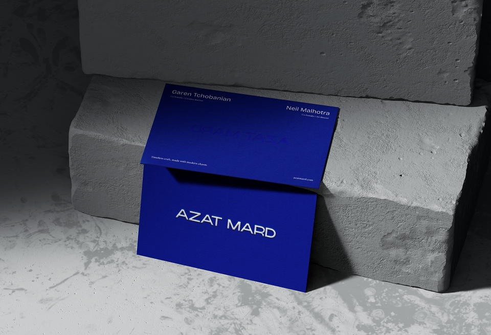
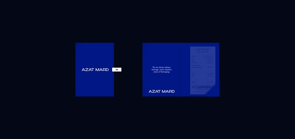
Azat means free in Armenian, and because of the brand is about freedom, strength and self-expression, I wanted to reflect all of this in the whole brand identity. The first touch with the brand is always done from the logotype. That's why it is written in a modern, confident, strong and bold font and consists of quite relaxed letters, which works well with the name.As the brand already has a lot of awareness amongst target audience, it was important not change it too much, and display in the logo everything I mentioned above.For the descriptor I chose a classic font from the antiqua family, emphasizing the rich history of Armenia, but it is also quite modernized, what emphasizes the main values of the brand. It shows us that the brand tries to create something new, based on the history of our motherland.
MADEIT CREDITS
-

Gayane GharagyozyanGraphic Designer