Sofia Valova
Brand Designer
ABOUT
Task:
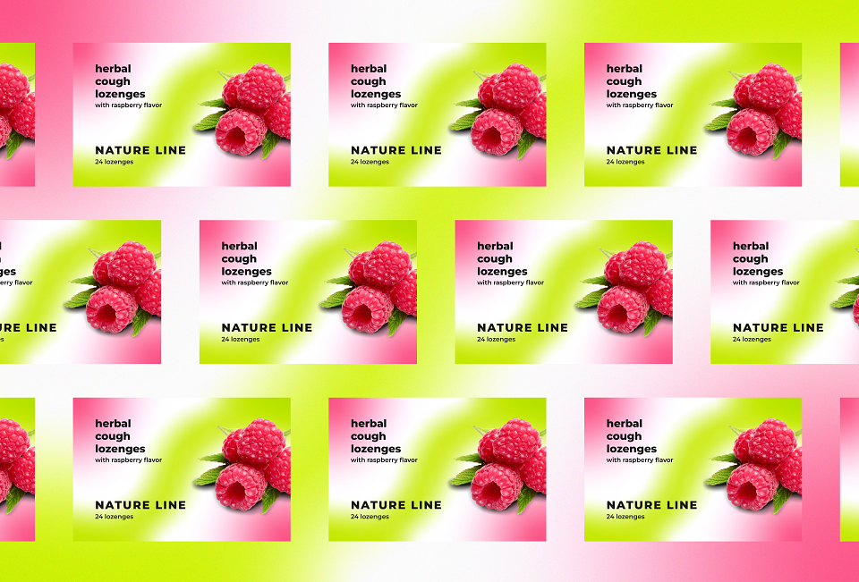
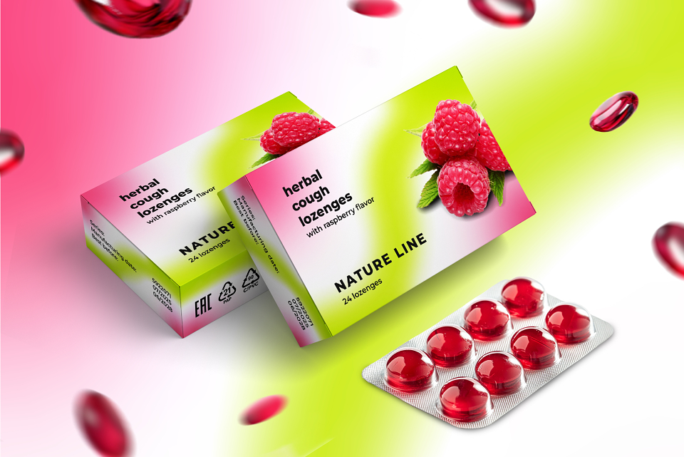
To create packaging for Nature Line throat lozenges that:
- Reflects the natural and high-quality nature of the product.
- Attracts customers' attention on the shelf with a fresh and modern design.
- Highlights the main flavor (raspberry) and the plant-based origin of the active ingredients.
- Evokes associations with health care, comfort, and nature.
Why this packaging design idea was chosen:
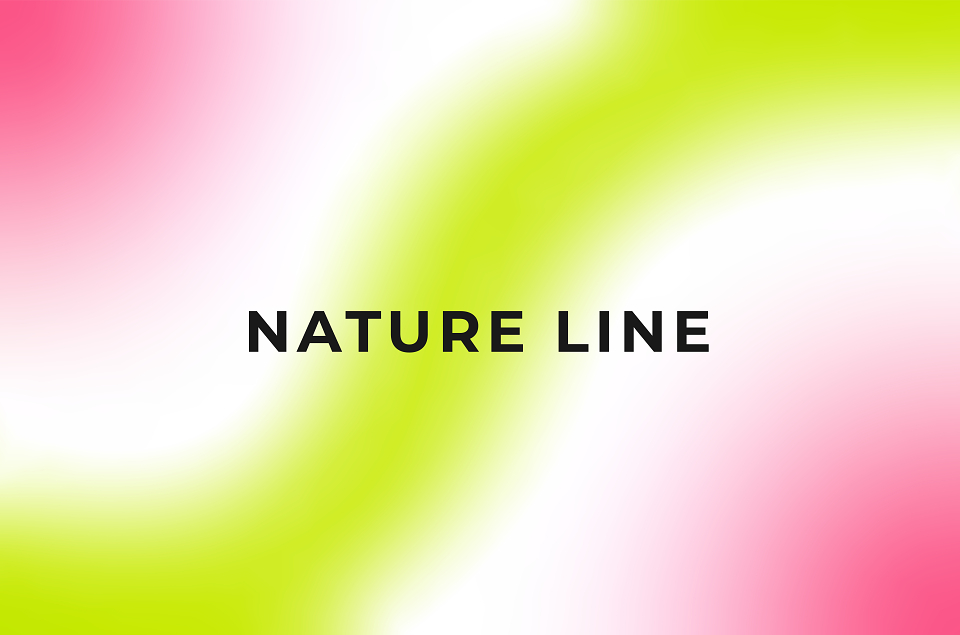
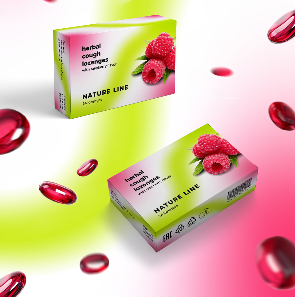
1. Gradient line as a symbol of the Nature Line brand:
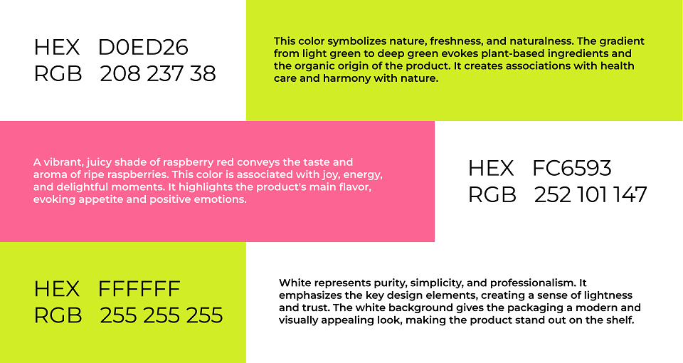
- The green gradient represents naturalness, freshness, and the product's plant-based origin.
- The "Nature Line" not only reflects the brand name but also creates visual flow, connecting different design elements — from nature (green) to the main flavor (raspberry).
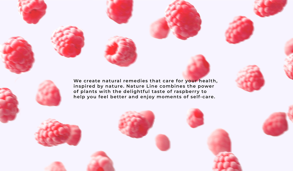
2. Raspberry color and berry focus:
- The bright raspberry color on the edges complements the berry imagery, evoking juiciness and the lozenges' delicious flavor.
- This helps customers quickly identify the product's flavor on the shelf.
3. Minimalism and freshness:
- The white background gives the packaging a clean, modern, and professional look, inspiring customer trust.
- This design approach makes the product appealing to a wide audience, from younger buyers to older generations.
4. Functionality:
- Clear text and a well-structured design (brand name, flavor, quantity) ensure ease of use for the customer.
- The packaging avoids unnecessary elements, emphasizing simplicity and naturalness.
This packaging design was chosen to effectively convey the core values of the brand: naturalness, care, and flavor.
MADEIT CREDITS
-

Sofia ValovaPackaging Designer