Sofia Valova
Brand Designer
ABOUT
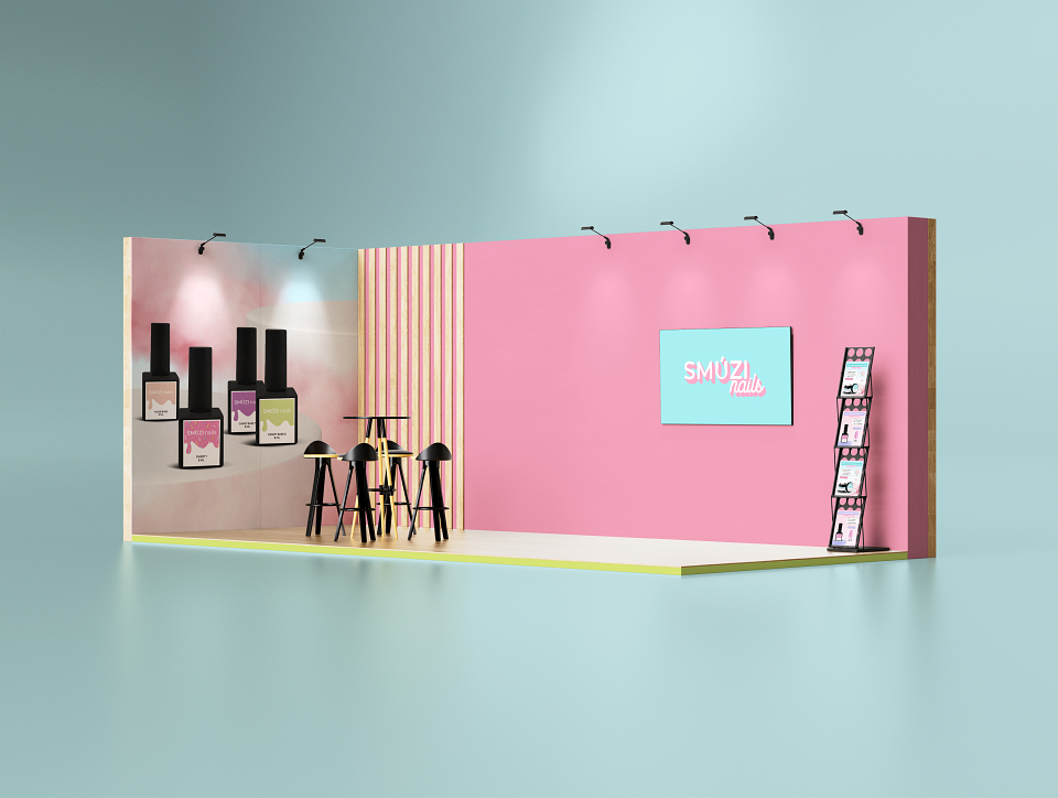
The mission is to develop an attractive, light, airy identity for the new brand of SMUZI nails polish gel. It should make the girl want to try and buy immediately, without thinking about the purchase.
The brand's clients are girls and manicure masters aged from 25 to 35 years.
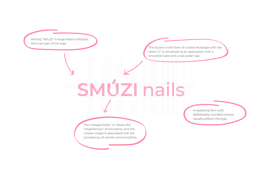
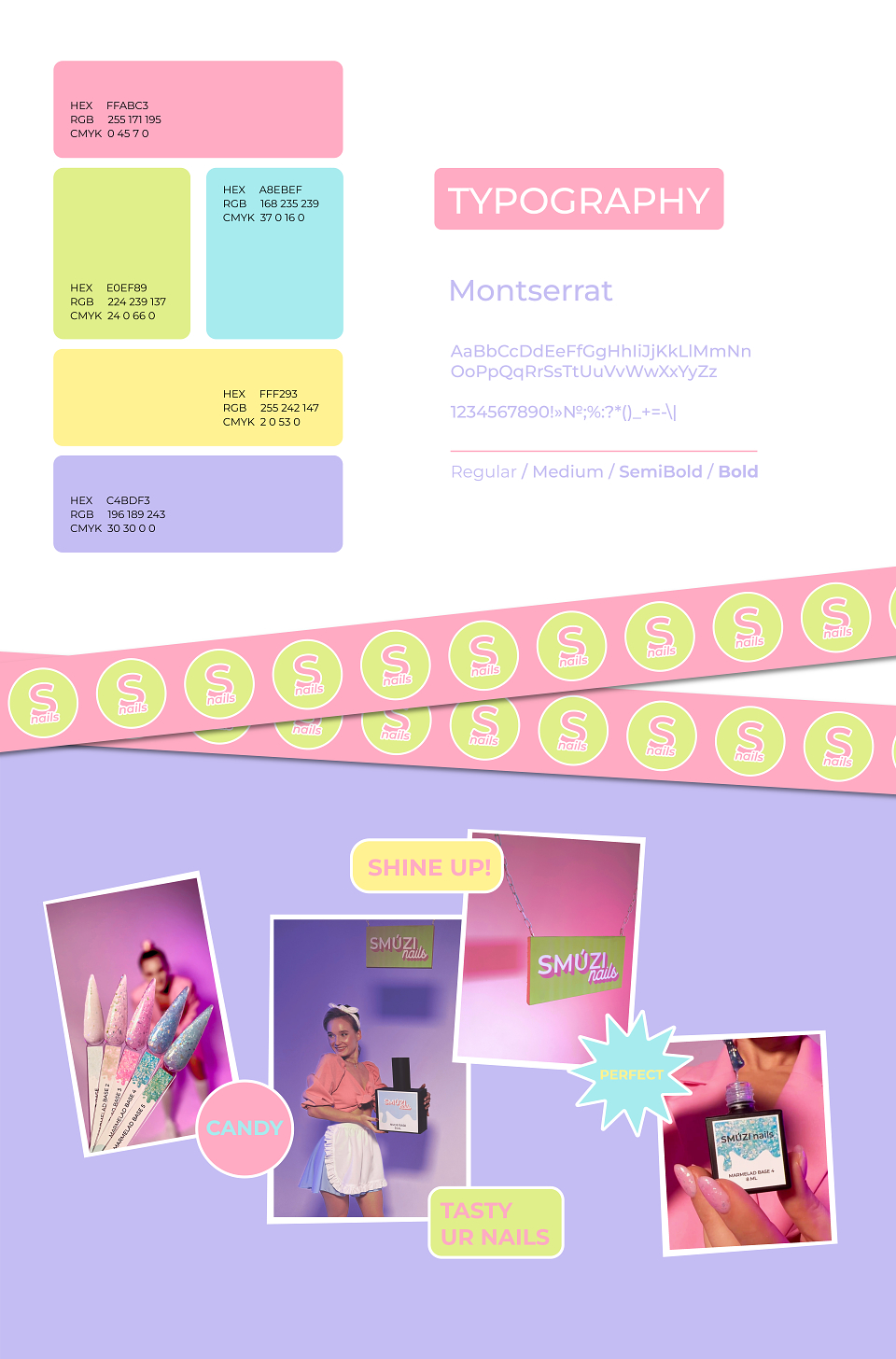
Therefore, when creating the logo, I chose a fairly simple and understandable font, with a slight emphasis on the letter "U". Such a small detail has created its own unusual charm in the logo, but at the same time it looks simple and pleasant.
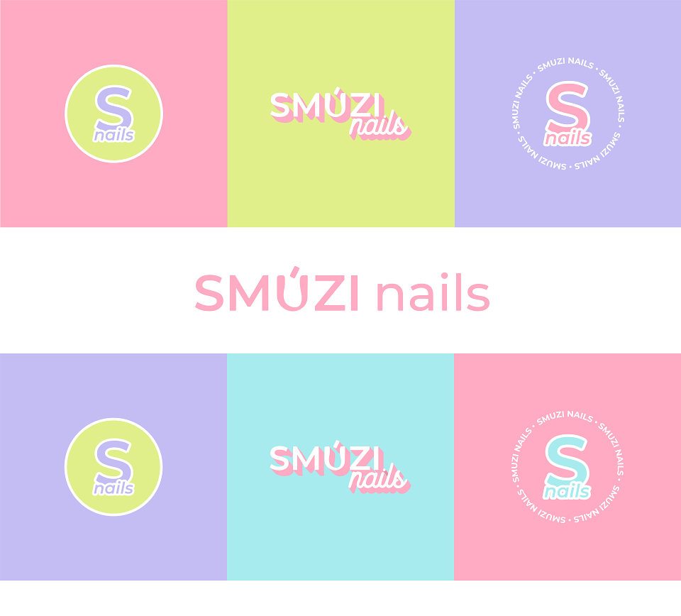
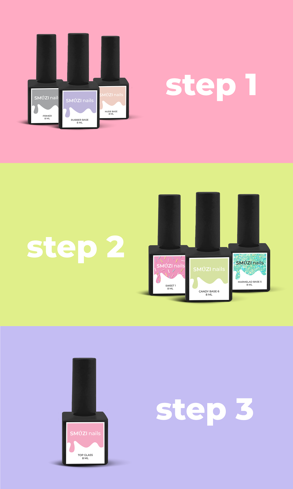
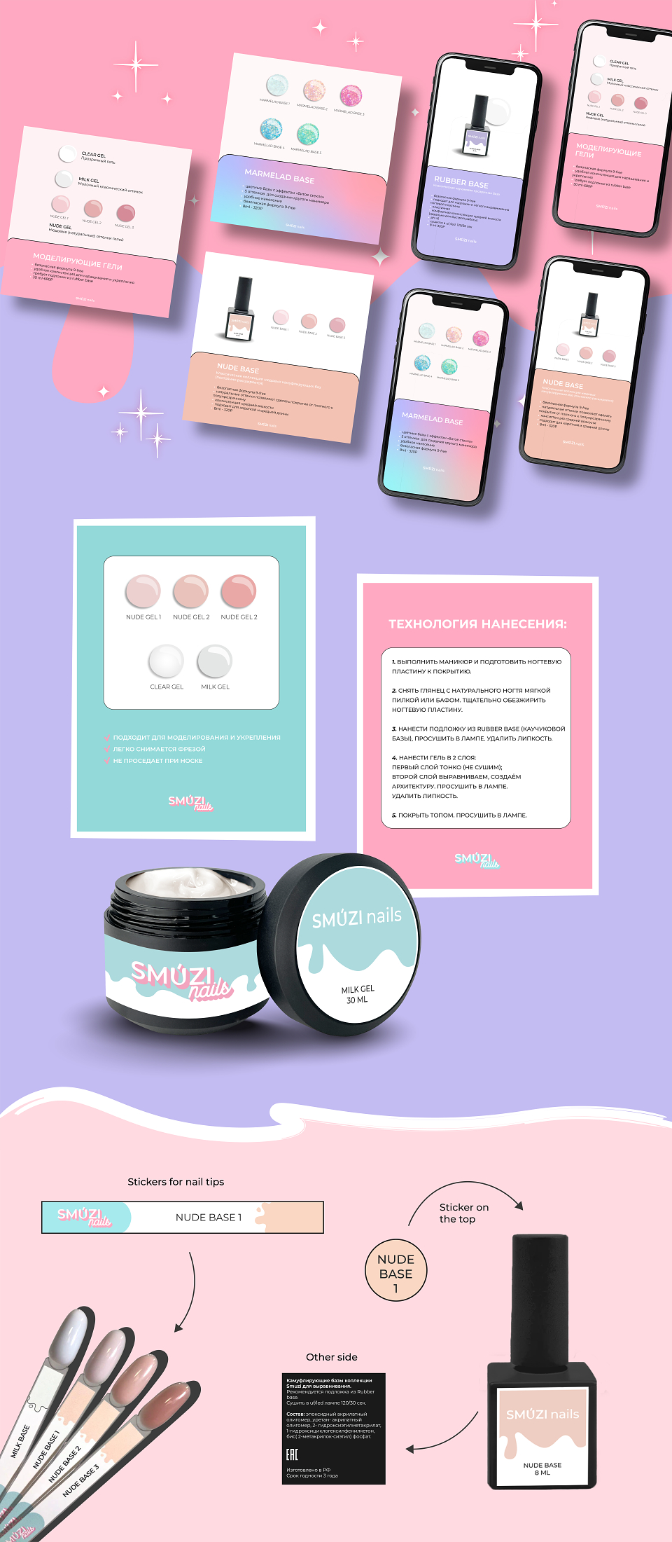
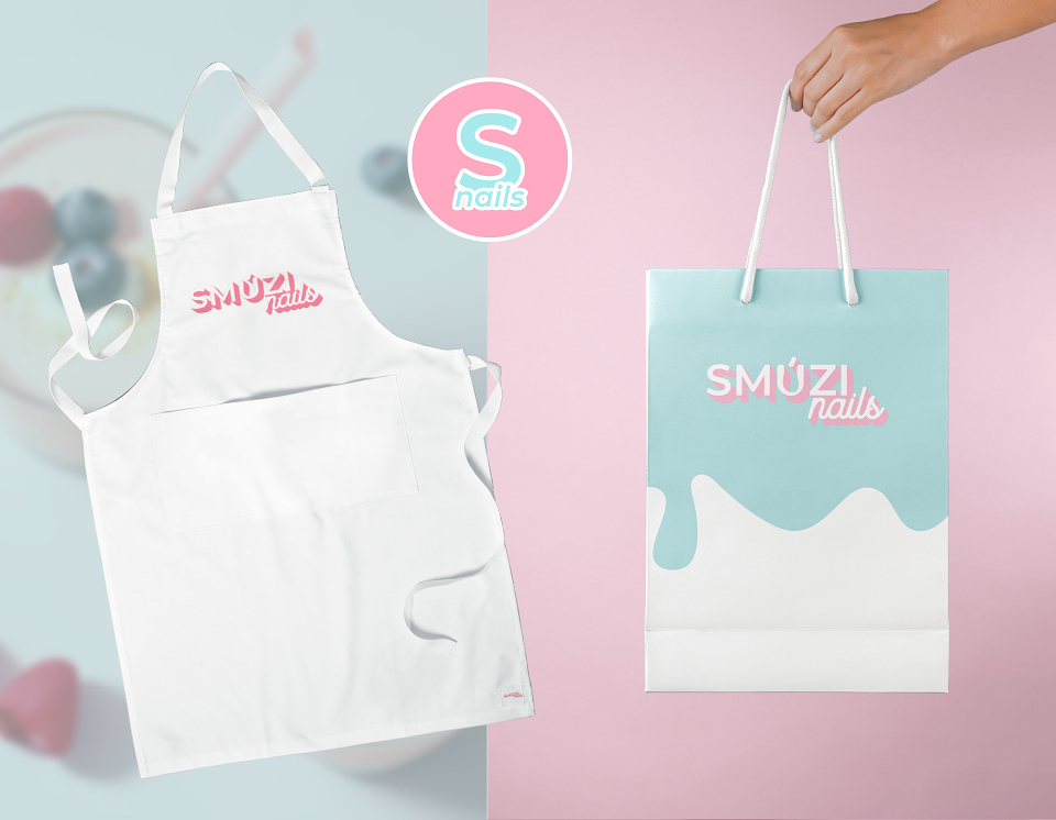
The brand accepts you for who you are, allows you to be less than perfect, and express yourself. Based on all of this, a bright, but gentle, soft one is selected a color palette that will not put pressure on the customer, but on the contrary will reveal and attract her. As a pattern for boxes, nail polish labels and in the future other corporate identity, I combined the idea of the texture of nail polish + smoothies.
So, visually, when touching with the brand, the customer will experience pleasant, "delicious" sensations that will be associated with the brand name, the taste of a fruit smoothie and translate the sensations when applying nail gel.
MADEIT CREDITS
-

Sofia ValovaBrand Designer