Tatjana Kle
Brand & Visual Identity Designer
ABOUT
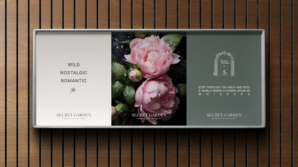
Hidden down a quiet cobblestone street, The Secret Garden is not just a flower shop - it’s a place of emotion, memory, and quiet magic. The brand specializes in floral arrangements that feel deeply personal - inspired by love letters, nostalgic gardens, and fleeting moments of beauty.
My role was to create a visual identity that captures this intimate and poetic atmosphere, while still feeling modern and refined.
My work included:
- Logo design
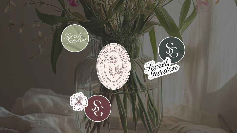
- Visual identity system
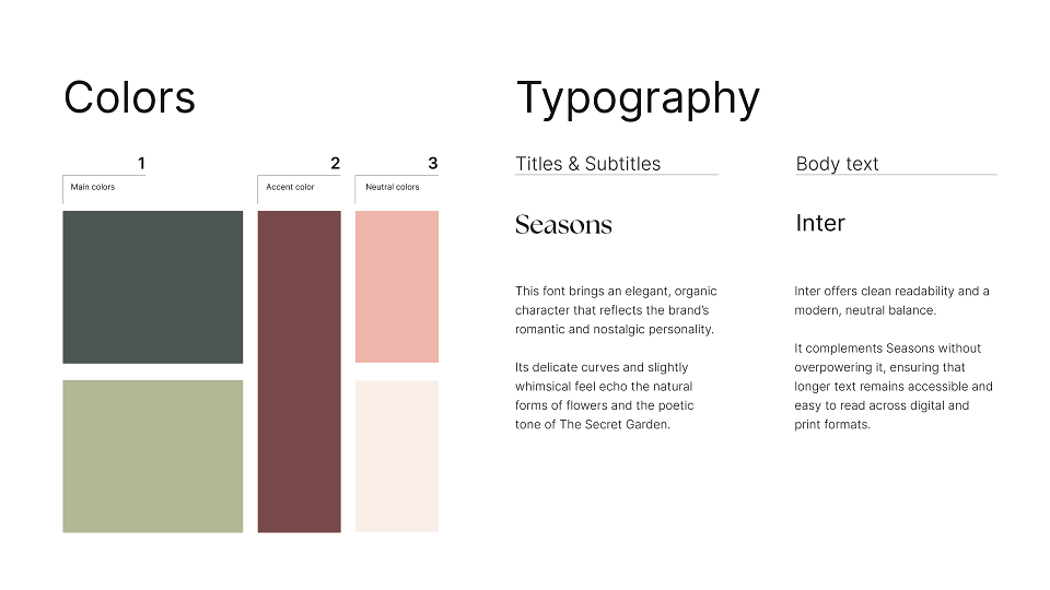
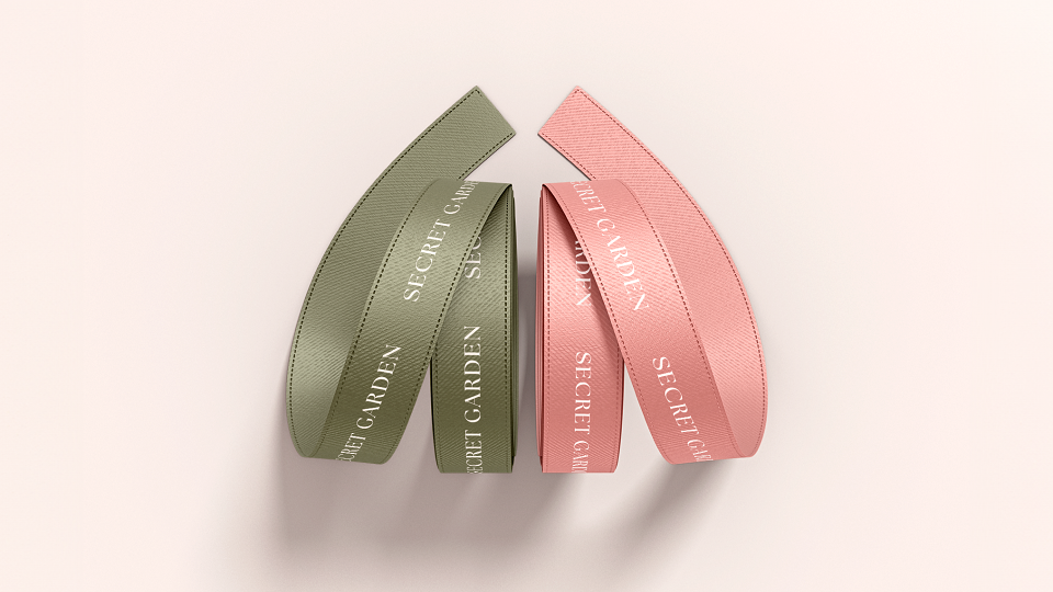
- Typography & colour palette
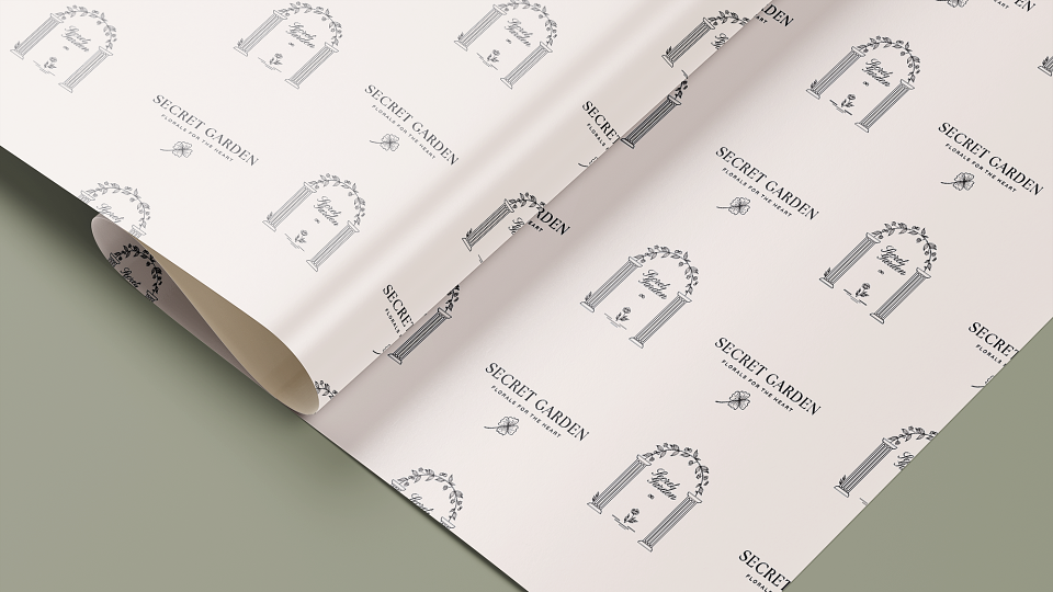
- Brand patterns & graphic elements
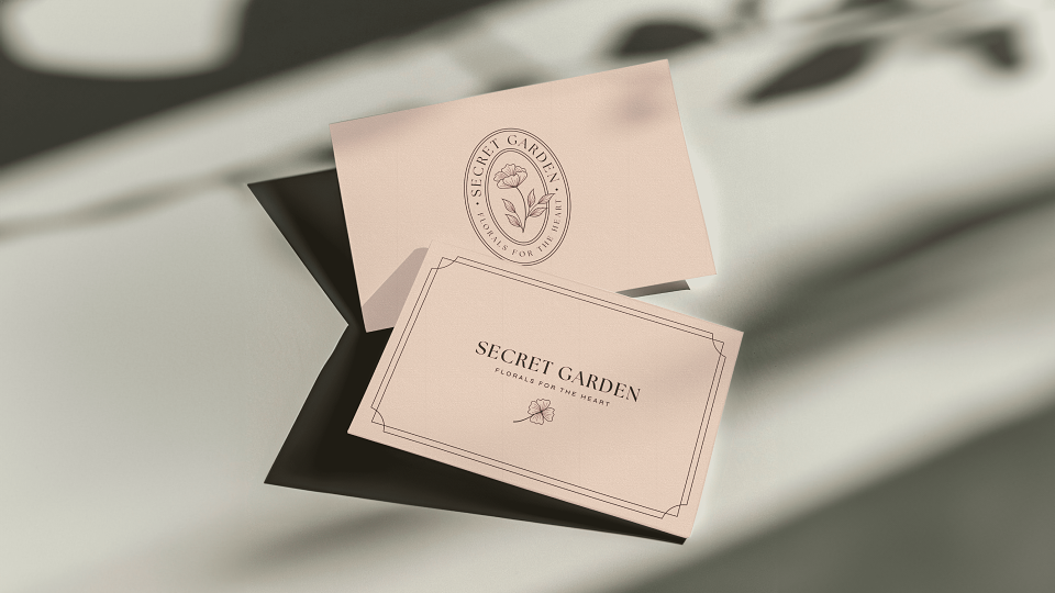
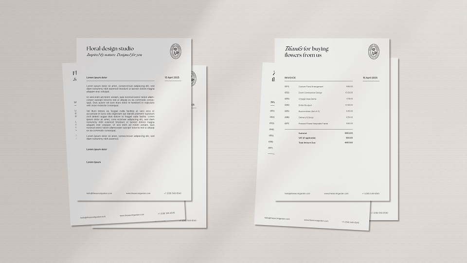
- Invoice & stationery design
- Billboard concept
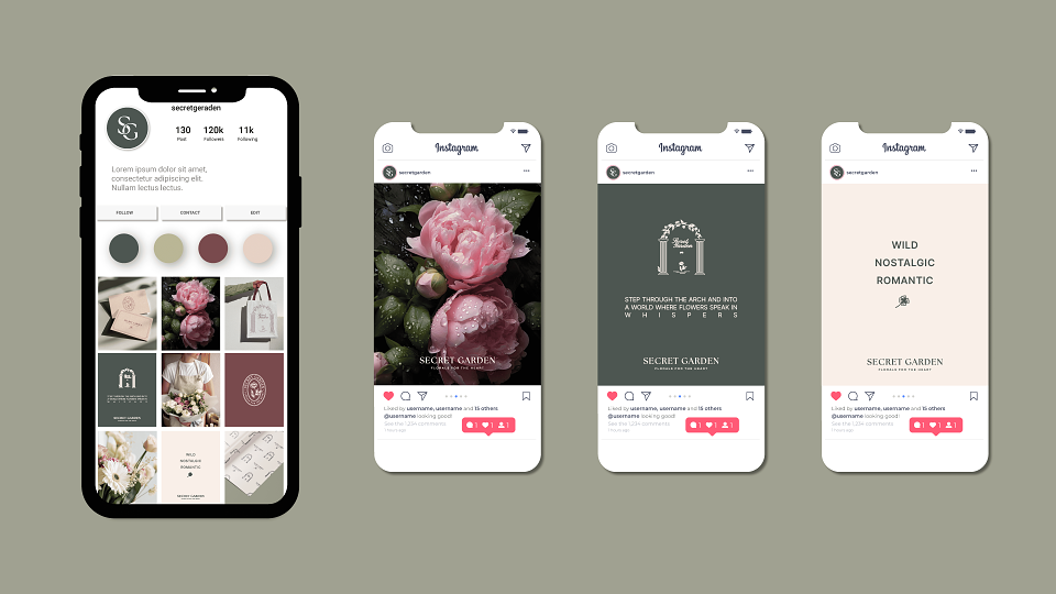
- Social media design
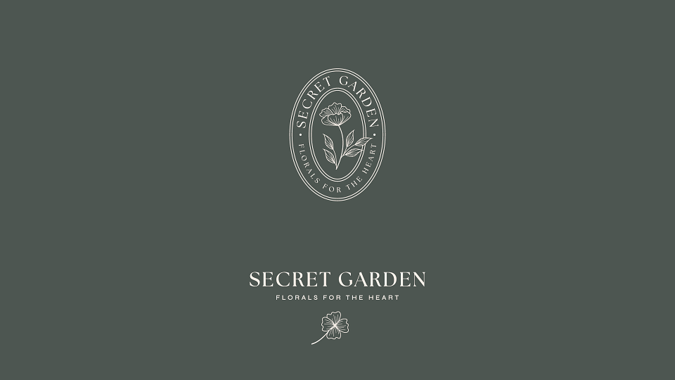
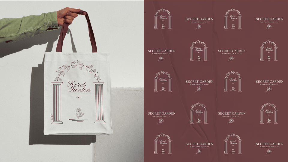
The visual identity for The Secret Garden is built around the idea of a hidden, intimate world - a place where nature, memory, and emotion come together.
The emblem-style logo captures this feeling of a curated, almost timeless space. The delicate flower at the center represents personal stories and emotions - every bloom as a symbol of something meaningful. The oval shape of the logo evokes the feeling of a seal or a keepsake - something precious, something to be kept close.
The secondary graphic element - the archway of vines and columns - is a direct reference to the name The Secret Garden. It visualizes the idea of stepping through into another world, a quiet escape from the outside, where nature takes over and beauty feels effortless.
This illustration becomes a visual metaphor for the brand experience: entering the store feels like crossing into a calm, personal space, surrounded by florals carefully chosen not just for how they look - but for how they make you feel.
MADEIT CREDITS
-

Tatjana KleGraphic Designer