Mariia Revina
Brand Identity Designer
ABOUT
The Zero Zero Co. is an eco-conscious brand dedicated to promoting sustainable living. The company specializes in creating environmentally friendly household products, such as laundry detergents and fabric softeners, with a focus on reducing waste and utilizing recyclable materials. Their mission is to inspire individuals to embrace a zero-waste lifestyle while enjoying high-quality, effective products.
Brand Story: The Zero Zero Co. was founded on the principles of sustainability, innovation, and care for the planet. The name itself reflects the brand's goal of achieving "zero waste, zero harm" in every aspect of its production and operations. Their products are crafted from eco-friendly materials and packaged in 100% recyclable containers, emphasizing the brand's dedication to minimizing environmental impact.
Project Goals: The goal of this branding project was to design a visual identity that reflects The Zero Zero Co.’s commitment to sustainability, while remaining approachable and modern. The branding needed to resonate with environmentally conscious consumers, balancing a professional and warm aesthetic.
Results: The final branding includes:
Logo Design:
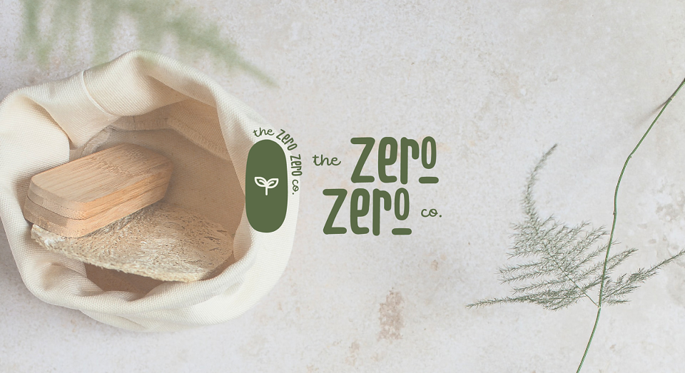
A modern and friendly typography with organic, flowing lines that convey a sense of nature and sustainability.
The primary logo features a sprouting plant icon inside an oval shape, symbolizing growth and ecological harmony.
A secondary stacked logo offers versatility for product packaging and promotional materials.
Color Palette:
Earthy tones like green and beige dominate the palette, highlighting the brand’s natural focus.
Subtle accent colors bring warmth and balance to the overall design.
Packaging Design:
Minimalistic yet eye-catching packaging with organic patterns and symbols representing recycling, the environment, and eco-friendliness.
The use of matte textures and sustainable printing techniques enhances the premium and eco-conscious feel.
Supporting Materials:
Custom-designed wrapping paper with environmental icons for use in shipping and gift packaging.
The branding extends to every touchpoint, ensuring a cohesive and engaging customer experience.
Design Highlights:
The typography strikes a balance between modernity and approachability, ensuring that the brand feels trustworthy and relevant.
The subtle organic patterns on the packaging and wrapping paper add depth while reinforcing the brand's eco-friendly values.
The versatile logo design is equally effective on digital platforms and physical products, ensuring strong brand recognition.
MADEIT CREDITS
-

Mariia RevinaVisual Identity Designer