ABOUT
Setting the Scene
Toilet hygiene has long been a category defined by discomfort—both physical and emotional. Between the wasteful guilt of wet wipes and the clinical sterility of bidets, no one had quite cracked the code on what modern consumers actually wanted: style, convenience, and a clean that made them feel something.
Saintly wasn’t stepping into a white space. It was stepping into a grey one—messy, overcomplicated, and overrun by brands all saying the same thing. To make a mark, Saintly would need more than a new product. It needed a point of view. One bold enough to disrupt the market, and elegant enough to stay on the bathroom shelf.
The Real Challenge
From Tushy’s cheeky bidets to sustainably-positioned wipes like Who Gives a Crap, the category was full of challenger brands trying to own the same tired tropes: “eco-friendly,” “flushable,” “better for your bum.” Everyone was saying something, but no one was saying something different.
The real challenge wasn’t getting people to believe in a new product. It was getting them to rethink the entire experience. Could we transform something awkward into something aspirational? Could we convince people that a wipe alternative wasn’t just better—but beautifully better?
Saintly had to create a brand that didn’t just stand apart from the category—it had to stand above it.
The Truth That Changed Everything
The insight that unlocked the brand was disarmingly simple: clean isn’t just a result—it’s a feeling.
And that feeling? It’s freeing. It’s confidence-boosting. It’s that just-showered strut you do when you know you’re at 100%. For our core audience—aspiring families, houseproud, and hygiene-obsessed—that emotional payoff meant everything.
They didn’t just want clean. They wanted to feel clean. And nothing in the category was delivering that.
This wasn’t about functionality. It was about liberation. Saintly wasn’t just here to wipe. It was here to uplift.
The Strategy
We reframed the brand from a product to a platform. Saintly wouldn’t sell on “wet is better” or “wipes are bad.” That was table stakes. The strategic leap was to position Saintly as a lifestyle upgrade—a confidence ritual, a daily dose of dignity, design, and yes, divinity.
This brand would play in the emotional space of self-care and confidence, not the rational turf of performance specs or plumbing diagrams. The strategy was simple but powerful: go beyond hygiene, and own the emotional halo of feeling heavenly fresh.
To do that, we needed a brand that could wear the robe and carry the sword. Something irreverent yet elevated. Playful yet premium. And above all, unmistakably Saintly.
Execution: Your Bathroom Saviour
At the heart of it all sat a brand idea that pulled everything together:
Your bathroom saviour.
It captured the product benefit, the emotional payoff, and the irreverent charm in just four words. It gave us license to speak boldly, design beautifully, and act with purpose. Saintly wasn’t here to compete with wipes. It was here to redeem them.
We weren’t solving a problem. We were answering a prayer.
Bringing It to Life
The creative was designed to bring the strategy to life with total coherence—from tone to type, from logo to line.
Tone of Voice: Holy Boldness
We built a voice that was confident, clean, and cheeky. No euphemisms. No fluff. Just elegant honesty with a wink. We weren’t afraid to say “butt” or “poop” if it made the point. But we said it with style—straight-talking, down-to-earth, and self-aware enough to charm even the skeptics.
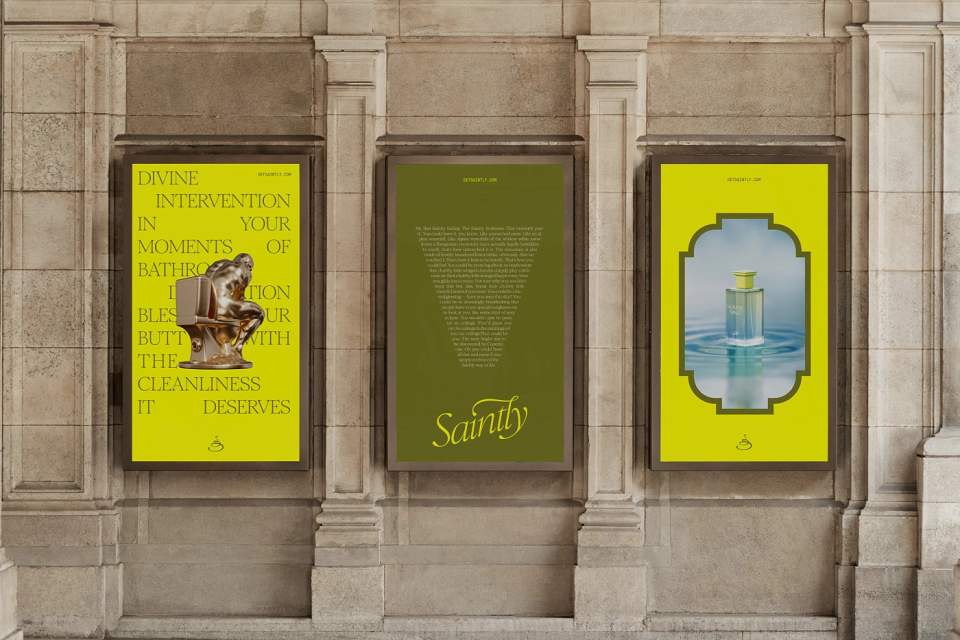
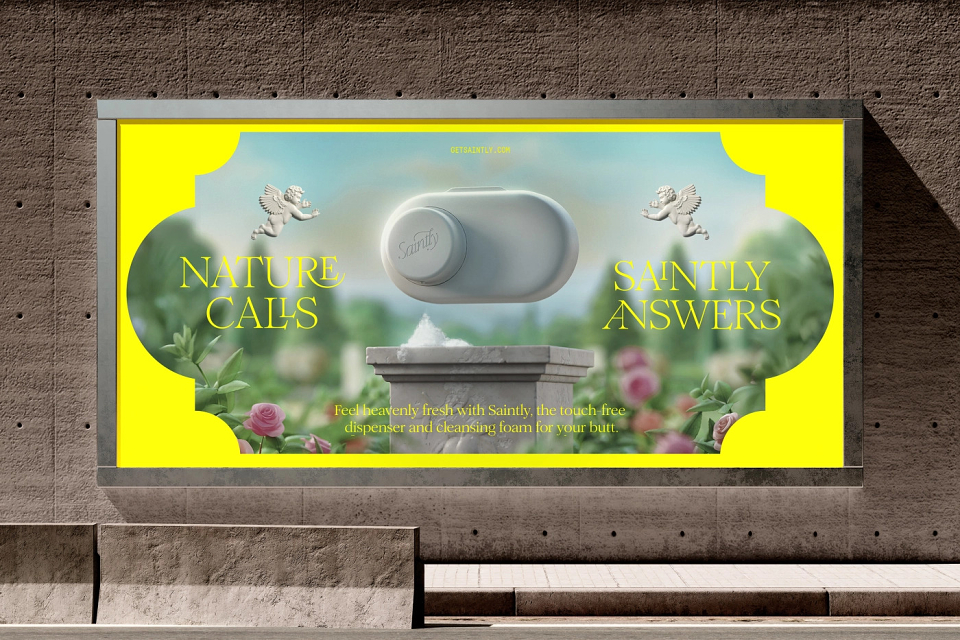
Lines like “Bless thy butt,” “Post-poop purity,” and “Touchless. Hygienic. Heavenly.” weren’t just clever copy. They were strategic expressions of a brand that knew exactly what it stood for—and wasn’t afraid to lead from behind.
Design: Divine Intervention
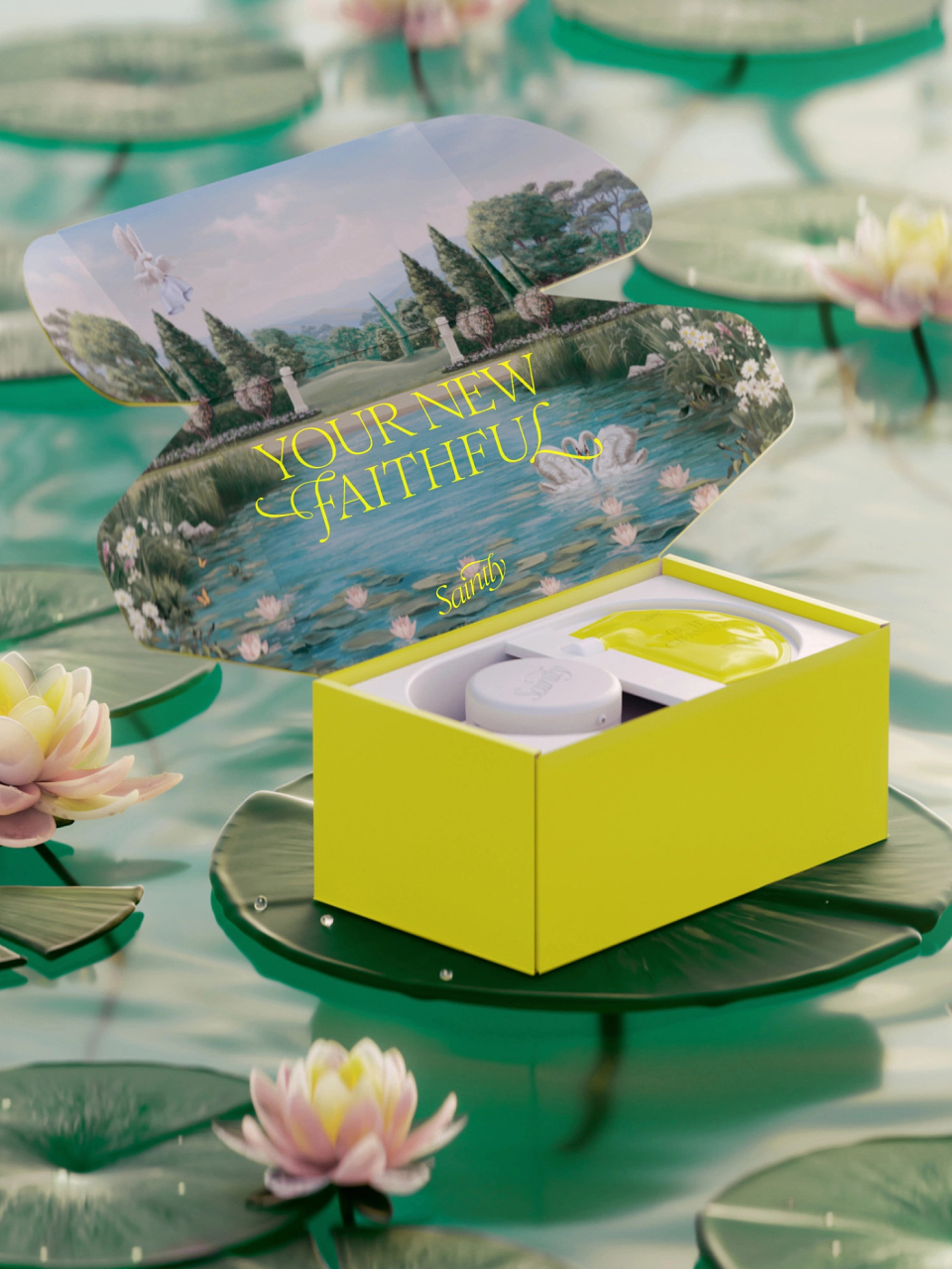
We drew from Renaissance frescos, religious iconography, and luxury branding codes to create a visual world that felt both sacred and surprising. A gold monogram that could sit comfortably on a luxury candle. A fresco mural that reimagined bathroom moments as mythic. A dispenser that looked more like a sculpture than a hygiene product.
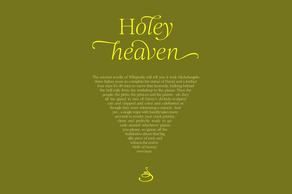
The typography was built from Romie—a serif typeface with ornate ligatures that gave every word a sense of occasion. And our palette of gold and yellow did double duty: warmth and wonder, luxury and light.
Across every touchpoint—from digital to packaging to merch—we created a system that didn’t just look premium. It felt like a blessing.