Investor Brand
London
ABOUT
The challenge:
How do you make the group as relevant as its brands? Open the cupboard and you’ll see pladis biscuits and snacks everywhere. But it’s a company you’ve never heard of, right? The business needed to embrace being a brand. One that supported and amplified their voice as an established industry player, with bold ambitions for growth.
The shift:
Pladis are bakers, not makers. It’s an important distinction and guides what they truly care about… baking some of the world’s best tasting and most loved biscuits and chocolates. This passion and pride were missing and needed to be central to pladis’s future.
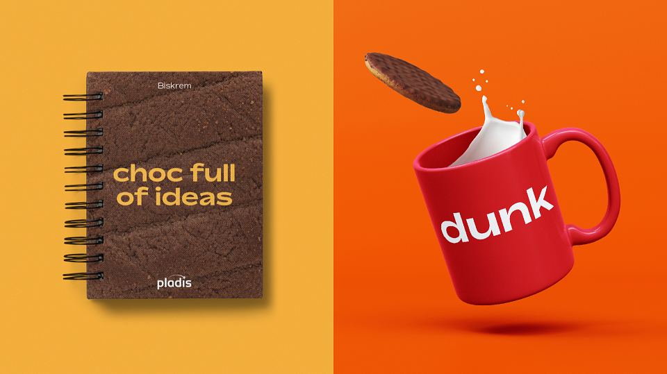
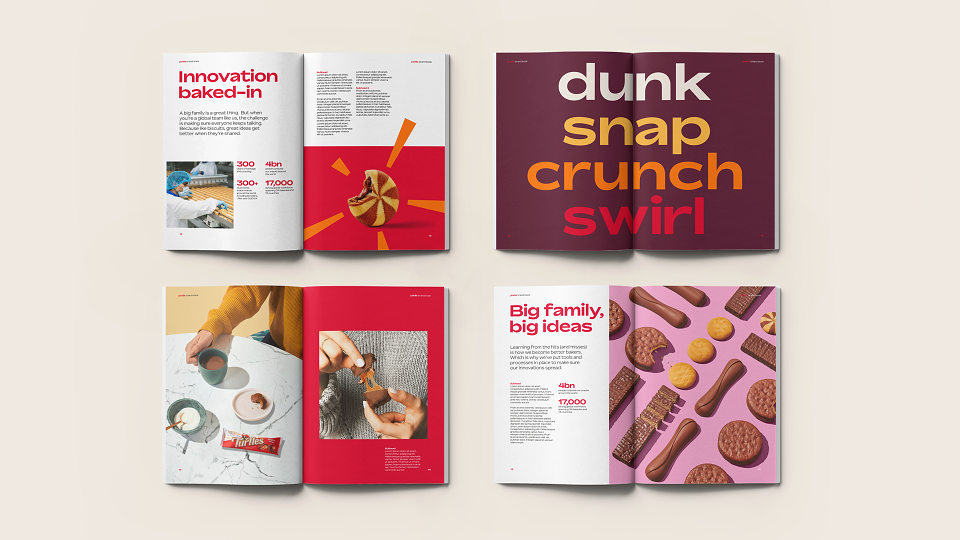
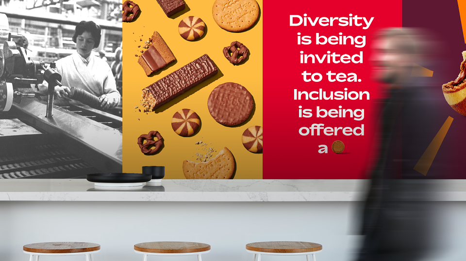
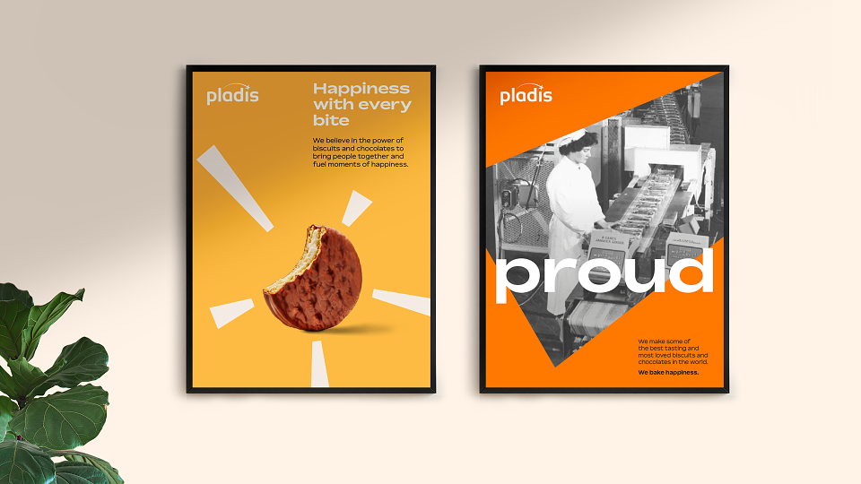
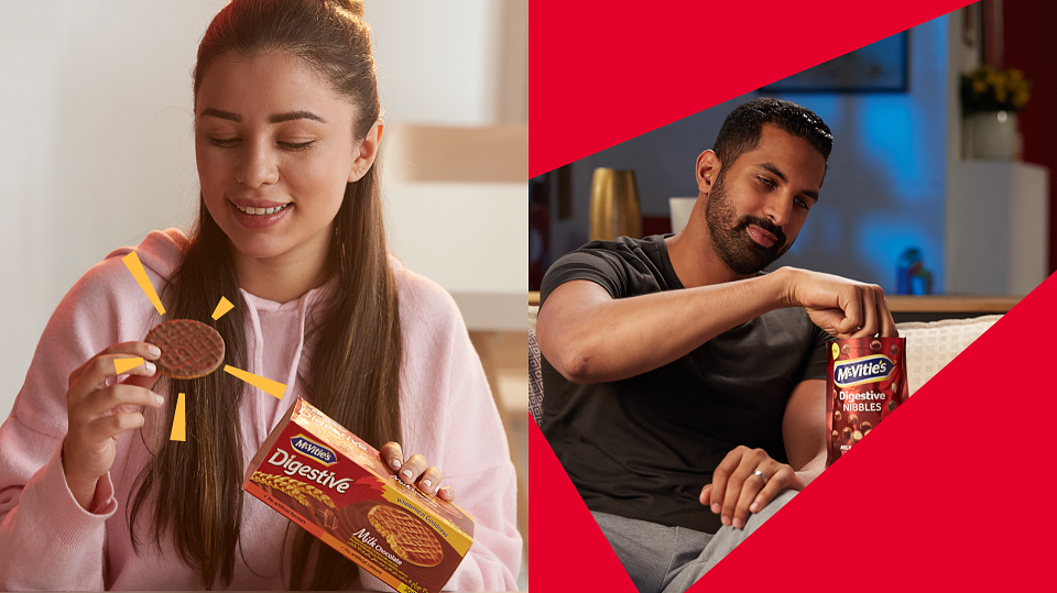
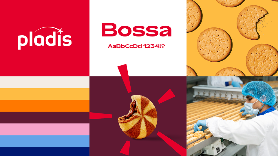
The brand had to balance a serious business vision with the spirit of heritage and craftsmanship of family favourite brands. We distilled the pladis purpose down to its emotive core: “happiness with every bite”, then set about making the visual brand the personification of this purpose.
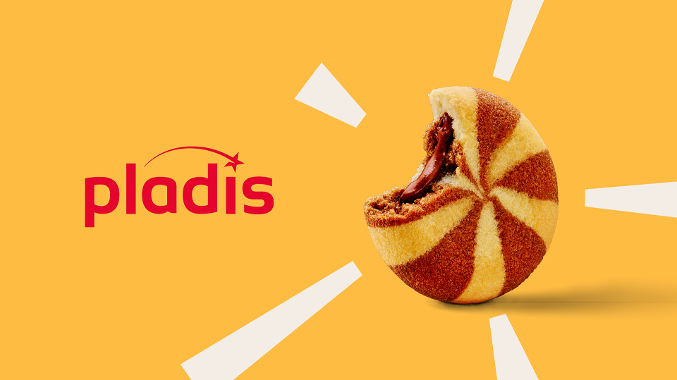
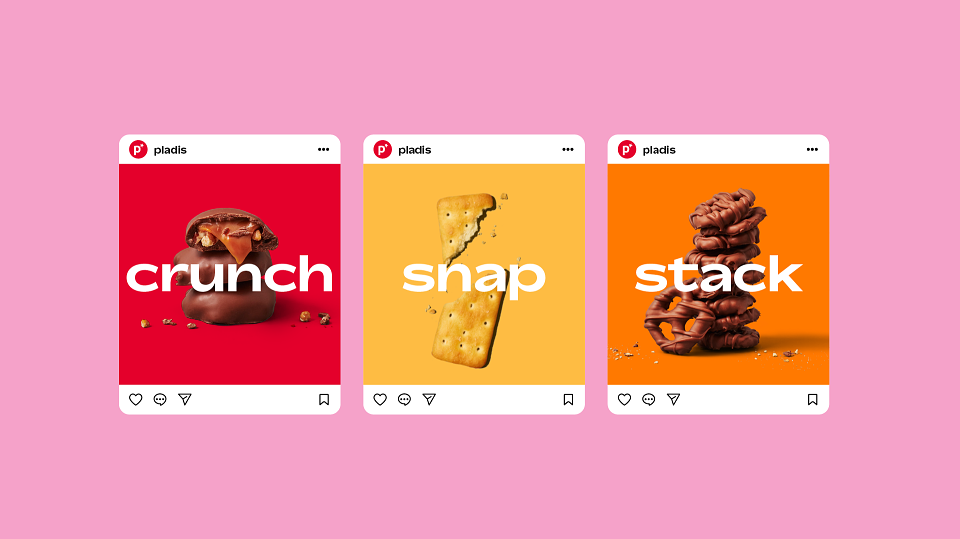
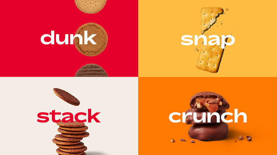
Baked into the brand line are two promises that informed the brand – the idea of happiness, which inspired the vibrant visual palette and verbal expressions; and the literal action of taking a bite which became a subtle wink across all product photography as it emphasised that, although beautiful, pladis’s products are to be enjoyed.
Finally, t he identity had its own story to tell. A shooting star motif was incorporated into the logo speaking to the origin of the name – a riff on the Pleiades star constellation and that of the star brands in the pladis portfolio.