Paulo Oliveira
Creative Director
ABOUT
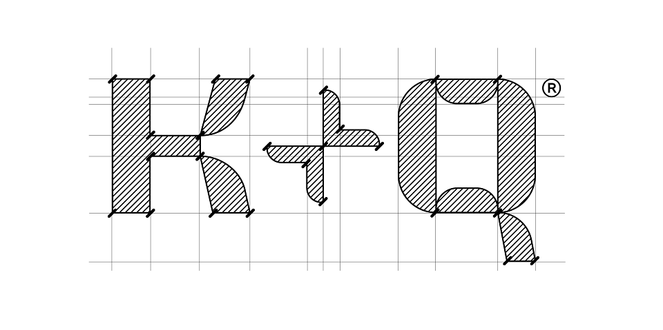
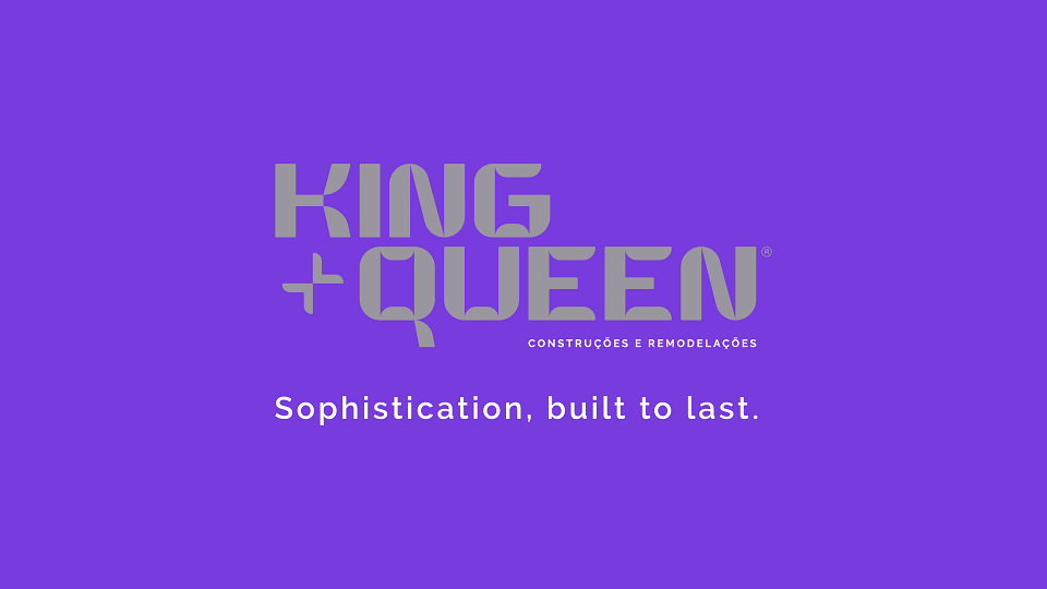
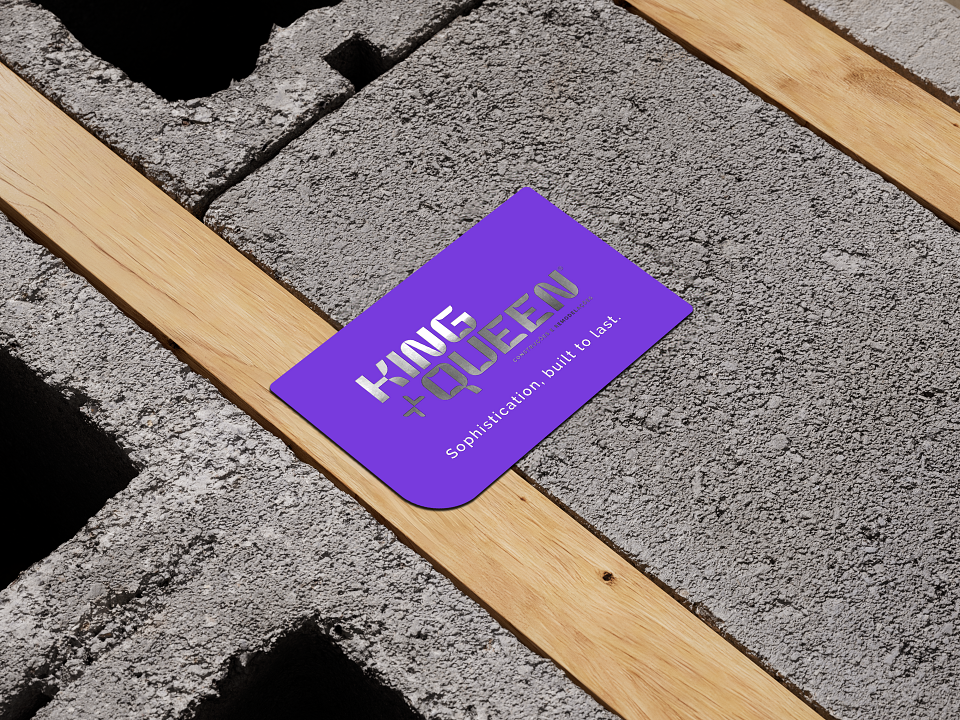
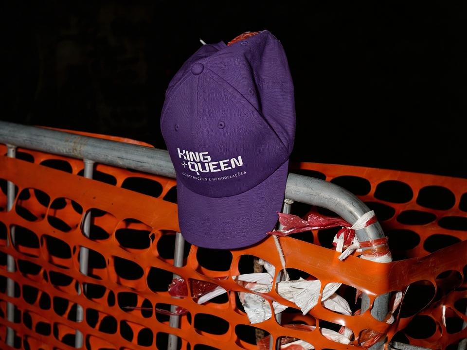
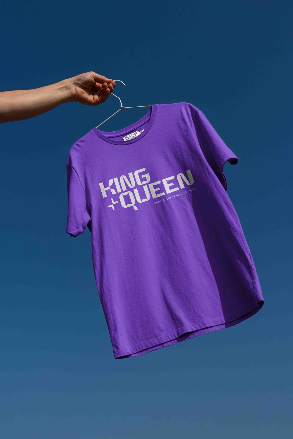
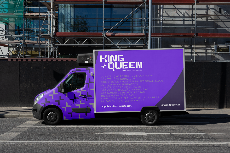
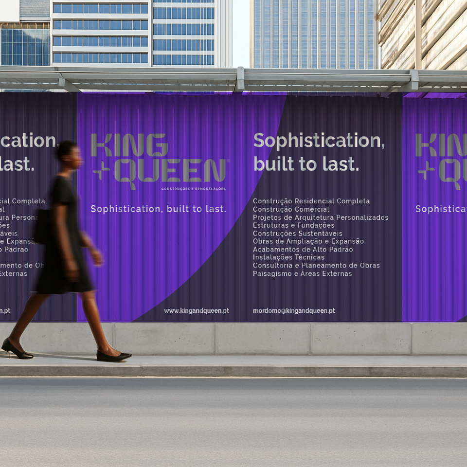
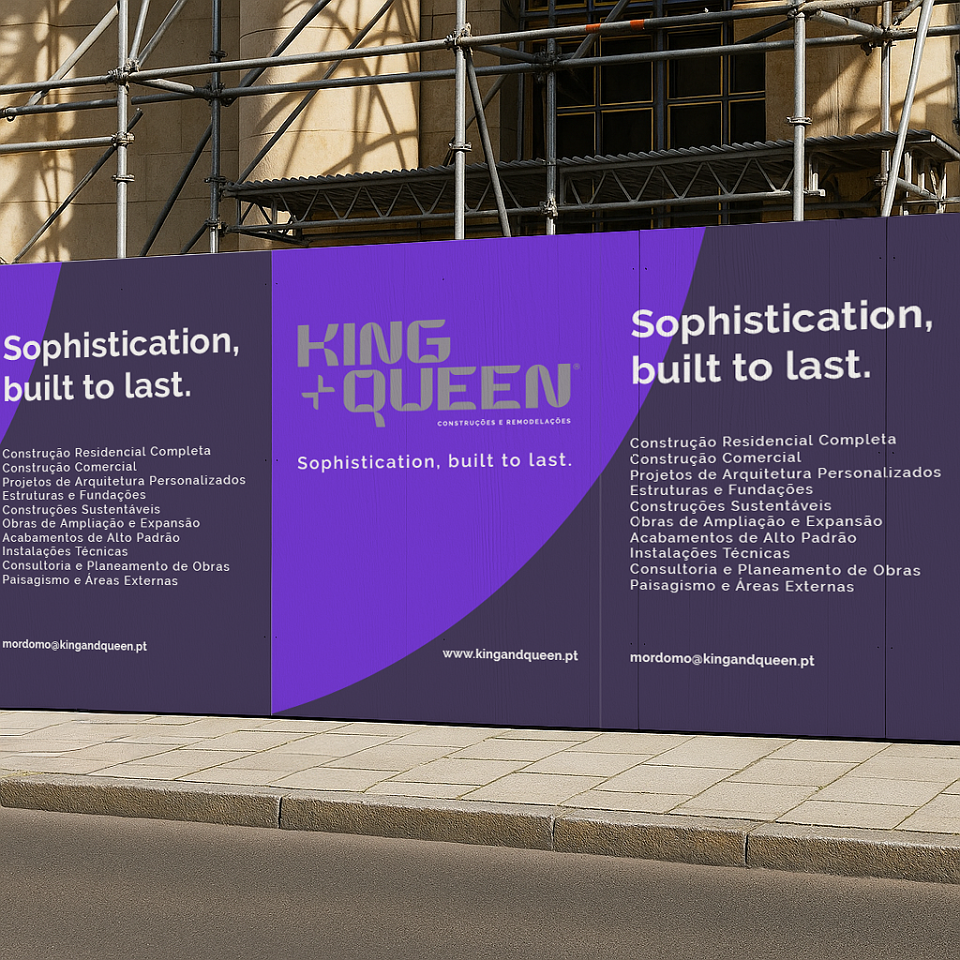
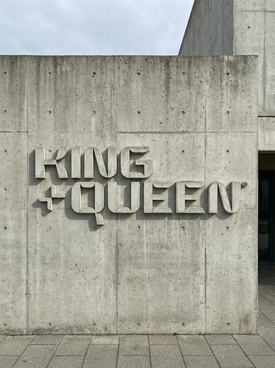
King + Queen, Constructions and Refurbishment stands for the transformation of ordinary spaces into sophisticated and highly functional environments. Every project is approached with a contemporary and creative mindset, balancing precision with bold thinking. The new visual identity translates this positioning into a clear and confident design system.The color palette is intentional and strategic. The vibrant purple represents creativity, ambition and modernity. It reflects the brand’s ability to rethink space and deliver tailored solutions with a strong point of view. It signals transformation, not cosmetic change, but considered reinvention.The grey /metal introduces balance and restraint. As a neutral foundation, it provides visual stability and allows the system to breathe. It reinforces the brand’s commitment to long term quality, structural clarity and refined execution.At the core of the identity is a custom designed typeface created exclusively for King + Queen. This is not an off the shelf solution, but a bespoke typographic system developed to express the brand’s unique character. Each letterform was carefully crafted to balance strength and elegance, with precise proportions and distinctive details that make the identity unmistakable. The tailored typography reinforces exclusivity and positions the brand as one that values originality and rejects generic solutions, just as in its architectural work.Through every element, King + Queen Constructions and Refurbishment communicates a clear harmony between innovation, style and functionality, creating spaces with identity, intention and lasting presence.
The signature “Sophistication, built to last” operates as a guiding principle for King + Queen Constructions and Refurbishment. It is not an inspirational tagline, but a clear statement of intent. “Sophistication” reflects a way of working grounded in rigor, attention to detail, and conscious aesthetic decisions, where elegance emerges from precision and balance. It represents a practical and intelligent refinement applied both to spatial design and to the strategic thinking behind each project from the outset.“Built to last” reinforces the brand’s commitment to durability, technical quality, and responsible execution. It expresses a long term vision in which materials, processes, and solutions are selected to withstand time and real world use. Together, the signature communicates King + Queen’s core promise: to create spaces with character, structural strength, and enduring value, where aesthetics and construction progress in parallel without compromise.
MADEIT CREDITS
-

King + Queen Constructions and RefurbishmentClient
-

Paulo OliveiraCreative Director