Angela Gigica
Freelance Graphic & Motion Designer, Art Director
ABOUT
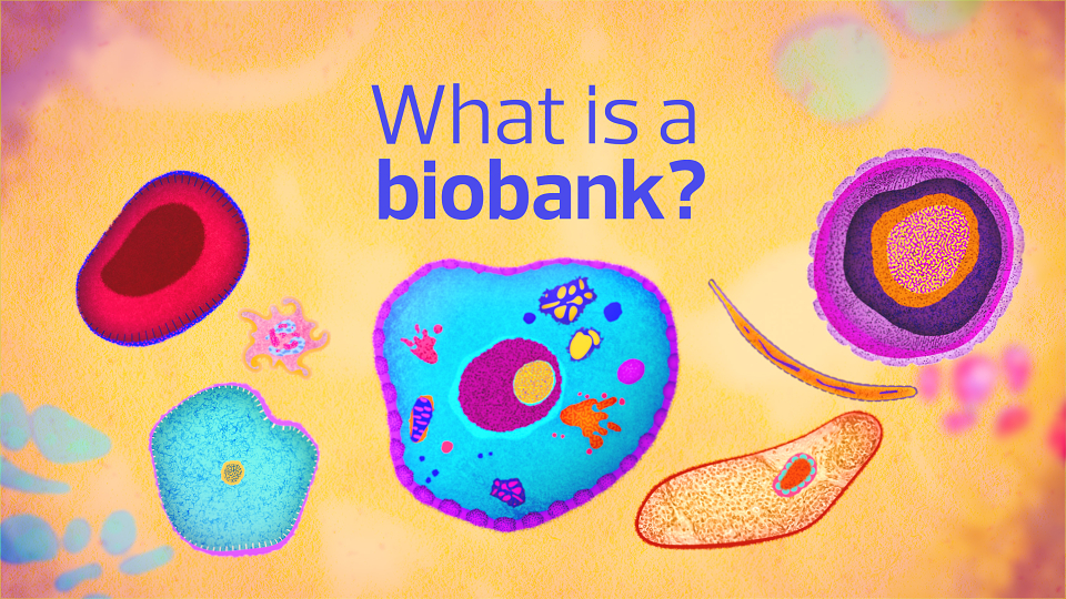
The illustration and animation were commissioned to explain how biobanks support cancer research. My role was to illustrate complex concepts for animation in a clear, transparent and human way, to help patients and the wider public see the real-world impact of participation. The film was created for the KHP in association with Guy’s and St Thomas’ NHS Foundation Trust.
The Brief
The illustration and animation were commissioned to explain how biobanks support cancer research. Using simple storytelling and visual metaphors, the animation’s role was to:
- Explain how biobanks support cancer research.
- Show how the samples and data are used responsibly.
- Help patients and the public see the real-world impact of participation.
- Build trust through clear communication (trust is essential for progress in cancer care)
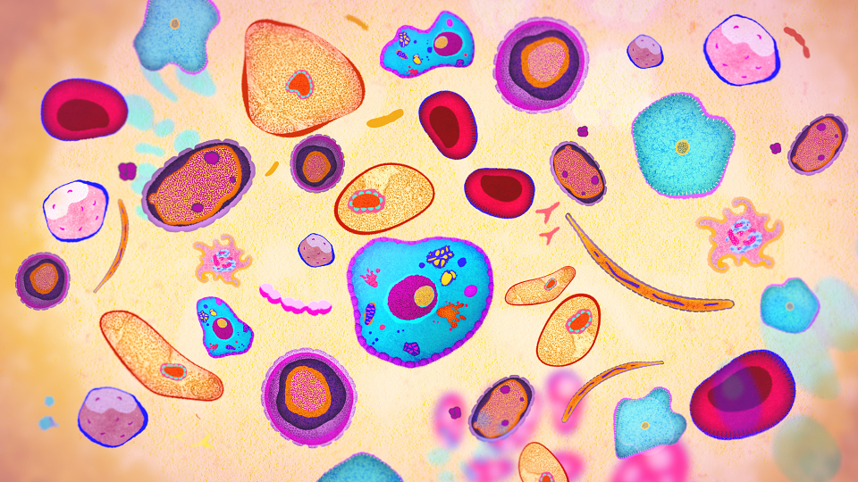
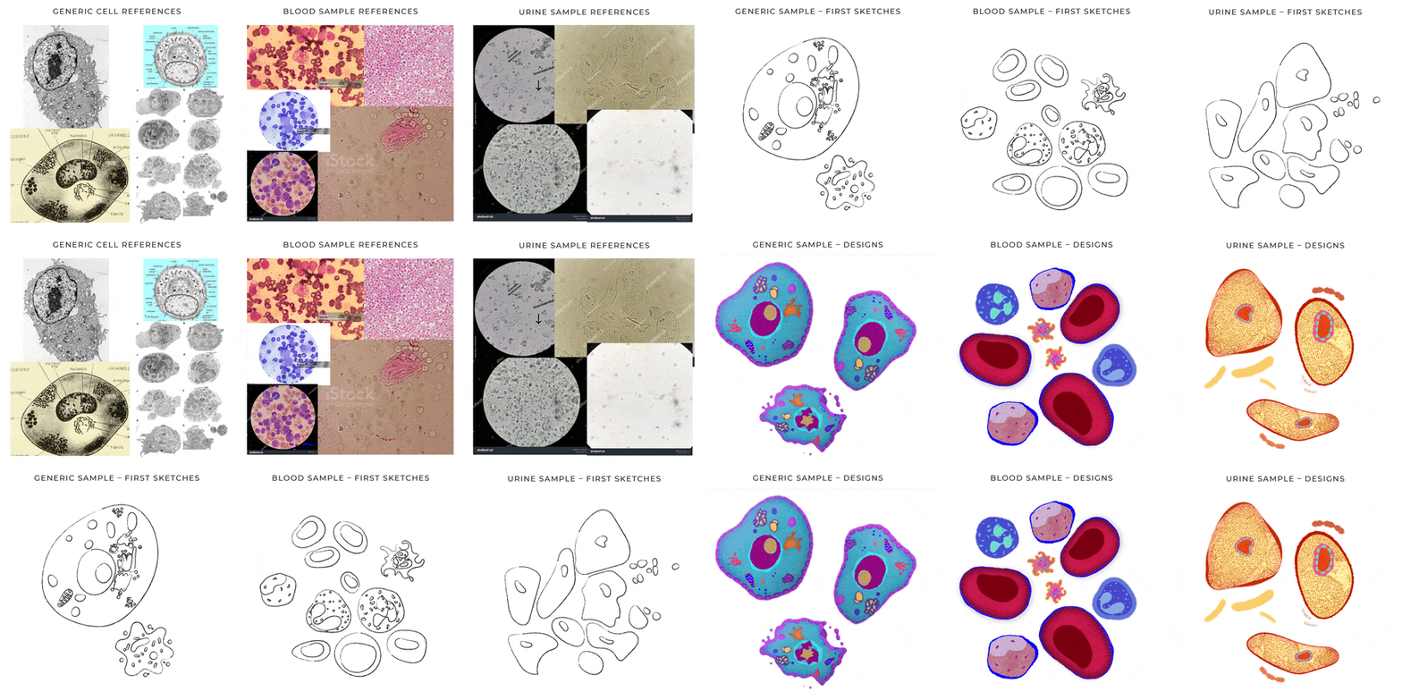
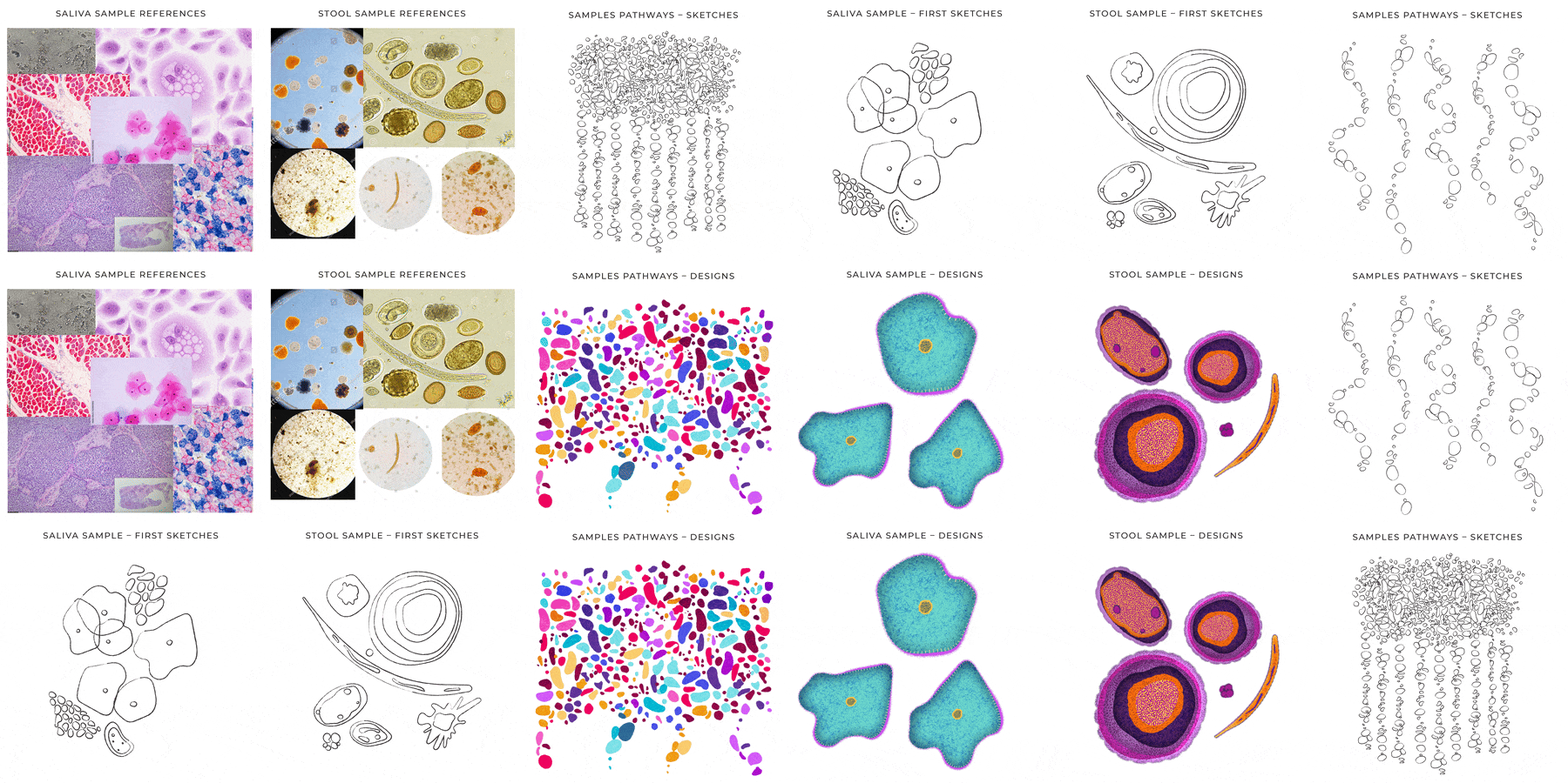
In terms of branding guides limitations and consistency, the brief was quite loose. I was able to define my own colour palette for the illustrations, and it allowed for creative exploration with various textures and shapes.
The Concept
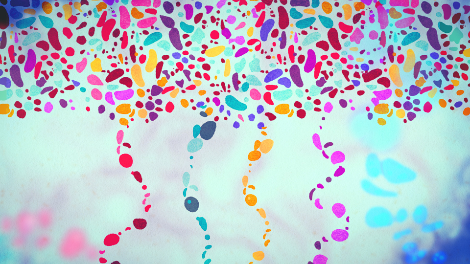
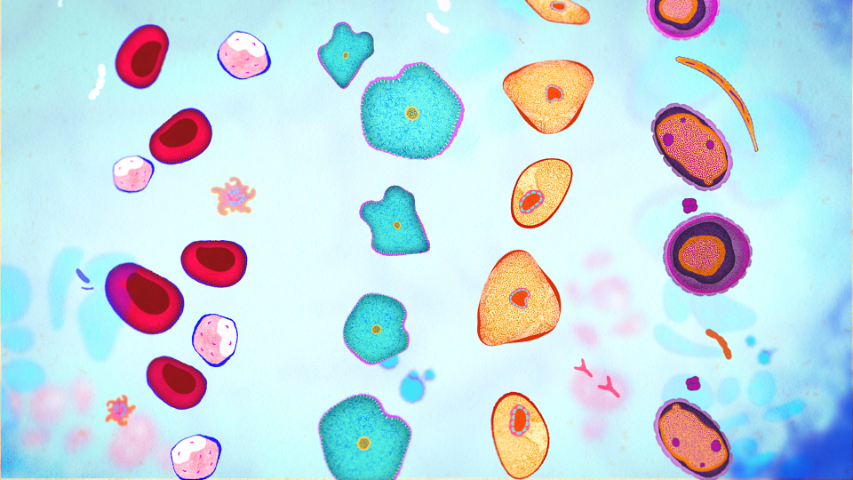
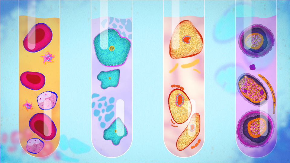
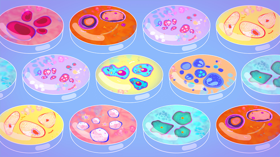
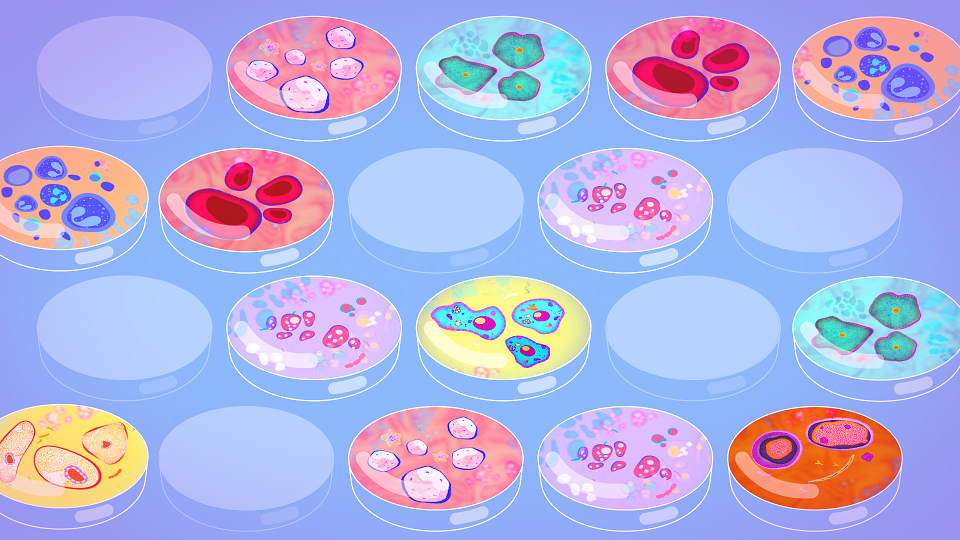
The concept was to visualise the journey of cell samples: from the moment they are collected, through processing and storage, to the point where they are placed in Petri dishes for treatment testing and later used and stored by researchers.
The Process
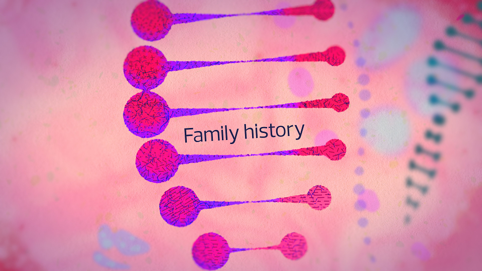
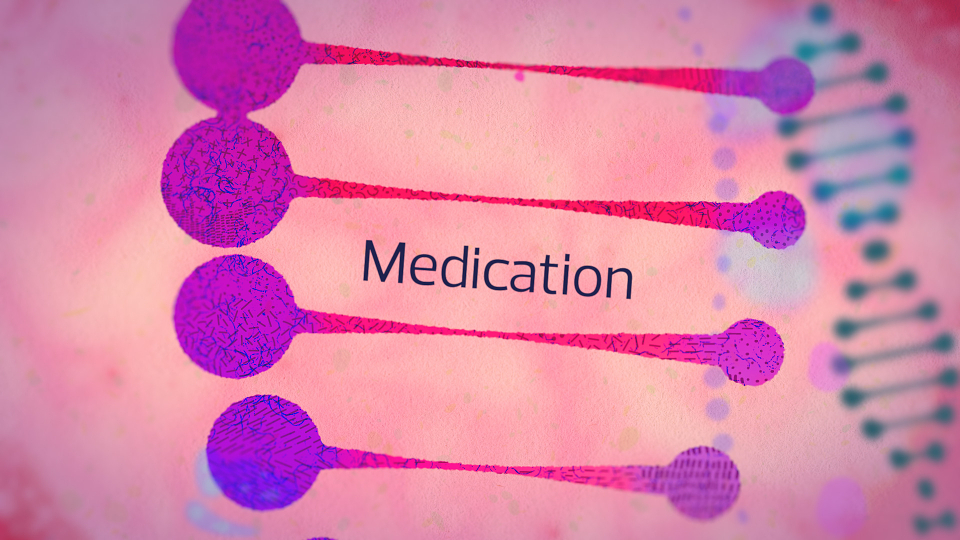
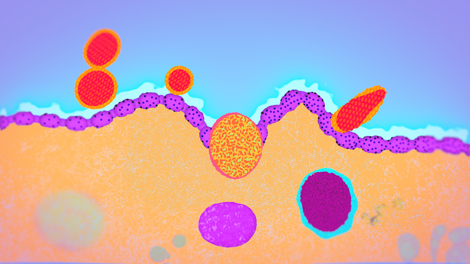
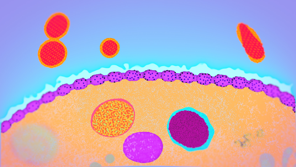
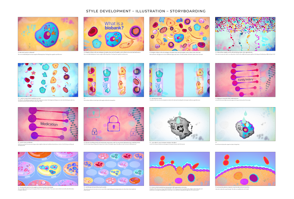
A first stage was to come up with a look and feel so I created 4-5 still frames illustrating some of the script lines which were chosen together with the producers during the brainstorming session.
The Execution
The video was edited and animated in-house by the CH Video team. I created illustrations, detailed static frames and suggested ways to animate and transitions for each line in the script.
The illustrations were animated in-house by CH Video and formed roughly 1 minute animated sequence of a total of a 2.5 minute film.
My Role: Illustration, Art Direction
Production Company: CH Video
Editing & Animation: Aidan Patterson, Sam Thorpe
Producers: Madeline Razzell, Ashleigh Chahin
MADEIT CREDITS
-

King's Health Partners Cancer BiobankClient
-

Angela GigicaIllustrator, Senior Motion Graphics Designer
Annual 2026 BronzeWhat is a biobank?Illustration
Project featured: on 18th February 2026