Matt
Art Director
ABOUT
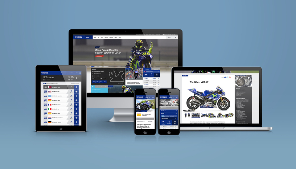
Yamaha Motor Europe tasked us with re-designing their Yamaha Racing dotcom. The brief called for a refreshed, modern and engaging platform that would act as the primary point of contact between racing fans and the brand.
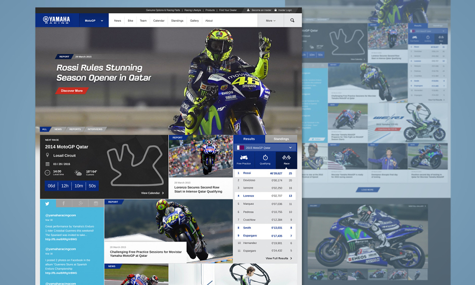
The new site is bolder, more impactful and more stimulating, in keeping with the adrenaline-soaked world it showcases.
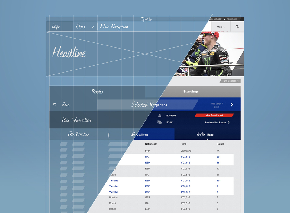
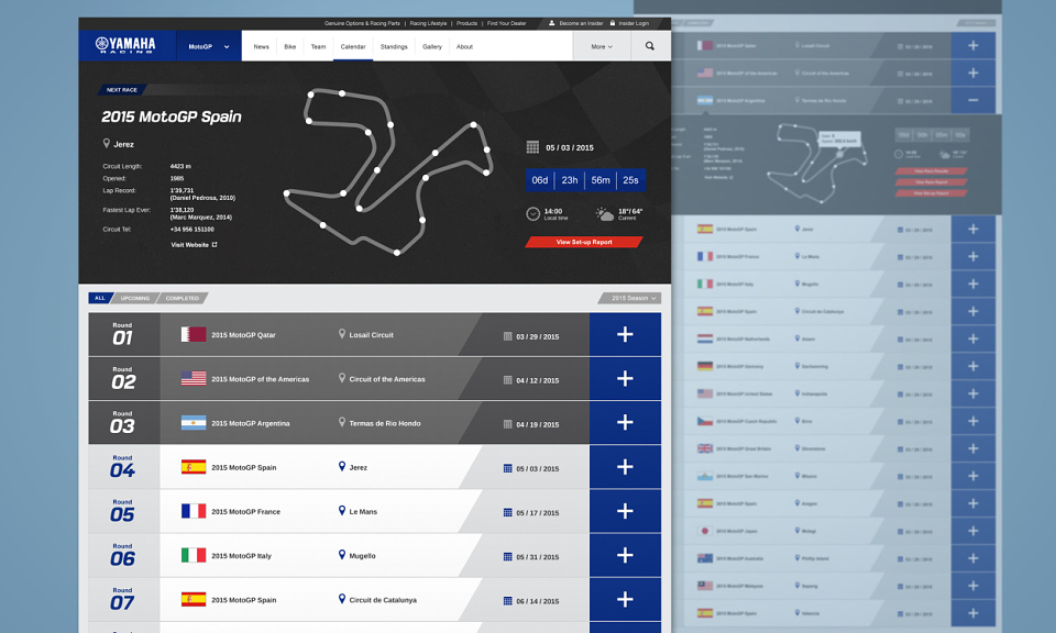
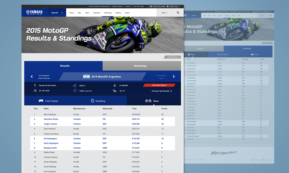
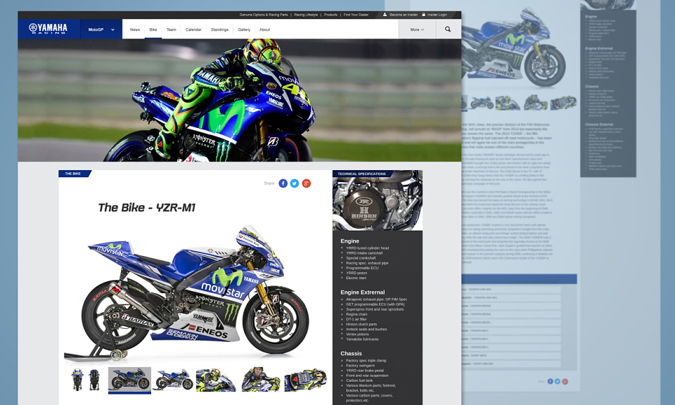
After assessing the entire site and its interdependencies, we identified user issues and used these insights to inform our site map, IA and creative approach. Although the previous site had an abundance of content, that content wasn’t easily accessible. To remedy this, we ensured that the new design, though more visceral, presents key information in a clear and logical manner.
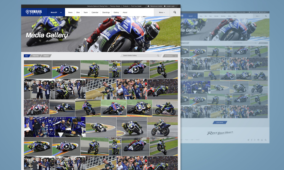
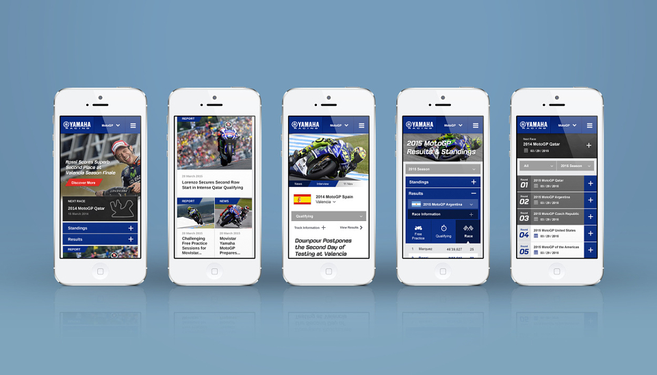
Yamaha Racing’s identity is strengthened with greater use of the brand’s colour palette, whilst bold grids and impactful imagery pump up the adrenaline. With an interface layer that presents content efficiently and responsively across all devices, Yamaha Racing is accessible wherever and whenever.
The new Yamaha Racing site is not only more visually stimulating, but in meeting racing fans’ needs and expectations it’s also more useful, accessible and rewarding.