The Foundry Types Ltd
London
ABOUT
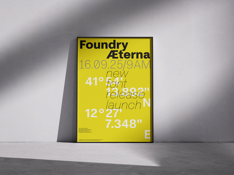
With the persistent reliance on ubiquitous, overused Neo-Grotesk typefaces in visual culture, a deeper issue comes into focus, one of complacency, sameness and creative stagnation. What began as a pursuit of clarity and neutrality has calcified into default thinking, where type design no longer challenges or contributes, but merely fills space. In response to this same-old cycle, Foundry Aeterna was conceived not as another revival or facsimile, but as a decisive, thoughtful interpretation of how a Neo-Grotesk should be for modern typography, in the new digital age. Grounded in the lineage of modernist foundations and minimalist principles, yet unafraid to speak with distinct tone, rhythm and detail. Foundry Æterna distils over a century of typographic nuance into a versatile, expansive family tailored to communicate with purpose, precision and presence.
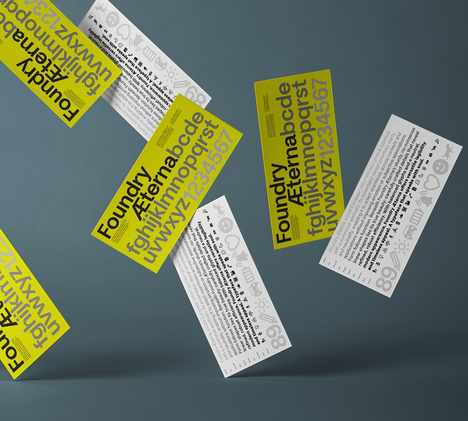
Foundry Æterna, a bold European, informed Neo-Grotesk typeface, with a workhorse aesthetic. Its essentialist design prioritizes clarity and neutrality, enabling it to adapt seamlessly across contexts and applications without imposing emotion or subjective associations. Form follows function. Beneath Foundry Æterna’s sturdy, no-nonsense linear shapes lies its true beauty, carefully crafted details that reveal refined, robust efficiency. With balanced glyphs and a neutral, modern appearance, Foundry Æterna offers versatile legibility and timeless appeal.
What is eternity? Scientists and philosophers have pondered that question since time immemorial. Religious leaders have promised it. Artists, writers and musicians have tried to interpret it. Yet there are no answers, it remains the eternal question. From the Latin word for eternal, Foundry Æterna finds its name.
Harmonious utilitarian letterforms, a large x-height relative to its capitals and compact spacing, imbues a calm readable experience, particularly in smaller text sizes. Closed terminals and a generally rounder Neo-Grotesk letterform promotes a spacious internal structure, without sacrificing legibility. A distinctive hallmark of Foundry Æterna is the subtle, slightly extended terminals ‘a, c, g and s’ and horizontal shaping to the ‘a, f, j, t and y’, details that quietly express its contemporary character.
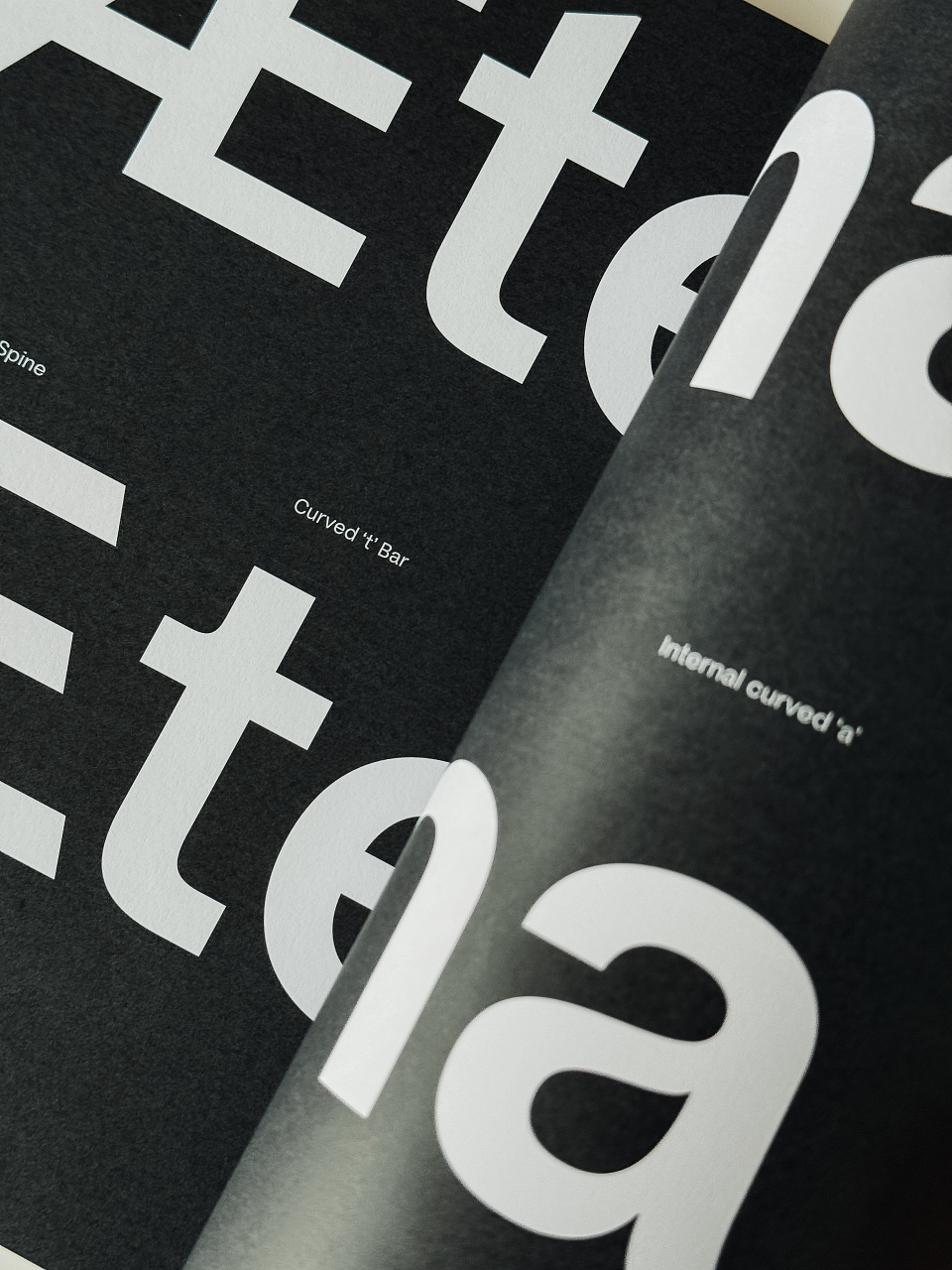
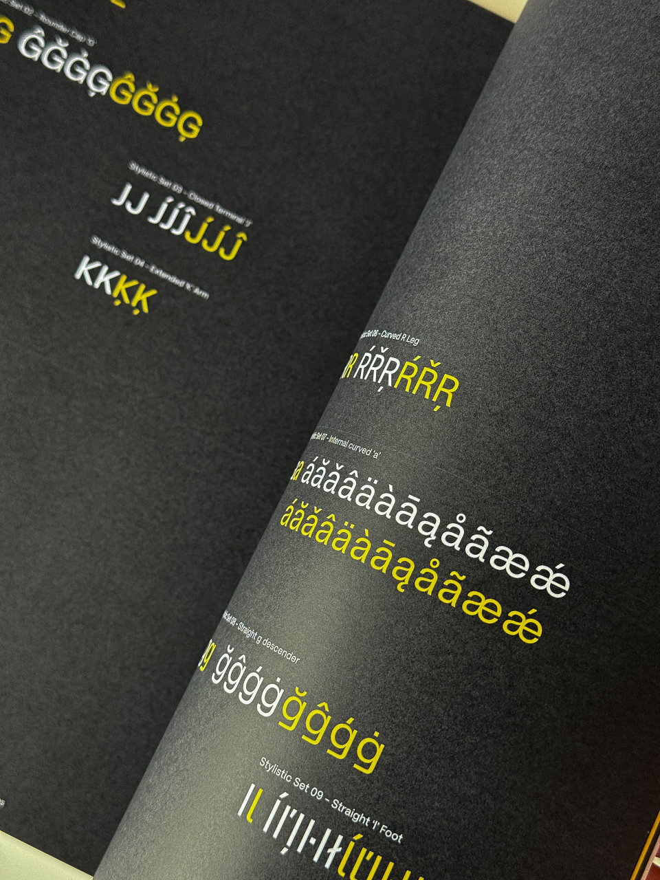
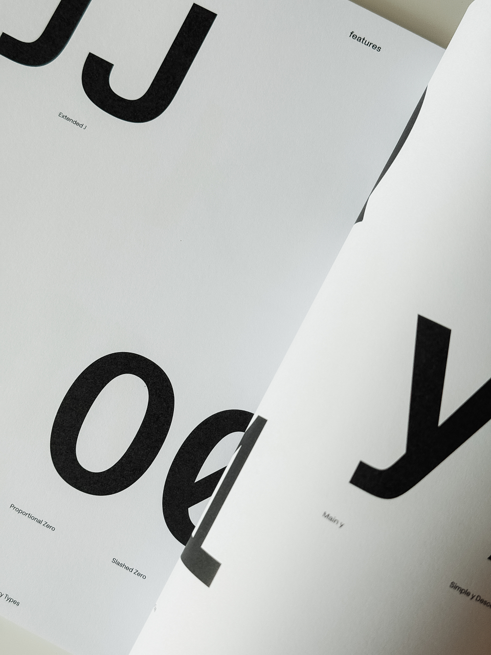
Accessible legibility features include: a distinctive, wider ‘J’, an extended ‘K’ arm, ‘M’s’ centre Vertex raised and an extended through ‘Q’ tail in the capitals. The lowercase features consist of: an ‘a’ with a serpentine internal shape with a flared stem stroke, a double storied ‘g’ and an alternative straight descender stroke, a lowercase ‘l’ with a horizontal foot (for enhanced legibility), the ‘t’ through bar is curved and a straight ‘y’ descender.
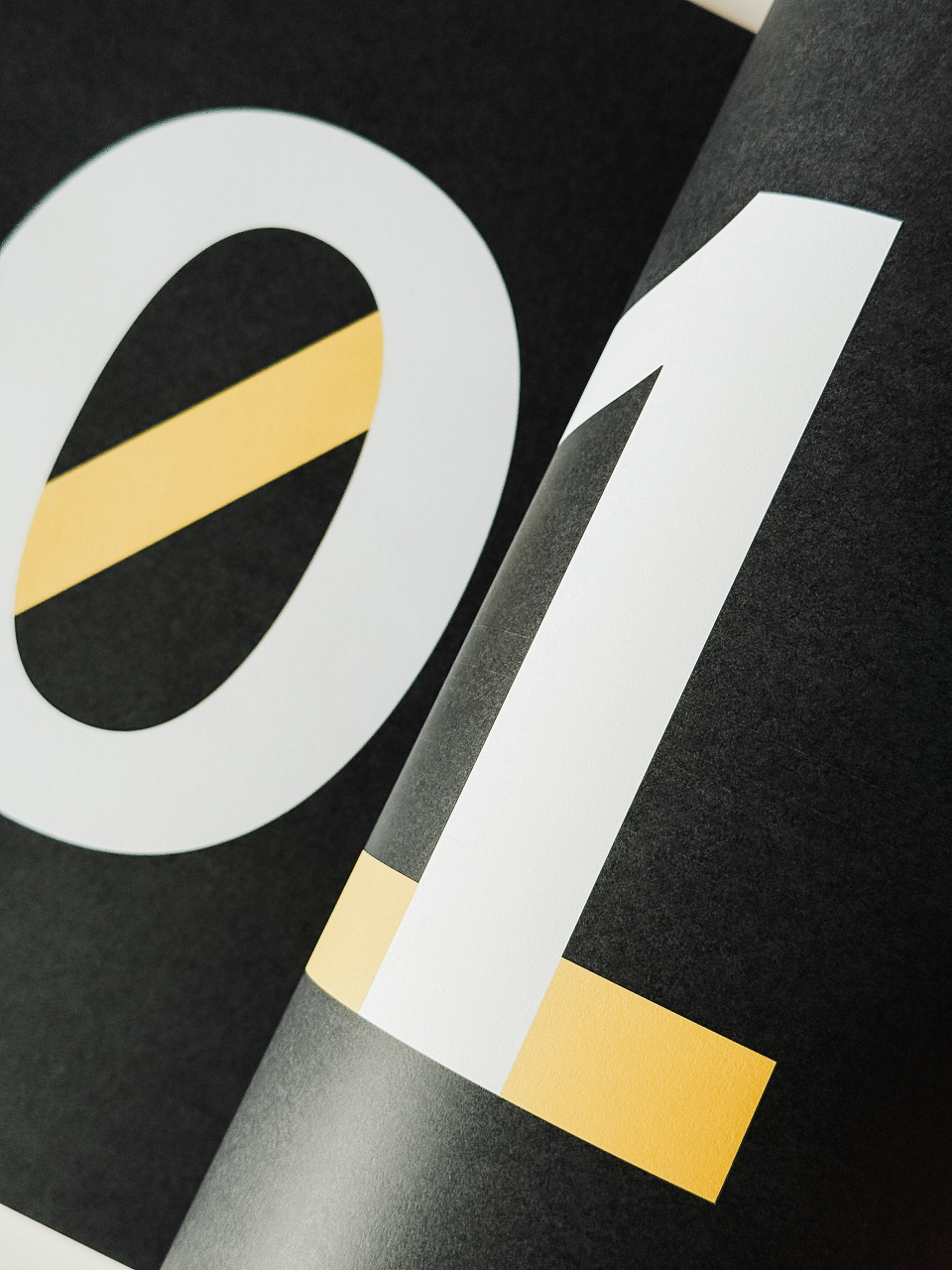
Foundry Æterna includes thoughtful alternate forms to enhance clarity and character recognition. These include a slashed zero for disambiguation, a figure one with a baseline bar in the tabular set and three distinct ampersand styles: one featuring a straight diagonal, one with a horizontal terminal and another based on the Latin word ‘et’. Each of these elements is designed to support optimum legibility across various contexts.
Alongside the typeface, Foundry Æterna includes a collection of over 290 meticulously designed icons and symbols. Created to support a broad range of applications: from transport and user interfaces to information systems and wayfinding. The Symbol set is built on the typeface’s capital height, aligned to the baseline and centrally spaced for seamless integration and ease of use.
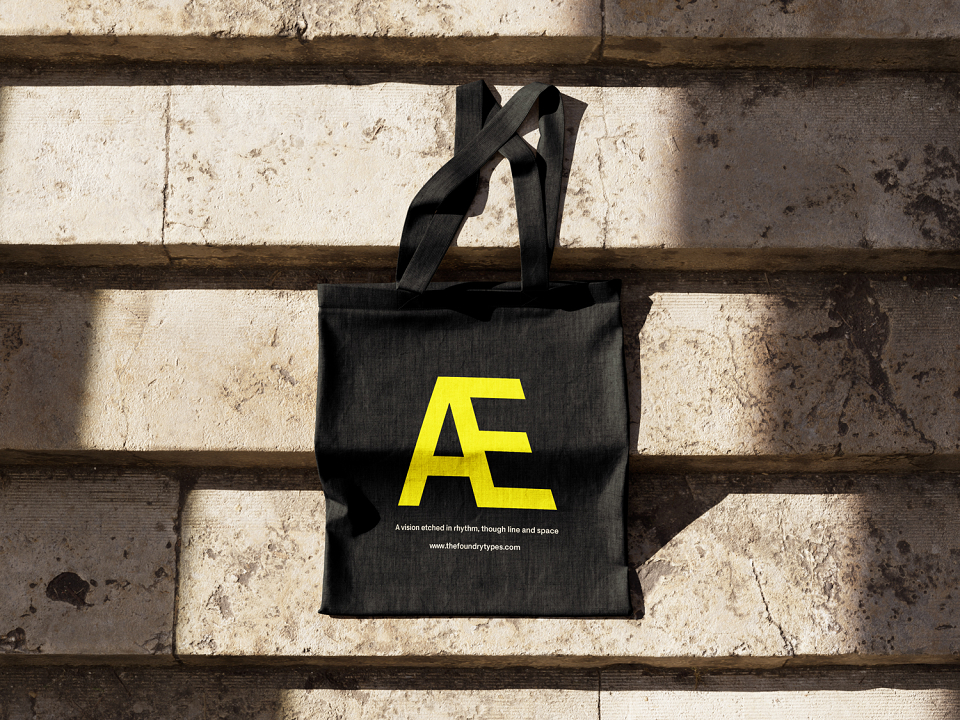
It is not merely a typeface, but a feeling spoken through form, a vision etched in rhythm, through line and space, the essence of visual harmony. Foundry Aeterna calls designers to go beyond the ordinary, inviting type to become more than a tool, a voice that speaks with soul.
David Quay, (Director/Designer – The Foundry Types)
“Foundry Æterna is a Neo-Grotesk crafted for timeless clarity, balancing modernist and minimalist principles with humanist nuance. Designed for versatility, it thrives in both digital and print, offering designers a modern classic that feels enduring yet distinctly contemporary”.
David Bennett, (Creative Director – OPX)
“It was great to see The Foundry Types create a contemporary sans serif typeface full of character. The range of weights is impressive, and the inclusion of symbols adds a smart extra layer. We’re currently working together on a printed behind the scenes book that reveals the sketches and testing process it’s a joy to work with.”
Stuart de Rozario, (Director/Designer – The Foundry Types)
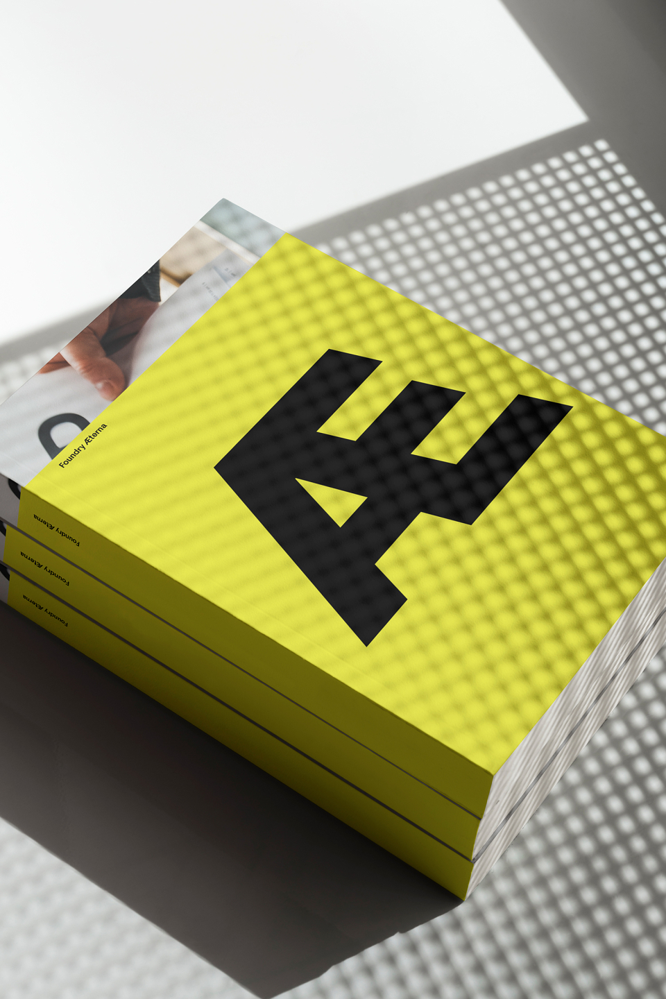
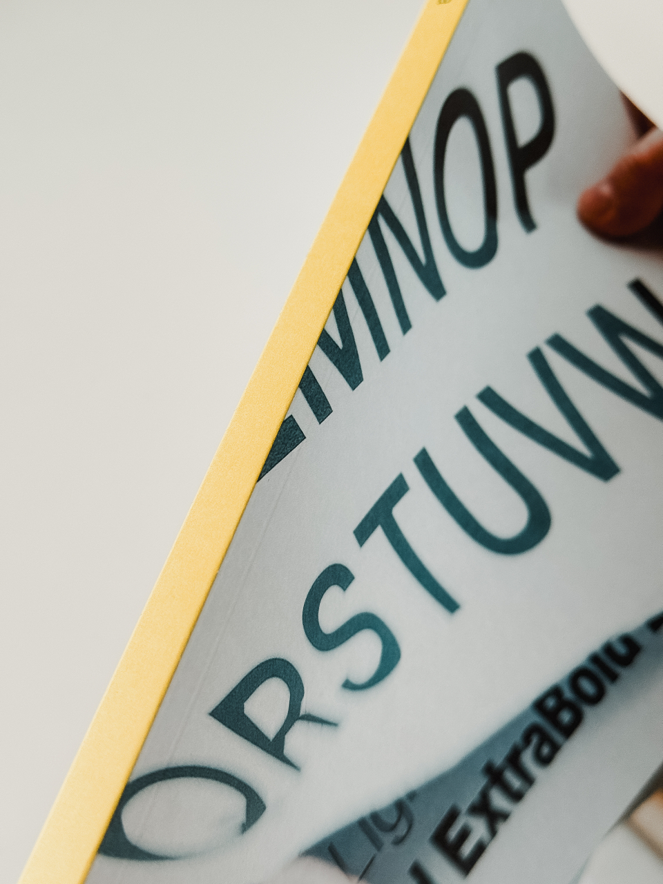
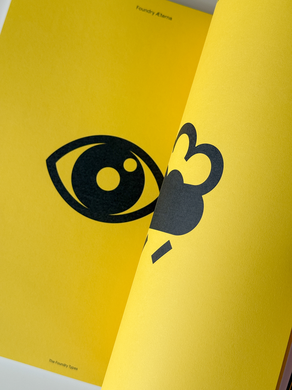
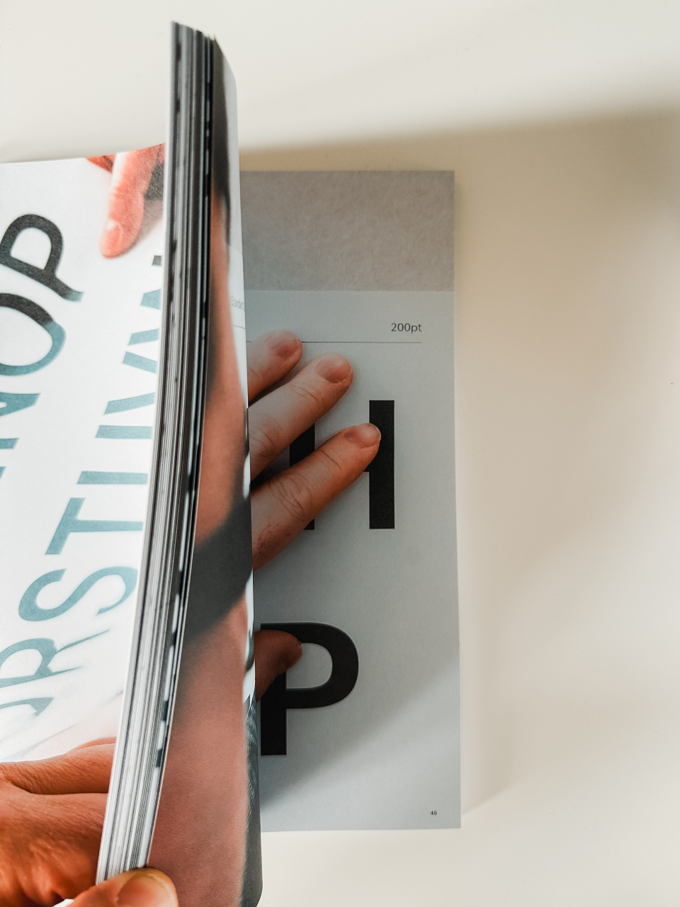
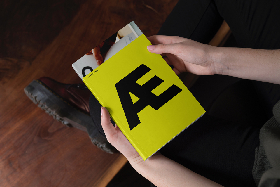
“OPX saw the development of Foundry Æterna at an early stage and brought their unique dynamism and energy to create a book that showcases the journey of designing a typeface. It’s a visual documentation of pencil sketches, digital drawing, on-screen development and font mastering. By opening a window into its processes, this book superbly visualises the decisions, experiments and iterations that shaped its final form”.
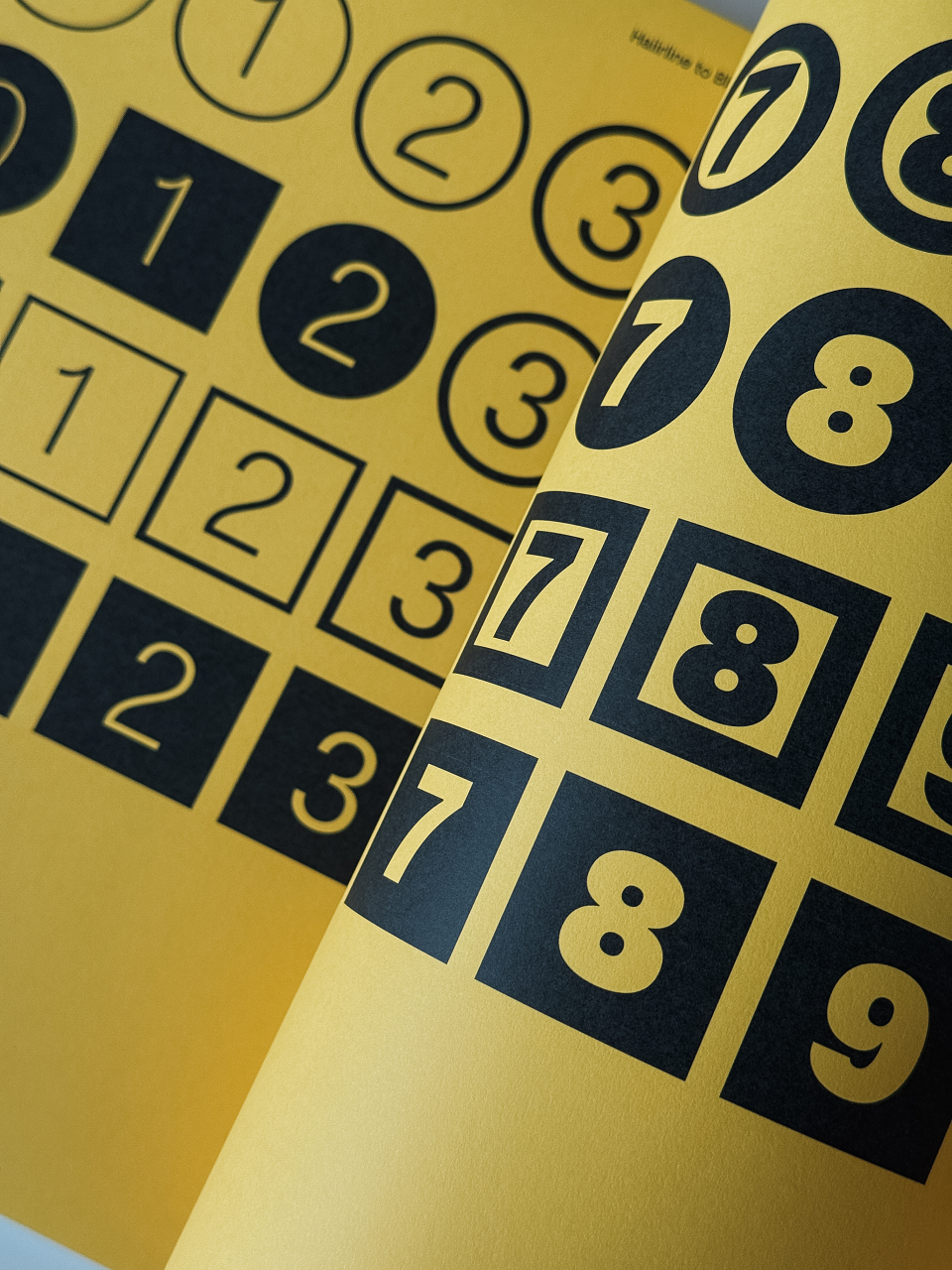
Foundry Æterna comes in 19 styles, consisting of: Hairline, Thin, ExtraLight, Light, Regular, Medium, Bold, ExtraBold, Black and the Symbol set. Each Roman weight comes with their accompanying Italics. The character set includes 20 Stylistic alternative features, with a set of positive and negative circled and squared numbers, a Bitcoin symbol, arrows, extended ligatures including a ‘www’ ligature.
Additionally, Foundry Æterna is now available in OpenType and TrueType formats for Desktop, WOFF and WOFF2 for Web and as a Variable Font on complete family purchases. The Variable font version offers a great range of benefits such as reducing file size and almost infinitum styles ranging from the Hairline through to the Black. Foundry Æterna is available exclusively from The Foundry Types and as a trial font.
Photography © David Bennett, OPX Studio.