Elmwood
London
ABOUT
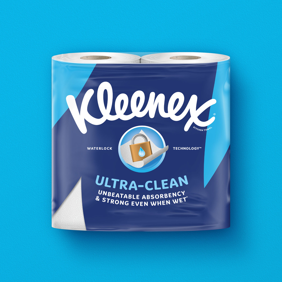
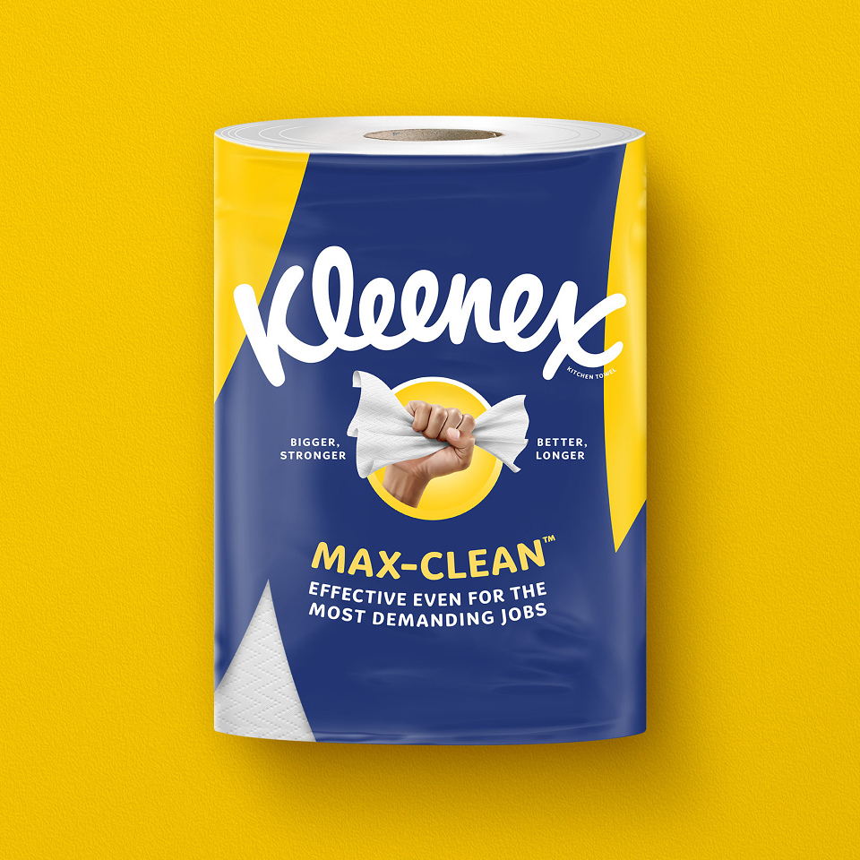
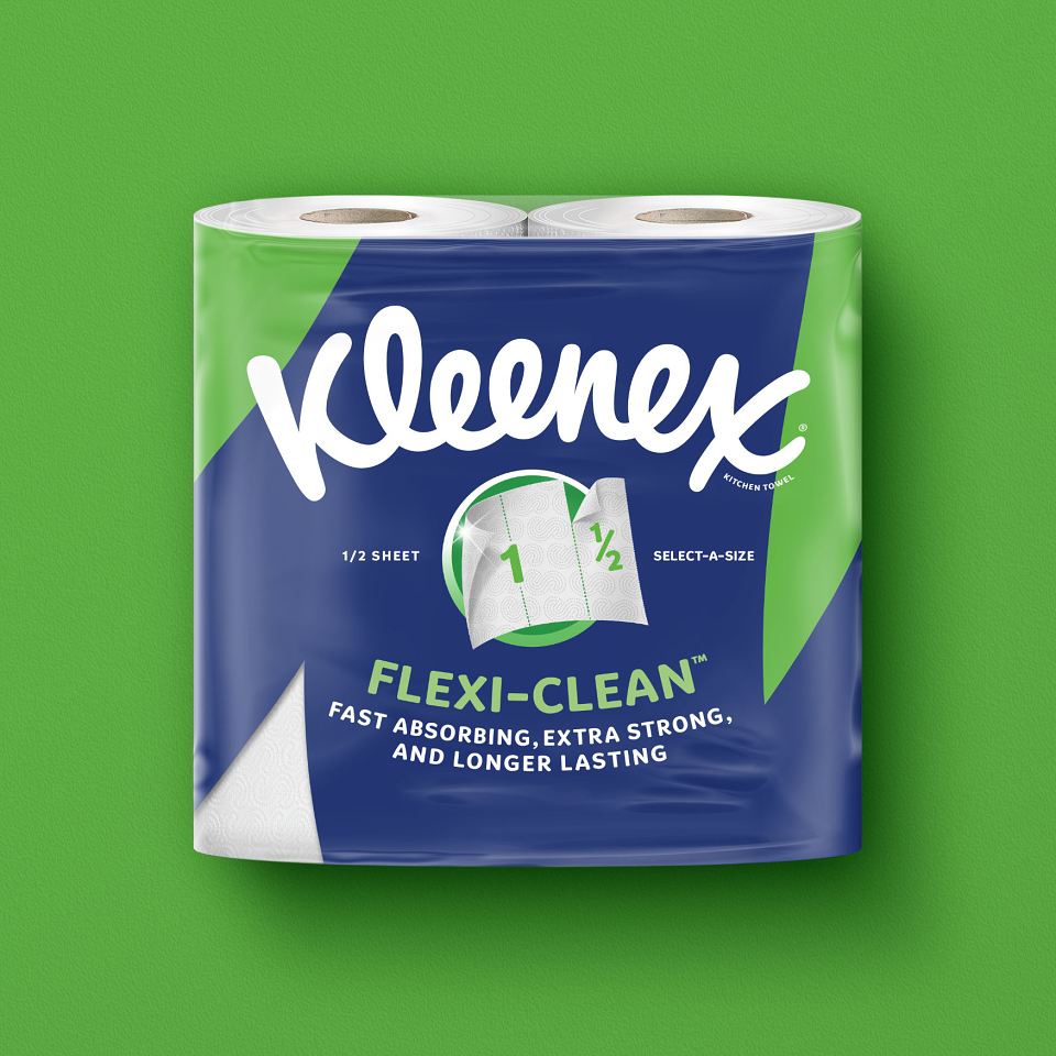
Already a household name in facial tissues, Kleenex wanted to break into the kitchen towel category in Western Europe.
To do this required a design that cut through the clutter of the category. Inspired by the flowing curves and loops of the Kleenex logo, Elmwood London created a bold design that visually captured the motion of cleaning, whilst allowing for individual product benefits to be communicated.
The Kleenex-blue wipe flows from pack to pack, unifying each variant, whilst allowing a bold pop of variant colour to help navigate in the crowded kitchen roll aisle. The individual product benefits are visualised proudly in the centre to highlight each product’s USP.
The simplicity allows Kleenex to lead the way and cut through the noise and complexity of dated category codes at shelf.
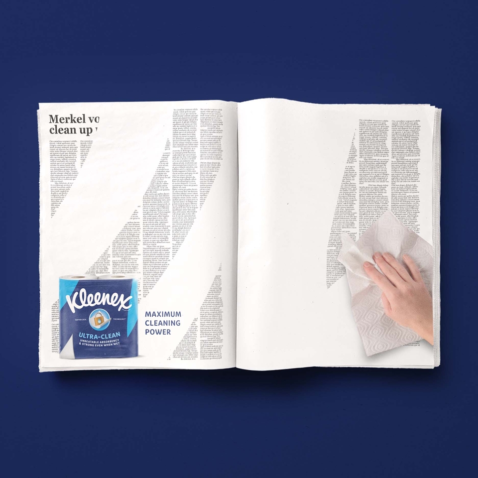
To help launch Kleenex’s first kitchen towel in Western Europe we brought the idea to life, showing how the wiping motion could be used off-pack to communicate the product benefit through advertising and beyond.