PepsiCo Design & Innovation
New York
ABOUT
A bold new chapter unfolds for Lay's with our ambitious global refresh!
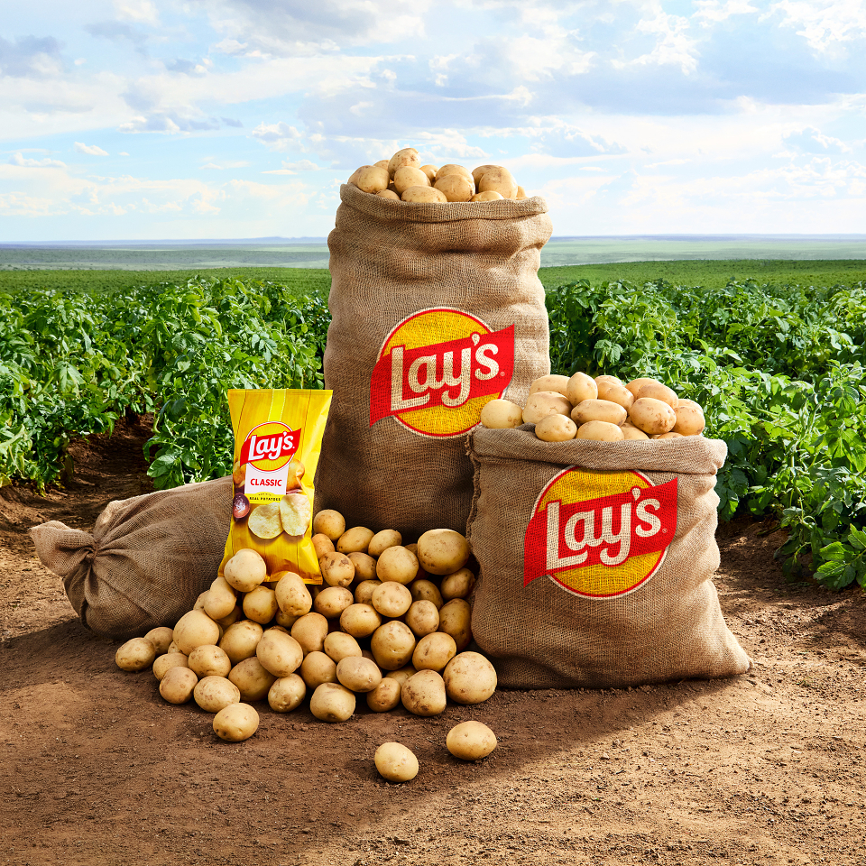
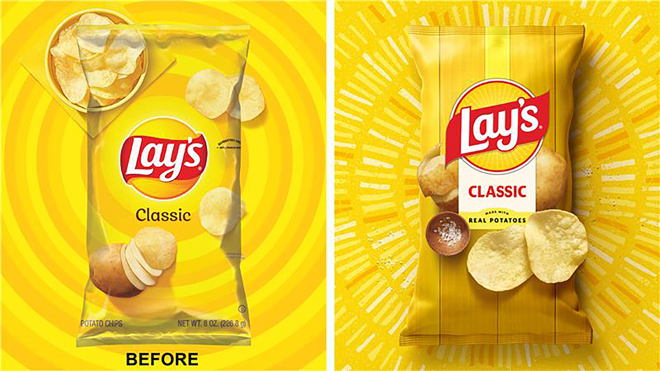
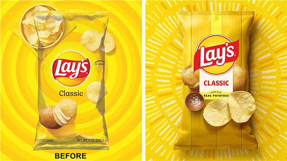
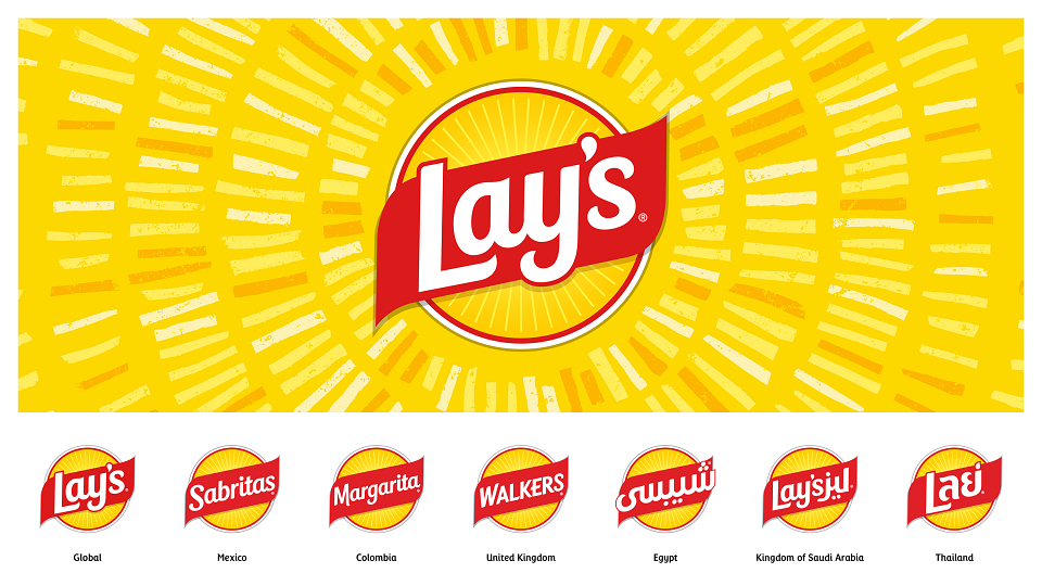
Building on nearly a century of bringing joy, our reimagined visual identity draws inspiration from the farm, the potato, and every chip, crafting a story reflected on every bag. We've refined the iconic Lay's yellow sun and red ribbon that people know and love, adding warm, energetic "Lay's Rays" to the wordmark. A joyful custom typeface and flavorful food imagery pay homage to Lay's origins on the farm, celebrating both the chip and the brand.
The new visual direction, designed in-house by PepsiCo Design & Innovation, celebrates the potato with a fresh, energetic style that highlights the famous chips’ ingredients and harnesses the power of the sun. Lay’s new look reinforces the brand’s commitment to providing the best experience for fans. Updated design elements include:
· New Logo: The new logo strengthens consistency and connection across Lay’s many varieties and the countries it’s enjoyed in. The logo enhances Lay's distinct yellow sun and red ribbon that evokes the quality of Lay’s potatoes, now with a refined signature font and upward angles for an element of upliftment.
· Lay’s Rays: The beams of light exuding from the Lay’s logo – known as Lay’s Rays – bring focus and energy to the heart of the new visual identity, paying homage to the sun that powers the quality ingredients inside every bag.
· Typeface: The debut of a new custom typeface perfectly pairs with the iconic logo. Designed to echo the Lay’s modern, yet joyful character, the handcrafted type unifies every touchpoint and drives the new visual identity forward.
· Color Palette: In addition to Lay’s signature sunny yellow, a refined color palette pulls hues from the ingredients of Lay’s recipes, including savory red, hickory brown, pickle green, and more.
· Backdrop: In the pack’s backdrop, the potato and other ingredients are positioned against wood grain slats, a nod to the farm crates that house Lay’s ingredients and the picnic tables where bags are often shared and enjoyed by friends and families.
This redesign, the brand’s biggest in nearly a century, is a love letter to our origins,” said Carl Gerhards, Senior Director of Design, Global Lay’s. “With the new Lay’s visual identity, our team created a flexible design system that celebrates the brand’s famous flavors in countries around the world. Every detail—from the sun-inspired logo and rays to the red ribbon seal and rich imagery—was crafted to honor Lay’s legacy while inviting people to connect with the quality ingredients and real stories behind every bag.”
This new visual identity marks a transformative new chapter for Lay’s, creating exciting ways for consumers to see, taste, and experience the quality and care behind every chip. Celebrating the potato’s farm-to-chip journey and the quality behind every Lay’s recipe, the refreshed design, immersive storytelling, and memorable moments help fans rediscover their love for Lay’s and show that every bite is crafted with care.