Soraia Soares
Brand Designer
ABOUT
Dr. Vanessa Azevedo is a nutritionist and she helps women to lose weight permanently. She felt the need to have a brand that would communicate the right message to her target audience and thus create a deep connection with them.
With a unique personality, the brand conveys elegance, transparency, determination, positivity and a lot of sophistication.
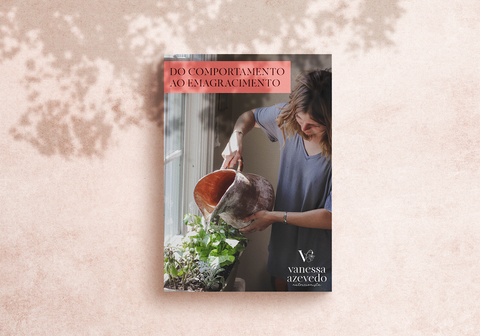
During the during the discovery phase, talking about how her consultation works, Dr. Vanessa told me that she uses an analogy with her patients that helps them during their weight loss process, which is the "Mudinha" (like a little plant growing).
The patient is like a little plant and food reeducation is like a seed that we plant and we need to water and care for her to grow and thus become a beautiful and healthy plant. The various plants that exist in our world take different times to grow and so it also works with the weight loss process with each woman, because each one of them are unique and each one take their own time.
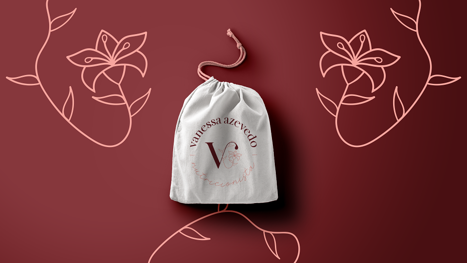
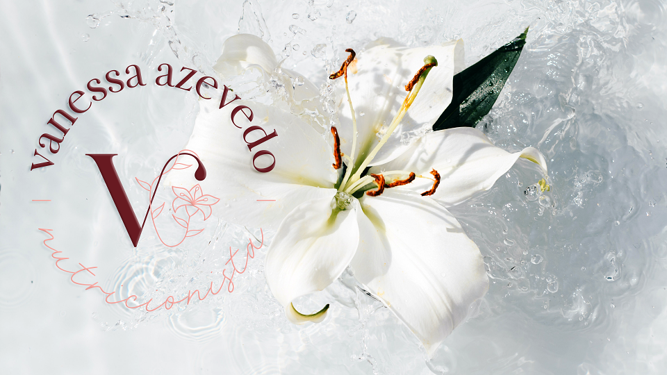
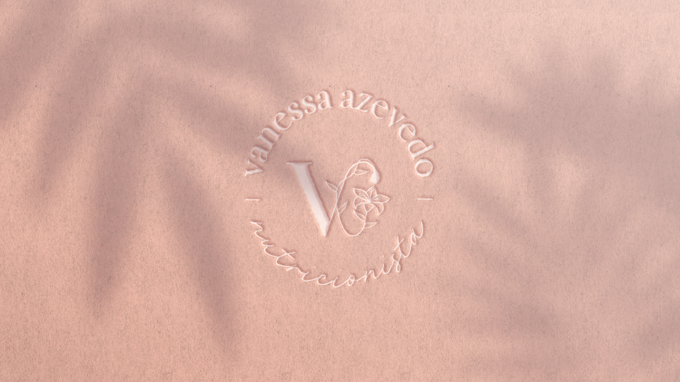
Taking this into account, the symbol consists of three special elements:
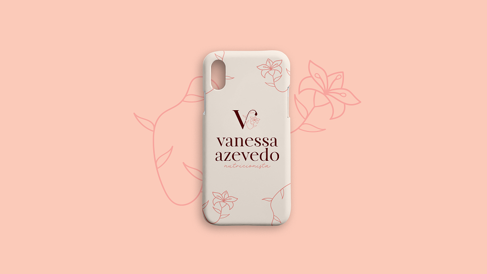
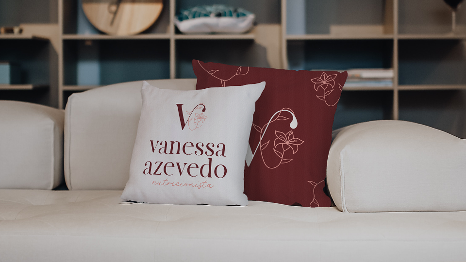
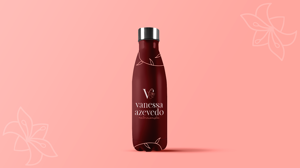
- Letter V: which represents Dr. Vanessa Azevedo and her unique way of helping women in their weight loss process.
- Water Drop: represents the life and growth of seedlings (that is, the evolution of their patients);
- Amarilis Flower: symbolizes healing, hope and full health.
Together it forms a strong and unique symbol, which represents all the essence and purpose of Dr. Vanessa Azevedo.
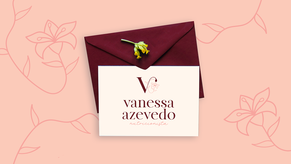
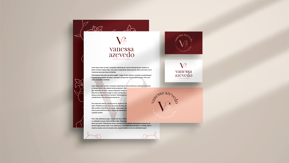
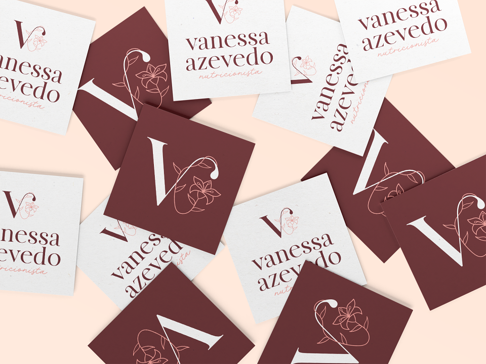
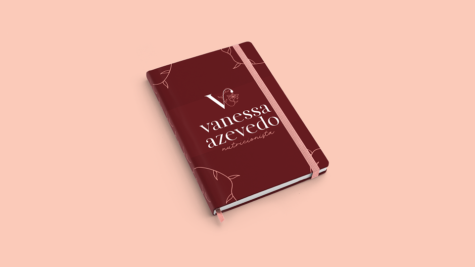
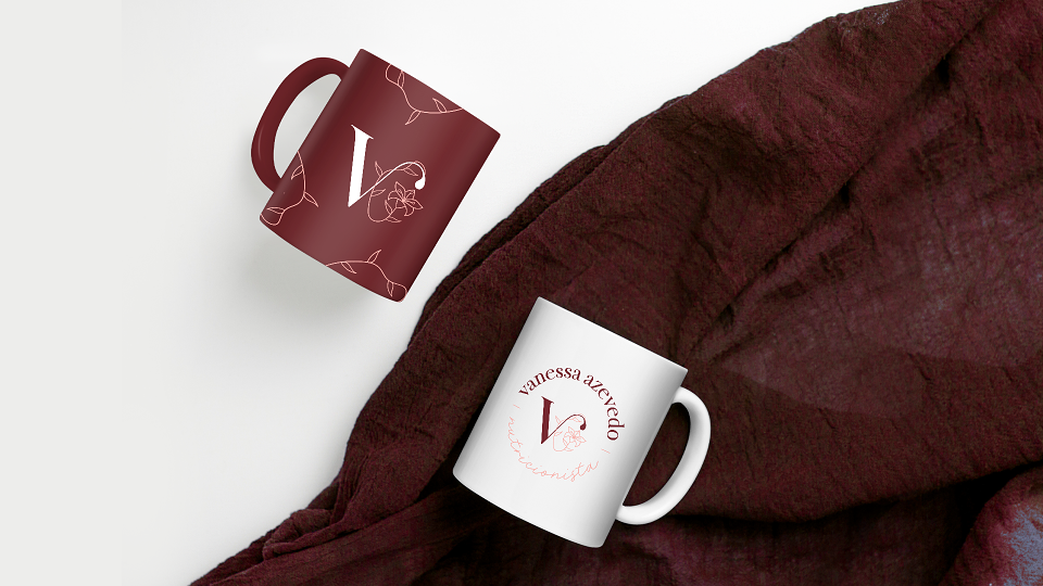
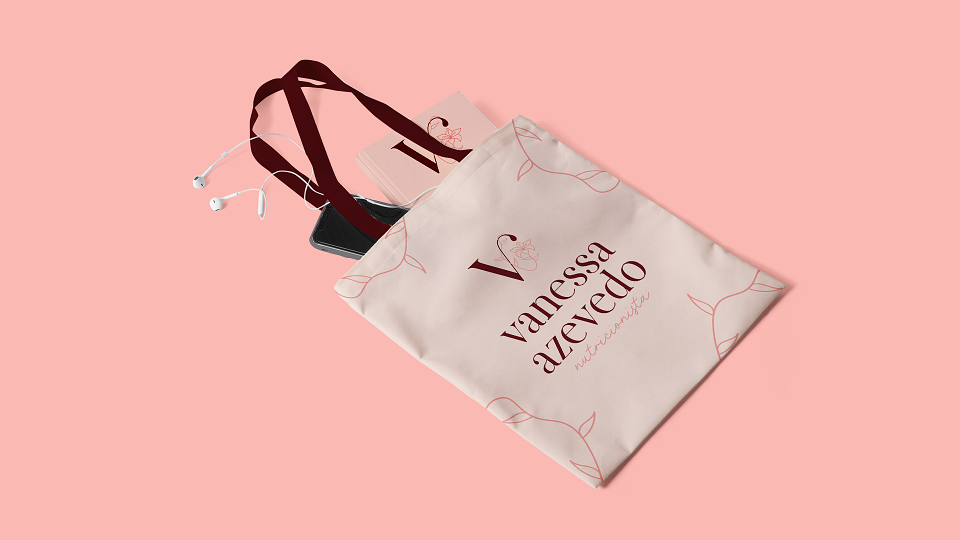
The color palette created has a unique and strong contrast, reminding the lightness and strength of these women who want a better and healthier life.
The typography conveys elegance and sophistication, with only lower case letters used to transmit the feeling of closeness and sympathy.