Soraia Soares
Brand Designer
ABOUT
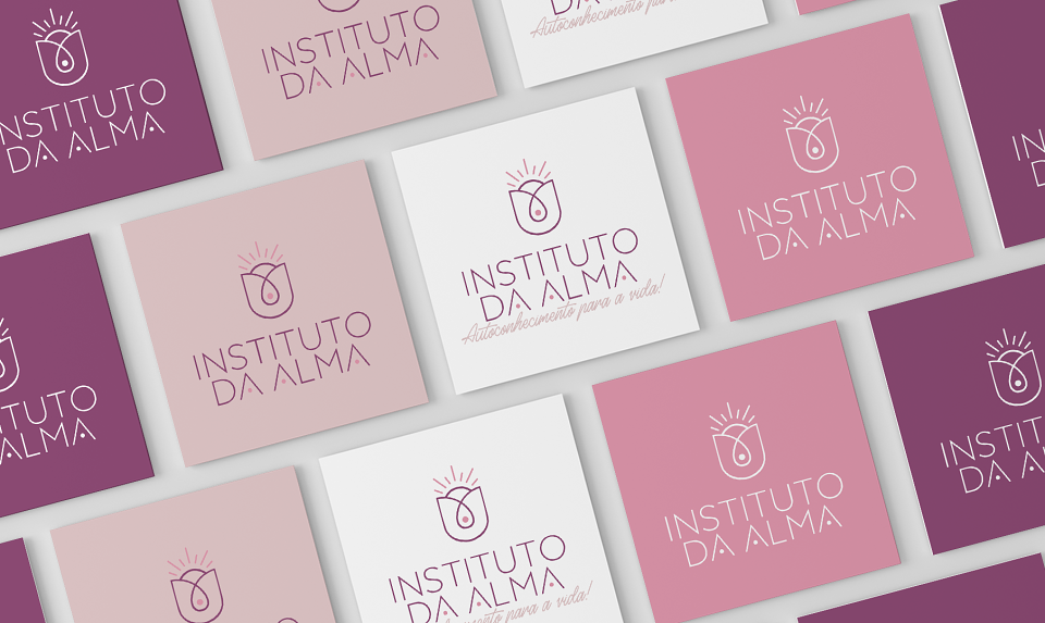
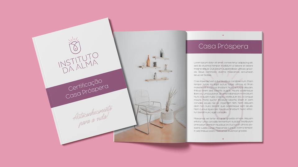
Instituto da Alma (can be translated to "Soul Institute") goes far beyond certification: it will bring a lot of self-knowledge to the lives of its students, making them better people at all levels. People who seek the Instituto da Alma want to evolve not only rationally but emotionally and energetically. With this in mind, the Institute will offer courses that will help these people reach their deepest “I”, reaching their soul. With a wide variety of certifications, its main objective is to train and bring knowledge to each individual in a unique and special way.
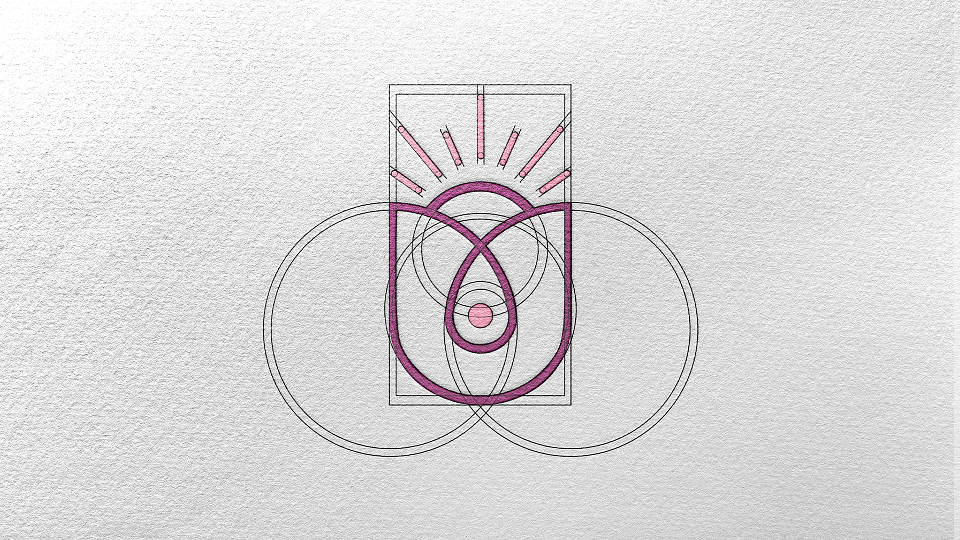
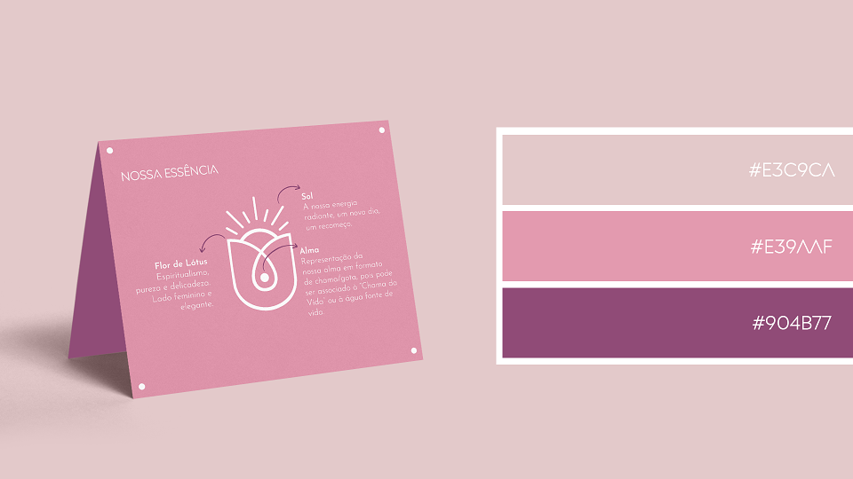
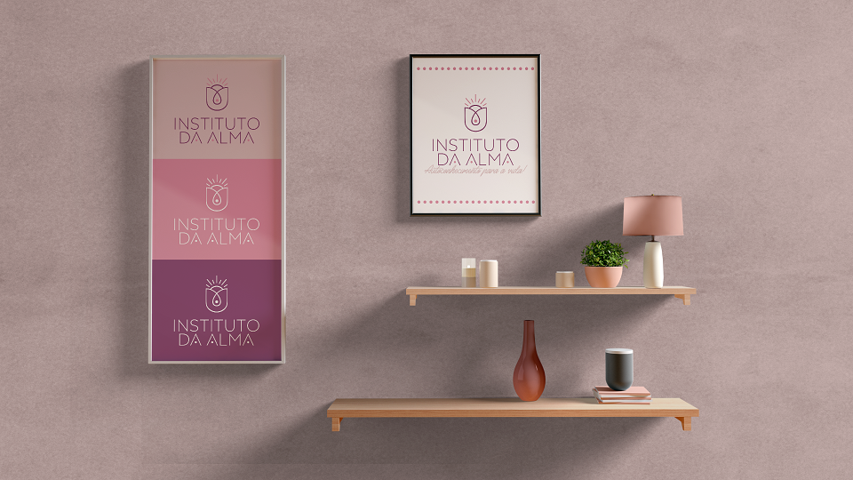
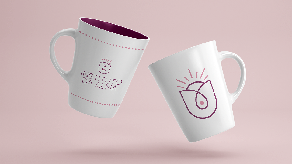
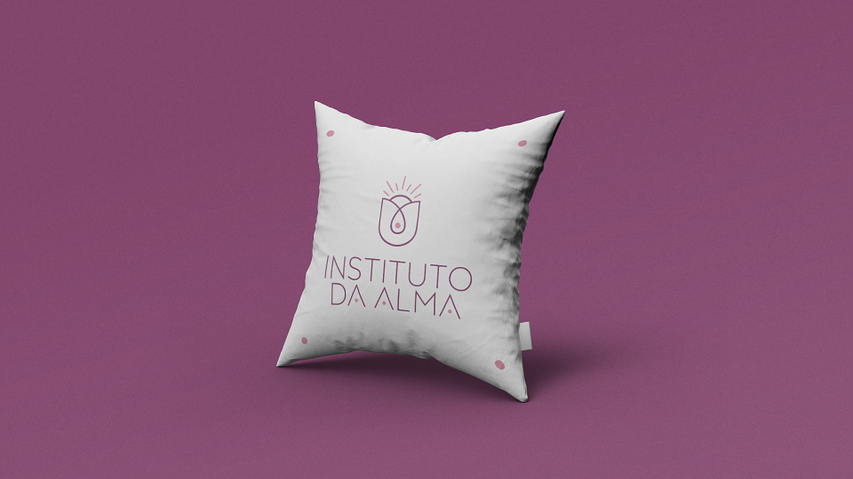
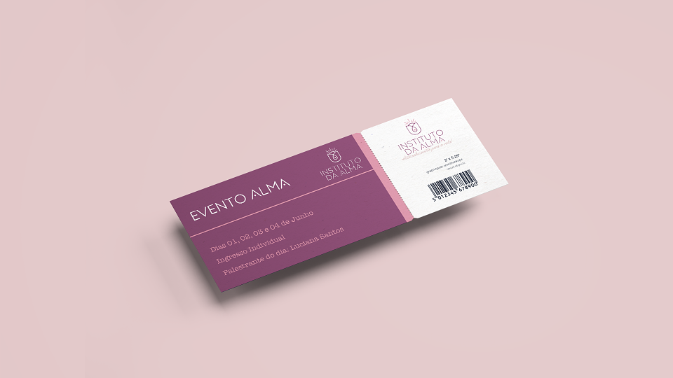
The Brand Identity for Instituto da Alma was inspired by the main concepts of the brand: Energy and Soul; and also in the female target audience. The elements created to combine these three concepts were:
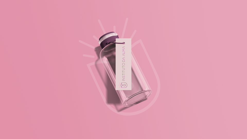
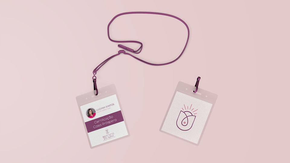
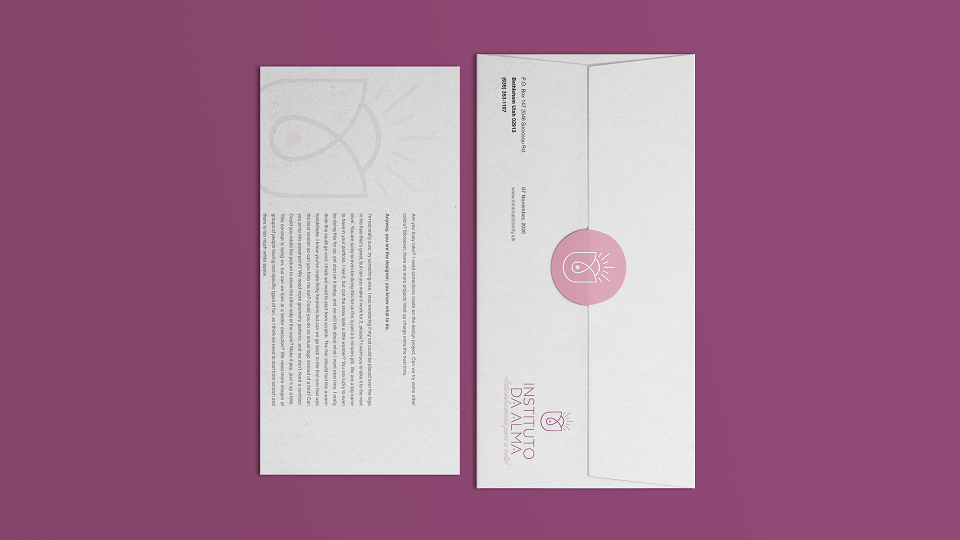
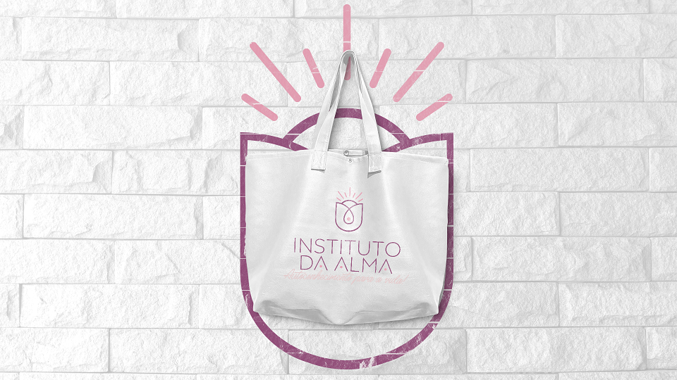
- Sun: which refers to our radiant energy, to a new day and the opportunity to start over;
- Lotus Flower: represents the spiritualism, purity and delicacy of both the brand and the target audience.
- Soul: representation of our soul in the shape of a flame / drop, as it can be associated with the "Flame of Life" or water that is the source of life.