ShopTalk/DEPT®
London
ABOUT
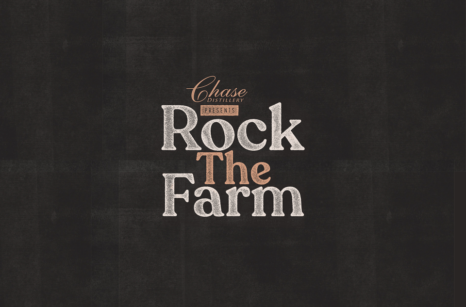
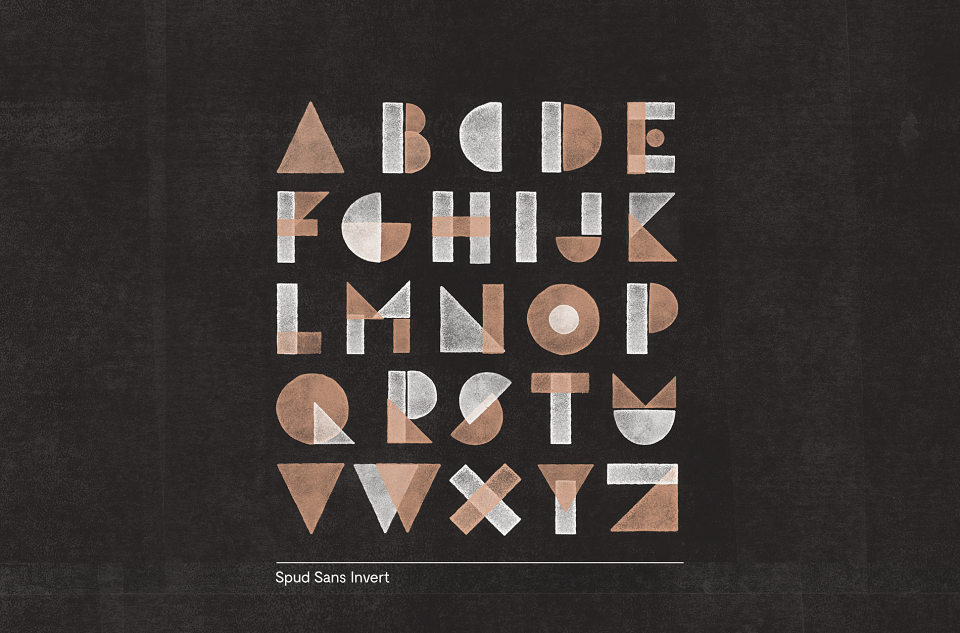
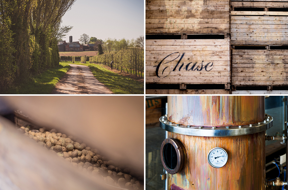
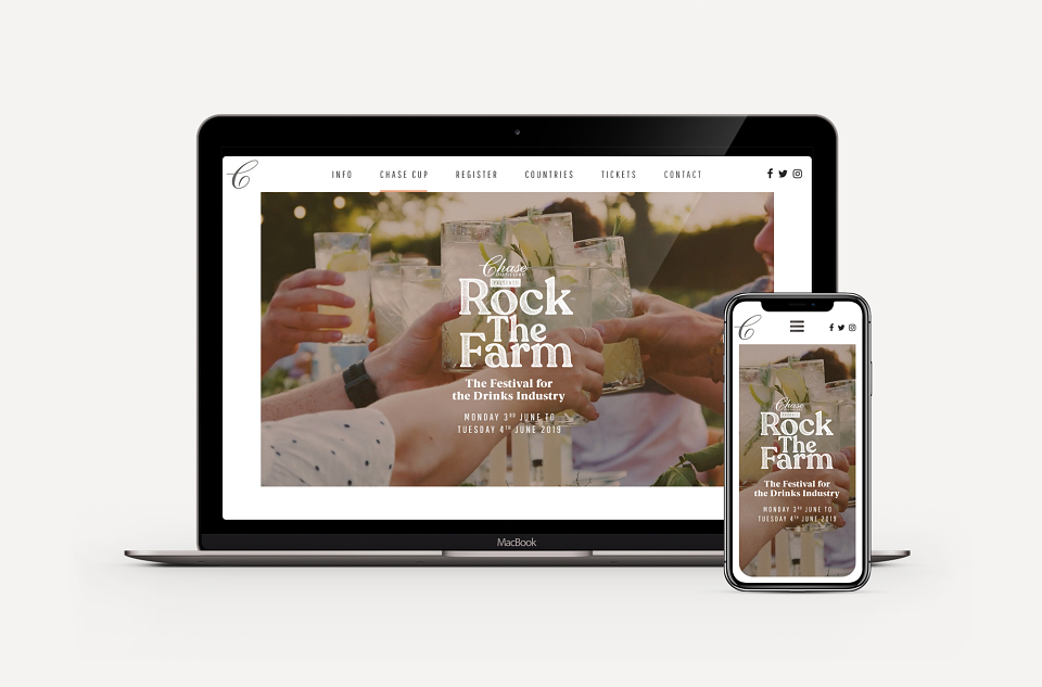
We worked with the Chase Distillery team to create a new brand identity for the 2019 re-launch of their Rock the Farm music festival. Tapping into the Chase family heritage of farming potatoes, the festival identity brings to life their earthy field-to-bottle production values and artisanal spirit. Our brand work was inspired by this craft and mirrors the company itself by placing the potato at the very heart of it. We even created a bespoke typeface in the process, ‘Spud Sans’.
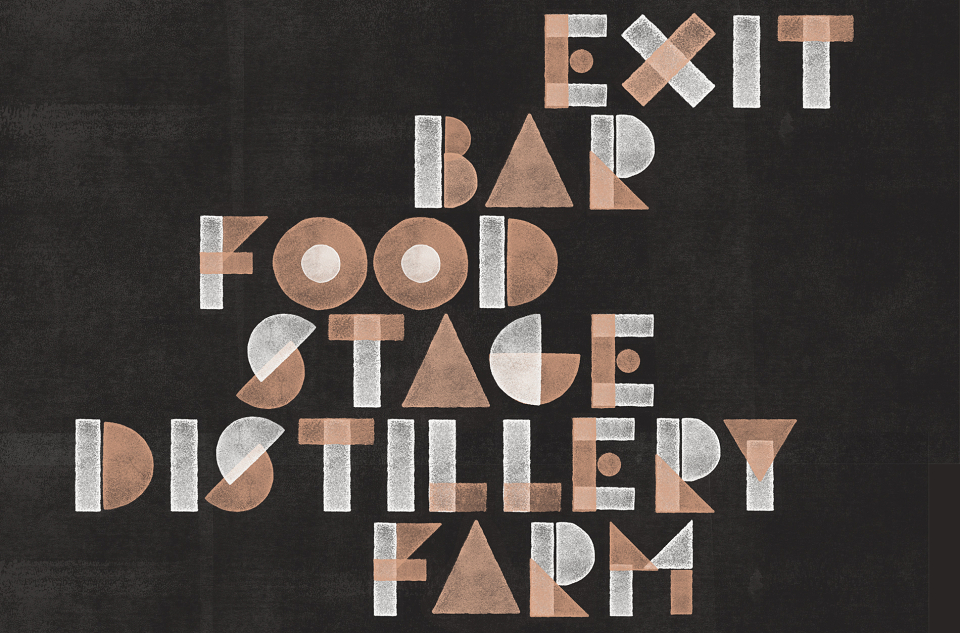
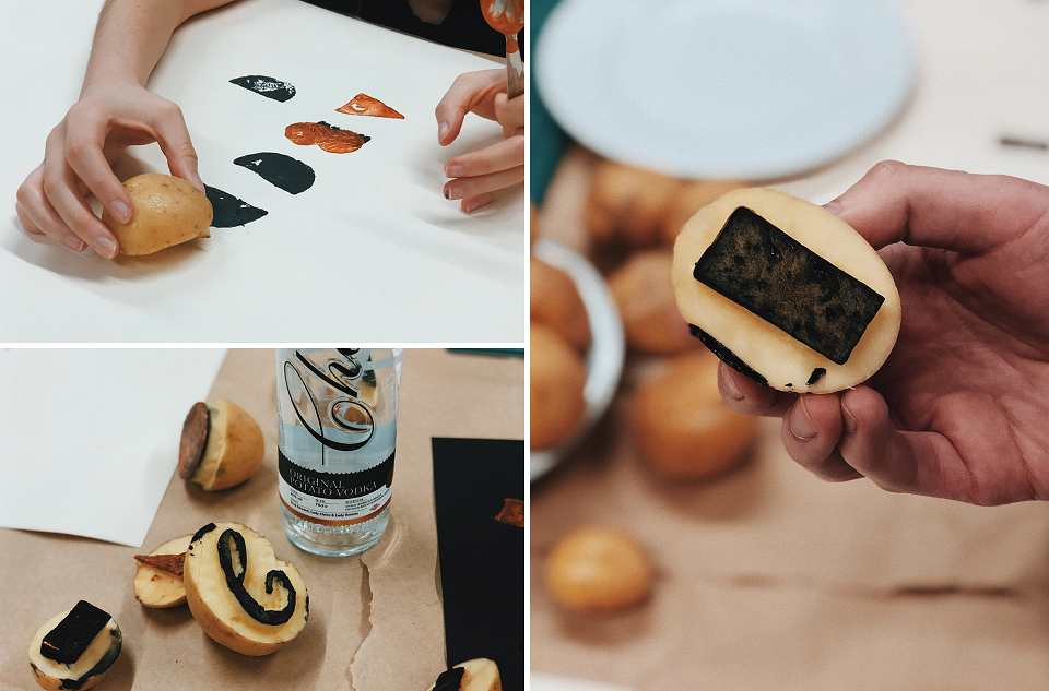
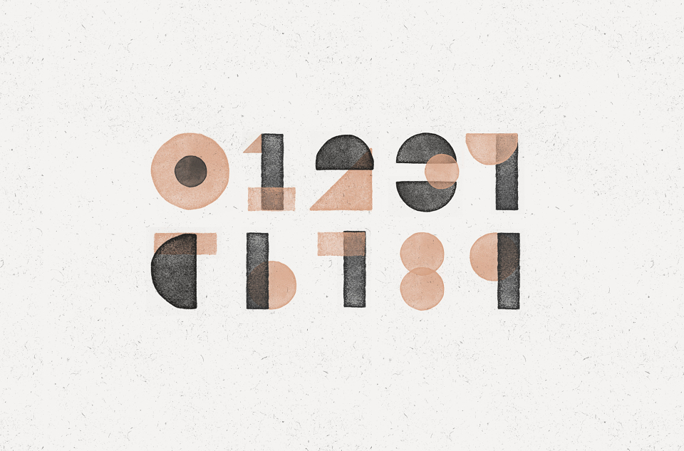
The bespoke typeface, Spud Sans, celebrates the potato and is completely ownable by Chase in their industry, with their heritage as potato farmers. The new font was developed using old-fashioned potato-printing techniques, before being refined digitally. The resulting alphabet has a truly homespun feel but is clean and clear-cut, so it can be used effectively across event & directional signage.
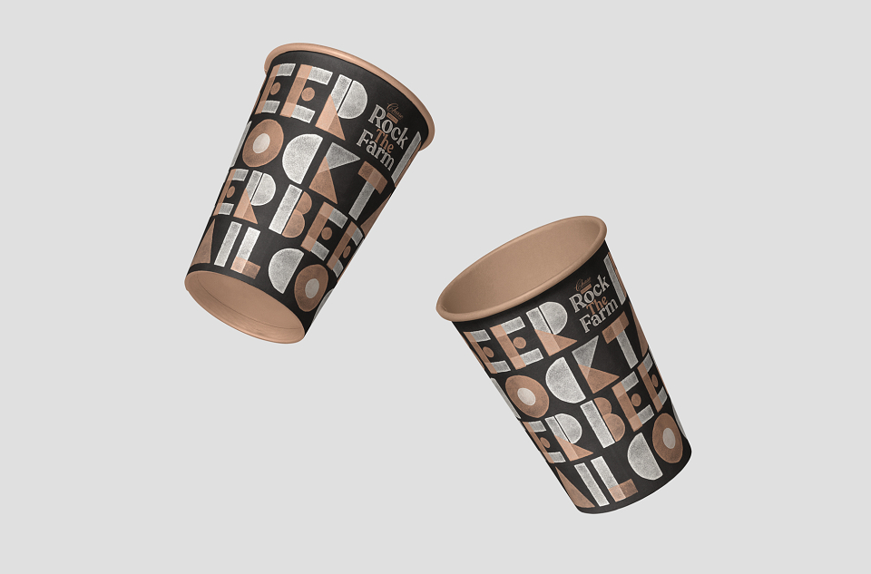
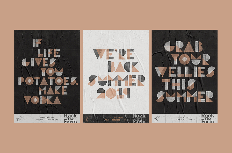
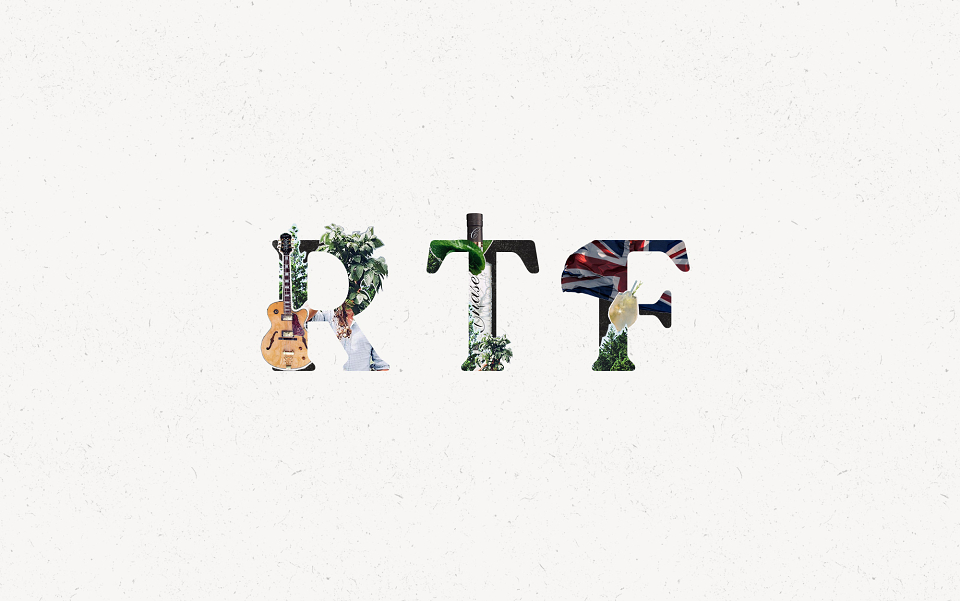
The main logos for Rock the Farm and Chase Cup are in a serif font to achieve stand-out, but have been given the potato-print texture to maintain brand cohesion. Spud Sans appears on posters, lanyards, digital platforms, promotional material and wayfaring signage. Collages on promotional posters introduce British iconography, including the Union Jack Flag, as well as images of musicians, mixologists and potato plants, bringing together all of the festival’s essential ingredients.