Brandon Consultants
Manchester
ABOUT
Challenge
Arrowtown Drinks entered the market with a bold vision from two brothers: to disrupt the alcoholic drinks industry with a better-for-you product and a purpose-driven partnership supporting marine conservation. Despite having all the right ingredients—great taste and a strong environmental mission—the brand struggled to stand out amidst the crowded and competitive RTD drinks category. Over time, the space became visually cluttered, filled with brands all telling similar stories, leaving Arrowtown’s unique proposition under-leveraged and unclear.
Our challenge was to break through the noise, distil the brand’s message, and craft a cohesive visual identity that would elevate Arrowtown as a standout option in the RTD space.
Insight
Rooted in a shared passion for feel-good moments, Arrowtown understands that our audience seeks sessionable, guilt-free enjoyment with friends. These moments of connection shouldn’t come at the expense of the planet, and that’s where Arrowtown’s purpose-driven approach shines. The brand’s partnership with Ocean Co, a marine conservation charity, not only complements these experiences but deepens the emotional connection with consumers, offering a unique value that goes beyond just taste.
By aligning the brand’s ethos with the joy of doing good, Arrowtown fuels a more meaningful, sustainable way to enjoy those cherished moments.
Idea
Carving up waves of positivity
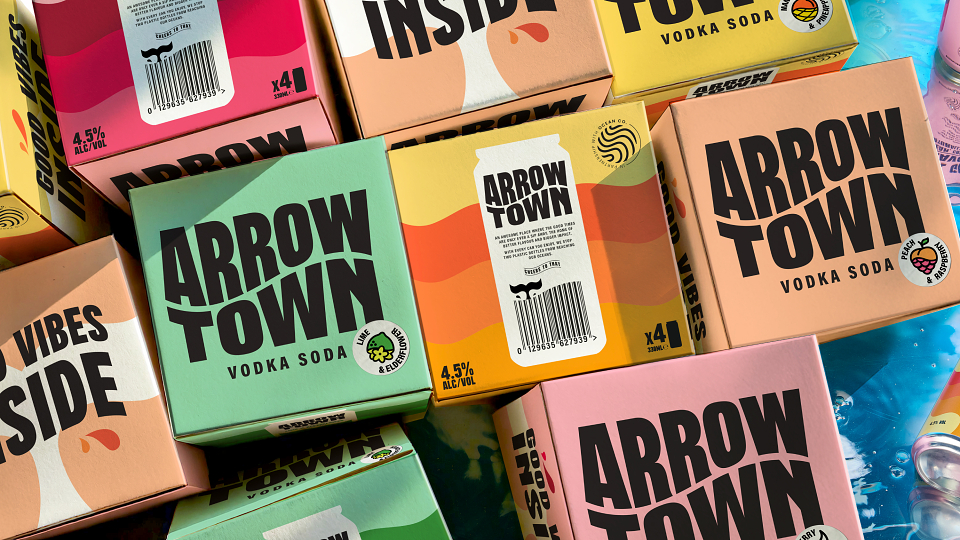
Inspired by Arrowtown’s core mission of doing good, we created a new brandmark to echo the ripple effect of sustainability, connecting each design element with the brand’s commitment to ocean conservation. Our process involved exploring multiple creative directions to achieve the perfect balance of clarity and character.
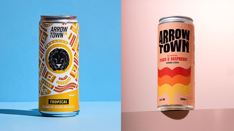
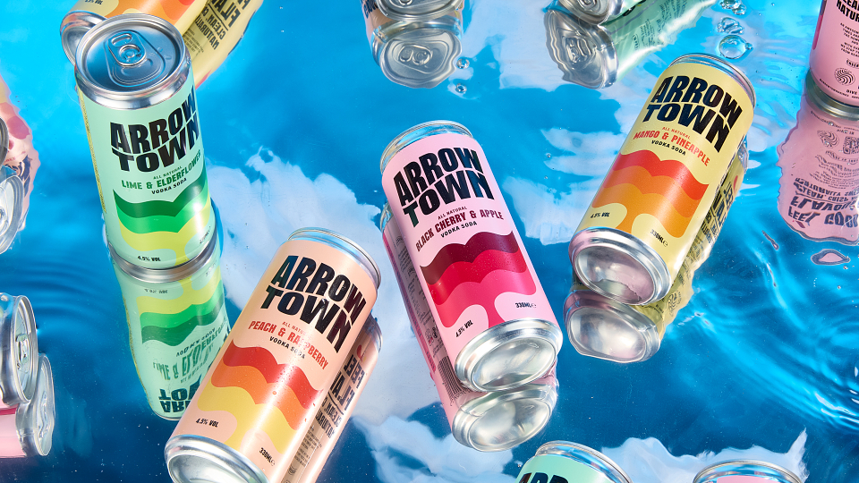
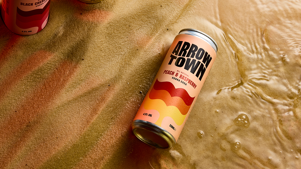
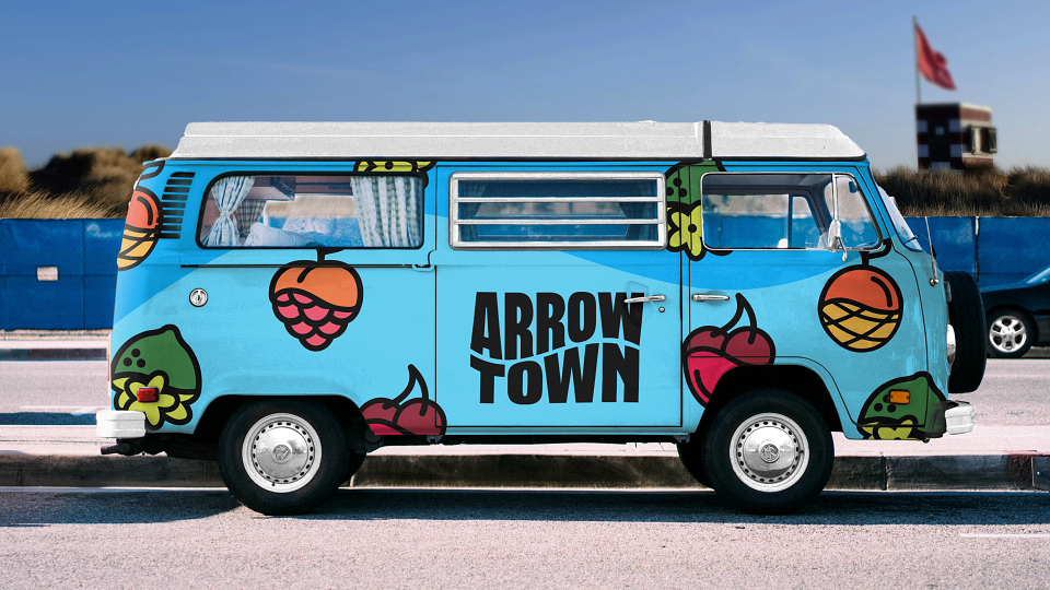
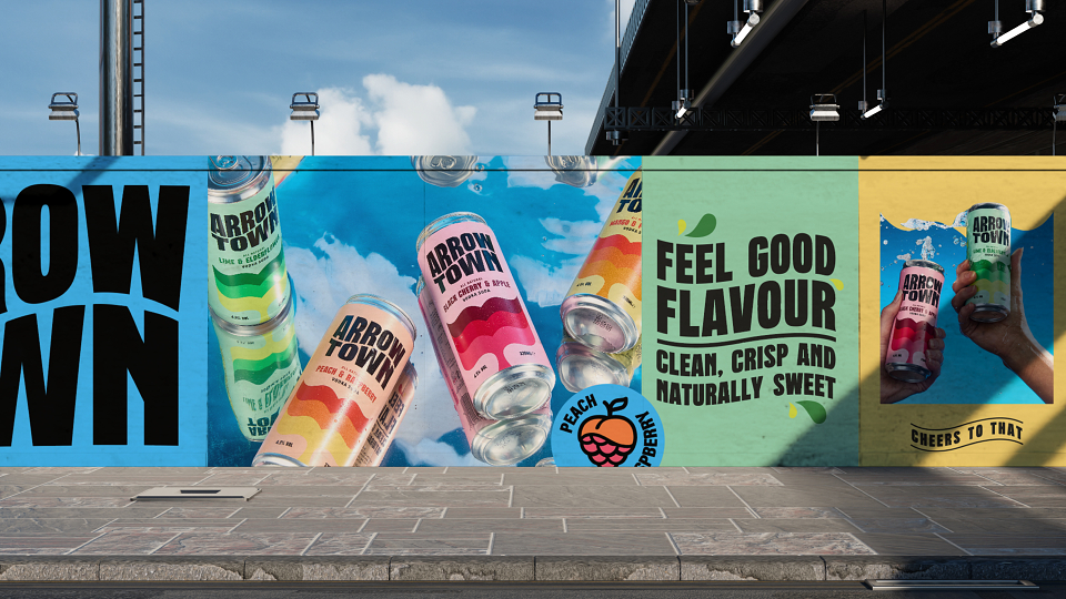
By blending boldness with simplicity, we crafted a visual identity that radiates Arrowtown’s commitment to both taste and environmental impact. A new VIS was created and amplified to evoke uplifting spirits, while the fluid design reflects the brand's "waves of positivity." This design ethos extends to the punchy colour palette and crafted typography, where flowing, dynamic elements mirror the natural movement of ocean waves.
Dynamic energy and spirit
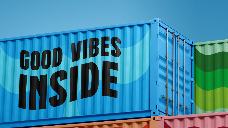
Drawing on the vibrant feel-good nature of Arrowtown, we infused energy and positivity into every design detail. The typography and visual assets convey a sense of movement and flow, complementing the brand’s values of joy and sustainability. This dynamic design not only reflects the fun, social nature of the product but also its deeper mission of protecting the oceans.
An authentic identity with purpose at its heart
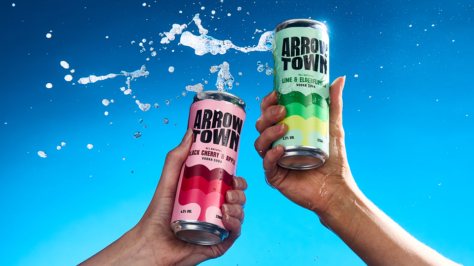
Our design strategy focused on unifying Arrowtown’s key elements, from product packaging to its message of sustainability. The resulting design reinforces the brand’s leadership in both taste and ethical responsibility, resulting in a distinct and cohesive look across the range and cutting through the visual clutter of the RTD category.
Impact
Arrowtown’s new identity creates an emotional connection with consumers, making it the go-to brand for those seeking a drink that not only tastes good but also does good for the planet.
With a meticulously refined brand mark now consistently applied across the product range, we’ve positioned Arrowtown as the standout option in the category, ready for long-term growth and sustainability-driven success.
AWARDS
World Brand Design Society