Jennifer Hayashi
Creative Director
ABOUT
I create a stamp style logo that could easily be found in any of the Japanese train stations in where the food was inspired from.
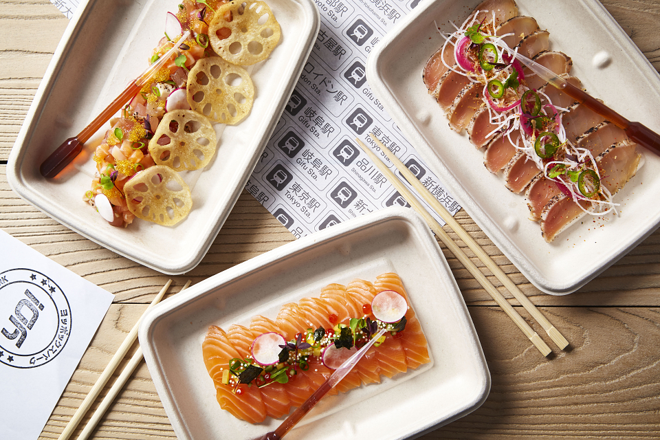
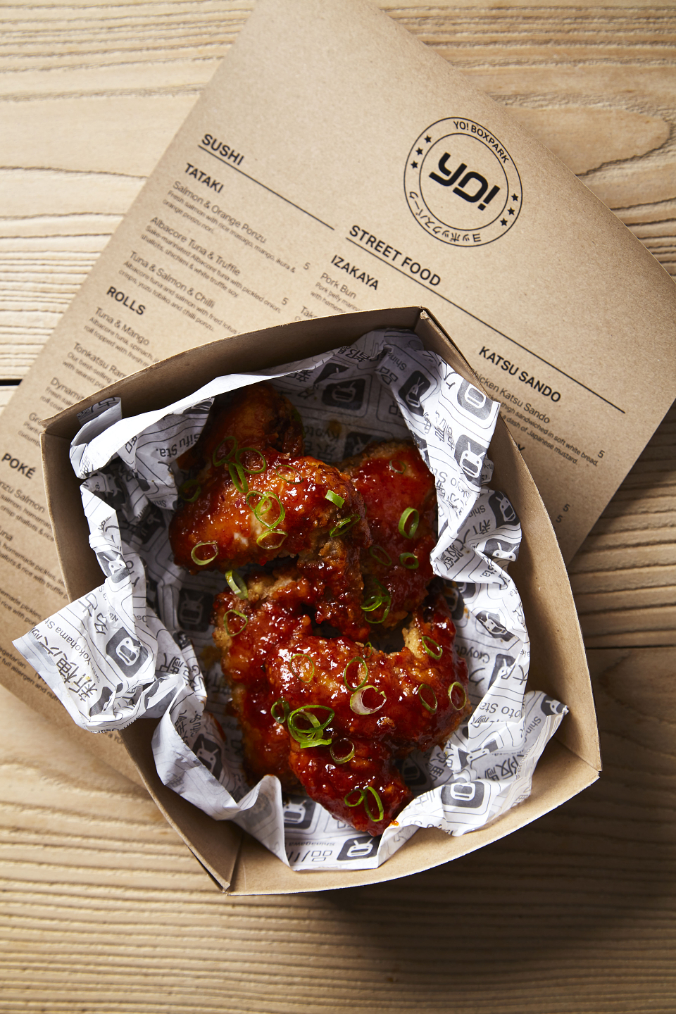
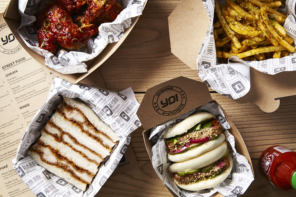
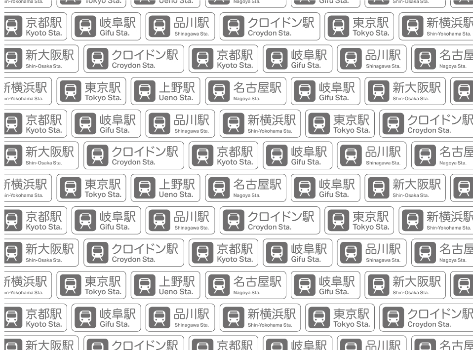
Each bullet train station features as a pattern on the packaging, a nod back to the origins of the brand.
The menu is printed on recycled brown paper to compliment the look and feel of YO! Boxpark. The restaurant features Izakaya style interiors with hand painted boards.