ABOUT
How do you bring five respected businesses together under one Group identity without diluting the equity they’ve spent decades building?
You don’t erase difference.
You orchestrate it.
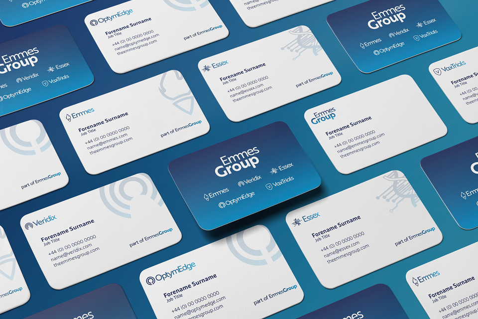
The opportunity for Emmes Group was never about consolidation. It was about connection. Creating a shared visual language capable of expressing collective strength while protecting the individuality, culture and heritage embedded within each company.
We began by reducing every identity to its essential parts.
Name. Emblem. Structure. Rhythm.
By understanding what made each brand distinct, we could uncover what connected them.
At the centre of the new system sat typography. A single typographic approach became the connective tissue across the portfolio, bringing consistency, clarity and confidence to the suite while allowing every business to retain its own voice.
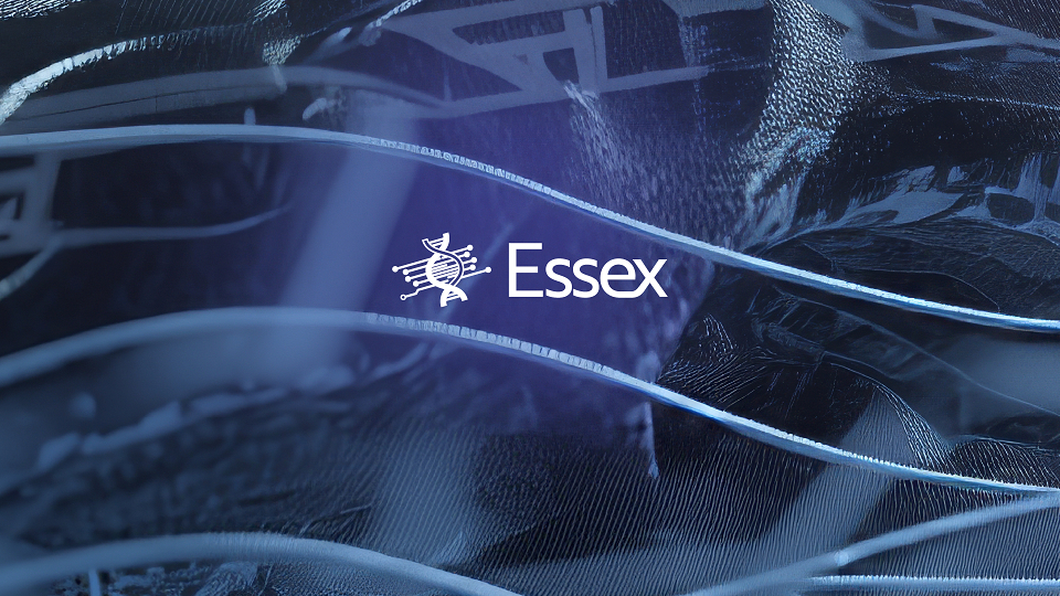
A subtle fusion point was introduced within each wordmark. Two characters intersecting as a visual cue inspired by the ‘mm’ at the core of the Emmes Group identity. Small by design. Powerful in repetition.
The emblems evolved in parallel.
Simplified with intent. Refined, not replaced.
Every mark was stripped back to its most recognisable form, preserving familiarity while creating a cleaner, more contemporary expression aligned to the wider Group.
The result is a cohesive identity architecture that balances autonomy with alignment. A system that signals the combined capability of Emmes Group while celebrating the character and credibility of every company within it - today and tomorrow.
Distinct brands.
Shared ambition.
One connected future.
MADEIT CREDITS


Project featured: on 18th May 2026
Pro member:
Contributor:
Invite
x3
Pro accounts have added benefits for Creativepool members. To get your Pro account go here.
The Mission Control Communications has been a Contributor since 4th February 2026.