Tim Olden
Graphic Designer & Illustrator
ABOUT
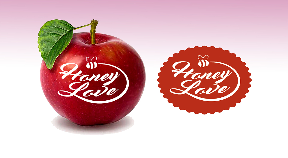
selection of natural scented products from Lavender, Rose, Cherry, Mango etc. As above apple was another fragrance. So after the briefing from our client we sat down worked which direction we should go in.
Where would the logo be seen – labels, so it had to be a simple one colour identity. The Market – manly women so it had to be a feminine colour
New Name – inspiration came from an old song title
Icon – it’s in the name Honey so a bee was created
Logo – has the shape of crimped oval
So when this was presented to the client with all the possibilities of where it would be used and seen. The client was over the moon with the design. Nothing like a happy client.