The Clearing
London,
ABOUT
Sowing the seeds of change
Farming is more than just a job; it’s the lifeblood of our communities, nourishing people and sustaining ecosystems around the globe. But as weed resistance grows – just like antibiotic resistance in people – it becomes more difficult to protect crops and make sure everyone has enough to eat. Now more than ever, the introduction of new herbicides that work in a different way is crucial to breaking this cycle and ensuring that farmers can continue to produce enough food to meet growing global demand.
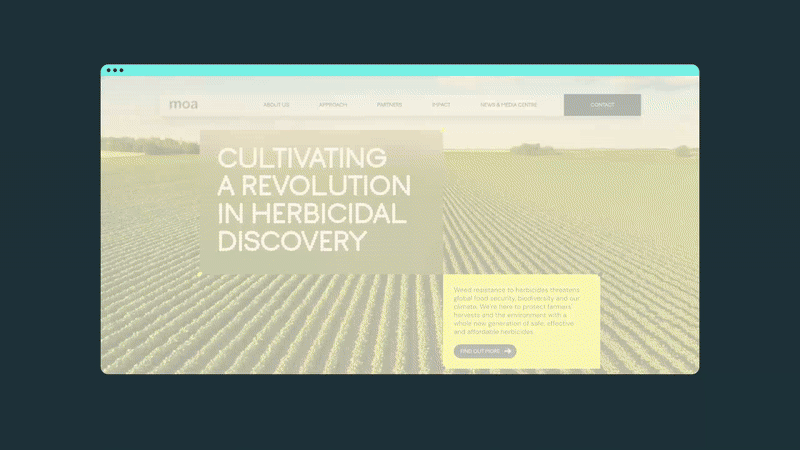
Moa, an agricultural biotech firm spun out of Oxford University is on a mission to revolutionise this field. In just five years, it has identified around 60 new modes of action – the molecules which define how herbicides work – setting the stage for a new generation of herbicides that promise to be both more effective and environmentally harmless. Our brief was to drive this vital work forward with a fresh new brand that helps it stand out and attract the investment needed to enter its next stage of growth.
Tackling a field of challenges
This is one of the most pressing and intricate challenges of our time—on par with issues like water scarcity—and Moa’s approach to tackling it is just as complex. Our first priority was to distil this complexity into a clear, compelling story that resonates with a wide range of audiences, from the farming and scientific community to potential investors and corporate partners.
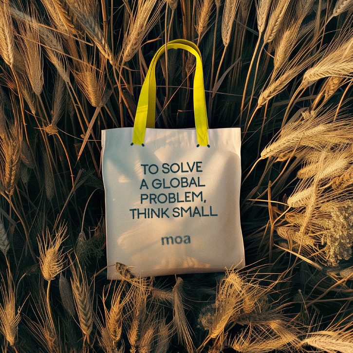
At the heart of that story, we crafted a powerful promise: to help farmers, investors, and colleagues harvest their full potential—whether that means growing healthier crops, making smart investments or building rewarding careers. From this, we developed a visual identity and tone of voice that’s grounded in the solution while highlighting the lasting impact Moa’s innovations will have on people and communities around the world.
A brand rooted in purpose
We retained the existing logo and built from there. Its circular shapes inspired a fresh visual language that mirrors the company’s methodical approach to product development—compound by compound, product by product, field by field, with unwavering precision and accuracy.
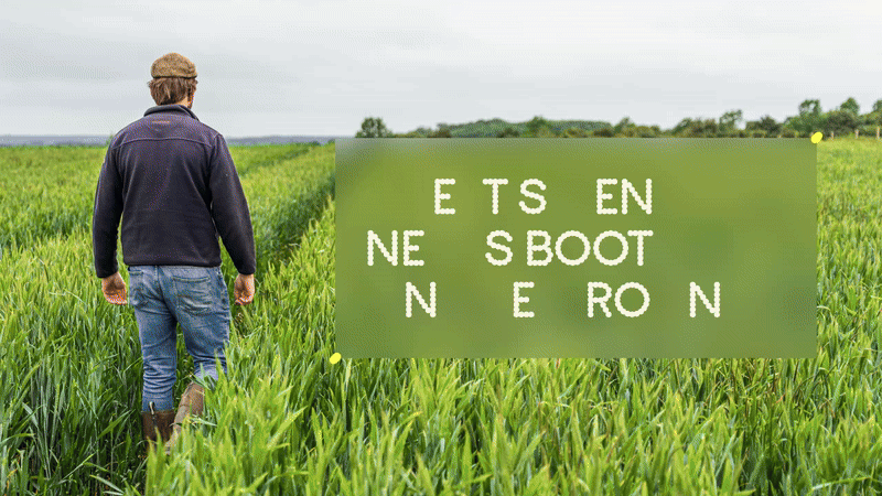
The imagery style is designed to tell Moa’s story in an ordered and structured way to again reflect how it operates. The layered photographs seamlessly marry the precision aspect of the work it does with the grand scale of its impact. And by making farmers an essential part of the brand story, we made sure the work felt grounded, showing the real, tangible impact the organisation has on agriculture and the people behind it—a connection that’s often missed in this field.
A voice blossoming with personality
The tone of voice we developed has a thought-provoking edge but is always underpinned by a precise and analytical approach, deliberately avoiding the jargon common in the sector. By reappropriating language from nature and subverting it, we added layers of meaning and a strong point of view to every headline to bring to life what Moa is as an organisation: a team of passionate, brilliant minds on a mission to transform their field – and the world.
MADEIT CREDITS
-

The Clearing -

Jonathan HubbardCreative Director & Founder