ABOUT
MPB is the world’s largest secondhand camera retailer, their global platform recirculating over 615,000 cameras and lenses each year. We helped them become the most confident.
Held back by the before
The original brand fell short of everything MPB offers. It lacked the conviction of a category leader and it didn’t have a point of view or personality their teams could identify with. Customers couldn’t identify with it either – it spoke to visual storytellers about their creative practice, leaving out hobbyists, kit collectors, content creators, the camera curious and many more. Over the years, their guidance had grown fractured, unwieldy and, depending on who you asked, incredibly restrictive or overwhelming.
Set free by the after
We worked closely with MPB’s creative team to develop a visual and verbal identity system that reflects their place in the market. Born of the promise The Right Way, the brand frees MPB to speak plainly about being the smartest, most sustainable way to buy, sell and trade camera equipment. The singularity of the new identity is a nod to the transparent and easy nature of doing business with MPB, one that serves to amplify the passion and wit of the people behind the brand.
Better for all
Crucially, the new brand isn’t just for photographers. It’s for everyone, whether they consider themselves a photographer or not. The point of view at the heart of the strategy speaks to the fundamental belief that everyone should have the tools to create. It’s why MPB makes getting hold of camera gear – and passing it on – better for all. And it gave rise to the personality principles that shaped the rest of the system.
Bold, smart and upbeat, the new brand gives MPB permission to innovate: to find new and better ways of doing things. It’s friendly and full of energy, helping all types of creators get from where they are to where they want to be, and cutting through generic marketing speak with to-the-point attitude backed by years of expertise.
The right way
The significance of the promise is twofold, encapsulating the savvyness of buying, selling or trading with MPB, but also the moral fortitude in choosing to shop secondhand and keep kit in the circular economy. It’s an unapologetic and unflinchingly confident declaration of quality, as well as an ambition to continue doing things the right way for many years to come. The promise empowers MPB with a claim only they can own, ushering in a new era of certitude for the brand.
A voice-first brand
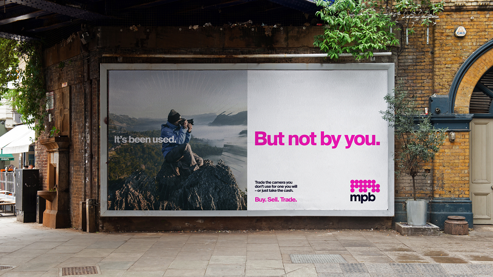
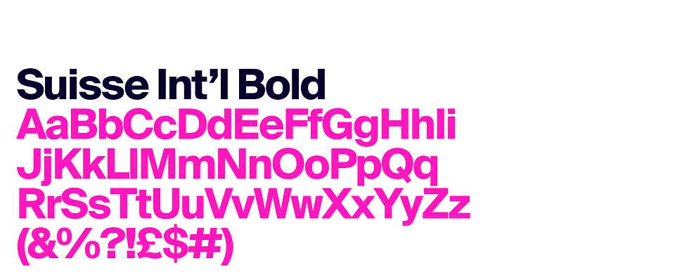
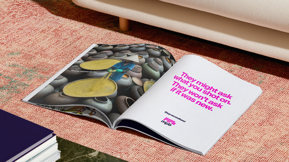
The new tone of voice allows MPB to speak with the hard-won authority of being the best at what they do. Equal parts form and function, it flexes between straightforward clarity and moments of levity that come from a clever bit of word play, allowing MPB to speak directly to all types of creators. The typeface, Suisse Int’l from Swiss Typefaces, is bold, simple, and lets tone do all the talking.
Supercharging MPB’s iconic pink
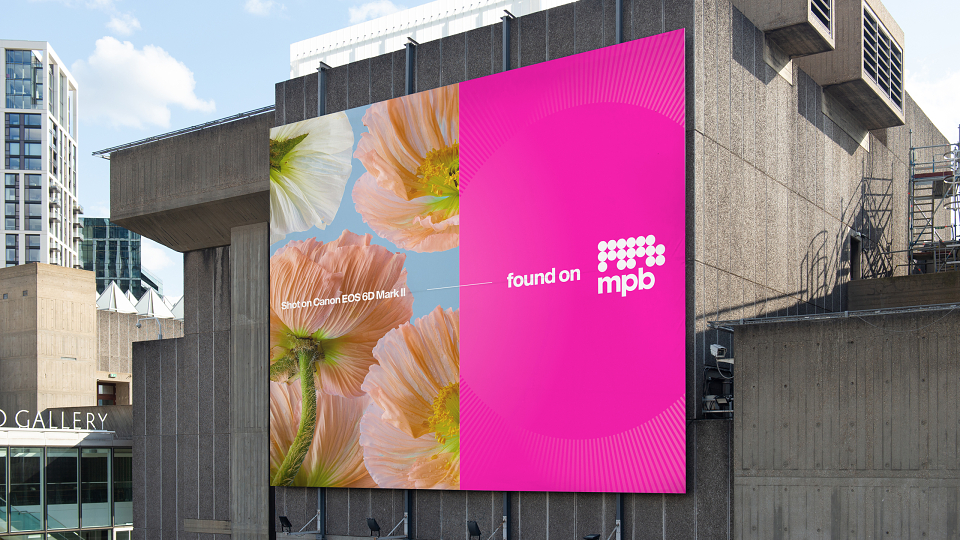
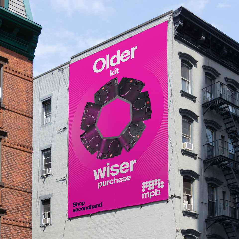
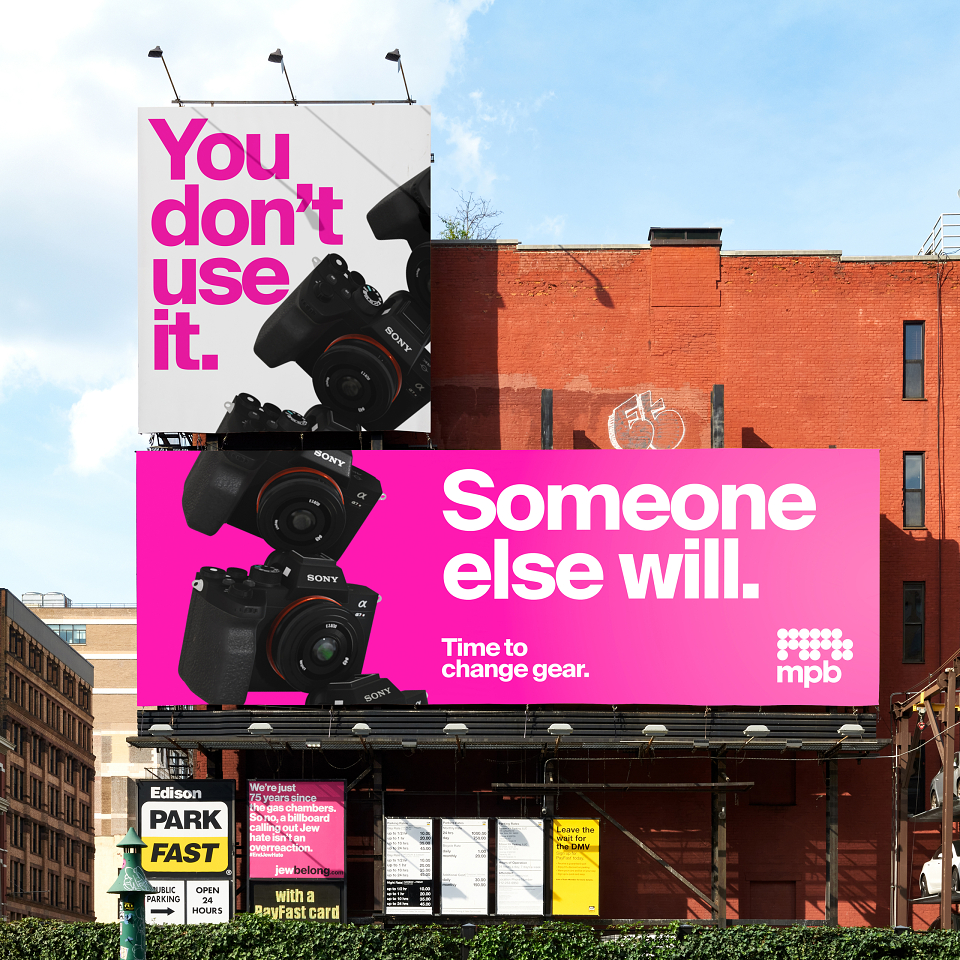
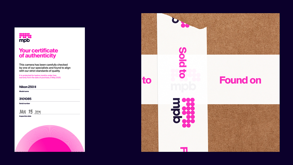
MPB has always leaned into its signature pink hue. We just dialled it up a notch (or ten). Midnight Blue and White are the only other colours in the palette, allowing pink to drive recognition and build equity.
Art direction for the experts
MPB shoots every product they list, so you always know exactly what you’re getting. We opened up their approach to product photography, introducing cameras and lenses up close, in situ, animated and within dynamic layouts, so they can hero products within content as well as in listings.
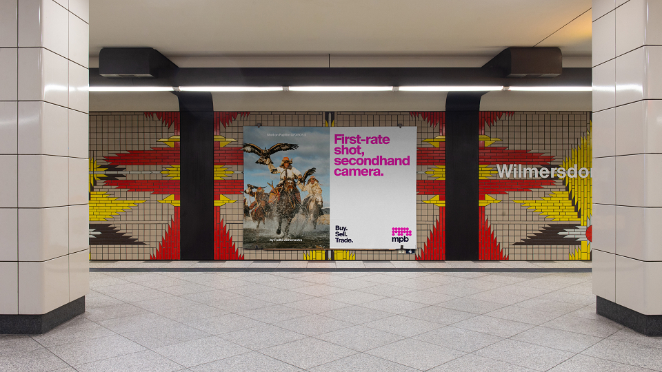
To capture people, we introduced reportage-style photography. The candid approach shows creators in action and in their own environment, telling the story of their creativity without having to say much at all.
Bringing it all into focus
Inspired by the focus ring on a camera lens, the graphic device frames key content and adds a dynamic visual signature to both print and digital.
The finishing touch: humanity
Hand-drawn icons complete the new identity with a touch of human warmth. They add the slightest bit of tactility to complement what is otherwise a very sleek design system. Dotted about MPB’s platform, social and marketing channels, the icons reinforce the brand’s personality and add another pop of pink.