ABOUT
Publication Campaign.
- Brand Identity/Logo-App Icon Design.
- Naming.
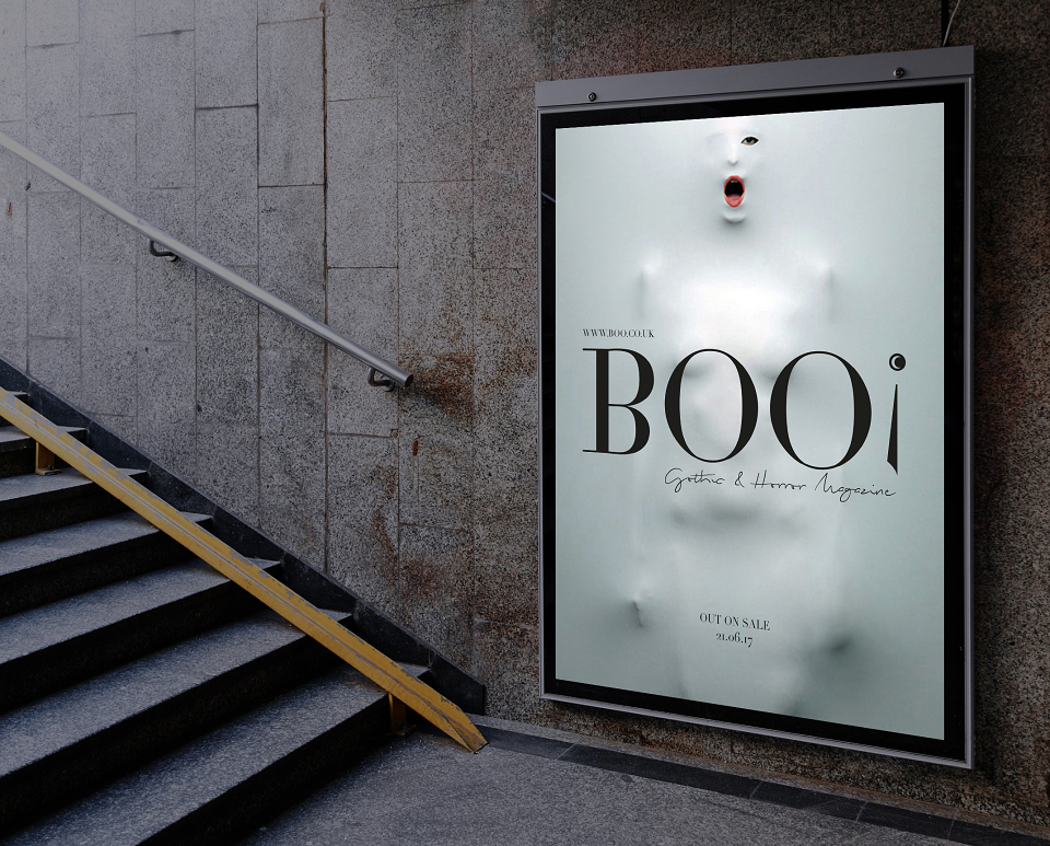
- OOH Advertising/Poster Designs.
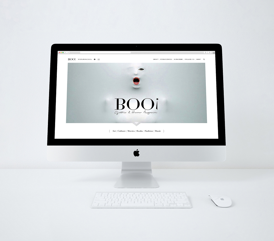
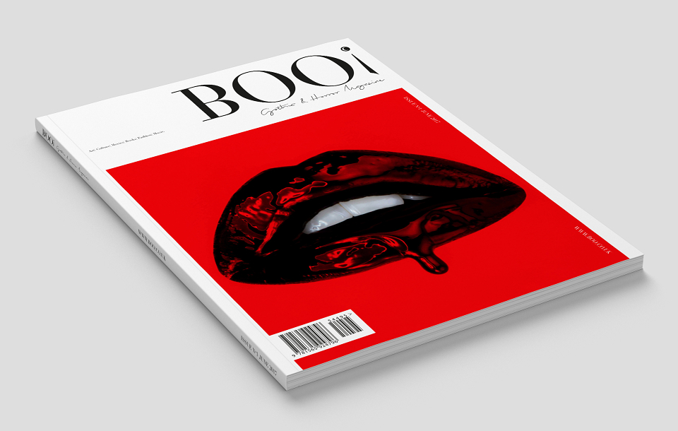
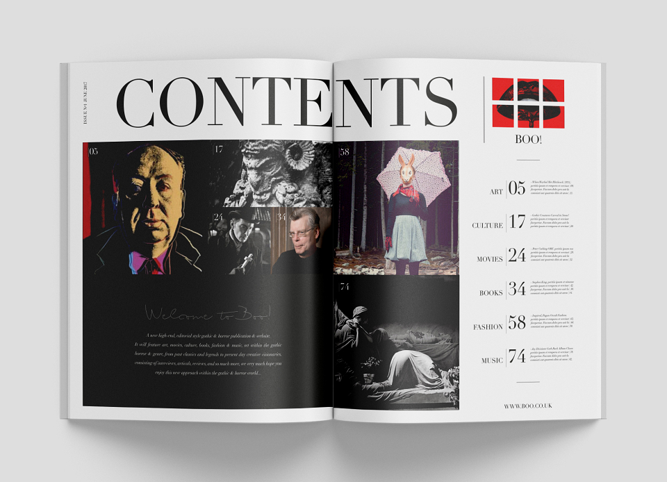
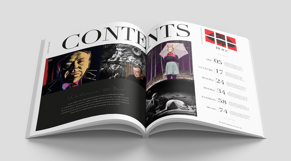
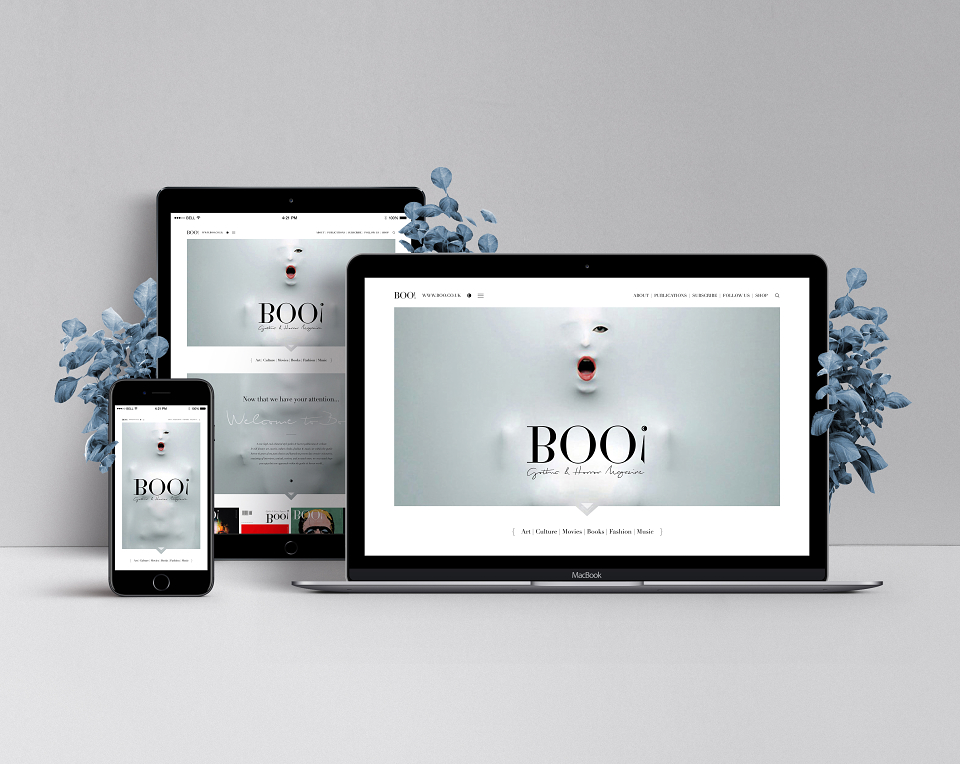
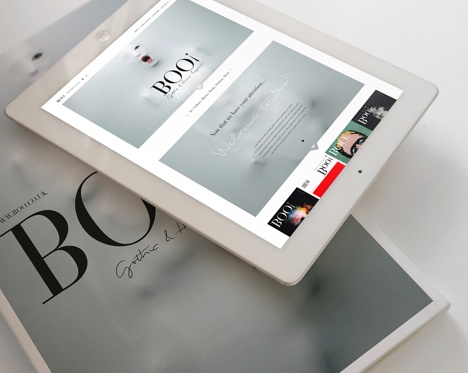
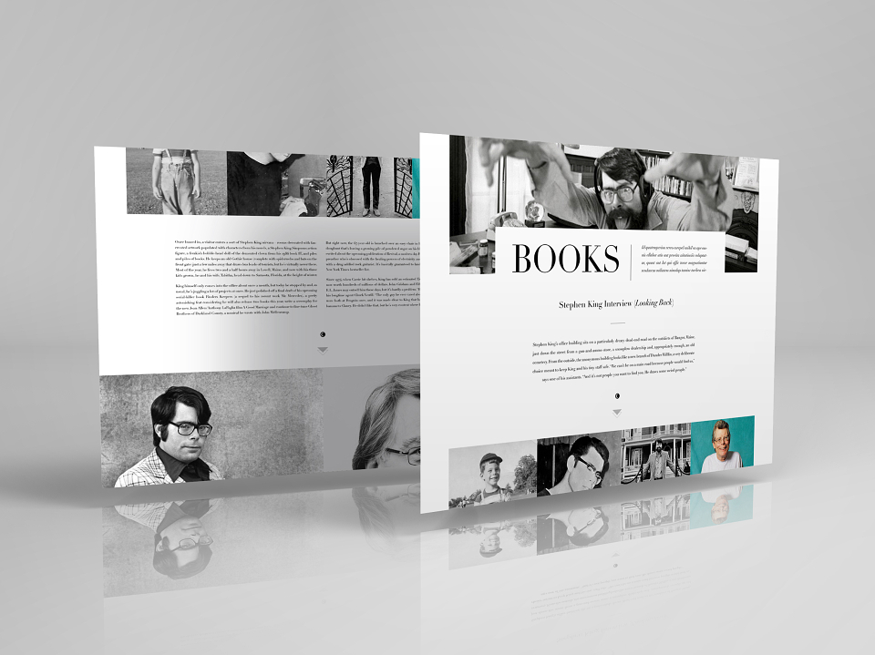
- Editorial Design. - (On/Offline)
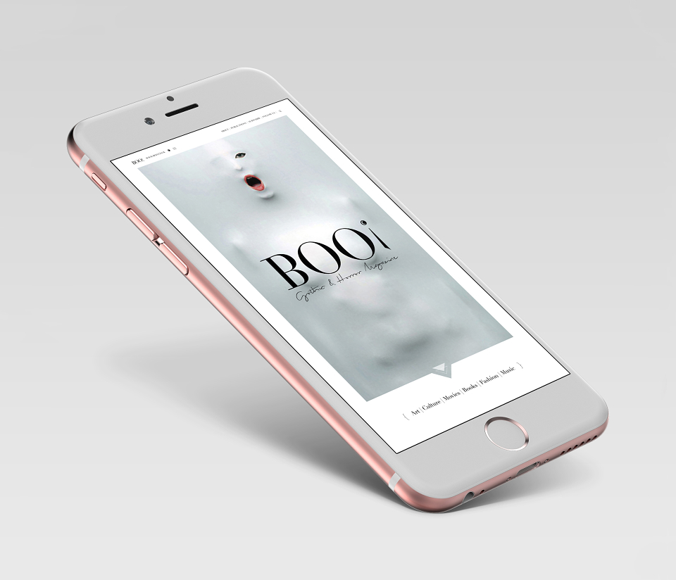
- Digital Design. - (Desktop/Tablet/Mobile)
- UI Design. - (Colour Palette/Layouts/Typography)
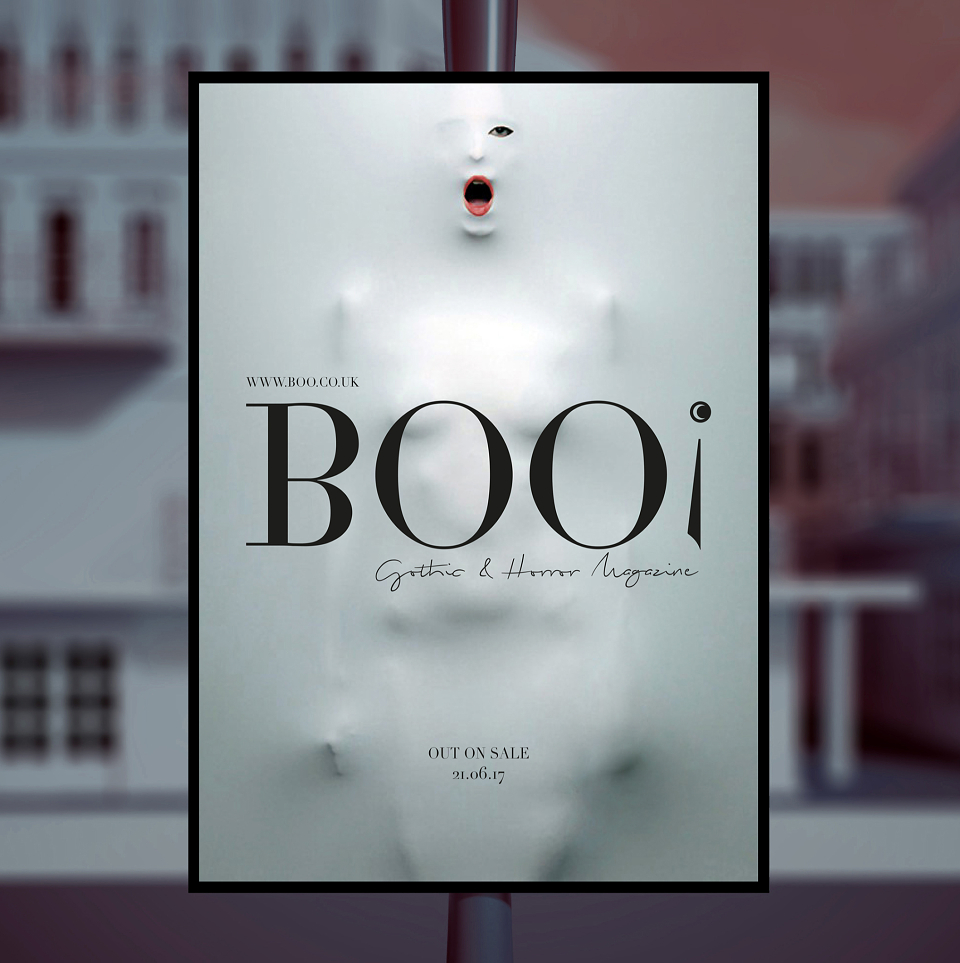
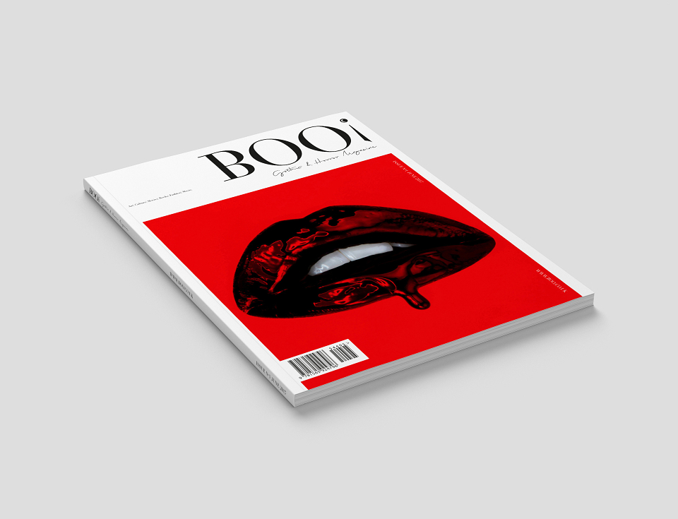
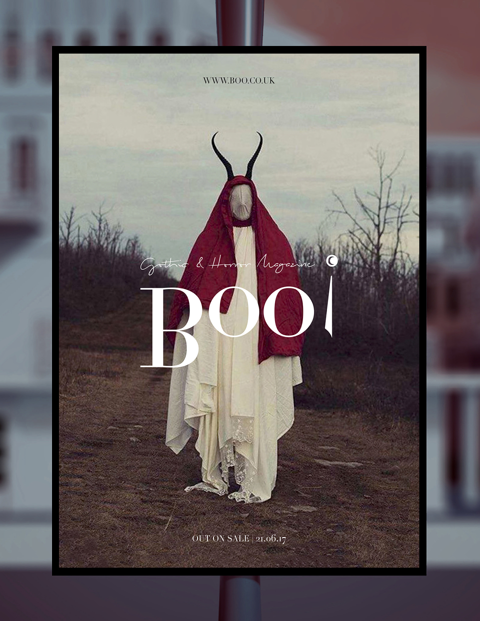
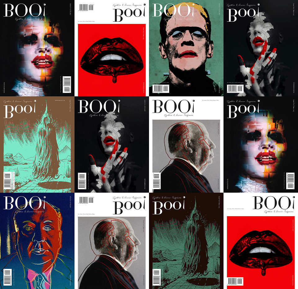
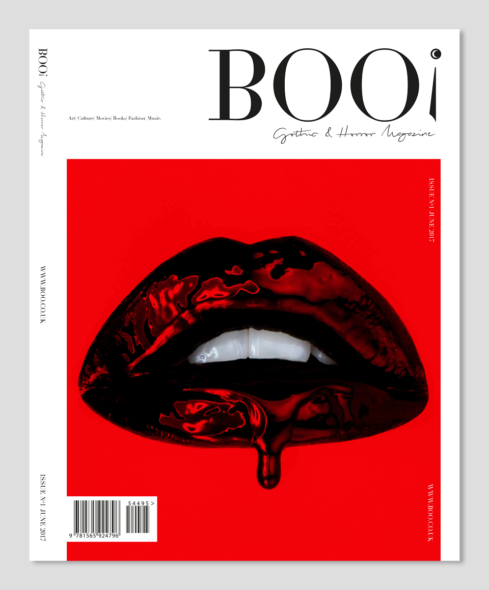
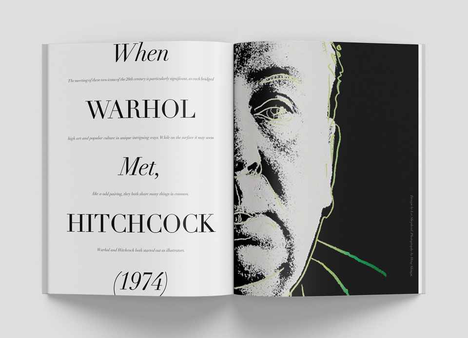
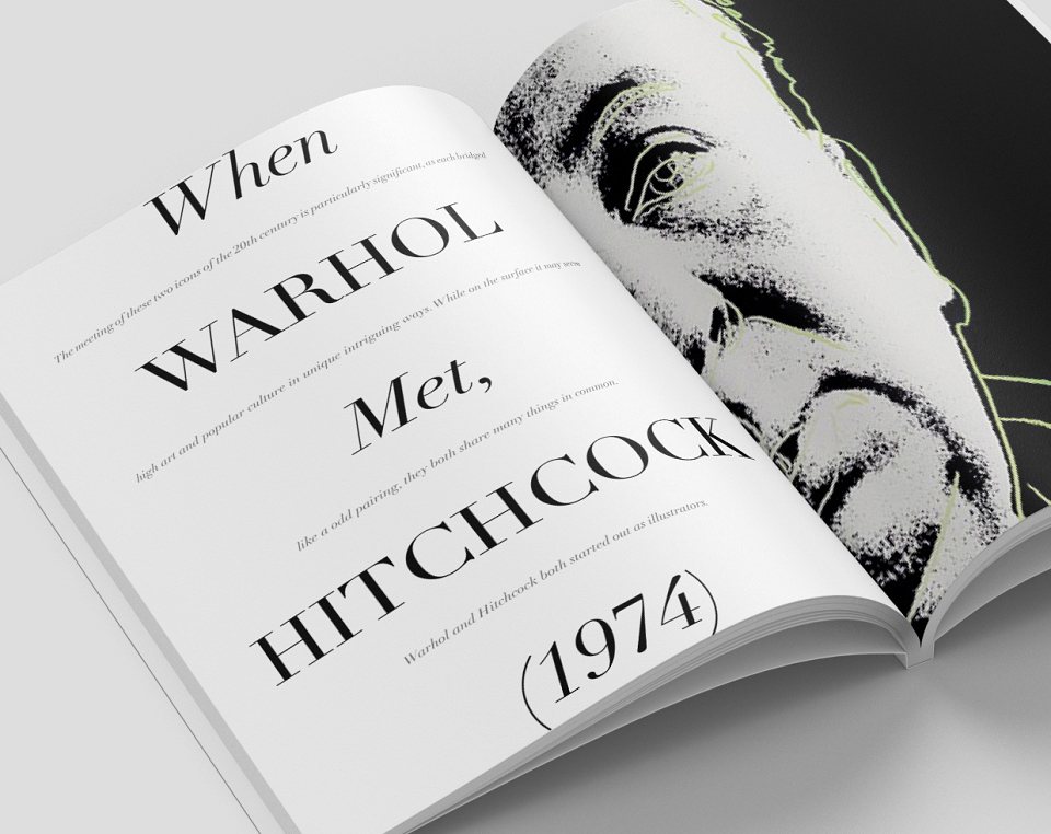
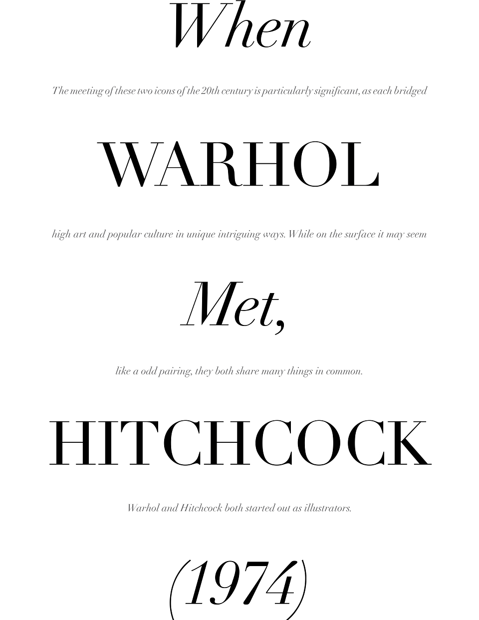
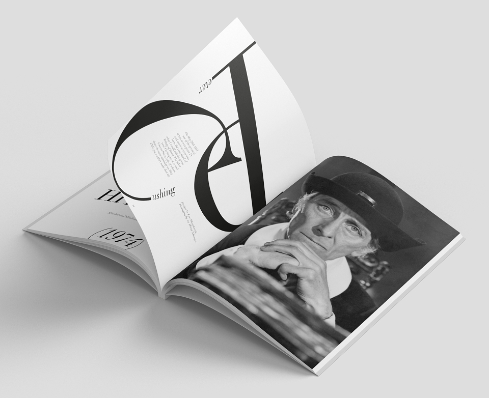
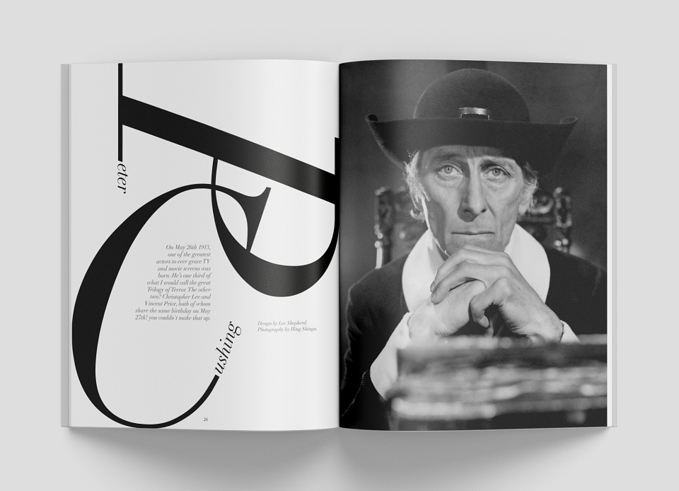
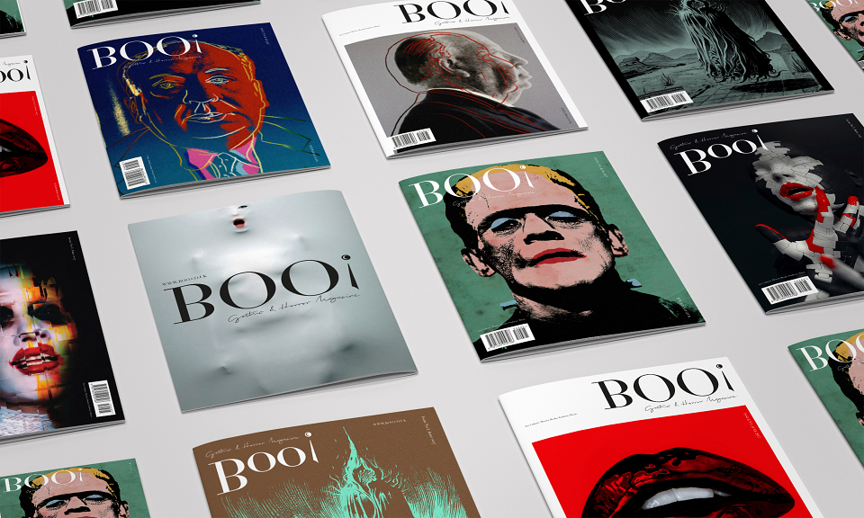
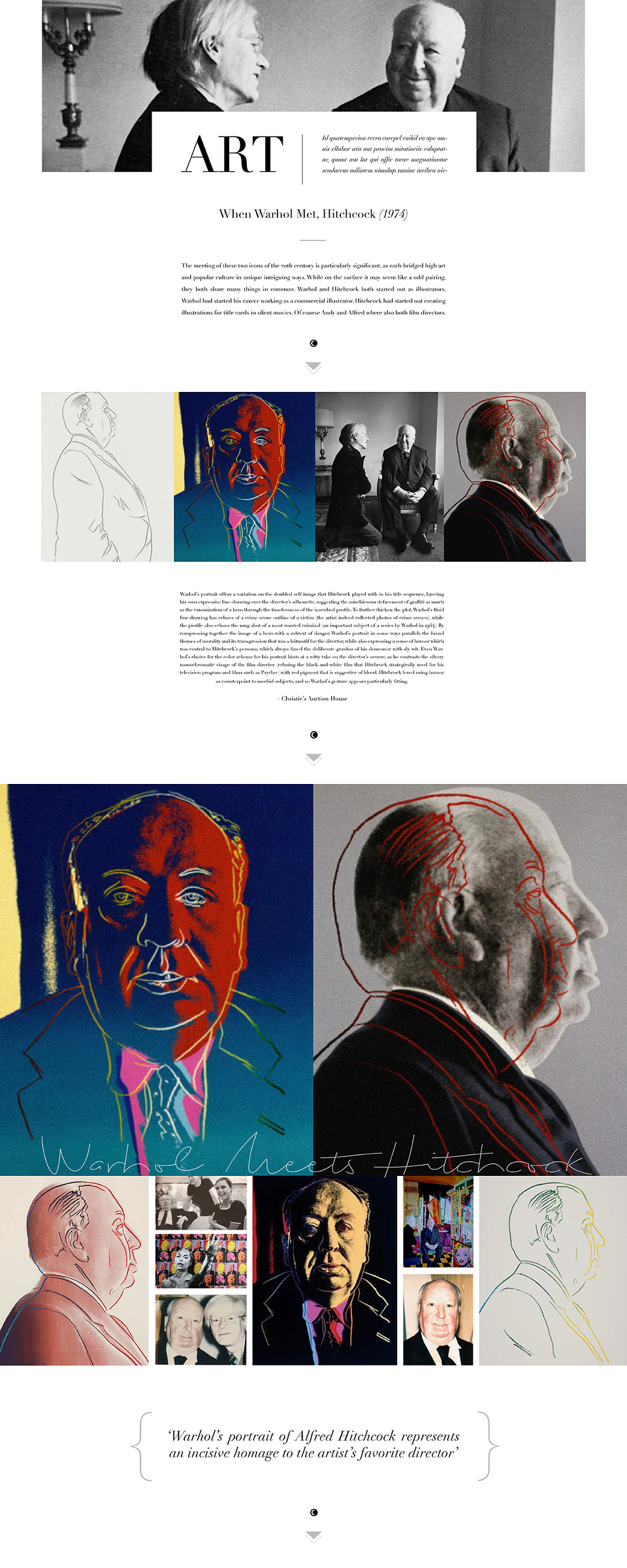
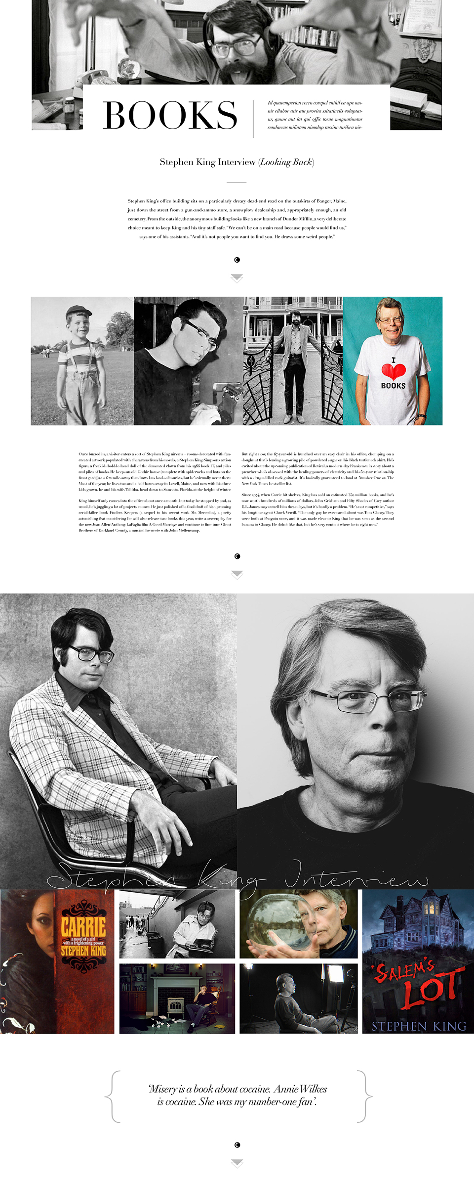
A self-initiated brief / campaign to produce and advertise a newly designed high-end on/offline editorial style gothic & horror magazine, which has never been seen before. The content / features are - Art, Movies, Culture, Books, Fashion & Music all set within the Gothic & Horror genre for a new sophisticated fan base.
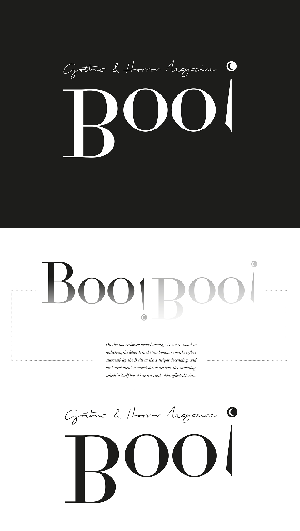
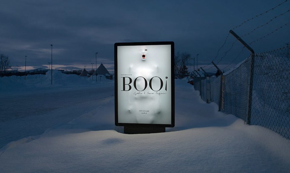
I came up with the name after a lot of research, alternatives were : shiver, scare, fright, fear, shock, jitter, jump, spook, creep's etc, but the word boo is the only word that conveyed a feeling to do with horror, shock or a reaction you might get from another human by saying it. I felt this was the appropriate brand name and title for the magazine, which in itself is a direct form of communication to the consumer.
—
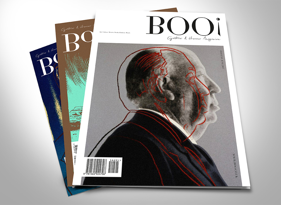
The brand name (upper case BOO!) I gave a twist to by reflecting it, but visually it would still seem correct, apart from the exclamation mark! You can barely tell but it does give the word a slight eerie / ghostly feel or to reference not seeing a vampires reflection, or a reflection in a window, or the moon shining on a lake etc. On the upper / lower case option it’s not a direct reflection, the B and the exclamation mark reflect alternatively - one sits on the base line descending and the other from the x height ascending but still flipped / reflected to give it a more unusual dimension. The exclamation mark has been manipulated to give it a slight gothic staff, dagger or quill like feel, along with the moon shape which has been added, to give a little more character to a simple, traditional and classy typeface and not the predictable gory font that is often seen and used for a publication of this kind.
—
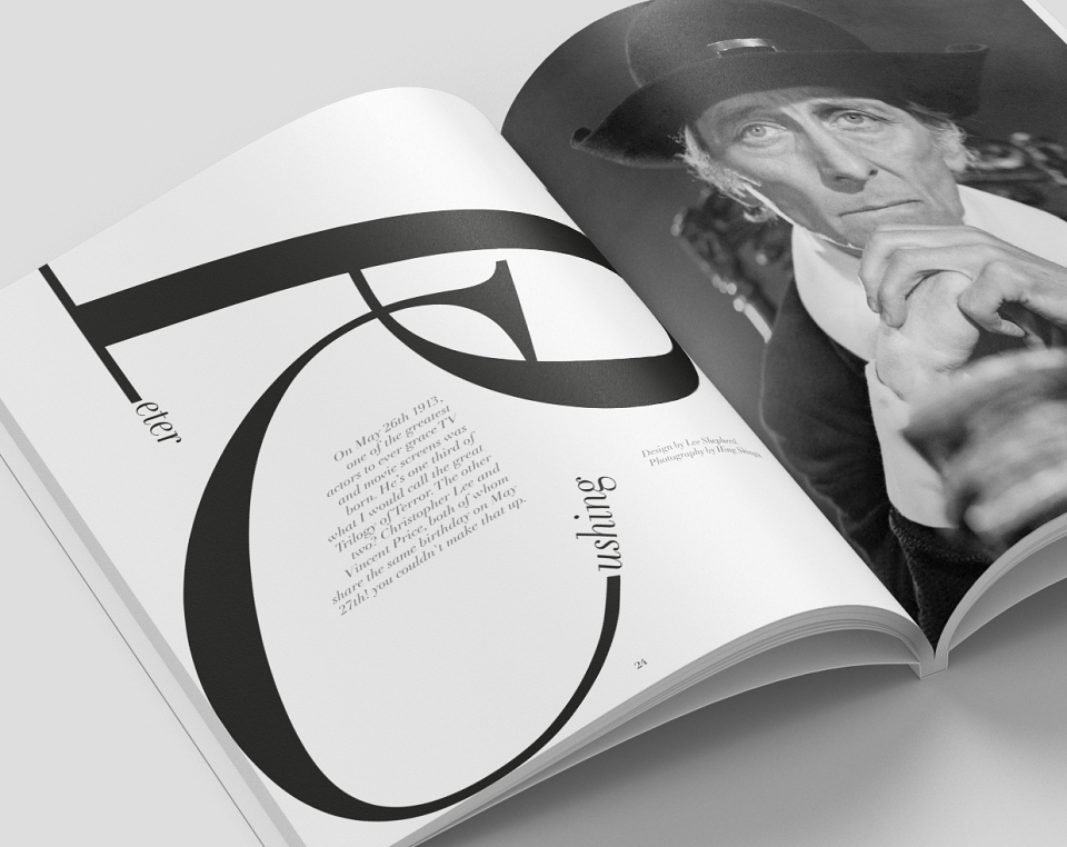
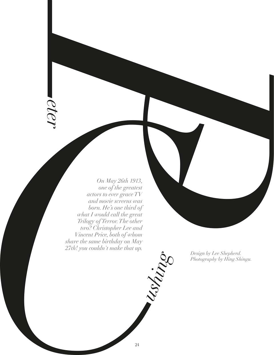
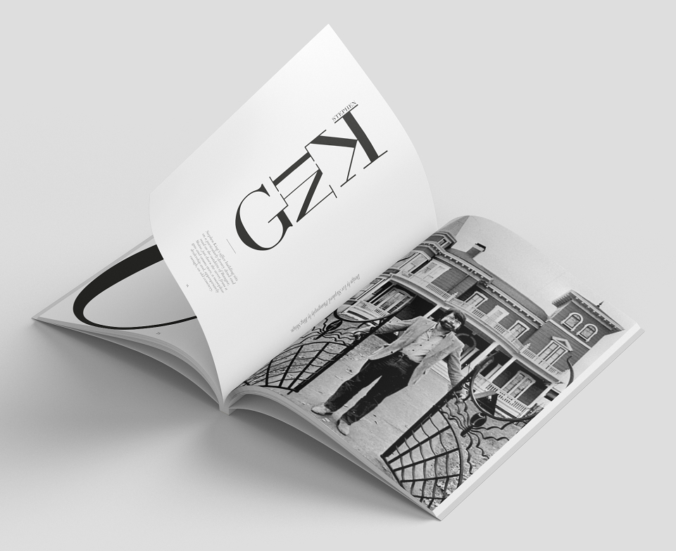
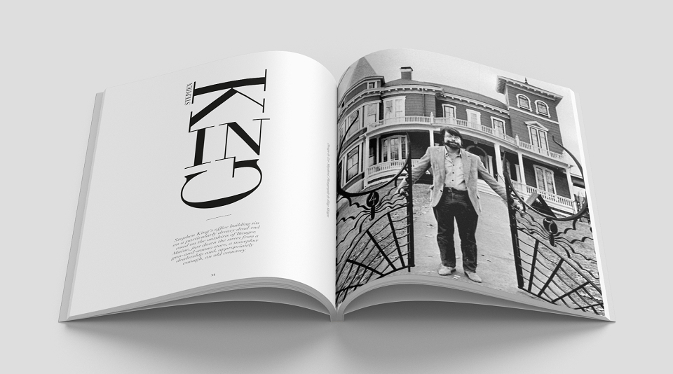
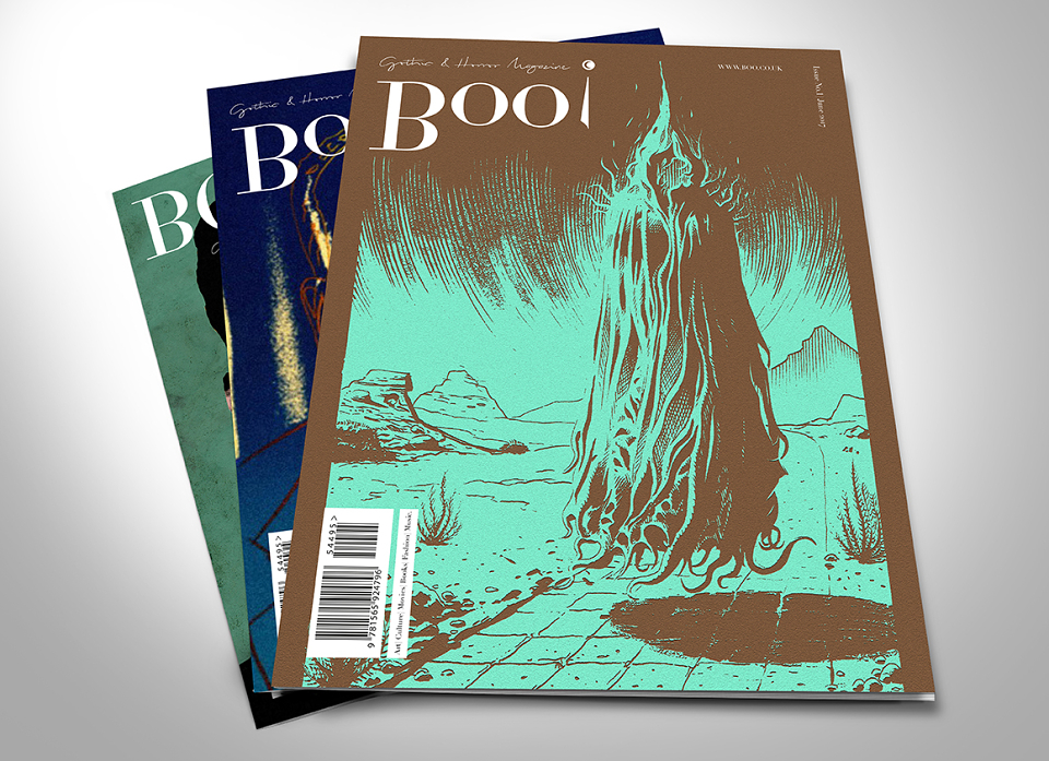
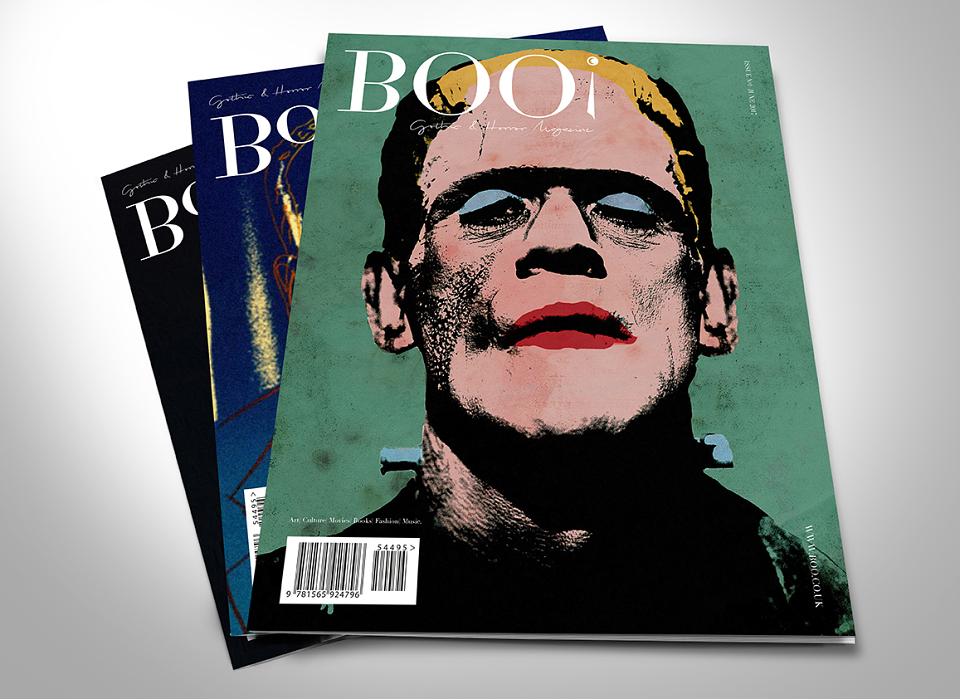
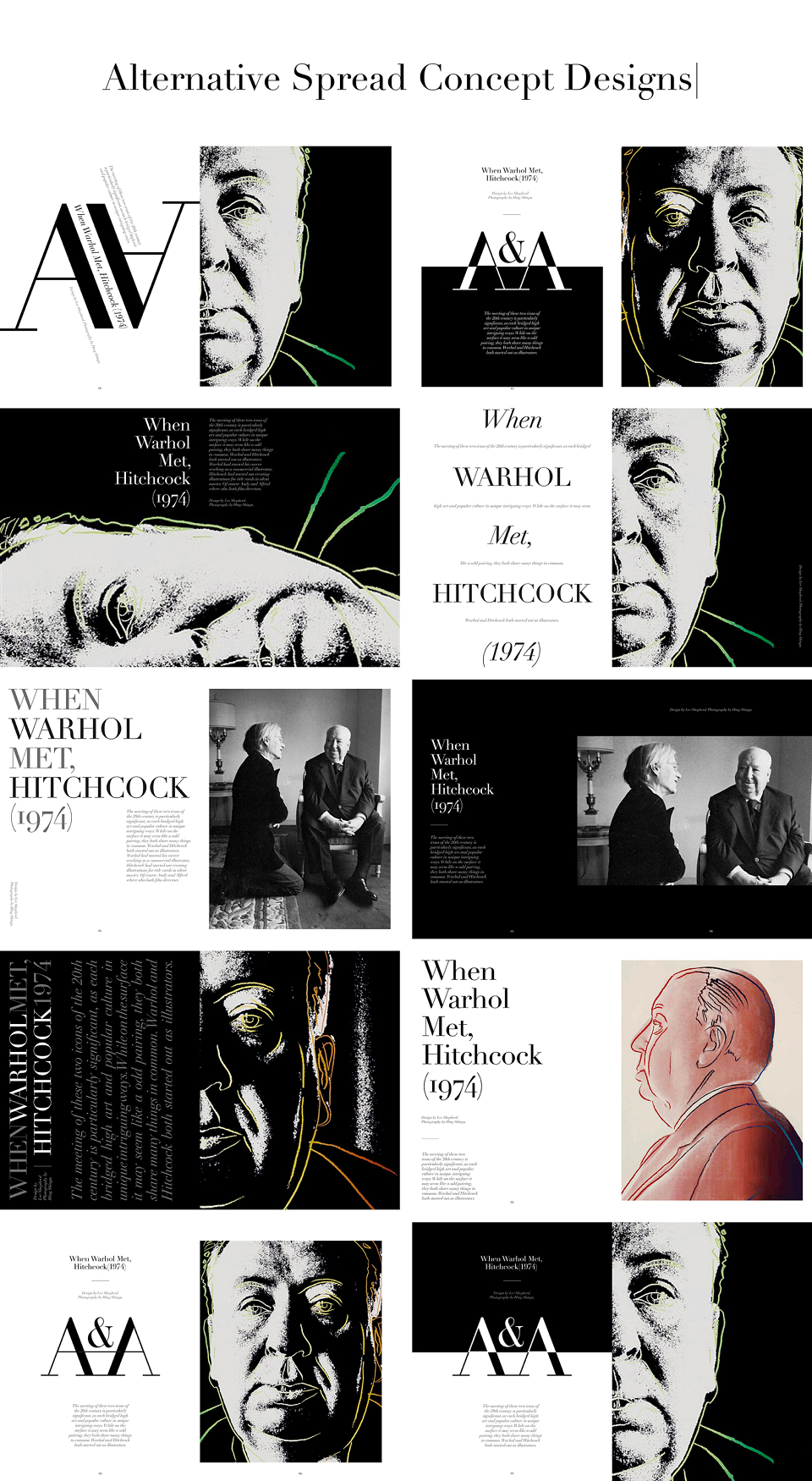
The two brand identity styles can appear to suit the cover at the time, depending on that issues space etc, as the thought process behind them both are the same, like many top end editorial magazines the name / branding stays the same but aspects of the design, style or the identity may differ for each issue. I have shown examples of the two styles on various potential covers, while the images themselves used on the covers are aimed at a specific feature / contents which are set within each publication.
—
AWARDS
Creativepool Annual Bronze