The Behaviours Agency
MANCHESTER
ABOUT
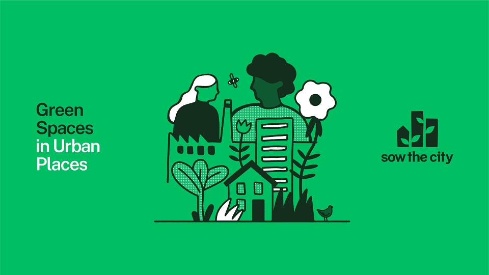
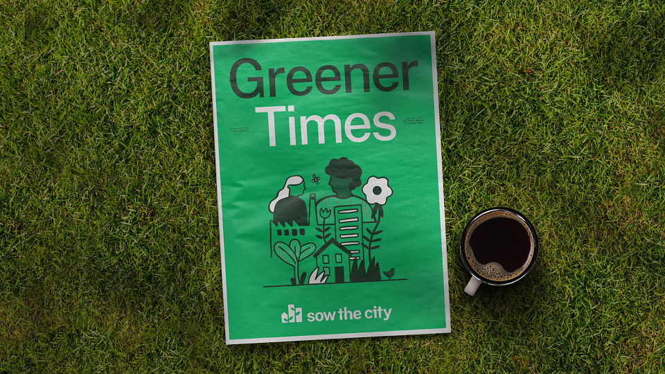
Sow the City is a Manchester-based social enterprise, founded in 2009 to help urban communities create greener cities, grow their own food and connect with nature. While their communications resonated with local communities, they lacked a strong, consistent and mature visual identity. An identity able to engage with corporate partners as well as the communities they work with is crucial to their growth. Helping to secure the vital partnerships and funding needed.
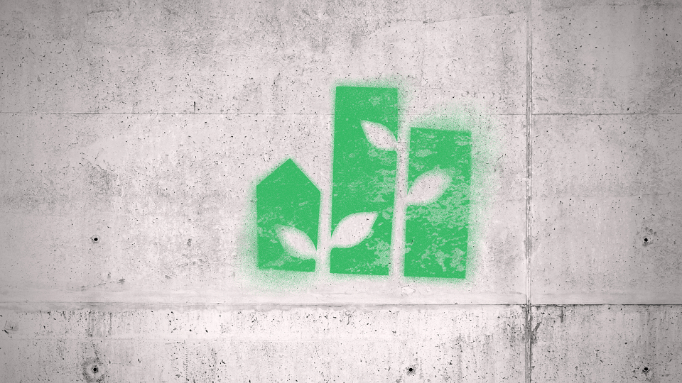
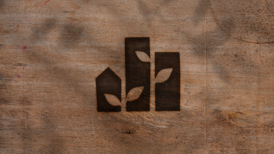
The brief for the logo mark had two key objectives. First, it needed to communicate three core elements that connect Sow The City's work: urban spaces, communities, and nature. Second, the mark needed to be practical for branding sites that Sow The City transforms, whether that burned into wooden planters or stencilled onto surfaces.
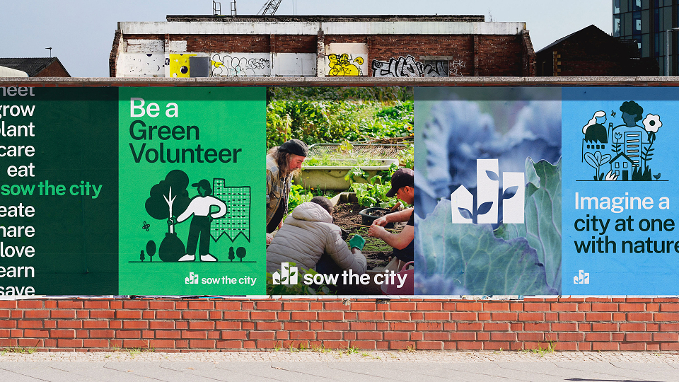
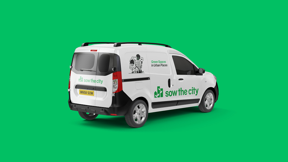
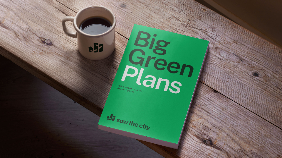
The mark consists of buildings representing the urban spaces where Sow The City works, ranging from high-rises to terraced streets. The three buildings symbolise the importance of community. Between these structures, negative space creates shoots and leaves. This clever design works in two ways: the young plants suggest how Sow The City cultivates spaces for nature to grow, while also representing the vast potential of their work.
The mark pairs with a sans-serif, lowercase wordmark. The lowercase letters convey friendliness and reflect the organisation's grassroots origins. The tapered stems, strokes, and finials echo the buildings in the mark, while the rounded crotchs complement the organic leaf shapes. This revitalised logo and visual identity now capture Sow the City's essence.
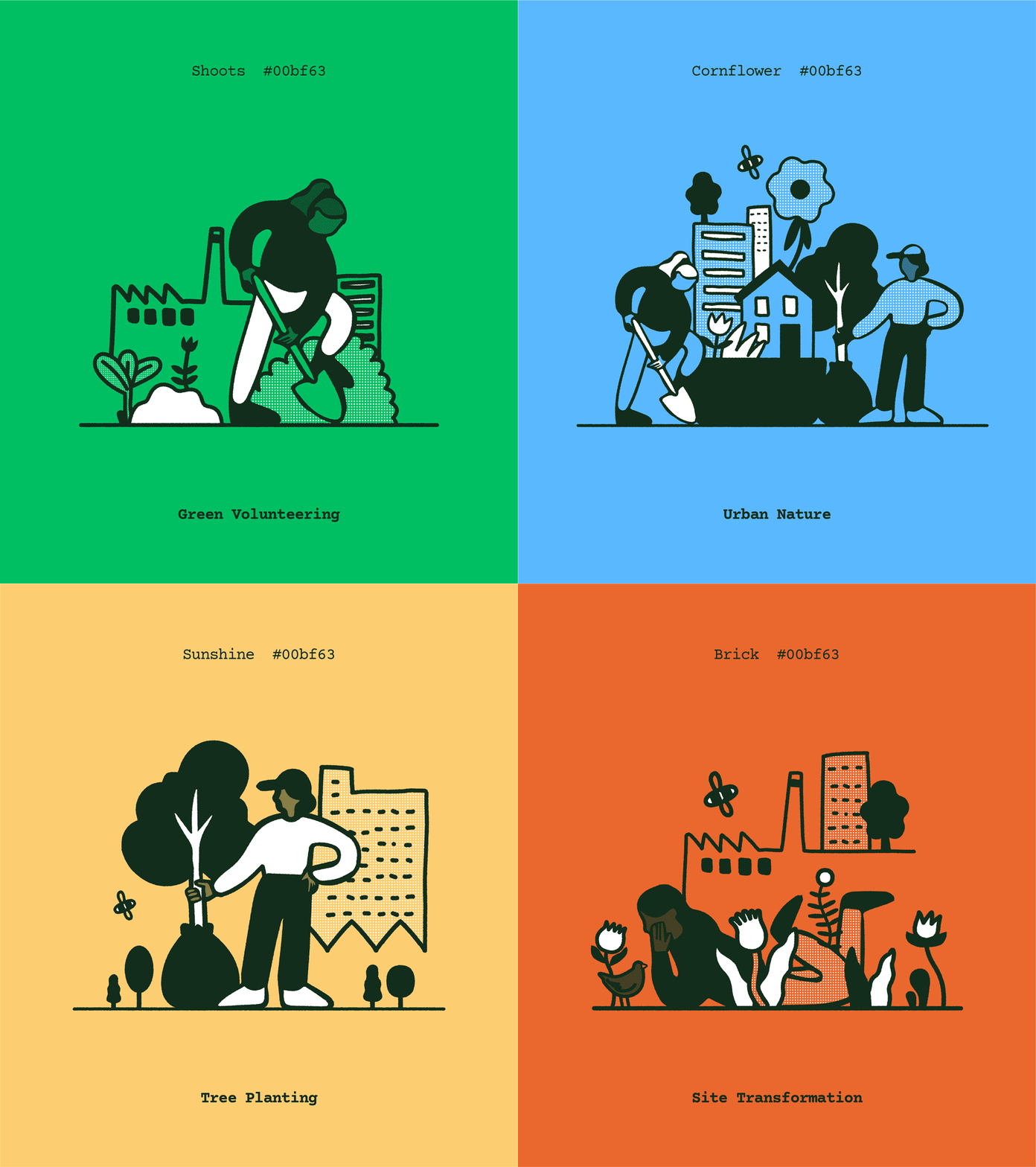
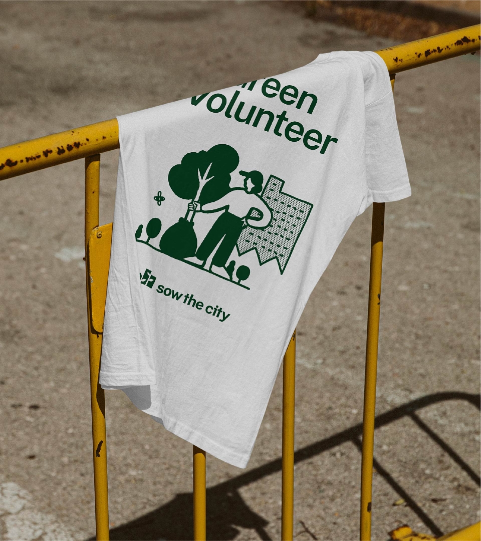
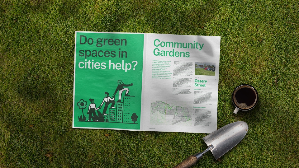
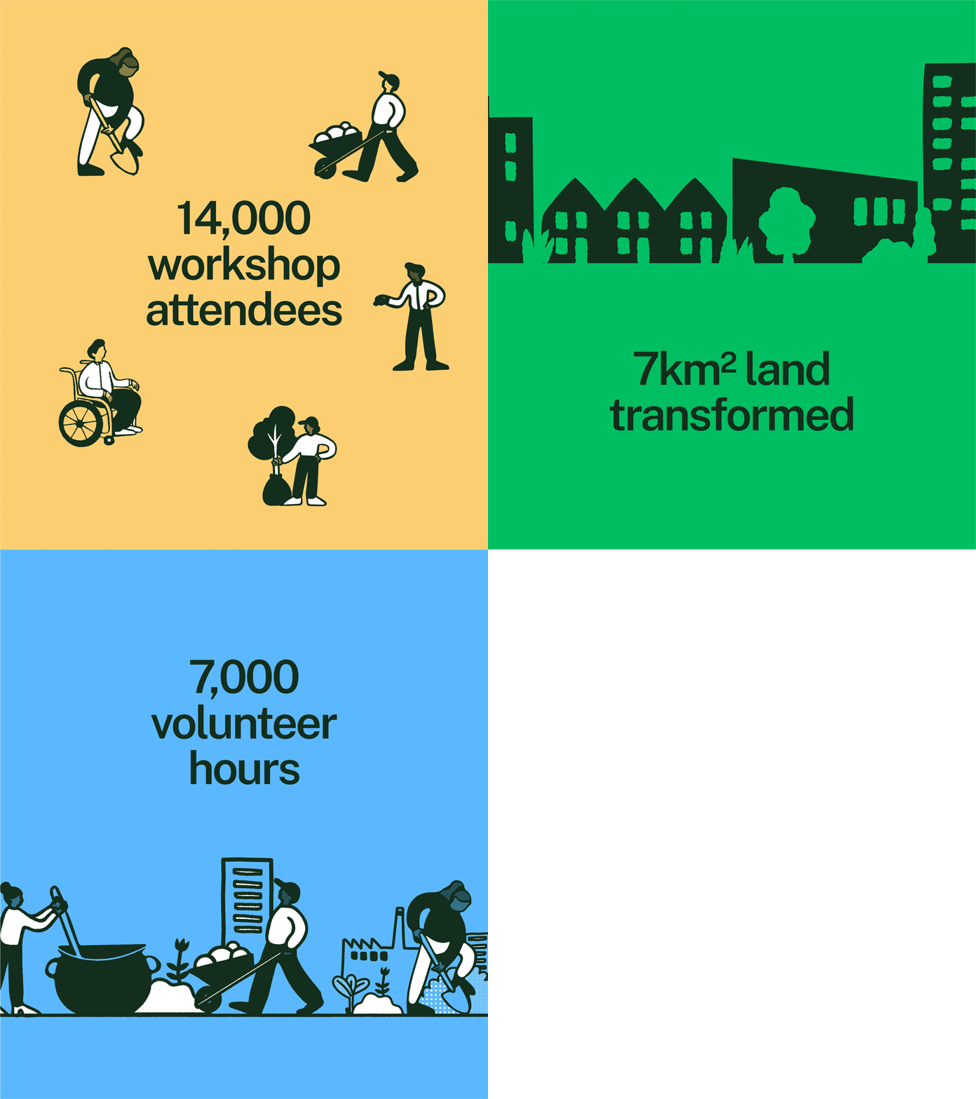
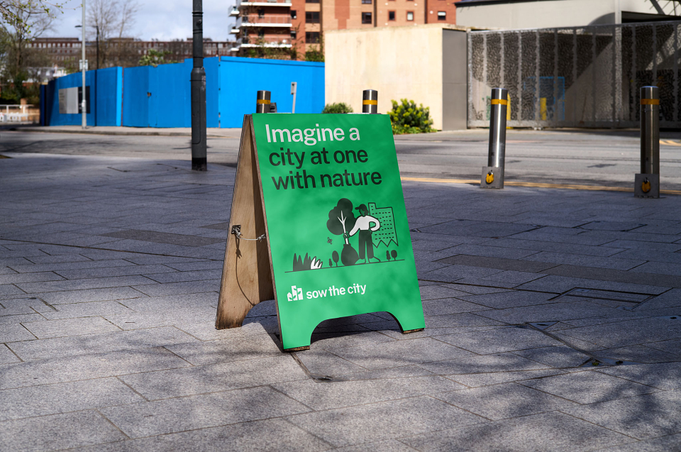
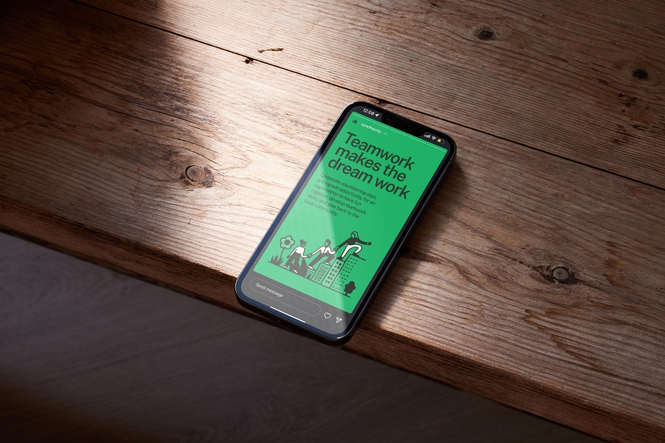
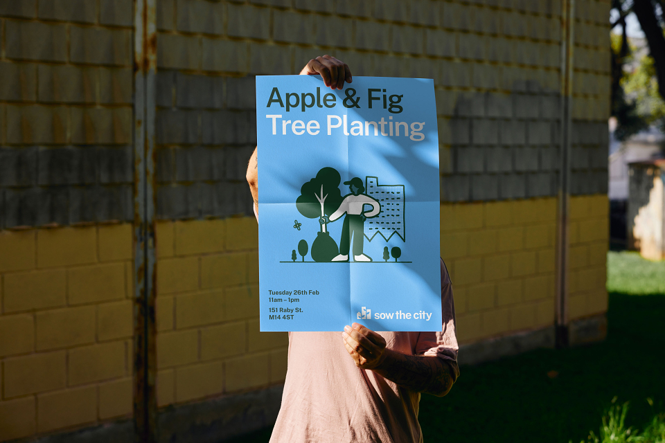
The rest of the identity is built around the toolkit of flexible and accessible assets we created. This means that a team of community workers rather than designers can easily create whatever comms are needed whilst maintaining brand consistency. The toolkit includes drag-and-drop illustrations that work seamlessly across a colour palette inspired by the company's grassroots history of using readily available coloured paper to create flyers. A straightforward typographic structure and rules plus comprehensive and easy-to-use templates ensured the team was ready to go.
This comprehensive rebranding successfully appeals to both community and corporate audiences, nurturing broader engagement and support for a greener, healthier, and more connected city for everyone.
MADEIT CREDITS


Annual 2025 SilverSow The City BrandingBranding
Project featured: on 10th July 2025