Mag. Vladimir von Bergdorff, MA
Group Managing Director
ABOUT
As organisations evolve, their identity must evolve with them. What once represented a single branding agency had gradually become a broader ecosystem of specialised businesses, disciplines and initiatives. The existing visual identity no longer reflected the scale, maturity or strategic direction of Foster + Svensson.
The redesign began with a simple question: how can one identity express multiple businesses while remaining unmistakably one brand?
The answer was not to create more visual complexity, but to remove it.
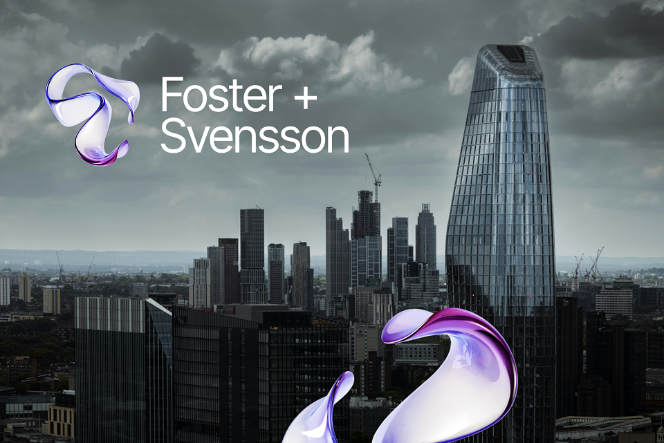
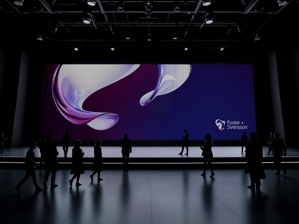
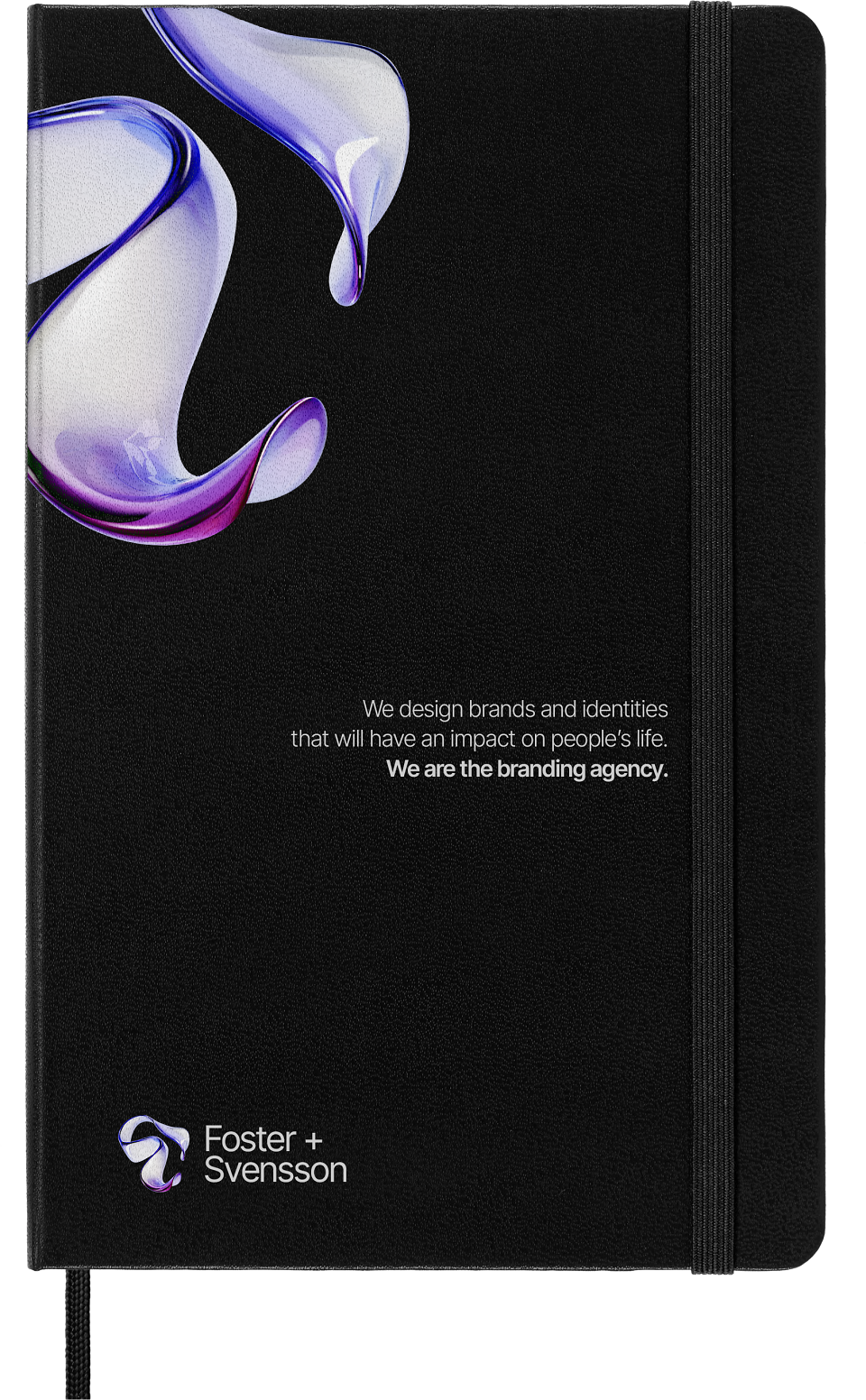
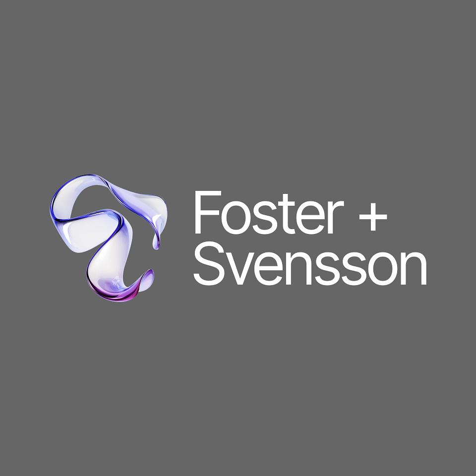
The new identity introduces a refined visual language built around clarity, consistency and precision. At its centre is a redesigned Foster + Svensson logo - more confident, more architectural and intentionally reduced to its essential form. Every proportion, spacing relationship and typographic decision was reconsidered to create a mark that performs equally well across print, digital environments and motion.
Rather than treating each business as a separate entity, the redesign establishes a coherent brand architecture that enables every specialised unit to benefit from the recognition and reputation of the Foster + Svensson name.
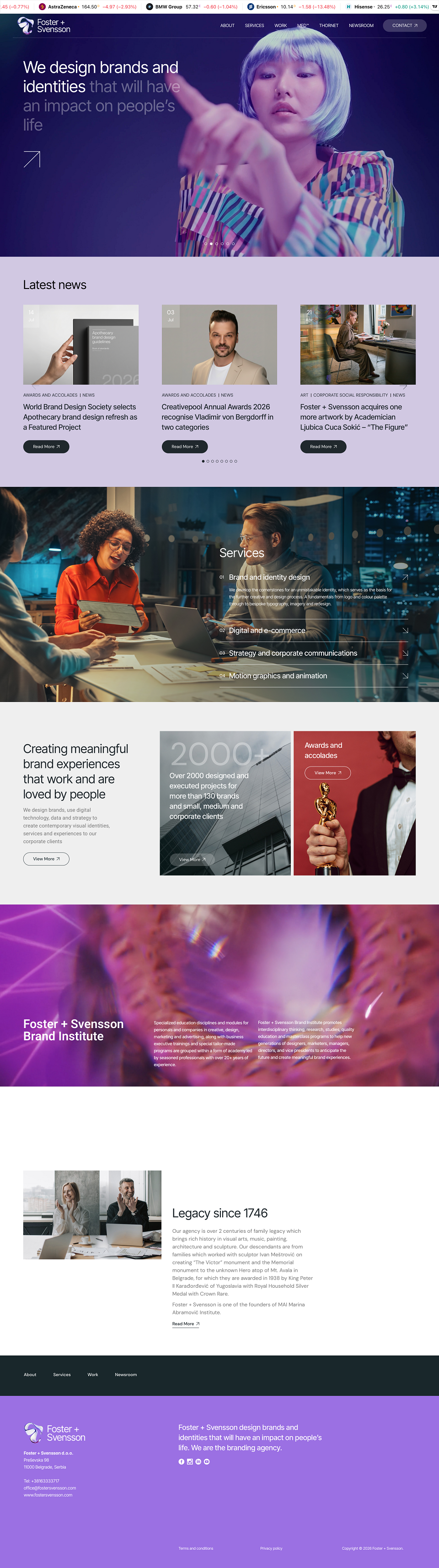
The identity system now extends consistently across Foster + Svensson MED™, Foster + Svensson Philanthropy, Foster + Svensson Brand Institute and Thornet, while allowing each business to communicate its own expertise within a unified framework. Instead of competing identities, the architecture creates one recognisable family whose differences are expressed through purpose rather than disparate visual styles.
This approach simplifies navigation for clients, partners and employees alike. Whether engaging with healthcare communications, technology, education or philanthropic initiatives, audiences immediately recognise the same design principles, the same quality standards and the same organisation behind every interaction.
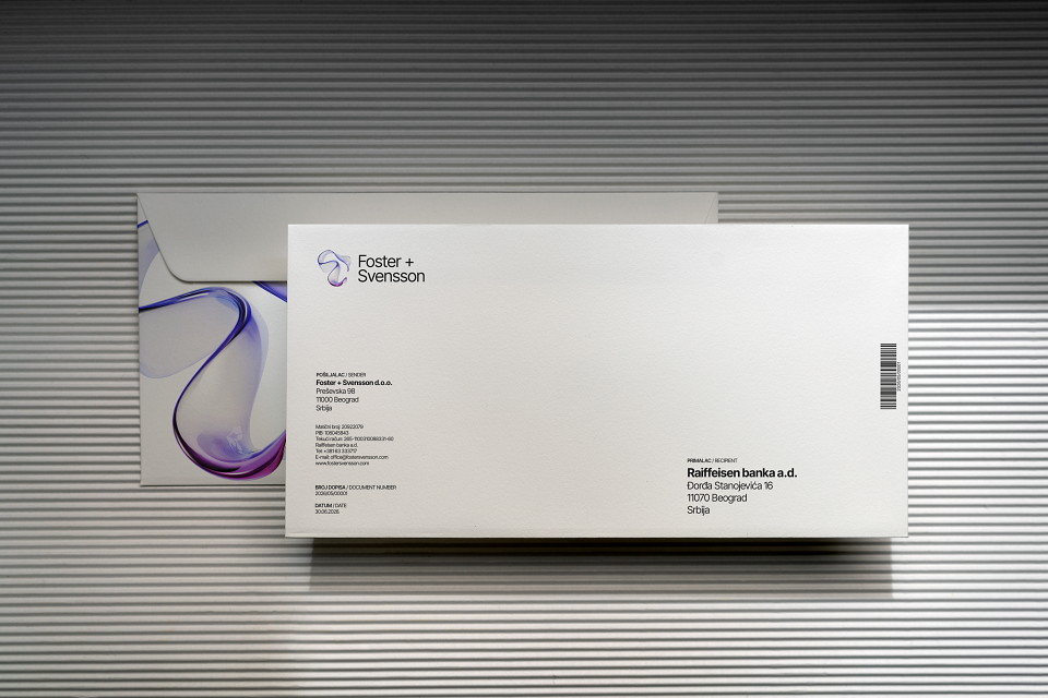
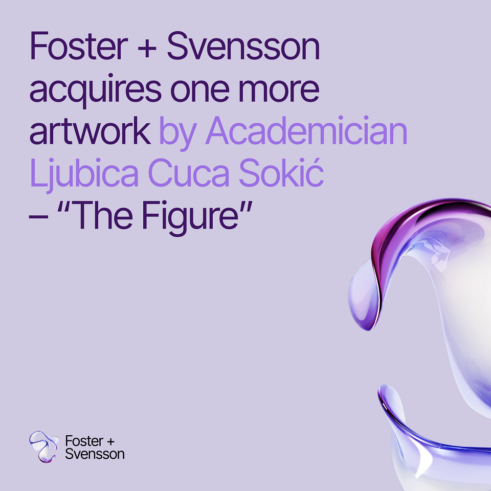
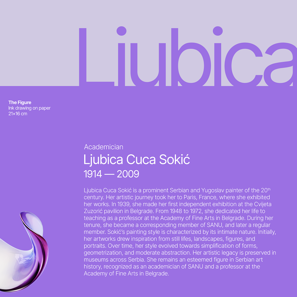
Beyond the logo, the project established a comprehensive visual system. A restrained typographic hierarchy, refined colour palette, modular layouts and carefully defined rules for photography, iconography, motion and digital applications work together to create a consistent experience across every touchpoint. The identity has been designed as a flexible operating system rather than a static collection of assets, capable of adapting to future services, products and business growth without losing coherence.
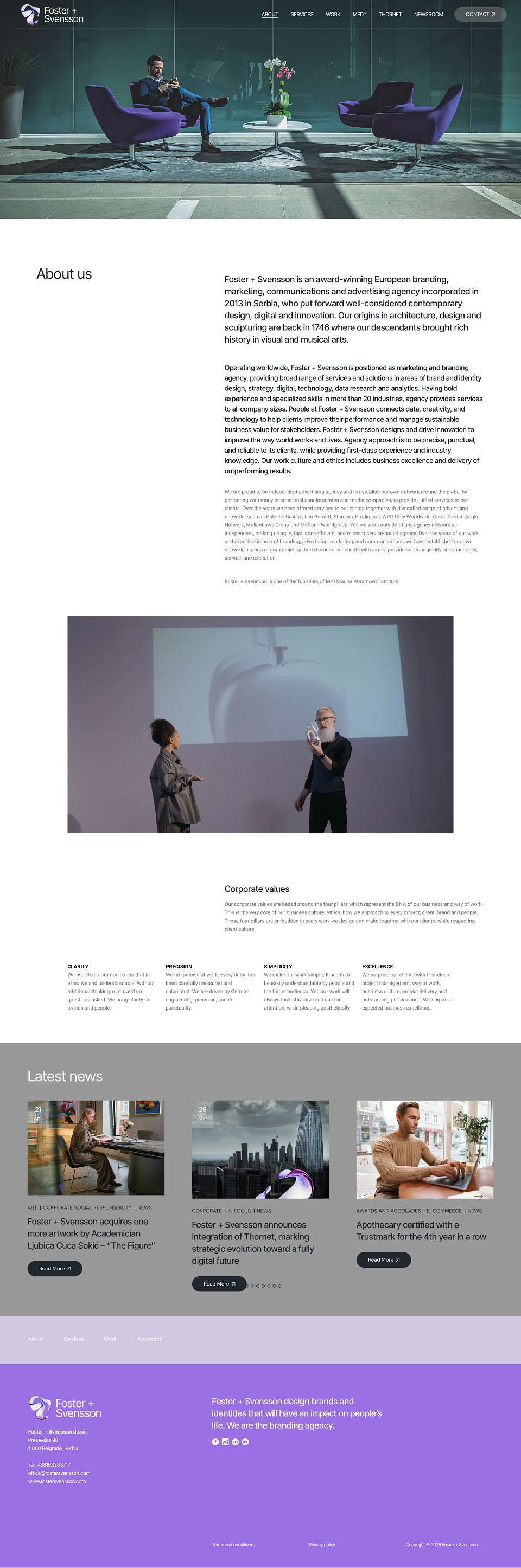
Consistency became the guiding principle throughout the project. Every presentation, website, publication, proposal, social media communication, internal document and environmental application now belongs to the same visual language. Regardless of medium or audience, every expression reinforces a single recognisable identity.
The redesign also reflects Foster + Svensson's broader evolution. Over the years the company has expanded beyond branding into digital experiences, healthcare communications, education, technology, strategy and corporate social responsibility. The previous identity represented where the company had been; the new one reflects where it is today - and where it intends to go next.
Rather than creating a visual statement for a moment in time, the objective was to design a long-term identity capable of growing with the organisation. Timeless rather than fashionable. Rational rather than decorative. Flexible rather than fixed.
The result is a brand identity that brings together multiple disciplines under one coherent visual system, strengthening recognition while simplifying communication across the entire Foster + Svensson ecosystem. And we have a brand name which is not just locked with brand device, but it also allows brand device itself to rotate, reposition and enchance the aesthetics and style of the communication.
In an increasingly fragmented communications landscape, the strongest brands are often the clearest ones. This redesign demonstrates that clarity is not achieved by adding more, but by designing with greater intention.
MADEIT CREDITS
-

Foster + SvenssonClient
-

Mag. Vladimir von Bergdorff, MAGroup Managing Director