The District
Cambridge
ABOUT
The Brief
Following a negative Ofsted inspection, a change of headship forged a change in strategic direction for St. Paul's Church of England primary school. To mark this gear change it was felt the visual and verbal identity needed an injection of energy.
Mediums
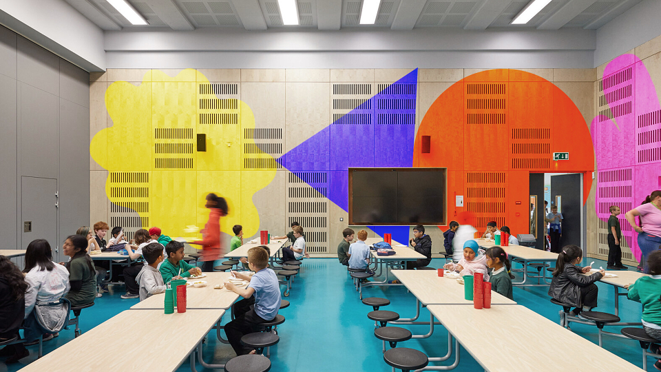
Following the development of the identity, it was applied across social media and key strategic poster sites around the college and in the city as well as used in signage across the campus. The campaign was also applied to the school's website and all external and importantly internal comms.
Concept
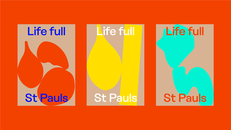
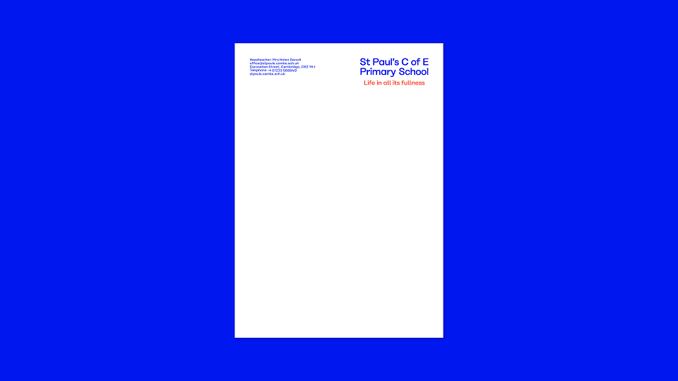
Following significant workshopping getting to the essence of the school, we developed a strapline which really reflected the diverse curriculum and indeed diverse catchment of the school 'Life in all its fullness'. This articulates the essence of a St Paul’s education, capturing the diversity and energy of the school, its staff and pupils. This was effectively the conceptual driver.
Execution
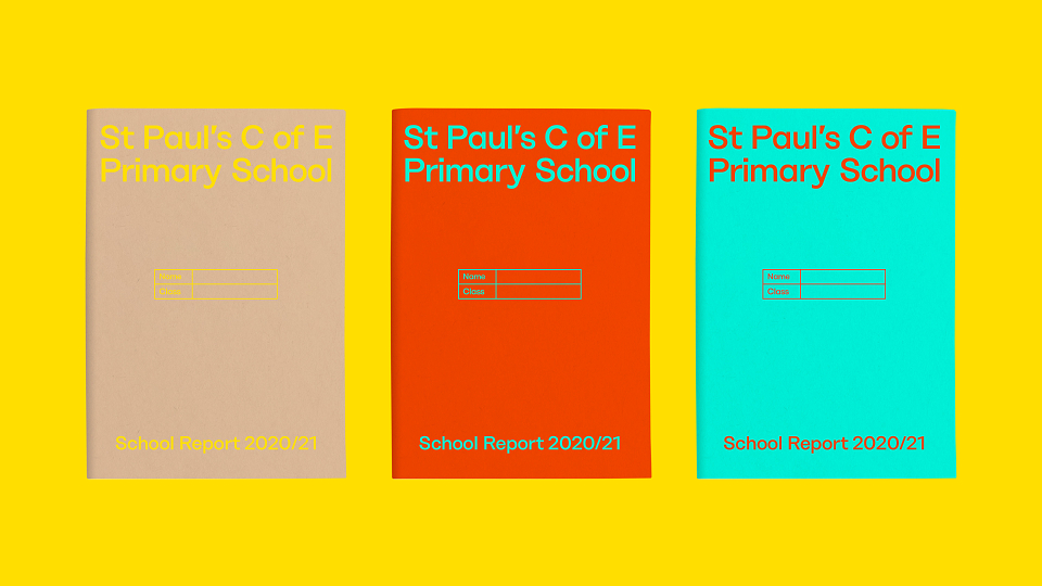
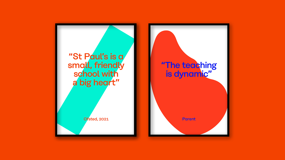
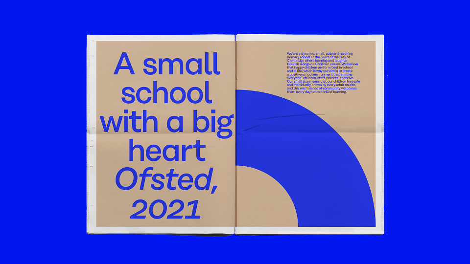
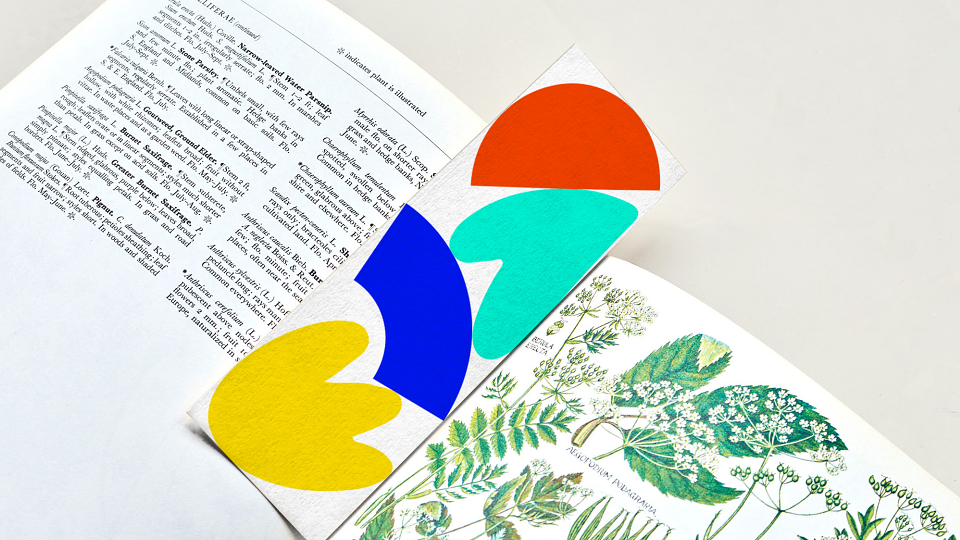
What began with the verbal, became a bright, diverse and energetic visual expression of life at St. Paul's ensuring every corner of the canvas on which it sat was full to every corner. The typeface 'Rationale', chosen for its smooth welcoming curves and its superb readability and clarity, was paired with organic and inorganic brightly coloured shapes that collide, and caress, and ultimately were animated, though even when still had implicit movement and energy. Chosen to express vibrancy, fun, diversity, playfulness, interactivity and positivity. They have a joyful personality and can be used flexibly: singularly, in pairs or in groups. The shapes and the relationship between them captured many concepts and were deliberately abstract and open to an individual's interpretation. They speak of the diversity of the students, the expansive nature of the curriculum and the fact that no two days are the same at St. Pauls.
Results
The identity which will be launched this month has already generated internal buy in and positivity, the head feeling it is a much more appropriate reflection on the ideology of the school and it has already been embraced by parents who have filled their windows with posters and talk excitedly about their new image.