Chromatic
London
ABOUT
Background
Acacia is a Private Equity firm with a difference. Named after the acacia tree, a symbol of renewal and resilience, Acacia focuses on technology-related businesses with potential for substantial and sustained growth. They take a very hands-on approach, investing care as well as capital to make portfolio businesses stronger.
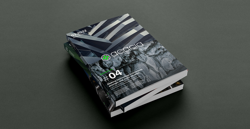
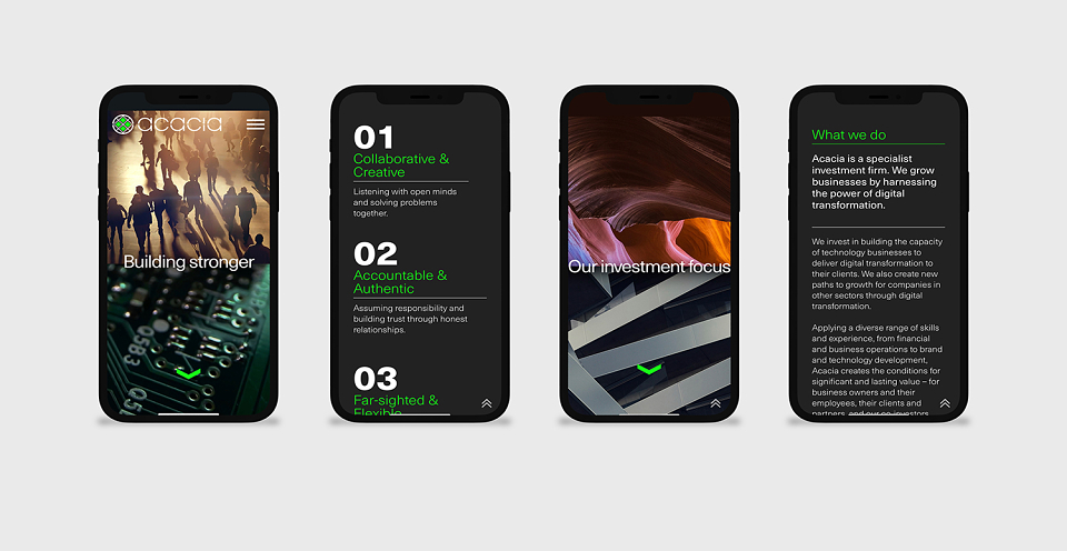
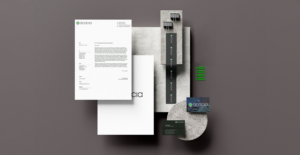
Acacia asked us to sharpen their brand proposition and reshape their Brand Visual Identity to reflect their distinctive approach and their market specialism.
Definition
Acacia represents a coming together of complementary characteristics: collaborative and creative; accountable and authentic; resilient and responsible; empathetic and expert. The way they invest capital and enrich culture unlocks potential and maximises their value.
Expression
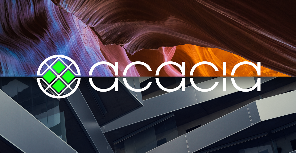
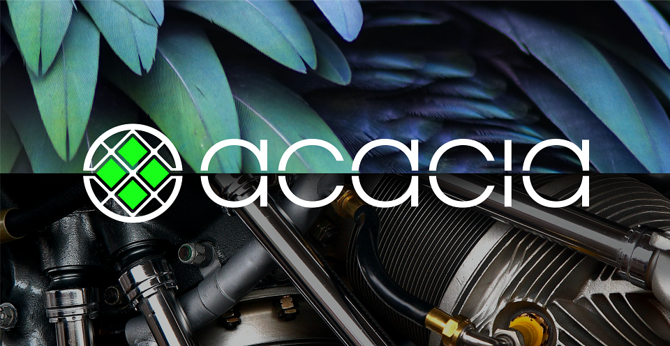
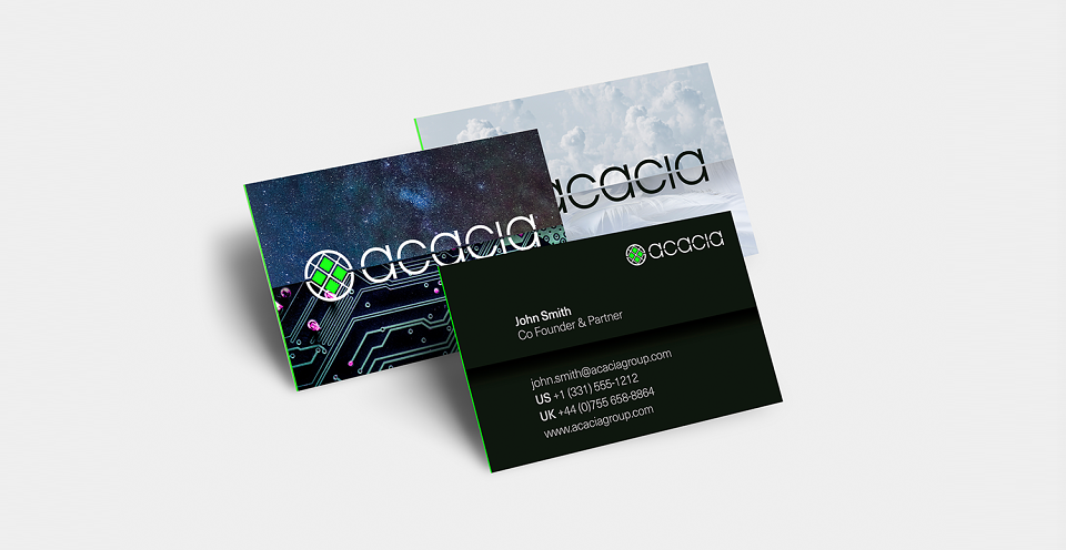
Juxtaposing contrasting images using a horizontal ‘split’ tells the story of Acacia’s dual characteristics. Ideas like Science & Humanity, Process & Empathy and Technology & Creativity can be communicated using this device.
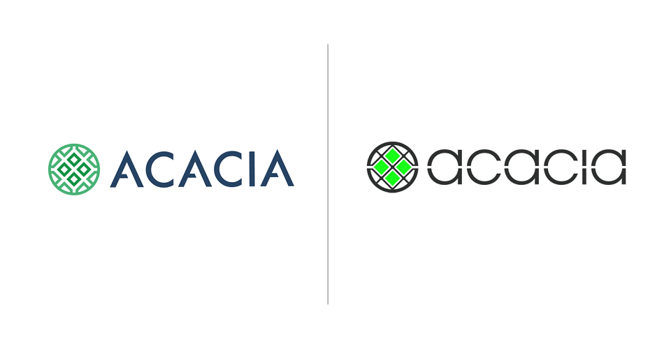
The new symbol, based on a microscopic view of an acacia pollen, incorporates the horizontal ‘split’ and carries its circular form into the logotype, creating a harmonious combination.