Mark Richardson
Creative Director
ABOUT
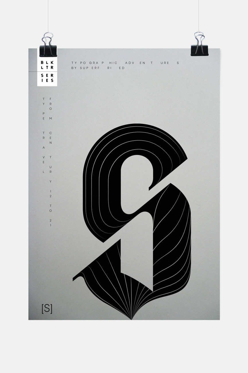
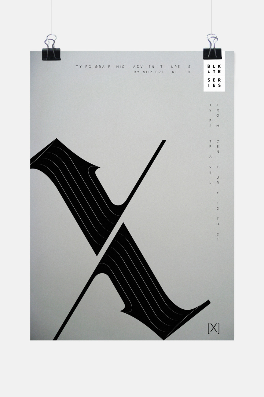
Typographic experiment
Type Travel – Century 12 to 21
–
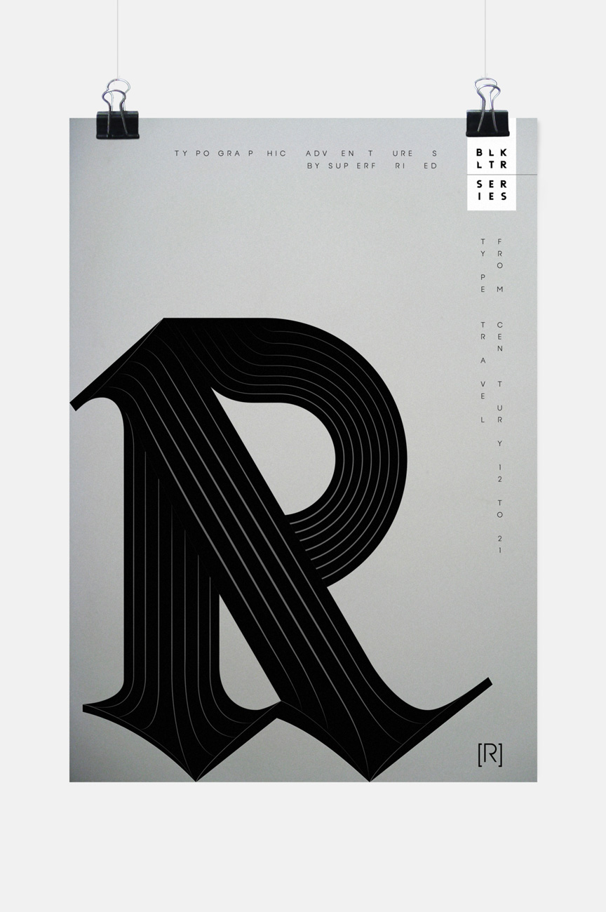
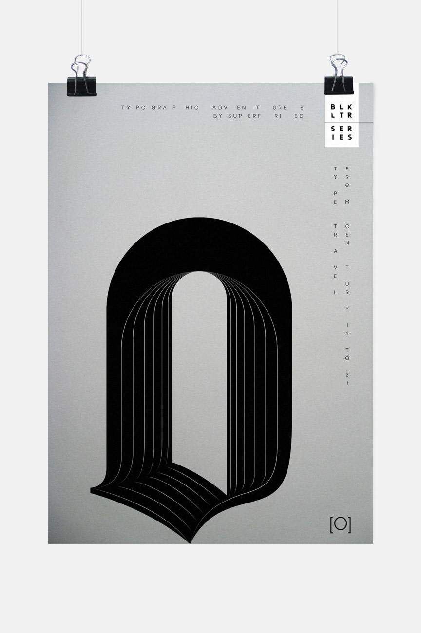
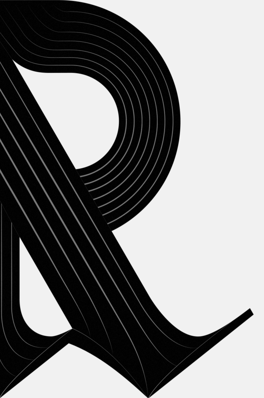
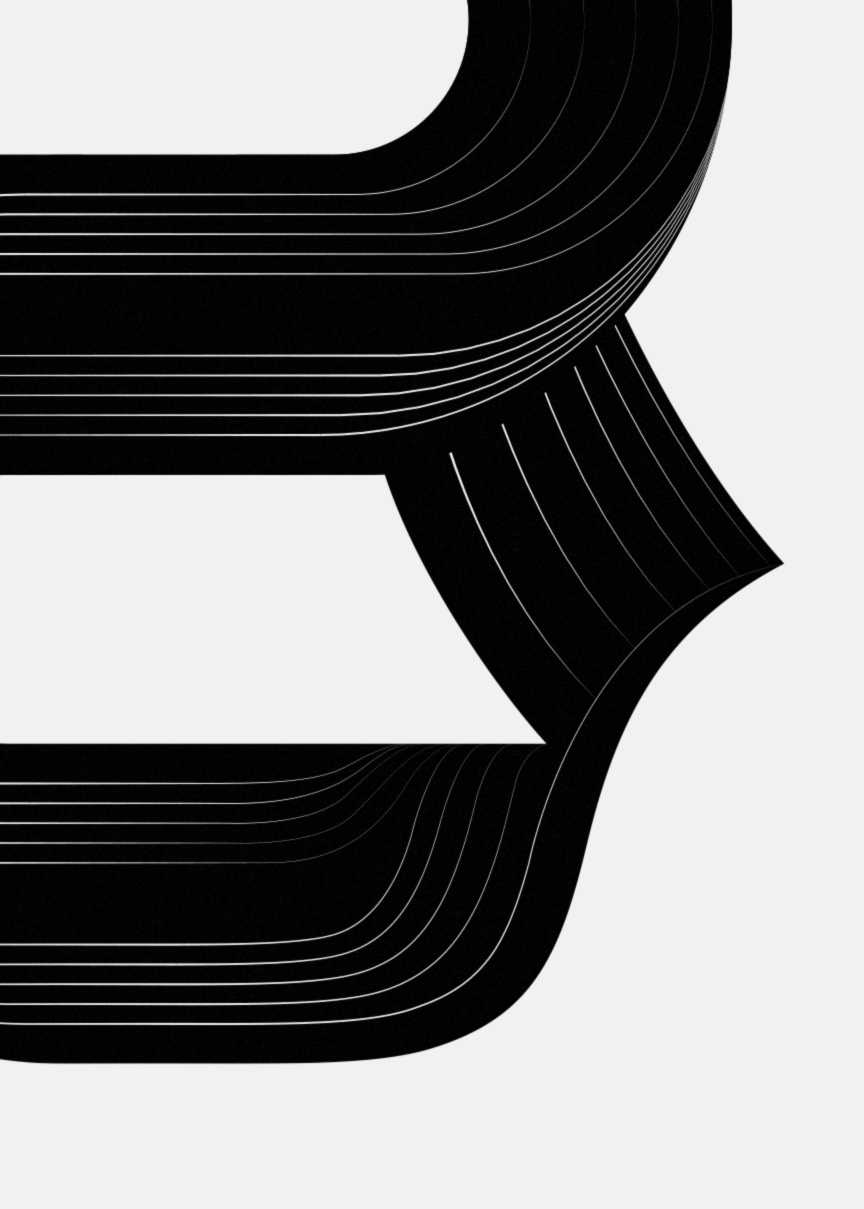
Whilst contemplating a blackletter typeface for a project I had forgotten how illegible the uppercase characters tend to be. This led to the idea of a personal project developing new, experimental, yet completely legible characters based on the signature blackletter forms.
Rather than approaching the project like a typeface, each character has been developed in isolation as a one-off. This eradicated any potential constraints allowing the distinct blackletter characteristics to lead as the shapes were combined to develop each specific glyph. Once each letterform was complete, experimental paths were employed to suggest depth, flow and optical ambiguity.